Understanding Mean, Median, and Quartiles in Data Analysis
Explore the concept of mean, median, quartiles, and cumulative frequency graphs through practical examples involving heights, weights, and ages. Learn how to calculate the missing values and interpret box plots to visualize data distribution effectively.

Download Presentation

Please find below an Image/Link to download the presentation.
The content on the website is provided AS IS for your information and personal use only. It may not be sold, licensed, or shared on other websites without obtaining consent from the author. Download presentation by click this link. If you encounter any issues during the download, it is possible that the publisher has removed the file from their server.
E N D
Presentation Transcript
Dr Frost Cumulative Frequency Graphs
Starter: Problems involving mean The mean height of a group of eight girls is 1.56m. When another girl joins the group the mean height is 1.55m. Work out the height of this girl. Answer = 1.47m ? Girl [Harder] The mean weight of ? cats is 1.5kg. When an obese cat of weight 14.3kg comes into the room, the new average weight is 1.7kg. Find the original number of cats ?. ? ? = ??
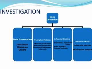
The Whole Picture... Frequency Polygon Histogram Grouped Frequency Table Cumulative Frequency Table Widths (cm): 4, 4, 7, 9, 11, 12, 14, 15, 15, 18, 28, 42 Width (cm) Frequency Width (cm) Cum Freq 0 < w < 10 4 0 < w < 10 4 10 < w < 25 6 0 < w < 25 10 25 < w < 60 2 0 < w < 60 12 Determine Median/LQ/UQ Median/LQ/UQ class interval Cumulative Frequency Graph Estimate of Median/LQ/UQ/num values in range Box Plots
Median/Quartile Revision Here are the ages of 10 people at Pablo s party. Choose the correct value. 12, 13, 14, 14, 15, 16, 16, 17, 19, 24 (Click to vote) 15.5 15 16 Median: 14 13 13.5 LQ: 17 18 19 UQ: Interquartile Range: 3 12 ? ? Range:
Quickfire Quartiles LQ Median UQ 1, 2, 3 1 ? 2 ? 3 ? 1.5 ? 2.5 ? 3.5 ? 1, 2, 3, 4 1, 2, 3, 4, 5 1.5 ? 2 ? 4.5 ? 2 ? 3.5 ? 5 ? 1, 2, 3, 4, 5, 6 Rule for lower quartile: Even num of items: find median of bottom half. Odd num of items: throw away middle item, find medium of remaining half.
What if theres lots of items? There are 31 items, in order of value. What items should we use for the median and lower/upper quartiles? 0 1 1 2 4 5 5 6 7 8 10 10 14 14 14 14 15 16 17 29 31 31 37 37 38 39 40 40 41 43 44 Use 1 Use the 8 th item 4? + 1? item LQ ? Use 1 2? + 1? item Median ? Use the 16th item Use 3 4? + 1? item Use the 24th item ? UQ
What if theres lots of items? Num items LQ Median UQ 4th ? 8th ? 12th ? 15 6th 12th ? 18th ? 23 ? 10th 20th ? 30th ? 39 ? ? ? ? 12th 24th 36th 47
Box Plots Box Plots allow us to visually represent the distribution of the data. Minimum Maximum Median Lower Quartile Upper Quartile 3 27 17 15 22 Sketch Sketch Sketch Sketch Sketch range IQR 0 5 10 15 20 25 30 How is the IQR represented in this diagram? How is the range represented in this diagram? Sketch Sketch
Box Plots Sketch a box plot to represent the given weights of cats: 5lb, 6lb, 7.5lb, 8lb, 8lb, 9lb, 12lb, 14lb, 20lb Minimum Maximum Median Lower Quartile Upper Quartile ? ? ? ? ? 5 20 8 6.75 13 0 4 8 12 16 20 24 Sketch
Worksheet Printed handout. Q1 Reference: GCSE-BoxPlotsQuartileStemLeaf
Box Plots If you only had the diagram, how could we interpret the distribution of data? What we observe What we can deduce The second box is wider than the first. There is a greater spread of weights in the top half. This is known as positive skew. ? The length of the second whisker (pun intended) is quite long. The fattest cat has a weight that is an extreme value, because the weight is far above the Upper Quartile. ? 0 4 8 12 16 20 24
Comparing Box Plots Box Plot comparing house prices of Croydon and Kingston-upon-Thames. Croydon Kingston 100k 150k 200k 250k 300k 350k 400k 450k Compare the prices of houses in Croydon with those in Kingston . (2 marks) For 1 mark, one of: In interquartile range of house prices in Kingston is greater than Croydon. The range of house prices in Kingston is greater than Croydon. ? For 1 mark: The median house price in Kingston was greater than that in Croydon. (Note that in old mark schemes, comparing the minimum/maximum/quartiles would have been acceptable, but currently, you MUST compare the median) ?
Worksheet Printed handout. Q7 Reference: GCSE-BoxPlotsQuartileStemLeaf
Stem and Leaf Median/ Quartiles? ? ? 3 3 7 8 4 1 4 6 ? ? 5 1 1 2 4 5 5 1|3 means 13 ? ? 6 0 2 3 ? ? ?
Worksheet Printed handout. Q3 Reference: GCSE-BoxPlotsQuartileStemLeaf
Recap: Frequency Tables (f) (x) ? ? ?? ? ? Mean of a list =Total of values = How would we usually calculate the mean from a list of items? Num values ? Mode = 2 ?
Frequency Polygons With a bar chart, we d plot each value with its frequency. But we ve now grouped the data. We all each IQ range a class interval. What could we use as a representative value for each class interval? IQ (x) Frequency 16 90 ? < 100 2 14 100 ? < 120 15 12 120 ? < 125 8 10 125 ? < 140 4 8 6 4 ? Modal class interval: ??? ? < ??? 2 90 100 110 120 130 140
Worksheet Frequency Polygons Printed handout. Q5, 8 Reference: GCSE-BoxPlotsQuartileStemLeaf
Recap: Grouped Frequency Tables ???? =570 30= 19 ? Question: Why is our mean going to be an estimate? Because we don t know the exact times within each range. ?
Write Down The Greek letter capital sigma , means sum of . frequencies midpoint of range ???? ?? ???? = ?? ?
Worksheet Grouped Frequency Tables Printed handout. Q1, 2 Reference: GCSE-GroupedDataCumFreq
Median from Grouped Frequency Tables IQ (x) 90 ? < 100 100 ? < 120 120 ? < 125 125 ? < 140 Frequency 5 15 8 3 ? ? ? 100 ? < 120 100 ? < 120 120 ? < 125 Lower Quartile class interval: Median class interval: Upper Quartile class interval: We will see soon that we can actually estimate a value (rather than just give a range) for the median, using something called a cumulative frequency graph.
The Whole Picture... Frequency Polygon Histogram Grouped Frequency Table Cumulative Frequency Table Widths (cm): 4, 4, 7, 9, 11, 12, 14, 15, 15, 18, 28, 42 Width (cm) Frequency Width (cm) Cum Freq 0 < w < 10 4 0 < w < 10 4 10 < w < 25 6 0 < w < 25 10 25 < w < 60 2 0 < w < 60 12 Determine Median/LQ/UQ Median/LQ/UQ class interval Cumulative Frequency Graph Estimate of Median/LQ/UQ/num values in range Box Plots
100m times at the 2012 London Olympics Modal class interval ? 10.05 < t 10.2 Median class interval ? 10.05 < t 10.2 Estimate of mean ? 10.02 Time (s) Frequency Cum Freq ? ? ? ? 9.6 < t 9.7 1 1 9.7 < t 9.9 4 5 9.9 < t 10.05 10 15 10.05 < t 10.2 17 32 TOTAL
Cumulative Frequency Graphs Time (s) Frequency Cum Freq 9.6 < t 9.7 1 1 Plot This graph tells us how many people had this value or less . 9.7 < t 9.9 4 5 Plot 9.9 < t 10.05 10 15 Plot 32 Plot 10.05 < t 10.2 17 32 ? 28 Median = 10.07s Cumulative Frequency 24 Lower Quartile = 9.95s ? 20 16 Upper Quartile = 10.13s ? 12 8 Interquartile Range = 0.18s ? 4 0 9.5 9.6 9.7 9.8 9.9 10.0 10.1 10.2 10.3 Time (s)
A Cumulative Frequency Graph is very useful for finding the number of values greater/smaller than some value, or within a range. Cumulative Frequency Graphs Estimate how many runners had a time less than 10.15s. 32 28 26 runners ? Cumulative Frequency 24 Estimate how many runners had a time more than 9.95 20 16 32 8 = 24 runners ? 12 Estimate how many runners had a time between 9.8s and 10s 8 4 11 3 = 8 runners ? 0 9.5 9.6 9.7 9.8 9.9 10.0 10.1 10.2 10.3 Time (s)
Time (s) Frequency Cum Freq 9.6 < t 9.7 1 1 Plot 9.7 < t 9.9 4 5 Plot Sketch Line 9.9 < t 10.05 17 22 Plot Plot 10.05 < t 10.2 10 32 Cumulative Frequency Graph Frequency Polygon Cumulative Frequency 32 18 28 16 Frequency 24 14 20 12 16 10 12 8 8 4 4 2 0 0 9.5 9.6 9.7 9.8 9.9 10.0 10.1 10.2 Time (s) 9.5 9.6 9.7 9.8 9.9 10.0 10.1 10.2 10.3 Time (s)
Worksheet Cumulative Frequency Graphs Printed handout. Q5, 6, 7, 8, 9, 10 Reference: GCSE-GroupedDataCumFreq
? ??? 5 23 35 39 40 ? ? 179 ?
34 ? ? ? Lower Quartile = 16 Upper Quartile = 44.5
We previously found: Minimum = 9, Maximum = 57, LQ = 16, Median = 34, UQ = 44.5 ? 1 mark: Range/interquartile range of boys times is greater. 1 mark: Median of boys times is greater. ?
44 100 134 153 160 ? ? 25 < ? 35 30 ? ? 40.9 24.1 = 16.8 ?
? ? ? ? C D B A
Summary You use a time machine (you made in DT) to travel forward time to when you re doing your GCSE, in order to give yourself 2 things not to forget when drawing a cumulative frequency diagram. What do you tell yourself? Plot the point with 0 cumulative frequency at the START of your first range, not necessarily at the start of the x-axis. ? Use the END of each range when plotting points, so that your cumulative frequency includes all the people in the range. ?
The Whole Picture... Frequency Polygon Histogram Grouped Frequency Table Cumulative Frequency Table Widths (cm): 4, 4, 7, 9, 11, 12, 14, 15, 15, 18, 28, 42 Width (cm) Frequency Width (cm) Cum Freq 0 < w < 10 4 0 < w < 10 4 10 < w < 25 6 0 < w < 25 10 25 < w < 60 2 0 < w < 60 12 Determine Median/LQ/UQ Median/LQ/UQ class interval Cumulative Frequency Graph Estimate of Median/LQ/UQ/num values in range Box Plots
? ? ? Cumulative Frequency Graph Description Box Plot ? ? ? Cumulative Frequency Graph Description Box Plot ? ? ? Cumulative Frequency Graph Description Box Plot ? ? ? Cumulative Frequency Graph Description Box Plot CARD SORT SOLUTIONS
? ? ? Cumulative Frequency Graph Description Box Plot ? ? ? Cumulative Frequency Graph Description Box Plot ? ? ? Cumulative Frequency Graph Description Box Plot ? ? ? Cumulative Frequency Graph Description Box Plot


")