Project Team Presentations and Data Visualization Projects
Project Team Presentations involve groups like 5Guys, BleacherReport, Bytes & Bars, CHAJ, and more working on COVID-19 data analysis and volleyball statistics visualization. The teams are tasked with tasks ranging from background research to creating interactive maps and charts, with a focus on understanding COVID-19 trends and visualizing volleyball team statistics.

Download Presentation

Please find below an Image/Link to download the presentation.
The content on the website is provided AS IS for your information and personal use only. It may not be sold, licensed, or shared on other websites without obtaining consent from the author. Download presentation by click this link. If you encounter any issues during the download, it is possible that the publisher has removed the file from their server.
E N D
Presentation Transcript
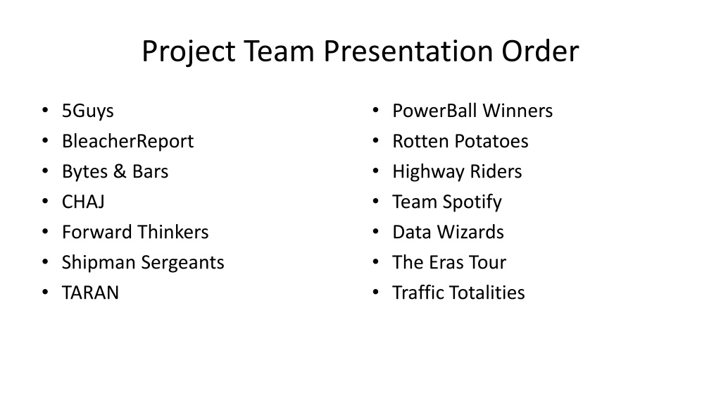
Project Team Presentation Order 5Guys BleacherReport Bytes & Bars CHAJ Forward Thinkers Shipman Sergeants TARAN PowerBall Winners Rotten Potatoes Highway Riders Team Spotify Data Wizards The Eras Tour Traffic Totalities
Assignments Sept. 14: Phase 1 written report due 1-2 pages in the 2-column format Will be edited and extended over the course of the semester Sept. 19: Interacting with Visualizations readings write-up Sept. 21: Visualization as Distortion readings write-up and D3 mini assignment Questions?
5Guys: Covid Cases Vincent LoBello, Jon Kutsch, Fisher Byers, Trey Smith, Tommy Garriga
The Big Idea High-level project idea Covid Cases by State Cases count Rate of spread Death rate Data sources covid.cdc.gov The CDC provides an immense amount of Covid data throughout the United States Backup sources: usafacts.org and coronavirus.jhu.edu
Uses and Users Uses Helping people understand how Covid cases have been rising and falling over the years, and visualizing the hot spots Users Teachers and students in public health courses People who have prior health issues and need to take precautions The interested public
Work plan Vincent LoBello Background Research Trey Smith Gathering Data Jon Kutsch Creating Charts and Graphs Tommy Garriga Creating Interactive Map Fisher Byers Creating Interactive Map Next up: Bleacher Report
BleacherReport: Volleyball Stats Jacob Yin, Lucas Ma, Justin Liu, Nikole Arredondo
The Big Idea Visualizing volleyball team statistics Service Aces Defense rating Kill percentage Data sources stats.ncaa.org the statistics of D1 NCAA game statistics for the past 10 years Backup sources: volleyballworld.com and www.naia.org
Uses and Users Uses Provides insight into the strengths and weaknesses of volleyball teams Users People interested in volleyball statistics Coaches who want to learn more about team dynamics
Work plan Jacob Yin Find and organize data Lucas Ma Work on the visualization Justin Liu Project Coordinator Nikole Arredondo Work on the visualization Next up: Bytes & Bars
Bytes & Bars: Internet Usage & Correlations Around the World Robert Eads, Tyler Felton, Julian Stoicoviciu, & Justin Van Nimwegen
The Big Idea Visualizing internet usage/connectivity and the relationship between different human development factors (literacy, education, etc.) Data sources Kaggle.com - Souce for data sets already structured in a table on a wide range of dates & countries Backup sources: ourworldindata.org & data.worldbank.org
Uses and Users Uses Helping people understand benefits of the internet on human development Understanding internet growth in different countries over time Users Teachers and students studying human geography in relation to the internet s expansion People trying to explore benefits of internet on human development The interested public
Work plan Robert Eads Condensing data, Data analysis & Visualizing data Tyler Felton Choosing visualization type(s), Interactive focus, & Future trend analysis Julian Stoicoviciu Physical visualization design & Interactive focus Justin Van Nimwegen Finding other correlations & data sets, Condensing data & data analysis Everyone Writing reports & creating presentations (specifics TBD), researching/determining optimal visualization design Next up: CHAJ
CHAJ: Video Game Speedruns Connor Hill, Haden Johnson, Alan Perez, John Harrell
The Big Idea High-level project idea Visualizing different video game speedrun records over time World record over time Compare records in different run categories Data sources Speedrun.com Youtube (backup)
Uses and Users Uses Helping people understand how records have progressed Helping people understand the impact of different rules/restrictions on speedruns Users Academics studying video games and/or culture Interested community members & potential runners
Work Plan Connor Hill - Gather Data Haden Johnson - UI Design Alan Perez - Plotting Data John Harrell - API Next up: Forward Thinkers
Forward Thinkers: Soccer Stats Anjali H, Alex P, Nurivan G, Sydney L, Shyam R
The Big Idea Visualizing Soccer World Cup Statistics Team Wins Team Viewership Player Leagues Data sources https://www.kaggle.com/datasets/die9origephit/fifa-world-cup- 2022-complete-dataset The data is in csv format, so it should be easy to use. It also includes a lot of statistics about the teams like possession percentage and what round they played in. Backup sources: https://www.soccerstats.com
Uses and Users Uses Help national teams and their fans understand their performance and what areas they could improve. Users National Teams (admins) players coaches The interested public
Work plan Anjali H write ups, research and organization into excel files Nurivan G load data, set up visualizations Sydney L find viable data, help set up visualizations Alex P write ups, research and organization into excel files Shyam R find viable data, setup/review visualizations Next up: Shipman Sergeants
Shipman Sergeants: Popular Trends on Spotify Cristof Navarro, Jack Sanchez, Punit Nookala, Steven Mao, Cyril John, Jiangyuan Liu
The Big Idea High-level project idea Visualizing music trends on Spotify according to geographical location Music Genre Artists Number of streams Data sources Kaggle.com Backup sources: Spotify API
Uses and Users Uses Helping people understand differences in music across a large geographic region and discover new genres/artists Users Ethnomusicologists Students Musicians
Work plan Jiangyuan Liu Product Manager/Data Engineer Cristof Navarro UI/UX Steven Mao Data Engineer Jack Sanchez UI/UX Punit Nookala Data Engineer Cyril John UI/UX Next up: TARAN
TARAN: Poverty Timothy Reynolds Andrew Hooper Ravish Shardha Andrew Wheir Nicholus Campbell
The Big Idea Visualize poverty levels and effects across the US Age / Sex / Race Educational status Employment status / work experience Data sources data.census.gov contains vast majority of US households and relatively accurate income levels Backup sources https://data.worldbank.org/topic/11
Uses and Users Uses Helping people understand the correlation of poverty with other socioeconomic factors Users Policymakers of all levels for (TODO: polite politician words for deciding exactly how much help should be given to people in poverty) Charitable organizations trying to help people put poverty behind them and assist with those stuck in poverty The interested public
Work plan Nicholus Campbell Design User Interface Andrew Hooper Design User Interface Timothy Reynolds Compile Data Ravish Shardha Compile Data Andrew Wheir Create Visualizations (Task ideas moved to project planning doc) Next up: Powerball Winners
PowerBall Winners: Video Games Sales Robbie Clark, Arya Gupta, JP Pham, Ismat Syah, Michael Tao
The Big Idea Visualizing Video Game sales Differences between console Differences between regions Differences between genres Data sources https://www.vgchartz.com/ - For any given game, this website will show the total sales, but can be further broken down to sales by console or by region. Backup Sources: https://www.npd.com/ , https://www.statista.com/topics/868/video-games/#editorsPicks
Uses and Users Uses Use case would be game studios determining which console to develop/optimize their games for. Users Game studios/Companies/Indie devs seeing what type of games are popular People who are interested
Work plan Robbie Clark Data Gather Arya Gupta Researcher JP Pham Cleaning Data Ismat Syah D3 Graph Creator Michael Tao Visualizer/Researcher Next up: Rotten Potatoes
Rotten Potatoes: Popular Streamed TV Shows/Movies Matthew Barry, Ana Jimenez, David Roh, Siddharth Venkatraman
The Big Idea Visualizing Top Streaming Services Content Characteristics Genre Year Released Rating Data sources Kaggle Title, Year, Age, Backup sources: Another kaggle dataset Revenue and User data: dataset
Uses and Users Uses Helps people identify the diversity among current streaming platforms content Helps production companies identify certain characteristics they should incorporate in their content to better align with a streaming company Users Studios Streaming Platforms Market Analysts Viewers
Work plan Sid Venkatraman Create Visualization for recommended viewer age group for content (target audience age) Matthew Barry Create visualization for revenue of streaming platforms David Roh Create Visualization for Rating (Rotten Tomato/Imdb) Ana Jimenez Create Visualization for age of content on platforms (how old the shows/movies are) Next up: Highway Riders
Highway Riders Vehicle Accident Visualization Joshua Wood, Xiaohu Huang, Arnav Sood, Art Young, Sam Hollenbeck
The Big Idea Visualizing vehicle accident data along I-610 Geospatial visualizations Car makes and models Times of day Accident severity Data sources Texas Department of Transportation online request form Backup: Crash data exists for other locations on https://data.gov/
Uses and Users Uses Understanding the places and times along this highway where accidents are most likely to happen Helping people to be more cautious at certain times and places on the highway. Users Drivers in Houston Traffic engineers The interested public
Work plan Josh Wood - get the data, clean up the data, write summary documentation Art Young write documentation, help process data Sam Hollenbeck work on visualization Arnav Sood will assist in writing the documentation and processing data Xiaohu Huang work on visualization and presentations Next up: Team Spotify
Team Spotify: Playlist Stats Navya Mittal, Minji Choi, Anton Hugo Ramirez, Linh Nguyen, and Vittoria Cicalese
The Big Idea Creating visualizations based on a listener s playlist on Spotify. These might include visualizations related to genres, artists, moods etc. Data sources - Web API reference: Spotify for Developers - Datasets - Spotify Research (R&D)
Uses and Users Uses Helping people understand the breakdown of the songs in a playlist in straightforward format based on stats like dancibility, energy, and tempo Users Music Enthusiasts: explore listening habits, discover new artists, or gain insights into musical preferences Advertisers and Marketers: understand the musical preferences of target audience and create more relevant and engaging advertisements Artists and Bands: identifies which songs connects with their audience and use data to make decisions about their music
Work plan Linh Nguyen Spotify API, data sorting, technical writing Vittoria Cicalese Spotify API, data sorting, visualization Navya Mittal - data sorting, creating visualizations using tableau, technical writing Anton Hugo Ramirez visualization, data sorting, technical writing Minji Choi API integration, visualization & technical writing Next up: Data Wizards
Data Wizards: Harry Potter Movie Statistics Rawan Alzubaidi Helen Mah Alireza Mahdaviarab Emily Sawyer Noah Thompson
The Big Idea Comparing the movies and characters based on different statistics Box office revenue Character screen time Number of times each spell is used How many times they say Harry Potter s name Etc. Data sources Box office revenue: www.statista.com Character screen time: www.imbd.com Everything else: HBO Max - Stream Harry Potter movies Watch the movies and record the data ourselves
Uses and Users Uses Providing fans with fun facts about the Harry Potter movies Users Fans of Harry Potter Movie Buffs The interested public
Work plan Rawan Alzubaidi UX lead Helen Mah data cleaning lead Alireza Mahdaviarab data collection lead Emily Sawyer UI lead Noah Thompson documentation and proofreading Next up: The Eras Tour