Geographic Data Visualization in R and QGIS for Malawi Health Analysis
Utilizing R and QGIS, this project focuses on visualizing sickle cell and HIV percentages by district in Malawi, mapping health facility locations, creating Voronoi polygons, and displaying malaria cumulative incidence data. Various geographic data visualization techniques are applied to provide insights into health trends at a district level in Malawi.

Download Presentation

Please find below an Image/Link to download the presentation.
The content on the website is provided AS IS for your information and personal use only. It may not be sold, licensed, or shared on other websites without obtaining consent from the author. Download presentation by click this link. If you encounter any issues during the download, it is possible that the publisher has removed the file from their server.
E N D
Presentation Transcript
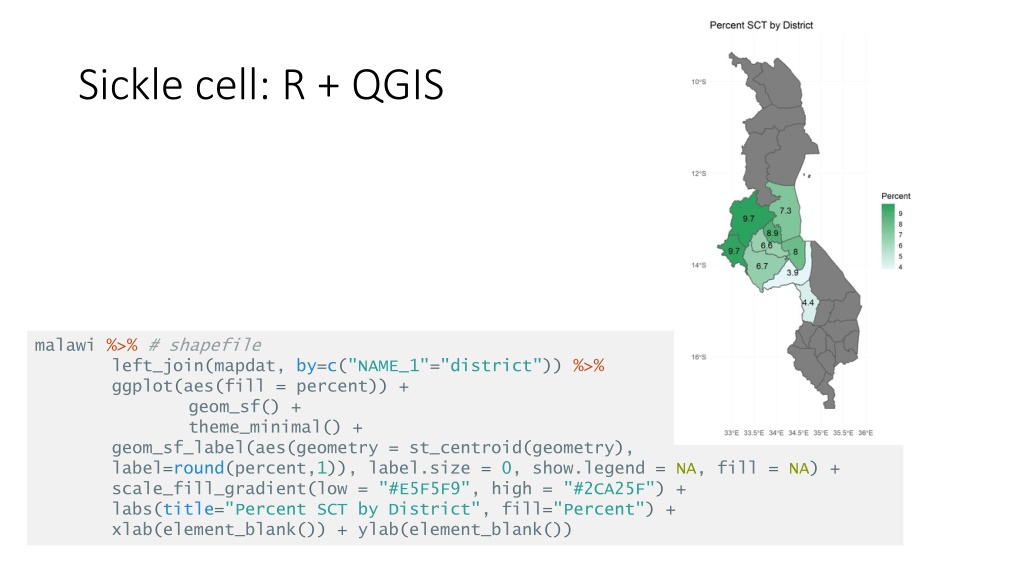
Sickle cell: R + QGIS malawi %>% # shapefile left_join(mapdat, by=c("NAME_1"="district")) %>% ggplot(aes(fill = percent)) + geom_sf() + theme_minimal() + geom_sf_label(aes(geometry = st_centroid(geometry), label=round(percent,1)), label.size = 0, show.legend = NA, fill = NA) + scale_fill_gradient(low = "#E5F5F9", high = "#2CA25F") + labs(title="Percent SCT by District", fill="Percent") + xlab(element_blank()) + ylab(element_blank())
Sickle cell: R + QGIS district_SCT_pct <- merge(malawi, SCT_pct, by.x = "NAME_1", by.y = "district") district_HIV_pct <- merge(malawi, HIV_pct, by.x = "NAME_1", by.y = "district") district_all <- merge(malawi, fig1, by.x = "NAME_1", by.y = "district") writeOGR(district_SCT_pct, dsn = ./district_SCT_pct.shp", "district_SCT_pct.shp", driver = "ESRI Shapefile", overwrite_layer = T)
Malawi health facility locations ggplot() + geom_sf(data=malawi) + geom_sf(data=facility2018_sf, alpha=0.5, color="red") + theme_bw(base_size = 18) + scale_x_continuous(breaks=c(34, 35))
Voronoi polygons # creating voronoi polygons. st_union necessary because st_voronoi doesn't work on sf object. Have to combine them into a multipoint object. vpolygons2018 <- st_voronoi(st_union(facility2018_sf)) ggplot() + geom_sf(data=vpolygons2018) + theme_bw(base_size = 18) + scale_x_continuous(breaks=c(34,35)) + scale_y_continuous(breaks=c(-10,-12,-14,-16)) + coord_sf(xlim=c(440000,850000), ylim=c(8087000,9021000), expand=F)
ggplot() + geom_sf(data=incidence2018_revise, lwd=0.1, aes(fill=variable)) + facet_wrap(~period, nrow=3, ncol=4) + theme_bw(base_size = 8.5) + scale_fill_distiller(palette = "Spectral") + theme(legend.key.height = unit(.5,"cm")) + ggtitle("Malaria Cumulative Incidence by Health Facilty \nMalawi 2018") + labs(fill = "cumulative \nincidence*", caption = "* values >0.5 set to 0.5") + scale_x_continuous(breaks=c(34, 35))
lakes <- st_read("./lake malawi/Malawi_lakes.shp") malawi <- readRDS(gzcon(url("https://biogeo.ucdavis.edu/data/gadm3.6/Rsf/gadm36_MWI_0_sf.rds"))) mozam <- readRDS(gzcon(url("https://biogeo.ucdavis.edu/data/gadm3.6/Rsf/gadm36_MOZ_0_sf.rds"))) tanzania <- readRDS(gzcon(url("https://biogeo.ucdavis.edu/data/gadm3.6/Rsf/gadm36_TZA_0_sf.rds"))) zim <- readRDS(gzcon(url("https://biogeo.ucdavis.edu/data/gadm3.6/Rsf/gadm36_ZWE_0_sf.rds"))) zam <- readRDS(gzcon(url("https://biogeo.ucdavis.edu/data/gadm3.6/Rsf/gadm36_ZMB_0_sf.rds"))) ggplot() + geom_sf(data=mozam,fill="cornsilk2",color="cornsilk3") + geom_sf(data=tanzania,fill="cornsilk2",color="cornsilk3") + geom_sf(data=zim,fill="cornsilk2",color="cornsilk3") + geom_sf(data=zam,fill="cornsilk2",color="cornsilk3") + geom_sf(data=malawi, fill="cornsilk") + geom_sf(data=lakes, fill="deepskyblue",color=NA) + geom_sf(data=malawi, fill=NA, color="tan4", size=1) + theme_bw() + geom_sf(data=facility2018_sf, alpha=0.5, color="red") + labs(title = "Health Facilities in Malawi", x = "Longitude", y = "Latitude") + xlim(32.5,36) + ylim(-17,-9.5) + theme(panel.background = element_rect(fill = "lightblue1")) + annotate(geom="text", x=33.5,y=-13.5,label="Malawi", fontface = "italic",color="black")
# load map RDS files of border countries and lakes load("./rds/SEAfrica.rdata") plot <- ggplot(data = dhs_map) + geom_sf(data=SEAf,fill="cornsilk2",color="cornsilk3") + geom_sf(data=malawi, fill="cornsilk") + geom_sf(data=lakes, fill="deepskyblue",color=NA) + geom_sf(data=malawi,fill=NA,color="tan4",size=1) + geom_sf(data=dhs_map %>% filter(pcr==1) %>% group_by(month, CLUSTER) %>% summarise(num = n(), prev=mean(malaria, na.rm = T)), aes(color=prev, size=num), alpha=0.5, show.legend = "point") + labs(title = "Malaria prevalence in Malawi", subtitle = str_wrap("DHS Survey 2015-2016; n=3,553"), x = "Longitude", y = "Latitude", size = "# individuals in cluster", color = "malaria prevalence") + theme_bw() + scale_color_distiller(palette ="Spectral") + xlim(32.5,36) + ylim(-17,-9.5)
library(rasterVis) popdens <- raster("./Malawi census boundaries/worldpop_mwi_ppp_2018.tif") rasterVis::gplot(popdens) + geom_tile(aes(fill = Hmisc::cut2(value,cuts = c(0,1,5,10,100,250)))) + scale_fill_ordinal(name="Population") + coord_equal() + theme_bw() + labs(title="Population Density: Malawi \nworldpop 2018", x="Longitude", y="Latitude")


 +")
")

")