Exploring Wind and Ocean Ecosystems Through Data Visualization Activities

Dive into a module that explores wind and ocean ecosystems through engaging activities such as creating wind rose plots, visualizing upwelling events, and working with large datasets. Designed for undergraduate environmental science and policy majors, this module offers hands-on experience with data processing and visualization, while addressing challenges related to interpreting wind rose plots and geographical data.

Download Presentation

Please find below an Image/Link to download the presentation.
The content on the website is provided AS IS for your information and personal use only. It may not be sold, licensed, or shared on other websites without obtaining consent from the author. Download presentation by click this link. If you encounter any issues during the download, it is possible that the publisher has removed the file from their server.
E N D
Presentation Transcript
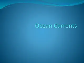
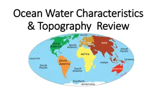
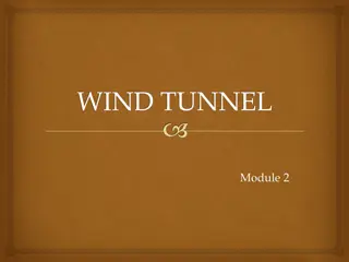
WIND AND OCEAN ECOSYSTEMS April Watson and Alanna Lecher
AUTHORS April Watson Alanna Lecher
CLASSROOM DEMOGRAPHICS FOR LAUNCH Undergrad environmental science and policy majors Environmental statistics course Most had experience with Excel Very few had experience with data visualization or GIS Macs/iPads vs. PC
WHERE CAN THIS MODULE BE USED? Oceanography class where the primary goal is to teach physical oceanography Atmospheric-based class (particularly Activity A and B) GIS course (particularly Activity D, but well suited to a degree program in which GIS is a component, for example Environmental Science)
ACTIVITIES IN THE MODULE Pre-module work: Set up an account with ArcGIS, online, outside of class as instructed by professor (only if doing Activity D) Activity A: Find latitude and longitude of buoys from the NOAA National Data Buoy Center in the Northwest Atlantic Ocean and plot the buoys on a worksheet. Activity B: Create a wind rose plot in Excel of wind direction and strength of a specific buoy in the Gulf Stream. Activity C: Identify an upwelling event with buoy water temperature data, create wind rose plots of upwelling and non-upwelling events. Activity D (Optional): Visualize upwelling with a choropleth map time series, look at MODIS chlorophyll data of upwelling and non-upwelling events.
WORKING WITH LARGE DATASETS Typically we clean up the data for the students EDDIE modules allow the student to process raw data Hands on experience with the way that scientists actually gather and process data
CHALLENGES Visualization Many students have never looked at a wind rose plot Or for that matter wind direction Or even lat/long! Something to consider in terms of context of your class and where you are in your content
Challenge: interpreting a wind rose plot Question: FROM which direction did the wind come most often? How often did the wind come from that direction?
This student thought the dominant wind from the NE, because they did not add up all of the lines going to the south. They also failed to put a legend on the wind rose. Had they put the legend on they would have seen that the winds blowing from the south were also the strongest winds.
Converting wind degrees to wind direction Question: If the wind degrees is 250 , what is the wind direction? Degrees Direction 145 230 93 3 201 278 112 250 242 357 315 33 153 296 181
DATA ACQUISITION Real data acquisition is messy! Requires a LOT of processing Patience, patience, patience!
DATA ACQUISITION For example: Buoy off line Didn t pick wind direction Have to delete the null data
UPWELLING Another challenge of data visualization of ocean upwelling They need to see a time when there is sharp decrease in ocean temperature Why did that happen? We focus on Monterey Bay, California
VISUALIZATION https://earth.nullschool.net/#current/wind/surface/level/orthographic=- 121.89,37.42,6892/loc=-122.057,36.761
VISUALIZATION OF EFFECT Upwelling affects areas due to increased nutrients being brought to the surface Another thing students have trouble visualizing! We created a GIS activity to help students see the effect of upwelling. Another challenge: need ArcGIS online access/computer access
ARCGIS ONLINE MAP https://arcg.is/1XS1ma0 Note: This part does require a subscription account to ArcGIS online I am working on adapting this for you Web application also https://lynnufl.maps.arcgis.com/apps/webappviewer/index.html?id=29f801b b75bd4ee88324838212e03c99
STUDENT INQUIRY In Activity C the students get to choose time periods that seem like there is upwelling and time periods where there is no upwelling Room for extension/adaption Your area Area of their interest Trends analysis Lots of options!
BENEFITS Experience real world data Inquiry based Physical processes are connected to biological aspects Practice with excel (useful!) Visualize concepts not typically easy to see GIS Interpretation of figures Experience oceanographic research Develop a better understanding of how science is conducted in marine settings
ADAPTATIONS Modular Can pick and choose which pieces to use in class or as homework Variations If time is short, we do include the datasets needed to run the modules Faster than having students download it themselves Extension Not exclusive to environmental or data literacy courses!