Essential Rules and Tips for Creating Quality Maps
Understanding what a map is, the rules of mapping, key features that should be included on maps (BOLTS), and essential tips for creating tasteful and easy-to-read maps. Guidelines include labeling in pencil first, horizontal labeling for human features, following natural directions for physical features, using different printing styles for various features, and coordinating colors with features for better clarity.

Download Presentation

Please find below an Image/Link to download the presentation.
The content on the website is provided AS IS for your information and personal use only. It may not be sold, licensed, or shared on other websites without obtaining consent from the author. Download presentation by click this link. If you encounter any issues during the download, it is possible that the publisher has removed the file from their server.
E N D
Presentation Transcript
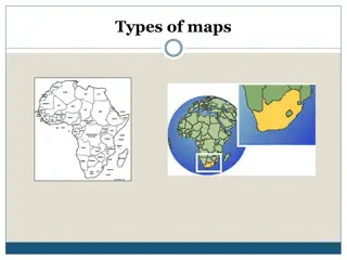
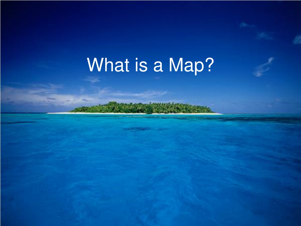
What is a Map? A map is a representation of the earth s features drawn on a flat surface. Unlike photographs, maps cannot show you what the land actually looks like. Instead, maps use symbols and colours to represent the features of an area. Maps simplify the real world. The maker of a map needs to decide which features to include and which ones to ignore, depending on the maps purpose.
The Rules of Mapping Whenever you draw a map, certain features should always be included. These features help the map reader understand the purpose of the map.
The following features should always be included on a map: The acronym BOLTS will help you remember them: B: Border sets the limits of the map. O: Orientation or direction, shown with a north arrow. Tells the reader which way is north. L: Legend Indicates the meaning of symbols used to represent real-world features (eg. Cities, boundaries, rivers, train tracks, etc.) T: Title Must be descriptive. Indicates what the map represents. S: Scale Indicates the difference between distance on the map and distance in the real world.
Map Essentials To create a good quality map, your map must be tasteful and easy to read. Follow these rules to create a good map:
1. All labels should be printed in pencil first. Once the spacing and spelling are correct, you can go over each label in pen.
2. All Human features (place names) are to be labeled horizontally.
3. Physical features (lakes, rivers, mountains) may be labeled by following the natural direction of the feature.
4. When labelling, use different printing styles to reflect different types of features; for example PROVINCE Capital City Town Hudson Bay
5. When labelling, co-ordinate colours with features: ie black for human features, blue for water, green for natural features, brown for mountains, etc.
6. When adding colour, be sure you shade lightly so you do not smudge your labels and so that you can clearly read the labels through the colour.
7. Colour is only used to add information, no to beautify for you map. Standard colours are to be used blue is always for water!, green is usually for foliage.
8. Always name the Cartographer (thats you!) before handing in.
9. Be sure to add a Date. Features on maps can change over time. The date of publication helps the reader know the time period for when the map was current.


 are to")