Understanding the Use of Maps in Public Health

Maps play a crucial role in public health by visualizing health data, trends, and locations of health events. They are used to communicate information such as disease rates, outbreaks, and causal factors. Spot maps show individual case locations, while area maps use colors or shades to communicate trends. Historically, John Snow's cholera investigation in 1854 using maps paved the way for modern epidemiological techniques like those employed by the CDC today. Although correlation and causation are often misunderstood in data interpretation, maps remain valuable tools in public health analysis.

Download Presentation

Please find below an Image/Link to download the presentation.
The content on the website is provided AS IS for your information and personal use only. It may not be sold, licensed, or shared on other websites without obtaining consent from the author. Download presentation by click this link. If you encounter any issues during the download, it is possible that the publisher has removed the file from their server.
E N D
Presentation Transcript
a factor is completely responsible for a given outcome Word Bank Area map a factor is partially responsible for a given outcome; other factors contribute, too Attribution an increase in the number of cases of a disease above what is normally expected in that area Causation map type that shows rates of disease or health conditions using different shades or colors Contribution relationship in which a factor causes an outcome Correlation relationship in which two factors share the same pattern Epidemic Public health the science of protecting and improving the health of people and their communities Spot map map type that uses symbols to show where each case or exposure originated
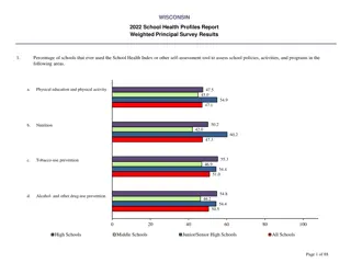
Maps are used in public health to show locations of health events and to visualize trends Area maps use colors or shades to communicate trends or averages Spot maps use dots or symbols to show the locations of individual cases Understanding How Maps Are Used in Public Health Area Map Spot Map
1. In what ways have you seen maps used to communicate health data? 2.What are some possible problems with using maps to communicate information? Think About It 3. Give an example use for a spot map and one for an area map.
John Snow was an English anesthesiologist who investigated a London cholera epidemic in 1854 Snow mapped the homes and workplaces of people with cholera Map showed most cases used the Broad Street pump as a water source Epidemic subsided after pump handle was removed CDC uses similar epidemiological techniques today to visualize data, only with more sophisticated geographic information systems (GIS) Maps and CDC
Correlation occurs when factors have the same pattern. Causation occurs when one factor causes another. Attribution occurs when causation is linked to a single cause. This is rare! Contribution occurs when a factor is only one of multiple factors leading to a given outcome. Maps and CDC Ex: Ice cream sales and drowning deaths both go up in the summer and down in winter. Correlation: Both factors share the same pattern. Causation: There is no causation here. Just because both have the same pattern does not mean that eating ice cream causes drowning! Both are actually caused by contributing factors such as hot weather and available vacation time.
1. How did Snows map help him to identify Pump A as the problem? 2. In addition to mapping cholera cases, what other surveillance data did Snow collect? Think About It 3. Obesity is an area of concern in public health. What other health concerns might have a correlation with obesity? What factors might show a contribution to obesity?
From the Expert https://youtu.be/HE4yJYY4WH8
1. Missouri used maps to direct people to nearby cooling centers during heat waves. Find an example of how maps are used in your community to direct people to public health related services. 2. Describe two ways that you have seen maps used in your life to communicate information related to public health (other than ways described in this lesson). Think About It 3. When you look at a map, what features do you look for to help you understand what you are seeing?
Call to Action! 1. Map lung cancer mortality 2. Analyze public health maps 3. Share your findings Give it a Try Why do you think participation is important?
Surveillance Surveillance What is the problem? What is the problem? Risk Factor Identification Risk Factor Identification What is the cause? What is the cause? Use the Public Health Approach Intervention Intervention What works? What works? Implementation Implementation How did we do it? How did we do it?
1. Map Lung Cancer Mortality - Use lung cancer mortality data to make an area map using different shades to show rates of lung cancer deaths - Analyze the map for patterns - Design interventions public health officials might consider to lower lung cancer deaths in affected areas Give it a Try
2. Analyze Public Health Maps - Map 1: Influenza: Analyze flu trends over time using the FluView dashboard - Map 2: Heart disease and stroke: Choose a health map to analyze - Map 3: Heart disease and stroke comparison: Compare two different health maps and discover trends - Design an intervention for one of the three maps above Give it a Try
3. Share Your Findings - Instagram @CDCmuseum Give it a Try


![Public Health Challenges and Responsibilities in [Name of Country]](/thumb/142726/public-health-challenges-and-responsibilities-in-name-of-country.jpg)