Understanding AWT and Swing for GUI Programming in Java

Explore the differences between AWT and Swing for building graphical user interfaces in Java. Learn how Swing components offer more flexibility and platform independence compared to AWT, with features like pluggable look-and-feel support and internationalization. Dive into the key features of Swing that make it a preferred choice for developing comprehensive GUI projects over AWT.

Download Presentation

Please find below an Image/Link to download the presentation.
The content on the website is provided AS IS for your information and personal use only. It may not be sold, licensed, or shared on other websites without obtaining consent from the author. Download presentation by click this link. If you encounter any issues during the download, it is possible that the publisher has removed the file from their server.
E N D
Presentation Transcript
Advanced Java Programming Lecture 1: Introduction to GUI Programming Lovely Professional University, Punjab
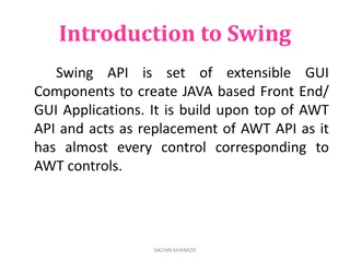
Introduction AWT is fine for developing simple graphical user interfaces, but not for developing comprehensive GUI projects. Swing components depend less on the target platform and use less of the native GUI resource. Swing GUI component classes are named with a prefixed J. Lovely Professional University, Punjab (India)
Why AWT and Swing? Although Swing eliminates a number of the limitations inherent in the AWT, Swing does not replace it. Swing is built on the foundation of the AWT. This is why the AWT is still a crucial part of Java. Swing also uses the same event handling mechanism as the AWT. Lovely Professional University, Punjab (India)
Java Foundation Classes JFC encompass a group of features for building graphical user interfaces (GUIs) and adding rich graphics functionality and interactivity to Java applications. Swing GUI Components Pluggable Look-and-Feel Support Internationalization Lovely Professional University, Punjab (India)
Key Features of Swing Swing Components Are Lightweight Means that they are written entirely in Java and do not map directly to platform-specific peers. Internationalization Allows developers to build applications that can interact with users worldwide in their own languages and cultural conventions. Lovely Professional University, Punjab (India)
Key Features of Swing Swing Supports a Pluggable Look and Feel The look and feel of Swing applications is pluggable, allowing a choice of look and feel. For example, the same program can use either the Java or the Windows look and feel. Additionally, the Java platform supports the GTK+ look and feel, which makes hundreds of existing look and feels available to Swing programs. The Synth package allows you to create your own look and feel. Lovely Professional University, Punjab (India)
AWT Vs Swing AWT SWING Components are heavy-weight. Light-weight components. Native look and feel Pluggable look and feel Does not have MVC Supports MVC Not available in AWT. Swing has many advanced features like JTabel, Jtabbedpane. Components are platform dependent. Components are platform independent. AWT components require java.awt package. Swing components require javax.swing package. Slower Faster than AWT Lovely Professional University, Punjab (India)
Swing API GUI API contains classes that can be classified into three groups: component classes, container classes, and helper classes. The component classes, such as JButton, JLabel, and JTextField, are for creating the user interface. The container classes, such as JFrame, JPanel, and JApplet, are used to contain other components. The helper classes, such as Graphics, Color, Font, FontMetrics, and Dimension, are used to support GUI components. Lovely Professional University, Punjab (India)
MVC Connection A visual component is a composite of three distinct aspects: 1) The state information associated with the component 2) The way that the component looks when rendered on the screen 3) The way that the component reacts to the user Model-View-Controller architecture is successful because each piece of the design corresponds to an aspect of a component. By separating a component into a model, a view, and a controller, the specific implementation of each can be changed without affecting the other two. Lovely Professional University, Punjab (India)
MVC In MVC terminology, the model corresponds to the state information associated with the component. For example, in the case of a check box, the model contains a field that indicates if the box is checked or unchecked. The view determines how the component is displayed on the screen, including any aspects of the view that are affected by the current state of the model. The controller determines how the component reacts to the user. For example, when the user clicks a check box, the controller reacts by changing the model to reflect the user s choice (checked or unchecked). Lovely Professional University, Punjab (India)
Swing MVC Architecture Swing uses a modified version of MVC that combines the view and the controller into a single logical entity called the UI delegate. For this reason, Swing s approach is called either the Model Delegate architecture or the Separable Model architecture. Therefore, although Swing s component architecture is based on MVC, it does not use a classical implementation of it. Lovely Professional University, Punjab (India)
Swing MVC Swing s pluggable look and feel is made possible by its Model-Delegate architecture. Because the view (look) and controller (feel) are separate from the model, the look and feel can be changed without affecting how the component is used within a program. To support the Model-Delegate architecture, most Swing components contain two objects. The first represents the model and second represents the UI delegate. Models are defined by interfaces. For example, the model for a button is defined by the ButtonModel interface. UI delegates are classes that inherit ComponentUI. For example, the UI delegate for a button is ButtonUI. Lovely Professional University, Punjab (India)
Event Dispatching Thread Swing programs are event-driven. An event is passed to the application by calling an event handler defined by the application. Swing event handling code runs on a special thread known as the event dispatch thread. Thus, although event handlers are defined by our program, they are called on a thread that was not created by the program. So all Swing GUI components must be created and updated from the event dispatching thread, not the main thread of the application. Lovely Professional University, Punjab (India)
Why EDT? Because most Swing object methods are not "thread safe": invoking them from multiple threads risks thread interference or memory consistency errors. Some Swing component methods are labeled "thread safe" in the API specification; these can be safely invoked from any thread. All other Swing component methods must be invoked from the event dispatch thread. Programs that ignore this rule may function correctly most of the time, but are subject to unpredictable errors that are difficult to reproduce. Lovely Professional University, Punjab (India)
Event Dispatching Thread To enable the GUI code to be created on the event dispatching thread, we must use one of two methods that are defined by the SwingUtilities class. These methods are invokeLater( ) and invokeAndWait( ). static void invokeLater (Runnable obj) static void invokeAndWait(Runnable obj) throws InterruptedException, InvocationTargetException Lovely Professional University, Punjab (India)
invokeLater() Vs invokeAndWait() invokeLater is used to perform task asynchronously in AWT Event dispatcher thread while InvokeAndWait is used to perform task synchronously. invokeLater is non blocking call while InvokeAndWait will block until task is completed. invokeLater is more flexible in terms of user interaction because it just adds the task in Event-Queue and allow user to interact with system while invokeAndWait is preffered way to update the GUI from application thread (waits for event to be completed). Lovely Professional University, Punjab (India)
Swing Containers Swing defines two types of containers. The first are top-level containers: JFrame, JApplet, JWindow, and JDialog. These containers do not inherit JComponent. They do, however, inherit the AWT classes Component and Container. Unlike Swing s other components, which are lightweight, the top- level containers are heavyweight. This makes the top-level containers a special case in the Swing component library. Lovely Professional University, Punjab (India)
Swing Containers The second type of containers supported by Swing are lightweight containers. Lightweight containers (e.g. JPanel, JScrollPane) do inherit JComponent. Lightweight containers are used to organize and manage groups of related components because a lightweight container can be contained within another container. Thus, we can use lightweight containers to create subgroups of related controls that are contained within an outer container. Lovely Professional University, Punjab (India)
JPanel JPanel is a generic lightweight container. Constructors: JPanel() Creates a new JPanel with default flow layout. JPanel(LayoutManager layout) Create a new JPanel with the specified layout manager. Lovely Professional University, Punjab (India)
JPanel Methods: PanelUI getUI () Returns the look and feel (L&F) object. void setUI (PanelUI pi) Sets the look and feel (L&F) object Lovely Professional University, Punjab (India)
JScrollPane JScrollPane is a lightweight container that automatically handles the scrolling of another component. The component being scrolled can either be an individual component, such as a table, or a group of components contained within another lightweight container, such as a JPanel. The viewable area of a scroll pane is called the viewport. It is a window in which the component being scrolled is displayed. JScrollPane(Component comp) Lovely Professional University, Punjab (India)
Steps to create JScrollPane Create the component to be scrolled. Create an instance of JScrollPane, passing to it the object to scroll. Add the scroll pane to the content pane. Lovely Professional University, Punjab (India)
JTabbedPane It manages a set of components by linking them with tabs. The user chooses which component to view by selecting the tab corresponding to the desired component. Selecting a tab causes the component associated with that tab to come to the forefront. If you want similar functionality without the tab interface, you can use a card layout instead of a tabbed pane. Lovely Professional University, Punjab (India)
Constructor: JTabbedPane() Adding Tabs: void addTab(String name, Component comp) void addTab(String name, Icon I, Component comp)
Color class We can set colors for GUI components by using the java.awt.Color class. We can use one of the 13 standard colors (BLACK, BLUE, CYAN, DARK_GRAY, GRAY, GREEN, LIGHT_GRAY, MAGENTA, ORANGE, PINK, RED, WHITE, and YELLOW) defined as constants in java.awt.Color. Colors are made of red, green, and blue components, each represented by an int value that describes its intensity, ranging from 0(lightest shade) to 255(darkest shade). This is known as the RGB model. Lovely Professional University, Punjab (India)
We can create a color using the following constructor: public Color(int r, int g, int b); Color color = new Color(128,100,100); The arguments r, g, b are between 0 and 255. If a value beyond this range is passed to the argument, an IllegalArgumentException will occur. Example: JButton jb1 = new JButton("OK"); jb1.setBackground(color); jb1.setForeground (new Color(100,1,1)); Lovely Professional University, Punjab (India)
Font class We can create a font using the java.awt.Font class and set fonts for the components using the setFont method in the Component class. The constructor for Font is: public Font (String name, int style, int size); You can choose a font name from SansSerif, Serif, Monospaced, Dialog, or DialogInput. Choose a style from Font.PLAIN(0), Font.BOLD(1), Font.ITALIC(2), and Font.BOLD+Font.ITALIC(3), and specify a font size of any positive integer. Lovely Professional University, Punjab (India)
Example: Font font1 = new Font("SansSerif", Font.BOLD, 16); Font font2 = new Font("Serif", Font.BOLD + Font.ITALIC, 12); JButton jbtOK = new JButton("OK"); jbtOK.setFont(font1); Lovely Professional University, Punjab (India)
Setting Default operations in a JFrame setDefaultCloseOperation() is used for setting the default operation for close button of a JFrame. void setDefaultCloseOperation (int what) These constants are declared in WindowConstants, which is an interface declared in javax.swing that is implemented by JFrame. JFrame.HIDE_ON_CLOSE (by default) JFrame.DO_NOTHING_ON_CLOSE JFrame.EXIT_ON_CLOSE Lovely Professional University, Punjab (India)
Layout Manager classes LayoutManager class Description BorderLayout The border layout manager. Border layouts use five components: North, South, East, West, and Center CardLayout The card layout manager. Card layouts emulate index cards. Only the one on top is showing. GridLayout The grid layout manager. Grid layout displays components in a two-dimensional grid. FlowLayout The flow layout manager. Flow layout positions components left to right, top to bottom. Lovely Professional University, Punjab (India)
FlowLayout Arranges the components in left to right, top to bottom fashion. public FlowLayout () public FlowLayout (int alignment) public FlowLayout (int alignment, int H_Gap, int V_Gap) Alignments are specified as: FlowLayout.LEFT FlowLayout.RIGHT FlowLayout.CENTER By default 5 pixels is used as horizontal and vertical gap between components. FlowLayout fl = new FlowLayout (FlowLayout.CENTER, 30, 20); frm.setLayout(fl); Lovely Professional University, Punjab (India)
GridLayout It divides a container into a grid of specified rows and columns. Each to display one component. Size of component is changed according to the size of the cell. public GridLayout (int row, int column) public GridLayout (int row, int column, int H_Gap, int V_Gap) GridLayout gl = new GridLayout (3, 4); frm.setLayout (gl); GridLayout gl1 = new GridLayout (3, 4, 20, 30); frm.setLayout (gl2); Lovely Professional University, Punjab (India)
BorderLayout It divides the container into 5 regions ( NORTH, SOUTH, EAST, WEST and CENTER). It is the default layout manager for Window. public BorderLayout() To add a component at a specific region, following method is used: public void add ( Component c, int Region) Example: Button btn = new Button( OK ); frm.add( btn, BorderLayout.EAST); Lovely Professional University, Punjab (India)
CardLayout It is used to arrange containers in the form of deck of cards. Methods: first() / last()/ next()/ previous(): is used to make the first/ last/ next/ previous card visible. show(): is used to make a specified card visible. public void show ( Container deck, String CardName) To give a name to the container while it is added to the deck: public void add ( Container card, String CardName) Lovely Professional University, Punjab (India)
Swing Components Swing components are derived from the JComponent class. JComponent provides the functionality that is common to all components. For example, JComponent supports the pluggable look and feel. JComponent inherits the AWT classes Container and Component. Thus, a Swing component is built on and compatible with an AWT component. Lovely Professional University, Punjab (India)
Components Lovely Professional University, Punjab (India)
JLabel JLabel is used to display text and/or an icon. It is a passive component in that it does not respond to user input. JLabel(Icon icon) JLabel(String str) JLabel(String str, Icon icon, int align) The align argument specifies the horizontal alignment of the text and/or icon within the dimensions of the label. It must be one of the following values: LEFT, RIGHT, CENTER, LEADING, or TRAILING. These constants are defined in the SwingConstants interface. Lovely Professional University, Punjab (India)
The icon and text associated with the label can be obtained by the following methods: Icon getIcon( ) String getText( ) The icon and text associated with a label can be set by these methods: void setIcon(Icon icon) void setText(String str)
JTextField JTextField allows us to edit one line of text. JTextField(int cols) JTextField(String str, int cols) JTextField(String str) The integer argument passed to the JTextField constructor, indicates the number of columns in the field (Minimum number of characters displayed in the TextField M or W ). This number is used along with metrics provided by the field's current font to calculate the field's preferred width. It does not limit the number of characters the user can enter. Lovely Professional University, Punjab (India)
JTextArea A JTextArea is a multi-line area that displays plain text. JTextArea () JTextArea (String str) JTextArea (int rows, int cols) JTextField (String str, int rows, int cols) Lovely Professional University, Punjab (India)
JPasswordField The JPasswordField class, a subclass of JTextField, provides specialized text fields for password entry. JPasswordField pf = new JPasswordField(10); For security reasons, a password field does not show the characters that the user types. Instead, the field displays a character different from the one typed, such as an asterisk * . As another security precaution, a password field stores its value as an array of characters, rather than as a string. Lovely Professional University, Punjab (India)
JPasswordField Reading the Password: char[] input = passwordField.getPassword(); Setting and Getting Echo-char: void setEchoChar(char) char getEchoChar() Lovely Professional University, Punjab (India)
Swing Buttons Swing defines four types of buttons, all are subclasses of the AbstractButton class, which extends JComponent. JButton, JToggleButton, JCheckBox, and JRadioButton AbstractButton contains many methods: String getText( ) void setText(String str) void setDisabledIcon(Icon di) void setPressedIcon(Icon pi) void setSelectedIcon(Icon si) void setRolloverIcon(Icon ri) Lovely Professional University, Punjab (India)
JButton JButton class provides the functionality of a push button. JButton allows an icon, a string, or both to be associated with the push button. JButton(Icon i) JButton(String str) JButton(String str, Icon i) When the button is pressed, an ActionEvent is generated. We can set the action command by calling setActionCommand( ) on the button. We can obtain the action command by calling getActionCommand( ) on the event object. Lovely Professional University, Punjab (India)
JToggleButton A toggle button looks just like a push button, but it acts differently because it has two states: pushed and released. Toggle buttons are objects of the JToggleButton class. JToggleButton is a super-class for two other Swing components that also represent two-state controls. These are: JCheckBox and JRadioButton JToggleButton(String str) By default, the button is in the off position. Lovely Professional University, Punjab (India)
JCheckBox JCheckBox class provides the functionality of a check box. Its immediate super class is JToggleButton, which provides support for two-state buttons. JCheckBox(String str) When the user selects or deselects a check box, an ItemEvent is generated. Lovely Professional University, Punjab (India)
JRadioButton Radio buttons are a group of mutually exclusive buttons, in which only one button can be selected at any one time. They are supported by the JRadioButton class, which extends JToggleButton. A button group is created by the ButtonGroup class. Its default constructor is invoked for this purpose. Elements are added to the button group by using add(). void add(AbstractButton ab) JRadioButton generates action events, item events, and change events each time the button selection changes. Lovely Professional University, Punjab (India)
Image Icons An icon is a fixed-size picture; typically it is small and used to decorate components. Java supports three image formats: GIF, JPEG, and PNG. The image file names for these types end with .gif, .jpg, and .png, respectively. To display an image icon, first create an ImageIcon object using new javax.swing.ImageIcon(filename). ImageIcon icon = new ImageIcon ( ravi.jpg"); An image icon can be displayed in a label or a button using new JLabel(image-Icon) or new JButton(imageIcon). Lovely Professional University, Punjab (India)


 Vs invokeAndWait()")


