Organizing Data Using Dot Plots and Stem-and-Leaf Displays
Dot plots and stem-and-leaf displays are graphical methods used to organize and present data effectively. Dot plots use dots to represent individual observations, while stem-and-leaf displays break down numerical values into stems and leaves for easy visualization. These tools help in understanding data distribution and identifying trends without losing the identity of each observation.

Download Presentation

Please find below an Image/Link to download the presentation.
The content on the website is provided AS IS for your information and personal use only. It may not be sold, licensed, or shared on other websites without obtaining consent from the author. Download presentation by click this link. If you encounter any issues during the download, it is possible that the publisher has removed the file from their server.
E N D
Presentation Transcript
Pertemuan - 2 ALFIRA SOFIA FAKULTAS PENDIDIKAN EKONOMI DAN BISNIS UNIVERSITAS PENDIDIKAN INDONESIA
A dot plot groups the data as little as possible and the identity of an individual observation is not lost. To develop a dot plot, each observation is simply displayed as a dot along a horizontal number line indicating the possible values of the data. If there are identical observations or the observations are too close to be shown individually, the dots are piled on top of each other. ALFIRA SOFIA FAKULTAS PENDIDIKAN EKONOMI DAN BISNIS, UNIVERSITAS PENDIDIKAN INDONESIA 2
Reported below are the number of vehicles sold in the last 24 months at Smith Ford Mercury Jeep, Inc., in Kane, Pennsylvania, and Brophy Honda Volkswagen in Greenville, Ohio. Construct dot plots and report summary statistics for the two small-town Auto USA lots. ALFIRA SOFIA FAKULTAS PENDIDIKAN EKONOMI DAN BISNIS, UNIVERSITAS PENDIDIKAN INDONESIA 3
ALFIRA SOFIA FAKULTAS PENDIDIKAN EKONOMI DAN BISNIS, UNIVERSITAS PENDIDIKAN INDONESIA 4
In Chapter 2, we showed how to organize data into a frequency distribution. The major advantage to organizing the data into a frequency distribution is that we get a quick visual picture of the shape of the distribution. One technique that is used to display quantitative information in a condensed form is the stem-and-leaf display. Stem-and-leaf display is a statistical technique to present a set of data. Each numerical value is divided into two parts. The leading digit(s) becomes the stem and the trailing digit the leaf. The stems are located along the vertical axis, and the leaf values are stacked against each other along the horizontal axis. Advantage of the stem-and-leaf display over a frequency distribution - the identity of each observation is not lost. ALFIRA SOFIA FAKULTAS PENDIDIKAN EKONOMI DAN BISNIS, UNIVERSITAS PENDIDIKAN INDONESIA 5
Suppose the seven observations in the 90 up to 100 class are: 96, 94, 93, 94, 95, 96, and 97. The stem value is the leading digit or digits, in this case 9. The leaves are the trailing digits. The stem is placed to the left of a vertical line and the leaf values to the right. The values in the 90 up to 100 class would appear as Then, we sort the values within each stem from smallest to largest. Thus, the second row of the stem-and-leaf display would appear as follows: ALFIRA SOFIA FAKULTAS PENDIDIKAN EKONOMI DAN BISNIS, UNIVERSITAS PENDIDIKAN INDONESIA 6
Listed in Table 41 is the number of 30-second radio advertising spots purchased by each of the 45 members of the Greater Buffalo Automobile Dealers Association last year. Organize the data into a stem-and-leaf display. Around what values do the number of advertising spots tend to cluster? What is the fewest number of spots purchased by a dealer? The largest number purchased? ALFIRA SOFIA FAKULTAS PENDIDIKAN EKONOMI DAN BISNIS, UNIVERSITAS PENDIDIKAN INDONESIA 7
ALFIRA SOFIA FAKULTAS PENDIDIKAN EKONOMI DAN BISNIS, UNIVERSITAS PENDIDIKAN INDONESIA 8
ALFIRA SOFIA FAKULTAS PENDIDIKAN EKONOMI DAN BISNIS, UNIVERSITAS PENDIDIKAN INDONESIA 9
The standard deviation is the most widely used measure of dispersion. Alternative ways of describing spread of data include determining the location of values that divide a set of observations into equal parts. These measures include quartiles, deciles, and percentiles. ALFIRA SOFIA FAKULTAS PENDIDIKAN EKONOMI DAN BISNIS, UNIVERSITAS PENDIDIKAN INDONESIA 10
To formalize the computational procedure, let Lprefer to the location of a desired percentile. So if we wanted to find the 33rd percentile we would use L33 and if we wanted the median, the 50th percentile, then L50. The number of observations is n, so if we want to locate the median, its position is at (n + 1)/2, or we could write this as (n + 1)(P/100), where P is the desired percentile. ALFIRA SOFIA FAKULTAS PENDIDIKAN EKONOMI DAN BISNIS, UNIVERSITAS PENDIDIKAN INDONESIA 11
Listed below are the commissions earned last month by a sample of 15 brokers at Salomon Smith Barney s Oakland, California, office. Salomon Smith Barney is an investment company with offices located throughout the United States. $2,038 $2,097 $2,287 $2,406 $1,758 $1,721 $1,637 $2,047 $2,205 $1,787 $1,940 $2,311 $2,054 $1,471 $1,460 Locate the median, the first quartile, and the third quartile for the commissions earned. ALFIRA SOFIA FAKULTAS PENDIDIKAN EKONOMI DAN BISNIS, UNIVERSITAS PENDIDIKAN INDONESIA 12
Step 1: Organize the data from lowest to largest value $1,460 $1,758 $2,047 $2,287 $1,471 $1,787 $2,054 $2,311 $1,637 $1,940 $2,097 $2,406 $1,721 $2,038 $2,205 ALFIRA SOFIA FAKULTAS PENDIDIKAN EKONOMI DAN BISNIS, UNIVERSITAS PENDIDIKAN INDONESIA 13
Step 2: Compute the first and third quartiles. Locate L25 and L75 using: 25 75 = ) 1 + = = ) 1 + = 15 ( 4 15 ( 12 L L 25 75 100 100 Therefore, the first and third quartiles are the 4th and 12th observatio = L in the n array, respective ly , 1 $ 721 L 25 = , 2 $ 205 75 ALFIRA SOFIA FAKULTAS PENDIDIKAN EKONOMI DAN BISNIS, UNIVERSITAS PENDIDIKAN INDONESIA 14
ALFIRA SOFIA FAKULTAS PENDIDIKAN EKONOMI DAN BISNIS, UNIVERSITAS PENDIDIKAN INDONESIA 15
ALFIRA SOFIA FAKULTAS PENDIDIKAN EKONOMI DAN BISNIS, UNIVERSITAS PENDIDIKAN INDONESIA 16
ALFIRA SOFIA FAKULTAS PENDIDIKAN EKONOMI DAN BISNIS, UNIVERSITAS PENDIDIKAN INDONESIA 17
ALFIRA SOFIA FAKULTAS PENDIDIKAN EKONOMI DAN BISNIS, UNIVERSITAS PENDIDIKAN INDONESIA 18
Refer to the Whitner Autoplex data in Table 2 4. Develop a box plot of the data. What can we conclude about the distribution of the vehicle selling prices? ALFIRA SOFIA FAKULTAS PENDIDIKAN EKONOMI DAN BISNIS, UNIVERSITAS PENDIDIKAN INDONESIA 19
In Chapter 3, measures of central location for a set of observations (the mean, median, and mode) and measures of data dispersion (e.g. range and the standard deviation) were introduced Another characteristic of a set of data is the shape. There are four shapes commonly observed: symmetric, positively skewed, negatively skewed, bimodal. ALFIRA SOFIA FAKULTAS PENDIDIKAN EKONOMI DAN BISNIS, UNIVERSITAS PENDIDIKAN INDONESIA 20
The coefficient of skewness can range from -3 up to 3. A value near -3, such as -2.57, indicates considerable negative skewness. A value such as 1.63 indicates moderate positive skewness. A value of 0, which will occur when the mean and median are equal, indicates the distribution is symmetrical and that there is no skewness present. ALFIRA SOFIA FAKULTAS PENDIDIKAN EKONOMI DAN BISNIS, UNIVERSITAS PENDIDIKAN INDONESIA 21
ALFIRA SOFIA FAKULTAS PENDIDIKAN EKONOMI DAN BISNIS, UNIVERSITAS PENDIDIKAN INDONESIA 22
Following are the earnings per share for a sample of 15 software companies for the year 2005. The earnings per share are arranged from smallest to largest. Compute the mean, median, and standard deviation. Find the coefficient of skewness using Pearson s estimate. What is your conclusion regarding the shape of the distribution? ALFIRA SOFIA FAKULTAS PENDIDIKAN EKONOMI DAN BISNIS, UNIVERSITAS PENDIDIKAN INDONESIA 23
= X 74 $ 26 . = = . 4 $ 95 X 15 n ( ) 2 + + 2 2 ($ . 0 09 . 4 $ 95 ) ... ($ 16 40 . . 4 $ 95 ) ) X X = = = . 5 $ 22 s 1 Median 15 1 n ( 3 ) 3 ($ . 4 95 . 3 $ 18 ) X = = . 1 = 017 sk . 5 $ 22 s ALFIRA SOFIA FAKULTAS PENDIDIKAN EKONOMI DAN BISNIS, UNIVERSITAS PENDIDIKAN INDONESIA 24
ALFIRA SOFIA FAKULTAS PENDIDIKAN EKONOMI DAN BISNIS, UNIVERSITAS PENDIDIKAN INDONESIA 25
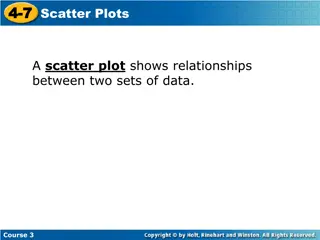
Satu teknik grafis yang dapat digunakan untuk menggambarkan hubungan antara dua variabel yaitu diagram pencar (scatter diagram). Untuk menggambarkan diagram pencar, kita membutuhkan dua variabel. Satu variabel digambarkan dalam sumbu X (horizontal), dan variabel lain digambarkan dalam sumbu Y (vertikal). ALFIRA SOFIA FAKULTAS PENDIDIKAN EKONOMI DAN BISNIS, UNIVERSITAS PENDIDIKAN INDONESIA 26
ALFIRA SOFIA FAKULTAS PENDIDIKAN EKONOMI DAN BISNIS, UNIVERSITAS PENDIDIKAN INDONESIA 27
In the Introduction to Chapter 2 we presented data from AutoUSA. In this case the information concerned the prices of 80 vehicles sold last month at the Whitner Autoplex lot in Raytown, Missouri. The data shown include the selling price of the vehicle as well as the age of the purchaser. Is there a relationship between the selling price of a vehicle and the age of the purchaser? Would it be reasonable to conclude that the more expensive vehicles are purchased by older buyers? ALFIRA SOFIA FAKULTAS PENDIDIKAN EKONOMI DAN BISNIS, UNIVERSITAS PENDIDIKAN INDONESIA 28
ALFIRA SOFIA FAKULTAS PENDIDIKAN EKONOMI DAN BISNIS, UNIVERSITAS PENDIDIKAN INDONESIA 29
Diagram pencar digunakan untuk menggambarkan data jenis / skala interval. Jika kita ingin mengkaji hubungan antara dua variabel dimana salah satu variabelnya berskala nominal atau ordinal, maka kita gunakan tabel kontinjensi (contingency table). ALFIRA SOFIA FAKULTAS PENDIDIKAN EKONOMI DAN BISNIS, UNIVERSITAS PENDIDIKAN INDONESIA 30
A manufacturer of preassembled windows produced 50 windows yesterday. This morning the quality assurance inspector reviewed each window for all quality aspects. Each was classified as acceptable or unacceptable and by the shift on which it was produced. Thus we reported two variables on a single item. The two variables are shift and quality. The results are reported in the following table. ALFIRA SOFIA FAKULTAS PENDIDIKAN EKONOMI DAN BISNIS, UNIVERSITAS PENDIDIKAN INDONESIA 31
Aczel, Amir D., and Jayavel Sounderpandian (2006), Complete Business Statistics, 6th edition, McGraw Hill. Levine, David M. (2008), Statistics for Managers : using Microsoft Excel, 5th Edition, Pearson Education. Lind, Douglas A. (2008), Statistical Techniques in Business & Economics, 13th Edition, McGraw Hill. Lind, Douglas A. (2007), Teknik-teknik Statistika dalam Bisnis dan Ekonomi Menggunakan Data Global, jilid 1, Edisi 13, Erlangga. Lind, Douglas A. (2008), Teknik-teknik Statistika dalam Bisnis dan Ekonomi Menggunakan Data Global, jilid 2, Edisi 13, Erlangga. Wahab, Moataza Mahmoud Abdel, Sampling Techniques & Sample Size, Presentation Material of Biostatistic, High Institute of Public Health, University of Alexandria. 1. 2. 3. 4. 5. 6. FAKULTAS PENDIDIKAN EKONOMI DAN BISNIS, UNIVERSITAS PENDIDIKAN INDONESIA 32
ALFIRA SOFIA FAKULTAS PENDIDIKAN EKONOMI DAN BISNIS, UNIVERSITAS PENDIDIKAN INDONESIA 33


, Complete")