Analyzing Data through Graphs: A Methodology for Practical Application
Explore a concise methodology for interpreting graphs effectively, understand the significance of data sources, target audiences, sample sizes, and potential misuse. Delve into questions raised by analyzing graphs related to Brexit and Irish passport demand, enhancing critical thinking skills for students.

Download Presentation

Please find below an Image/Link to download the presentation.
The content on the website is provided AS IS for your information and personal use only. It may not be sold, licensed, or shared on other websites without obtaining consent from the author. Download presentation by click this link. If you encounter any issues during the download, it is possible that the publisher has removed the file from their server.
E N D
Presentation Transcript
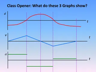
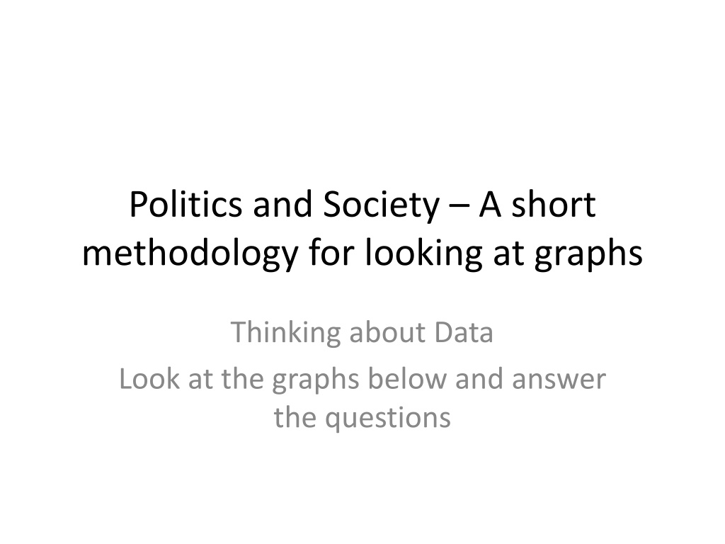
Politics and Society A short methodology for looking at graphs Thinking about Data Look at the graphs below and answer the questions
A brief note for teachers I used these two graphs at the start of consecutive double classes. I asked the students to give their initial reactions to the data and work out what they think the graph indicated I then present them with a (kind of brief) methodology for asking themselves systematic questions about the data (any suggestions on this welcome!) I then try and link the graph to specific events in class (i.e. I showed the graph of the voter apathy, then the opening 10 minutes of the 2ndPresidential Debate in the US, and asked what impact listening to such divisive rhetoric might have on those disillusioned young (potential) voters (This worked really well, I felt!!!)
What kinds of questions should we ask ourselves about data? 1. Who compiled these data? (i.e. who paid for it?) 2. Who are the target audience(s) of this data? (Who do they want to read it?) 3. What was the sample size? ( N Number) 4. How was that sample chosen? (i.e. is it representative/randomized?) 5. What information does this graph provide? (Check the axis ) 6. What kinds of conclusions can we draw from this graph? 7. What does the graph NOT tell us? 8. How might the results of this graph be MISUSED?
Source: http://www.politico.eu/article/uk-demand-for-irish-passports-doubles-after-brexit- vote/?utm_content=buffer0a4cc&utm_medium=social&utm_source=twitter.com&utm_campaign=buffer
Questions on the graph.. What story does this graph tell us about the Brexit vote? How do we account for the negative value in the month of March? What should the Irish government do about these data? Do it tell us anything about the gross number of applications? Would it be important to get the core data upon which this is based?
http://www.keepeek.com/Digital-Asset-Management/oecd/social-issues-migration-http://www.keepeek.com/Digital-Asset-Management/oecd/social-issues-migration- health/society-at-a-glance-2016_9789264261488-en#page132
Based on the graph answer the following questions How does Ireland s political engagement compare with other countries ? For young people? Its average population? What conclusion can we draw about political engagement amongst older members of the population? What does it mean if the average line is outside the bar chart? Which countries are most/least engaged? What might you put this down to? Is it important to consider the population size of each country before we draw an overall conclusions? What are the policy implications for a government looking at this graph? How might this graph (based on 2012-14) change in the coming years? Why?
Further reading Consider this Op-Ed by Anne-Marie McNally in the Irish Times. How well does the graph accord with McNally s views? Can the students see that they are, themselves, a part of the attempt to rectify this situation? What methods (outside of the pol-soc classroom) might the government (or individual political parties) use to address this difficulty? Consider ideas such as voting age subsidizing youth conferences bulking up CSPE and Primary School Civics? What are the long-term consequences of ignoring trends like those identified in the data? *** I really struggled to introduce what the OECD was, and the degree to which its data might be reliable http://www.irishtimes.com/opinion/apathy-is-not-the-answer-why- we-need-to-get-involved-in-politics-1.2185315 I m hoping to post more of these data tasks to my twitter feed as I stumble upon them: @khpolsoc (feel free to follow along)