Understanding Bar Graphs, Double Bar Graphs, and Histograms

 undefined

B
a
r
G
r
a
p
h
s
a
n
d
H
i
s
t
o
g
r
a
m
s
P
R
I
N
C
E
S
S
C
.
B
A
R
C
E
G
A
A
P
G
S
C
H
O
O
L
,
M
A
N
A
M
A
,
B
A
H
R
A
I
N

Powerpoint hosted onwww.worldofteaching.com
Please visit for 100’s more free powerpoints
W
h
a
t
d
o
y
o
u
k
n
o
w
a
b
o
u
t
b
a
r
g
r
a
p
h
?
d
o
u
b
l
e
b
a
r
g
r
a
p
h
?
H
i
s
t
o
g
r
a
m
?
B
a
r
G
r
a
p
h
A
b
a
r
g
r
a
p
h
c
a
n
b
e
u
s
e
d
t
o
d
i
s
p
l
a
y
a
n
d
c
o
m
p
a
r
e
d
a
t
a
T
h
e
s
c
a
l
e
s
h
o
u
l
d
i
n
c
l
u
d
e
a
l
l
t
h
e
d
a
t
a
v
a
l
u
e
s
a
n
d
b
e
e
a
s
i
l
y
d
i
v
i
d
e
d
i
n
t
o
e
q
u
a
l
i
n
t
e
r
v
a
l
s
.
H
o
w
t
o
i
n
t
e
r
p
r
e
t
a
B
a
r
G
r
a
p
h
?
How many of Mr.
How many of Mr.
Snowden’s
Snowden’s
students are
students are
band members?
band members?
How many of Mr.
How many of Mr.
Snowden’s
Snowden’s
students are not
students are not
band members?
band members?
T
T
h
h
e
e
b
b
a
a
r
r
g
g
r
r
a
a
p
p
h
h
s
s
h
h
o
o
w
w
s
s
M
M
r
r
.
.
S
S
n
n
o
o
w
w
d
d
e
e
n
n
’
’
s
s
s
s
t
t
u
u
d
d
e
e
n
n
t
t
s
s
b
b
y
y
g
g
e
e
n
n
d
d
e
e
r
r
a
a
n
n
d
d
b
b
a
a
n
n
d
d
m
m
e
e
m
m
b
b
e
e
r
r
s
s
h
h
i
i
p
p
.
.
D
o
u
b
l
e
B
a
r
G
r
a
p
h
Can be used to
compare two
related sets of
data
H
o
w
t
o
m
a
k
e
a
D
o
u
b
l
e
-
B
a
r
G
r
a
p
h
?
Choose a scale and interval
Choose a scale and interval
for the vertical axis.
for the vertical axis.
Draw a pair of bars for each
Draw a pair of bars for each
country’s data. Use different
country’s data. Use different
colors to show males and
colors to show males and
females.
females.
Label the axes and give the
Label the axes and give the
graph a title
graph a title
.
.
Make a key to show what
Make a key to show what
each bar represents.
each bar represents.
T
h
e
t
a
b
l
e
s
h
o
w
s
t
h
e
h
i
g
h
w
a
y
s
p
e
e
d
l
i
m
i
t
s
o
n
i
n
t
e
r
s
t
a
t
e
r
o
a
d
s
.
w
i
t
h
i
n
t
h
r
e
e
s
t
a
t
e
s
S
t
e
p
1
Choose a scale
Choose a scale
and interval for the
and interval for the
vertical axis.
vertical axis.
S
t
e
p
2
Draw a pair of bars for each
Draw a pair of bars for each
state’s data. Use different
state’s data. Use different
colors to show urban and rural.
colors to show urban and rural.
S
t
e
p
3
a
n
d
4
Label the axes and
Label the axes and
give the graph a
give the graph a
title.
title.
Make a key to
Make a key to
show what each
show what each
bar represents
bar represents
S
p
e
e
d
L
i
m
i
t
(
m
i
/
h
)
Urban
Rural
Speed Limit on Interstate Roads
H
i
s
t
o
g
r
a
m
Histogram is a bar graph that
shows the frequency of data
within equal intervals.
There is no space in between
the bars.
H
o
w
t
o
m
a
k
e
a
h
i
s
t
o
g
r
a
m
?
T
h
e
t
a
b
l
e
b
e
l
o
w
s
h
o
w
s
t
h
e
n
u
m
b
e
r
o
f
h
o
u
r
s
s
t
u
d
e
n
t
s
w
a
t
c
h
T
V
i
n
o
n
e
w
e
e
k
M
a
k
e
a
h
i
s
t
o
g
r
a
m
o
f
a
l
l
t
h
e
d
a
t
a
.
S
t
e
p
1
Make a frequency
Make a frequency
table of the data.
table of the data.
Be sure to use
Be sure to use
equal intervals
equal intervals
S
t
e
p
2
Choose an appropriate scale and interval for the vertical
Choose an appropriate scale and interval for the vertical
axis. The greatest value on the scale should be at least as
axis. The greatest value on the scale should be at least as
great as the greatest frequency.
great as the greatest frequency.
S
t
e
p
3
Draw a bar for each interval.
Draw a bar for each interval.
The height of the bar is the
The height of the bar is the
frequency for that interval.
frequency for that interval.
Bars must touch but not
Bars must touch but not
overlap.
overlap.
Label the axes and give the
Label the axes and give the
graph title
graph title
C
a
n
y
o
u
n
o
w
m
a
k
e
a
b
a
r
g
r
a
p
h
,
d
o
u
b
l
e
b
a
r
G
r
a
p
h
a
n
d
a
h
i
s
t
o
g
r
a
m
?
The list below shows the results of
a typing test in words per
minute. Make a histogram of the
data.
62, 55, 68, 47, 50, 41, 62, 39, 54,
70, 56, 70, 56, 47, 71, 55, 60, 42
T
h
e
e
n
d
Bar graphs are useful for displaying and comparing data, while double bar graphs help compare two related datasets. Histograms show the distribution of data. Learn how to interpret and create these visual representations effectively with examples provided.

Download Presentation

Please find below an Image/Link to download the presentation.
The content on the website is provided AS IS for your information and personal use only. It may not be sold, licensed, or shared on other websites without obtaining consent from the author. Download presentation by click this link. If you encounter any issues during the download, it is possible that the publisher has removed the file from their server.
E N D
Presentation Transcript
Bar Graphs and Histograms PRINCESS C. BARCEGA APG SCHOOL, MANAMA, BAHRAIN Powerpoint hosted on www.worldofteaching.com Please visit for 100 s more free powerpoints
What do you know about bar graph? double bar graph? Histogram?
Bar Graph A bar graph can be used to display and compare data The scale should include all the data values and be easily divided into equal intervals. Spanish Mandarin Hindi English 0 200 400 600 800 1000
How to interpret a Bar Graph? The bar graph shows Mr. Snowden s students by gender and band membership. 7 How many of Mr. Snowden s students are band members? How many of Mr. Snowden s students are not band members? 6 5 4 3 2 1 0 Female band Female not band Male band Male not band
Double Bar Graph Can be used to compare two related sets of data 90 80 70 60 50 40 30 20 10 0 1st Qtr 2nd Qtr 3rd Qtr 4th Qtr
How to make a Double-Bar Graph? Choose a scale and interval for the vertical axis. Draw a pair of bars for each country s data. Use different colors to show males and females. Label the axes and give the graph a title. Make a key to show what each bar represents.
The table shows the highway speed limits on interstate roads .within three states State Urban Rural Florida 65mi/h 70 mi/h Texas 70 mi/h 70 mi/h Vermont 55mi/h 65 mi/h
Step 1 Choose a scale and interval for the vertical axis. 80 60 40 State Urban Rural Florida 65mi/h 70 mi/h 20 Texas 70 mi/h 70 mi/h 0 Vermont 55mi/h 65 mi/h
Draw a pair of bars for each state s data. Use different colors to show urban and rural. Step 2 80 State Florida Texas Vermont Urban 65mi/h 70 mi/h 55mi/h Rural 70 mi/h 70 mi/h 65 mi/h 60 40 20 0 Florida Texas Vermont
Step 3 and 4 Speed Limit on Interstate Roads 80 Urban Label the axes and give the graph a title. Make a key to show what each bar represents Rural Speed Limit (mi/h) 60 40 20 0 Florida Texas Vermont
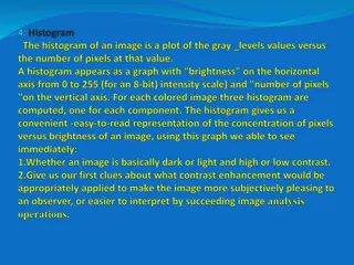
Histogram Histogram is a bar graph that shows the frequency of data within equal intervals. There is no space in between the bars.
The table below shows the number of hours students watch TV in one week Make a histogram of all the data. Number of hours of TV 1 II 6 III 2 IIII 7 IIII - IIII 3 IIII - IIII 8 III 4 IIII - I 9 IIII 5 IIII - III
Make a frequency table of the data. Be sure to use equal intervals Step 1 Number of hours of TV Frequency Number of hours of TV II IIII IIII - IIII IIII - I IIII - III 1-3 4-6 7-9 15 17 16 1 2 3 4 5 6 7 8 9 III IIII - IIII III IIII
Step 2 Choose an appropriate scale and interval for the vertical axis. The greatest value on the scale should be at least as great as the greatest frequency. 20 16 Number of hours of TV Frequency 12 8 1-3 4-6 7-9 15 17 16 4 0 1-3 4-6 7-9
Step 3 Hours of Television Watched Draw a bar for each interval. The height of the bar is the frequency for that interval. Bars must touch but not overlap. Label the axes and give the graph title 20 16 Number of students 12 8 Number of hours of TV Frequency 4 0 1-3 4-6 7-9 15 17 16 1-3 4-6 7-9 Hours
Hours of Television Watched 20 Number of students 16 12 8 4 0 1-3 4-6 7-9 Hours
Can you now make a bar graph, double bar Graph and a histogram?
The list below shows the results of a typing test in words per minute. Make a histogram of the data. 62, 55, 68, 47, 50, 41, 62, 39, 54, 70, 56, 70, 56, 47, 71, 55, 60, 42