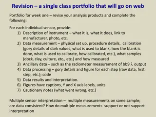
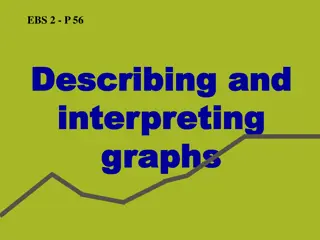
Understanding Graphs for Mathematical Interpretation

Explore how students can grasp information through graphical formats and convert it into mathematical graphs. Learn about qualitative graphs, functions, axes, and more. Delve into exercises matching graphs with situations and drawing graphs for given scenarios like plane take-off, biking, and snowboarding.

Download Presentation

Please find below an Image/Link to download the presentation.
The content on the website is provided AS IS for your information and personal use only. It may not be sold, licensed, or shared on other websites without obtaining consent from the author. Download presentation by click this link. If you encounter any issues during the download, it is possible that the publisher has removed the file from their server.
E N D
Presentation Transcript
Students will be able to explain information presented to them in a graphical format. Students will be able to convert information into a mathematical graph.
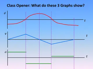
Qualitative graphs allow us to mathematically interpret and draw conclusions from real life phenomena. Graphs can be used to represent almost anything which is measurable. They are an essential tool in understanding and conveying mathematical information. Graphs often consist of an independent axis (x-axis) and a dependent axis (y-axis). It is useful to think of the dependent axis as depending on the independent axis . Graphs often depict functions. Functions have exactly one output for any given input. Graphically, this means one unique y-value for a given x-value. A graph which depicts two y-values for a given x-value is not a function. The graphs in these activities are all line graphs.
In the following exercises, indicate which graph matches the given situation.
For the following examples, draw a graph with the given y-axis and x-axis to represent the given information.
. A plane takes off from New York City and lands in Los Angeles 7 hours later. x-axis: Time elapsed y-axis: Altitude
A man rides his bike from his house to a store at a constant speed down the street, stops, and heads back at a slower constant speed. a) x-axis: Time elapsed y-axis: Distance from home b) x-axis: Time elapsed y-axis: Speed
A snowboarder goes up a ski-lift then rides down a mountain trail accelerating then stopping himself at the end. x-axis: Time elapsed y-axis: Speed
A faucet is turned on at a constant rate and the vase, pictured above, is placed below it. x-axis: Time elapsed y-axis: Height of water
In a national park there is a population of foxes and one of rabbits. The population of foxes is initially very low, it rises over 10 years to a high number, stays constant for 1 year, then in 10 years shrinks again to its original small size. Use two different colors to graph two lines. One representing the population of foxes, and the other of rabbits. x-axis: Elapsed Time y-axis: Population
Information on reading qualitative graphs: (Part A was drawn from this resource) http://www.teachertube.com/video/qualitative- graphs-korncast-47936 Reading line graphs: https://www.khanacademy.org/math/pre- algebra/applying-math-reasoning- topic/reading_data/v/u08-l1-t2-we2-reading- line-graphs More information on predator-prey models (more advanced): https://en.wikipedia.org/wiki/Lotka%E2%80%93Vol terra_equations