
Introduction to Stata
Powerful data analysis software, including data management, visualization, and statistical analysis. Seminar covers navigating Stata, data import, exploring and visualizing data, basic statistical analysis, and outputting to Word and Excel.
5 views • 126 slides

Interactive Concept Mapping for Data Analysis in Science Education
Explore GLOBE and My NASA data collection through concept mapping. Engage students in visualizing and analyzing data. Activities include cloud types study, data acquisition, assessing accuracy, and data visualization. Suitable for all class formats - online, hybrid, or face-to-face.
1 views • 11 slides

Object-Oriented Analysis and Design Workflow
Object-Oriented Analysis (OOA) is a crucial step in software development to produce a logical model of the system's functionality. It involves requirements analysis, use case analysis, and use case realization to identify classes, responsibilities, attributes, and associations. The process includes
11 views • 90 slides
PATHFINDER LEADERSHIP AWARD SESSION NO.3. Risk Assessment
Explore the crucial aspects of risk assessment, including understanding risks, why it's necessary, when and how to conduct assessments, and who should be involved. Gain insight into visualizing risks and learn about the importance of control measures. Get ready to enhance your leadership skills in m
1 views • 14 slides

Guidelines for Designing Person-Centered Care Pathway Schemas
This document provides a template and writing instructions for creating schemas for person-centered and integrated care pathways. It offers insights on visualizing the steps of a care pathway and emphasizes clear communication in the design process. Contact details are included for further guidance.
6 views • 21 slides
Trouble Visualizing Data_ The Best Dashboard Software Can Change Your Perspective
Dive into the world of the best dashboard software with our latest blog. Find out how the right tools can transform your approach to data visualization, making complex information easily understandable and actionable. We explore how enhancing your data analysis capabilities can lead to improved deci
9 views • 7 slides

Spring 2BL : Lecture 5
In Lecture 5 of the Spring 2BL course with Vivek Sharma, students will delve into probability distributions, confidence levels, and the visualization of data through histograms. The lecture covers topics like calculating the mean and standard deviation, understanding the uncertainty in measurements,
2 views • 28 slides
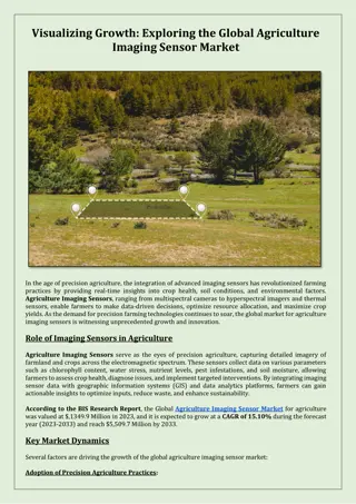
Visualizing Growth: Exploring the Global Agriculture Imaging Sensor Market
According to the BIS Research Report, the Global Agriculture Imaging Sensor Market for agriculture was valued at $,1349.9 Million in 2023, and it is expected to grow at a CAGR of 15.10% during the forecast year (2023-2033) and reach $5,509.7 Million by 2033.
6 views • 3 slides

Guiding Others to Follow Jesus Through Compassion and Care
Tax collectors and sinners gathered around Jesus, sparking criticism from the Pharisees. Jesus teaches the importance of caring for the lost with parables of the lost sheep and coin. We are encouraged to emulate Jesus by visualizing, evangelizing, and prioritizing helping others to follow Him.
0 views • 16 slides
asia pacific x ray detecter
X-ray detectors are devices or systems used to capture and record X-ray images for medical, industrial, scientific, or security purposes. They are essential tools for visualizing the internal structures of objects and organisms through the use of X-ray radiation. X-ray detectors are used in a variet
1 views • 3 slides
xray detecter
X-ray detectors are devices or systems used to capture and record X-ray images for medical, industrial, scientific, or security purposes. They are essential tools for visualizing the internal structures of objects and organisms through the use of X-ray radiation. X-ray detectors are used in a variet
1 views • 2 slides
Visualizing Hurricane Tracks and Severity Over 40 Years
Explore hurricane track data from 1981 to 2021 sourced from the International Best Track Archive for Climate Stewardship. The visualization includes maps showcasing hurricane frequency, maximum severity by Saffir-Simpson scale categories, and trend indices. Follow the evolution of hurricane patterns
0 views • 18 slides

Certification in AutoCAD 2D & 3D Course Overview
AutoCAD 2D & 3D course provides essential skills for drafting, creating, and visualizing designs with ease. The course duration is 1.5 months with a focus on design blending, editing, building layouts, and enhancing 2D/3D models. Topics covered include drawing tools, modification, isometric drawing,
2 views • 6 slides
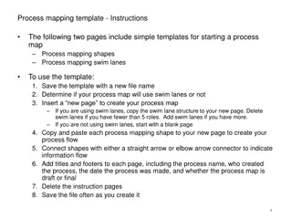
Simplified Process Mapping Templates and Shapes
Comprehensive instructions and templates for initiating a process map, with clear shapes for visualizing start decisions, activities, inefficiencies, and more. Includes options for utilizing swim lanes to enhance organization and clarity.
0 views • 4 slides
Introduction to Cartesian Components of Vectors in Two-Dimensional Space
Exploring Cartesian components of vectors in a two-dimensional coordinate frame using unit vectors i and j. Learn how to express vectors, add them using the triangle law, use column vector notation, and find resultant vectors. Understand position vectors in terms of coordinates. Examples and diagram
0 views • 16 slides

Employee Assessment Application: Power Platform Capabilities
Explore how the Employee Assessment Application utilizes low-code technology like Microsoft PowerApps to streamline the appraisal process, mobile device usage for evaluations, and integration with Power BI for visualizing ratings. Overcome challenges of manual data entry and paperwork through automa
0 views • 14 slides

The Joy of Sets: Graphical Alternatives to Euler and Venn Diagrams
Graphical representations of set membership can be effectively portrayed using alternatives to traditional Euler and Venn diagrams. Learn about upset plots, indicating set membership graphically, and the use of Venn or Euler diagrams as solutions. Explore the historical context and challenges with V
3 views • 43 slides
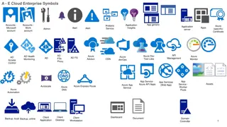
Symbolic Representation of Azure Cloud Enterprise Services
The images depict a variety of symbols representing different Azure cloud enterprise services, including application insights, analysis, monitoring, security, storage, virtual networks, and more. Each symbol represents a specific aspect or component of Azure services, such as VPN gateways, firewalls
0 views • 6 slides

Visualizing Real Numbers on a Number Line by Successive Magnification
Visualization techniques for representing real numbers on a number line through successive magnification are demonstrated step by step. The procedure involves dividing the line into equal parts and zooming in on specific ranges to accurately locate decimal values. This method helps in understanding
1 views • 12 slides

Visualizing Real Numbers on a Number Line
The procedure of representing real numbers on a number line through successive magnification is explained in detail. It involves dividing the line, marking points, and magnifying specific intervals to accurately position numbers like 5.2316. Each real number corresponds to a unique point on the numb
0 views • 12 slides
Analyzing Interaction Effects in Composite-Based SEM
Explore the concept of interaction effects in composite-based structural equation modeling (SEM) through topics like the logic of interaction, estimating effects, multigroup analysis, and visualizing effects. Learn about moderators, their role in relationships between variables, and techniques for a
1 views • 23 slides
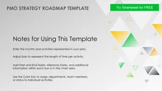
PMO Strategy Roadmap Template for Effective Project Management
This PMO strategy roadmap template provides a structured framework to plan, implement, monitor, evaluate, and close out projects effectively. Utilize the template by entering activities, adjusting timelines, assigning tasks, and tracking progress through milestones. The color-coded key helps in visu
0 views • 4 slides

Mastering Quadratic Functions: Graphing Through Transformations
Explore the vertex form of quadratic equations, understand transformation rules, and learn step-by-step methods for graphing quadratics with examples and practice problems. Enhance your skills in identifying vertices, plotting points, and visualizing the U-shaped graphs of quadratic functions.
0 views • 10 slides

GridPIQ Web Calculator for Grid Project Impact Quantification
Explore the Grid Project Impact Quantification Tool (GridPIQ) for assessing impacts of grid projects, visualizing time series, comparing assumptions, and more. Quickly input data and analyze scenarios for energy storage, PV, emissions, and peak power impacts using this intuitive online tool.
2 views • 15 slides
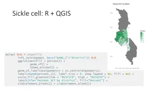
Geographic Data Visualization in R and QGIS for Malawi Health Analysis
Utilizing R and QGIS, this project focuses on visualizing sickle cell and HIV percentages by district in Malawi, mapping health facility locations, creating Voronoi polygons, and displaying malaria cumulative incidence data. Various geographic data visualization techniques are applied to provide ins
0 views • 8 slides
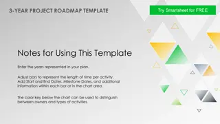
Comprehensive 3-Year Project Roadmap Template
This comprehensive 3-year project roadmap template provides a structured framework for planning and visualizing project activities over a multi-year timeline. It includes detailed instructions on how to customize the template, add milestones, adjust timeframes, and track progress. Utilize this templ
0 views • 4 slides

Enhancing Learner Understanding through Computer-Based Simulations in Teaching Electrolysis
Computer-based simulations (CBS) have the potential to improve learner comprehension of complex science concepts like electrolysis. Challenges in teaching and learning electrolysis include identifying anode/cathode, analyzing reactions, and writing chemical equations. Factors contributing to these c
0 views • 34 slides

Bacteria Identification Techniques: Staining and Microscopy Overview
Staining techniques in microbiology play a crucial role in visualizing bacteria under microscopes. This content covers the importance of staining, types of dyes, wet and dry mounts, hanging drop technique, and different types of staining methods employed in identifying bacteria. Explore the basics o
0 views • 39 slides
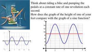
Comparing Bike Pedal Motion to Sine Function Graph
When riding a bike and pumping the pedals at a constant rate, the graph of the height of one foot follows a pattern similar to a sine function. Understanding the relationship between the two graphs can help in visualizing trigonometric functions and their translations.
0 views • 9 slides

Visualizing Relationships with Data: Earthquakes, Volcanoes, and Plate Tectonics
Explore the locations of earthquakes and volcanoes to understand plate boundary zones, compare plate motion in different regions, and determine plate boundary zones using various data sources. Follow step-by-step instructions to study maps, analyze earthquake and volcano distributions, and engage in
0 views • 37 slides

Visualizing a Positive Future: Impact Evaluation of a Pre-Entry Course for Adult Learners
Reflections on the impact evaluation of a non-accredited pre-entry course for mature learners at the Lifelong Learning Centre, University of Leeds. The session discusses the aims of the course, community engagement approaches, Jumpstart program details, and the use of Qualitative Comparative Analysi
0 views • 14 slides

Developing a Private Sector Engagement Plan for UNCAC Implementation
Developing a private sector engagement plan for UNCAC implementation involves identifying target groups, understanding their needs, selecting relevant activities, and planning engagement strategies. Factors such as company size, access to decision-makers, and industry influence play a crucial role i
0 views • 28 slides
Visualizing Categorical Data in Data Analysis
Explore methods for displaying and describing categorical data effectively, from frequency tables to bar and pie charts. Understand the importance of visual representation in drawing insights and making comparisons. Dive into examples using football team data and Titanic survivors. Learn to identify
1 views • 20 slides

Robust Parity Test for Extracting Parallel Vectors in 3D
Fundamental primitives for visualizing 3D data include line features like ridges and valleys of a scalar field, stream lines of a vector field, vortices of a velocity field, and extremal curves of a tensor field. Parallel Vectors (PV) provide a unified representation of 3D line features, forming con
0 views • 27 slides

Achieving Academic Success Through Goal Setting
Setting specific, measurable, attainable, relevant, and time-bound goals is crucial for success. Visualizing your path, creating smart goals, and taking action are key steps. Michael Jordan's wisdom underscores the importance of mindset and fundamentals in achieving your objectives. Stay focused, at
0 views • 15 slides

Realtime Feedback Tool for Nasal Surgery
Revolutionary software aims to assist surgeons in visualizing and enhancing the accuracy of septoplasty procedures. By predicting surgical scissor line-of-cut from training data and generating real-time visualizations of the process, this tool revolutionizes the learning environment for residents in
0 views • 17 slides
Visualizing Lengths: Fun Learning Activities for Students
Experience engaging activities on measuring lengths and distances, comparing familiar objects, estimating lengths, visualizing proportions, and exploring real-world scenarios. The content includes explicit teaching on the length of a blue whale, constructing maps, measuring room dimensions, and fun
1 views • 12 slides

Enhancing Chemistry Education with Augmented Reality Technology
Augmented reality technology offers innovative solutions to overcome barriers in teaching chemistry within the biosciences. By integrating AR tools such as interactive 3D images and simulations, students can explore the micro-world of biomolecules with higher comprehension and engagement. This appro
0 views • 11 slides
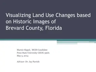
Visualizing Land Use Changes in Brevard County, Florida: Historic Images Analysis
Explore a fascinating project by Marnie Sippel, a Penn State University MGIS candidate, focusing on visualizing land use changes in Brevard County, Florida. The project involves studying historic aerial photos from various sources, researching software for analysis, and documenting changes in land u
0 views • 26 slides
Visualizing the Future Public Symposium - November 3-5, 2021
Visualizing the Future Public Symposium is a project aimed at developing a literacy-based agenda for library and information professionals focusing on data visualization. Supported by the Institute of Museum and Library Services, this symposium features lightning talks, discussions, an invited speak
0 views • 6 slides