Steps to Obtain Tau by Curve Fit
Learn how to analyze photoresistor response data and obtain the time constant (tau) by curve fitting. Follow steps to create scatter plots, calculate Lux values, model equations, errors, and more to improve the quality of your data analysis. Enhance your data visualization skills and optimize data for publications and homework reports.

Uploaded on Sep 24, 2024 | 0 Views
Download Presentation

Please find below an Image/Link to download the presentation.
The content on the website is provided AS IS for your information and personal use only. It may not be sold, licensed, or shared on other websites without obtaining consent from the author. Download presentation by click this link. If you encounter any issues during the download, it is possible that the publisher has removed the file from their server.
E N D
Presentation Transcript
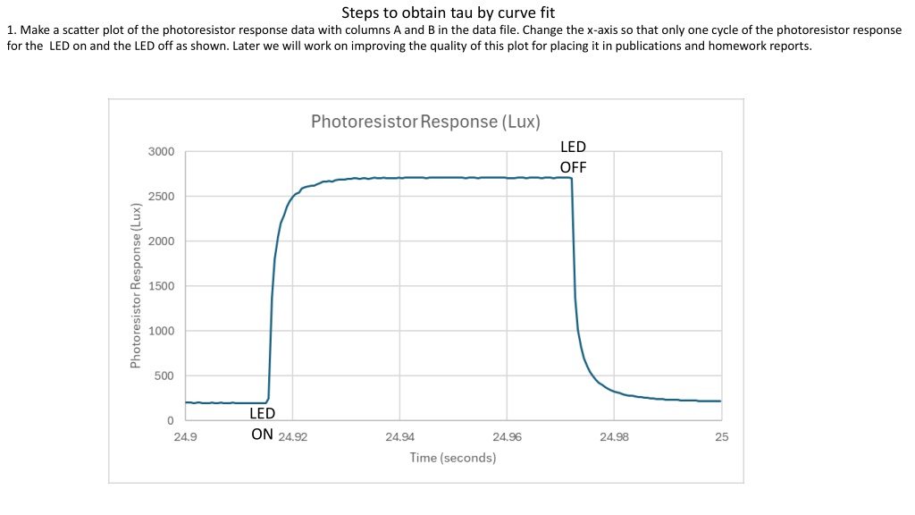
Steps to obtain tau by curve fit 1. Make a scatter plot of the photoresistor response data with columns A and B in the data file. Change the x-axis so that only one cycle of the photoresistor response for the LED on and the LED off as shown. Later we will work on improving the quality of this plot for placing it in publications and homework reports. LED OFF LED ON
Columns A and B are the measurement data. Well make Columns C-J for the model to obtain tau, the photoresistor response time. 2. Create the column headings in column C as in the example below. 3. Hover over the point in the graph where the Lux value cleanly starts to go up, indicated by the red dot in the red box on the right and write down the time. 4. Find the row for this time, below in yellow as row 252 for this example. 5. Put the start time t0 in cell C3, in this example as =$A$252. Put the corresponding lux value into cell C5 as =$B$252. $ signs tell Excel to always use the column and/or row when the formulas get copied to another place . t0,L0
6. Hover over the point in the graph where the Lux value reaches a level peak, indicated by the green dot in the green box on the right and write down the time. 7. Find the row for this time, below in yellow as row 352 for this example. 8. Put the corresponding lux value into cell C5 as =$B$352 for this example (yours may be a different number). 9. Enter a value for tau (seconds) below, in this example, 0.001248614. NOTE: The cell with #NUM! are not a problem since the Model (Lux) values are only relevant to the problem at times near the pulse shown after the time of the red dot. L1
Add the model equation to column D. 10. Put this equation for the model into cell D2. 11. Propagate the model down by clicking on the little green square on the bottom right of cell D2.
Add the Error by row to column E. 12. Enter this equation for the Error by Row into cell E2. This is the absolute value of the difference between the model and the measurement. 13. Propagate the error down by clicking on the little green square on the bottom right of cell E2.
Summed Error goes into cell F2. 14. Enter this equation for the Error by Row into cell E2. This is the absolute value of the difference between the model and the measurement. Note that your cell numbers for the beginning cell (E252) needs to be the row you used for t0 and ending cell (E352) needs to be the row used for L1.
Add the model curve to the graph 15. Right click in the middle of the graph and choose Select Data . Then click on Add to bring up the menu below. In this example, 100Aves is the name of the sheet, and the range of values 252 to 352 are for this example, yours may be different. After clicking on OK a curve like the orange one should show up. We only want to plot the model where it is applicable. Later we will make the graph more acceptable for publication.
Find the value of tau that minimizes the summed error. 16. Under the data tab, on the far right, find the Solver and click on it to bring up this dialogue. The objective is $F$2, which is the summed error. We want it to be a minimum value, and minimize it by changing variable cells: $C$9, which is the value of tau. After clicking on Solve a new solution for tau should be in the cell $C$9 and the dialogue box should say found a solution . Keep the new value. That s the optimal value of tau that makes the model best the measurements. If your computer does not have the Solver installed, here s how you can do it. The sequence is File:Options:Add-ins:Manage Excel Add-ins Go...:Click on Solver Add- in:OK. Each step is separated by a colon.
Do the curve fit for the photoresistor Lux values going down after the LED is off 17. Select these cells and copy them into the clipboard (Ctrl C for Windows). Right click on cell G1 and choose Paste Special .Then choose formulas (I think it is the second in the list. Propagate the Model (Lux) and Error by row by clicking on Then find new values for t0, L0, and L1 the same way we did for the LED on part earlier. Select cell H9 and then double click the little green square in the bottom right of that cell to propagate the equation down. Then click on cell I9 and double click the little green square to propagate it down also. Scroll down to make sure it propagated the calculations to the bottom. If not, select the last row with numbers in it to propagate further. Keep doing that until the numbers in columns H and I reach to the lowest numbers in columns A and B. t0, L0 L1
Add the graph of the model for LED Off as shown below 18. After using the solver again (as earlier) the Summed Error should be a minimum for the value of tau shown. This is the response time for photoresistor after the LED is turned off.
Create publication quality graphs Large dark fonts that are visible from 10 feet away from your monitor. Color choices and line types (solid or dashed) that are easy to identify. Frame around the entire plot. Tick marks on the plot, usually facing inside. Note that right clicking on chart elements, like axis numbers, the interior of the plot, the exterior of the plot, the data curves, etc, allow you to change their properties. This is a guide for the style I find most effective, you may find other styles that work better for your perspective or problems at hand.
Make a Publication Quality Graph With the Following Steps 1. Right click here to bring up menu. 2. Click on Copy.
Make a copy of the graph 1. Click on cell V1 (or equivalent in your spreadsheet. 2. Right click on V1 to bring up the menu below. 3. Click on the red box below Paste Options: A copy of the graph should appear. x x z
Make a copy of the graph 1. Right click here on the graph in an empty place above the graph and below the top. 2. Click on Move Chart
Move the graph to a new sheet 1. Click on New sheet: 2. Use a new name for the new sheet, example below is Graph. 3. The graph should be in its new sheet.
Heres the graph in its own sheet. Change the default font size and all. 1. Click here on the graph in an empty place above the graph and below the top to select the entire graph. 2. Click the options on the right. The result is on the next page.
Get rid of the border around the outside. 1. Right click here on the graph in an empty place above the graph and below the top to select the entire graph. 2. Click the options on the right. The result is on the next slide.
Add a border around the plot itself 1. Right click here in the graph area. 2. Click the options on the right. The result is on the next slide.
Get rid of the grid lines 1. Click on a horizontal grid line and delete. 2. Do the same for the vertical grid lines (delete them).
Make the axes 1 pt wide, black, and add tickmarks 1. Right click on one of the numbers on the horizontal axis to bring up the dialogue box. 2. Select Format Axis 3. Make the settings shown for the axis line color and properties. 4. Then go to the tool on the right (3rd screen shot on this page.) 5. Tick Marks:Major type:Inside. 6. Do the same steps 1-5 for the vertical axis.
Adjust the plot to fill the entire canvas 1. Click on each axis in the middle and use the round handle to move the axis close to its closest wall , to use all of the graph space.
Adjust the plot to fill the entire canvas 1. Click in the middle of the chart to bring up the large green + in the upper right corner. 2. Click on legend to add it, and move it to a good spot.
This version has the response time for the LED on and off included: Sequence is Insert:Text Box then drag a box where the text goes.