Excel Tutorial: Finding Trendline Equation and Calculating Rates of Change
Learn how to find the equation of a trendline in Excel and use it to calculate rates of change. This step-by-step guide includes importing data, adding a trendline, displaying the equation, and interpreting it for analysis. Make the most of Excel's features for data analysis.

Download Presentation

Please find below an Image/Link to download the presentation.
The content on the website is provided AS IS for your information and personal use only. It may not be sold, licensed, or shared on other websites without obtaining consent from the author. Download presentation by click this link. If you encounter any issues during the download, it is possible that the publisher has removed the file from their server.
E N D
Presentation Transcript
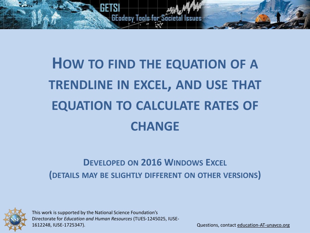
HOW TO FIND THE EQUATION OF A TRENDLINE IN EXCEL, AND USE THAT EQUATION TO CALCULATE RATES OF CHANGE DEVELOPED ON 2016 WINDOWS EXCEL (DETAILS MAY BE SLIGHTLY DIFFERENT ON OTHER VERSIONS) This work is supported by the National Science Foundation s Directorate for Education and Human Resources (TUES-1245025, IUSE- 1612248, IUSE-1725347). Questions, contact education-AT-unavco.org
STEP 1 Import your data into excel Place your x- values in the left hand row, and your y-values in the right hand row
STEP 2 To plot your data, go insert charts line graph (or whichever style of graph you are looking for) Your graph should then appear
STEP 3 To add a trendline, go design Add chart element scroll down the list and hover over trendline click on linear trendline
STEP 4 Your trendline may be hard to see (shown in dotted blue line here) Double-click on your trendline A right hand window will pop up (format trendline window)
STEP 5 On the format trendline window, click the paint bucket and change the appearance of your trendline
STEP 6 To display the equation of the line, click on the chart symbol under trendline options and scroll down until you see display equation on chart By checking the box, your equation will appear on your graph
STEP 7 (OPTIONAL) To lower your x-axis position (it looks bad here), double- click on your y-axis values a righthand window (format axis) will pop up click on the chart symbol type in y- value value for where you want your x-axis to cross
USING YOUR TRENDLINE EQUATION You can use your trendline equation to calculate rates of change Your trendline equation may look something like this: y = 2.5822x 5175.6 or in general form, as y = m*x + c where m is the number for the gradient or slope of the line, and c is the intercept, the y-value when x = 0. In our example, the x-values represent time and the y-values represent the change in mean sea level (in mm)
USING YOUR TRENDLINE EQUATION The slope of the line is 2.5822. What does this number mean? The slope of a line is the change in y produced by a 1 unit increase in x. In our case, the equation is treating a 1 unit increase in x as 1 year. Our equation tells us that the during the period 1993 2003 the average change in sea level every year is plus 2.5822 mm.
USING YOUR TRENDLINE EQUATION So, if we wanted to calculate the average change in sea level after 5 years, then we would figure: 2.58*5yrs = 12.91mm If we wanted to calculate the average change in sea level after 20 years, we would figure: 2.58*20yrs = 51.64mm. After 10 weeks, then we would figure: 2.58*.1923 = 0.496mm. Now you can predict the change in sea level through any time period! Note: the example here is based on the time period 1993 2003. The slope will vary depending on which time period is being considered.


")