Make Beautiful Tailwind Cards That Inspire Your Users
In this article, weu2019ll explore how to create cards with Tailwind CSS, and add images and responsive designs.

Download Presentation
Please find below an Image/Link to download the presentation.
The content on the website is provided AS IS for your information and personal use only. It may not be sold, licensed, or shared on other websites without obtaining consent from the author. Download presentation by click this link. If you encounter any issues during the download, it is possible that the publisher has removed the file from their server.
Presentation Transcript
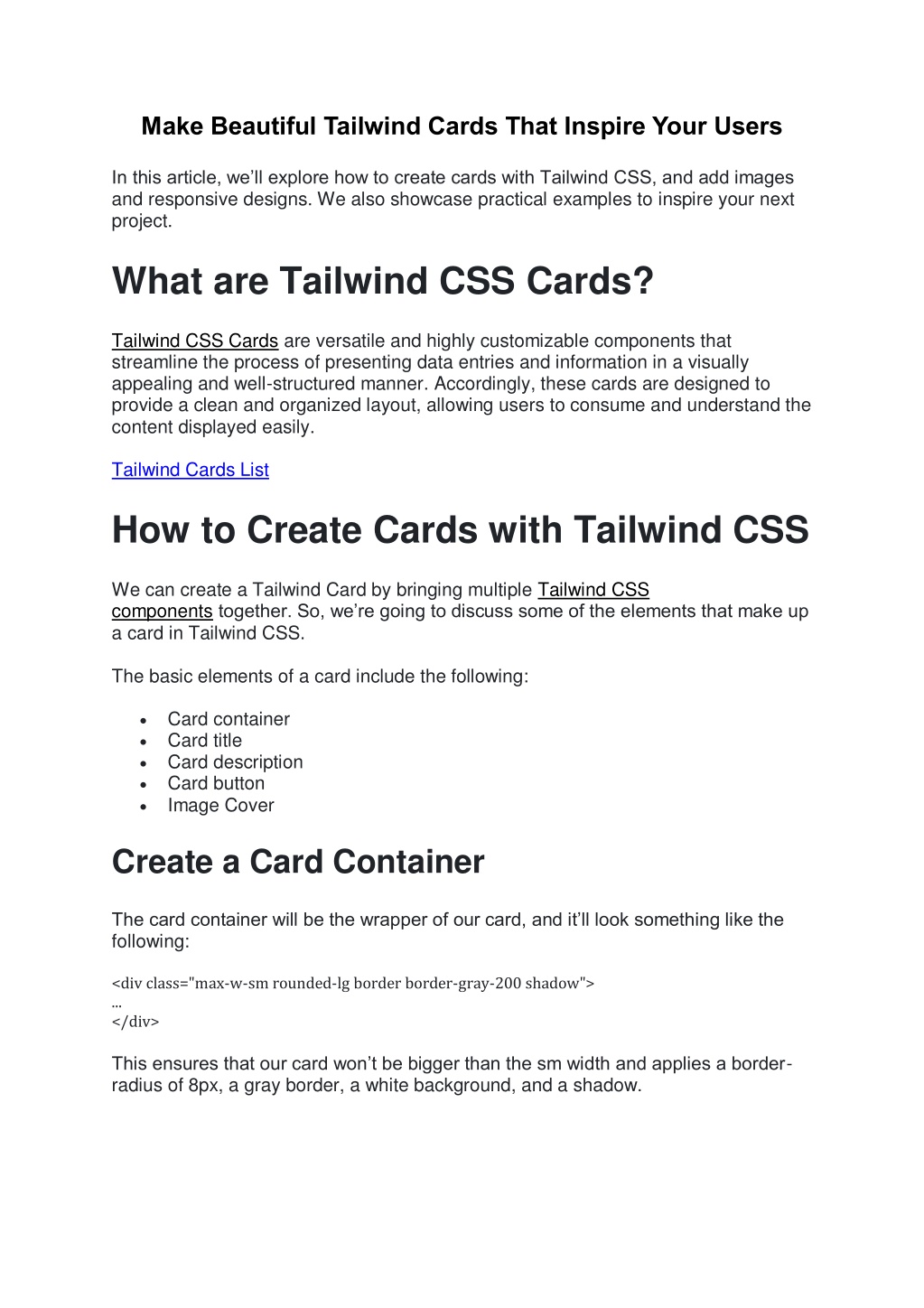
Make Beautiful Tailwind Cards That Inspire Your Users In this article, we ll explore how to create cards with Tailwind CSS, and add images and responsive designs. We also showcase practical examples to inspire your next project. What are Tailwind CSS Cards? Tailwind CSS Cards are versatile and highly customizable components that streamline the process of presenting data entries and information in a visually appealing and well-structured manner. Accordingly, these cards are designed to provide a clean and organized layout, allowing users to consume and understand the content displayed easily. Tailwind Cards List How to Create Cards with Tailwind CSS We can create a Tailwind Card by bringing multiple Tailwind CSS components together. So, we re going to discuss some of the elements that make up a card in Tailwind CSS. The basic elements of a card include the following: Card container Card title Card description Card button Image Cover Create a Card Container The card container will be the wrapper of our card, and it ll look something like the following: <div class="max-w-sm rounded-lg border border-gray-200 shadow"> ... </div> This ensures that our card won t be bigger than the sm width and applies a border- radius of 8px, a gray border, a white background, and a shadow.
Card Title Next, we ll add a card title. A card title can be the product name, a user s full name, or any title about the card s content. However, there are some cards with optional header titles. <h2 class="mb-2 text-2xl font-bold tracking-tight text-gray-900"> Card Title </h2> Card Description The card description contains more context about the card item, such as a category, group, etc. This also allows the user to know more about the title of the card. <p class="mb-3 text-gray-700"> Card description </p> Card Button The card button allows us to create a CTA (call to action) within a card. Thus, this allows us to perform actions like add to cart or redirect the user to a product full page. <button class="rounded-lg bg-blue-700 px-3 py-2 text-center text-sm font-medium text-white hover:bg-blue-800 focus:outline-none focus:ring-4 focus:ring-blue-300"> Card button </button> Card Outcome Now that we know how to create a button, by putting everything together, our final card code will look something like below: <div class="max-w-sm rounded-lg border border-gray-200 p-5 shadow"> <h2 class="mb-2 text-2xl font-bold tracking-tight text-gray-900">Card Title</h2> <div class="flex flex-col items-start"> <p class="mb-3 text-gray-700">Card description</p> <button class="rounded-lg bg-blue-700 px-3 py-2 text-center text-sm font-medium text-white hover:bg-blue-800 focus:outline-none focus:ring-4 focus:ring-blue-300">Card button</button> </div> </div>