Guidelines for Creating an Effective Research Poster
This template provides guidance on creating a professional and visually appealing research poster for presentations. It includes instructions on layout, content, and design elements to help students effectively showcase their projects.
Download Presentation

Please find below an Image/Link to download the presentation.
The content on the website is provided AS IS for your information and personal use only. It may not be sold, licensed, or shared on other websites without obtaining consent from the author.If you encounter any issues during the download, it is possible that the publisher has removed the file from their server.
You are allowed to download the files provided on this website for personal or commercial use, subject to the condition that they are used lawfully. All files are the property of their respective owners.
The content on the website is provided AS IS for your information and personal use only. It may not be sold, licensed, or shared on other websites without obtaining consent from the author.
E N D
Presentation Transcript
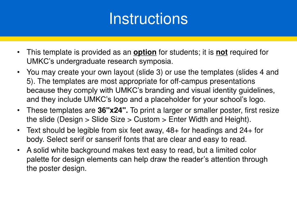
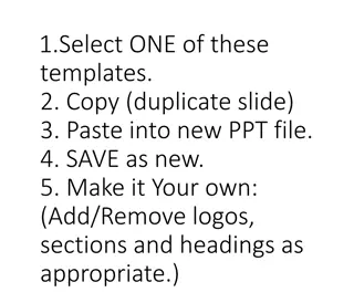
Instructions This template is provided as an option for students; it is not required for UMKC s undergraduate research symposia. You may create your own layout (slide 3) or use the templates (slides 4 and 5). The templates are most appropriate for off-campus presentations because they comply with UMKC s branding and visual identity guidelines, and they include UMKC s logo and a placeholder for your school s logo. These templates are 36"x24". To print a larger or smaller poster, first resize the slide (Design > Slide Size > Custom > Enter Width and Height). Text should be legible from six feet away, 48+ for headings and 24+ for body. Select serif or sanserif fonts that are clear and easy to read. A solid white background makes text easy to read, but a limited color palette for design elements can help draw the reader s attention through the poster design.
Instructions The main heading should include the title of your project, author(s) names (including your faculty mentor), relevant affiliations (the UMKC department/division that sponsored this project and/or the course name, research group, or lab in which this project originated), and any funding acknowledgements. The content of the poster should present your project with text, visual aids, and white space. Use the section headings that convey your work most effectively. The section headings in these templates are simply a guide for layout and may be adjusted just be sure to correct the alignment. After you have adjusted the template to meet your needs, delete the slides you are not using. Save the PPT. Save your poster as a PDF to submit for printing (File > Save as > File Type = PDF).
UNDER CONSTRUCTION Create your own poster layout. Use the insert tab to add text boxes, shapes, and images.
Title School Logo Here Author Name(s) Affiliations (i.e., Department/Division, Course Name, or Lab) Title of Poster Authors names Affiliations Background Results Conclusion Text Text Text Research Question Text Methodology References Text Text
Title Title School Logo Here Author Name(s) Author Name(s) Affiliations (i.e., Department/Division, Course Name, or Lab) Background Results Conclusion Text Text Text Question Text Methodology References Text Text
