Professional Poster Presentation Guidelines
Designing and presenting a professional poster is essential to stimulate interest, receive feedback, and generate contacts for your research. This guide outlines the key steps in poster planning, from choosing the style and size to creating the layout and content effectively. With tips on PowerPoint usage and ensuring clarity in your poster, you can effectively communicate your research to a diverse audience.
Download Presentation

Please find below an Image/Link to download the presentation.
The content on the website is provided AS IS for your information and personal use only. It may not be sold, licensed, or shared on other websites without obtaining consent from the author.If you encounter any issues during the download, it is possible that the publisher has removed the file from their server.
You are allowed to download the files provided on this website for personal or commercial use, subject to the condition that they are used lawfully. All files are the property of their respective owners.
The content on the website is provided AS IS for your information and personal use only. It may not be sold, licensed, or shared on other websites without obtaining consent from the author.
E N D
Presentation Transcript
Design and Presenting a Professional Poster Original slide set courtesy of Jane Tougas Faculty of Computer Science Dalhousie University tougas@cs.dal.ca
Why Make a Poster Presentation? Stimulate interest and discussion Receive feedback on research Generate contacts
Questions a Poster Answers What s the scholarly or research question? Why is this question important? What specific methods were used? Why are these unique/important? How does this relate to other scholarly work or research in the field? What comes next?
Poster Planning Choose poster style and size PowerPoint: (preferred) The height must be set at 36 or 44 if printed at the Office of Undergraduate Research. There is no restriction on the width, but it usually does not exceed 44 . All other software programs: The width must be set at 36 or 44 if printed at the Office of Undergraduate Research. There is no restriction on the height, but it usually does not exceed 44 .
Poster Planning Decide on one concept or question Make it easy to understand. Your poster should stand alone. In other words, someone outside your field should be able to read through your poster and understand the main points without further explanation. Verbal explanations should supply details, not essentials.
Poster Planning Creating your poster using PowerPoint (preferred and most common) To change dimensions: Click on the Design tab Click the Page Setup icon (first one on the left) Adjust dimensions: height - 36 and width (should not exceed)44 PowerPoint has fewer default format settings so it is easier customize text and picture arrangement. Do NOT wait until the last minute.
Poster Layout Sketch your layout before you start Title Intro Conclusion
Poster Content Title Authors (including other authors and mentors if your project is not all your own work) Affiliations (required - UK Logo) Introduction
Poster Content Methods Data and Results (may be incomplete that s OK) Conclusions and Future Work (Especially if your data and results are incomplete, expand on Future Work.) References and Acknowledgements
Poster Text Keep it short and simple Remove all non-essential information Attract visual attention: use photos and graphics Try for: 40% text 40% photos and graphics 20% empty space
Poster Text Left align text Pick one font and stick to it. Avoid italics. Use larger/colored font for emphasis.
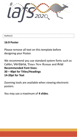
Suggested Font Sizes Title: Authors: Affiliations: Section headings: Text: Acknowledgements: 96 pt 72 pt 36-48 pt 36 pt 24 pt 18 pt
Color A white background is usually best Stick to muted colors Avoid red/green combinations as red/green color blindness is common Don t overuse color Be consistent
Graphics Large enough for viewing from at least 3 feet away Text should support graphics, not vice versa Use heavy lines in tables and graphs for easier viewing
Poster Editing Proofread Spell check Must have mentor s approval Get feedback from multiple sources in time to make changes before printing. Consult with colleagues and others outside your field of research.
Poster Presentation Give an overview of your work in 3-5 minutes Practice your presentation ahead of time, and time it! Get feedback from others both within and outside your field.
Speaking Points Explain why the research question and results are important. Not just about procedures and data Remember your audience Not everyone understands post-structuralism, mitosis, or other jargon that is discipline-specific. Keep talk relevant to content of poster Keep it simple! A clear presentation gives a better impression than a complicated speech meant to impress.
Answering Questions When you are done presenting, be sure to ask if there are any questions Listen carefully Wait for them to finish the question! Optional: Repeat or rephrase the question to make sure you understand Answer the question concisely Ask if you ve adequately answered the question
Printing Posters printed for events run through the Office of Undergraduate Research are printed free of charge. Any student participating in our events may have one poster printed per semester free of charge. You will be notified via e-mail when your poster is ready. The deadline for poster printing through the UGR office for the Showcase of Undergraduate Scholars is April 15. To print your poster follow this link: http://www.uky.edu/academy/showcase
References www.kumc.edu/SAH/OTEd/jradel/Poster_Presentations/110.html www.mitacs.ca/AC2005/index.php?section=tips www.siam.org/siamnews/general/poster.htm www.acm.org/crossroads/xrds3-2/posters.html
