Effective Research Poster Presentation Guidelines
During your research poster presentation, stand by your poster, engage with judges, and provide a clear overview of your project in 4-5 minutes. Dress business casual, practice your presentation, and aim to stimulate interest, receive feedback, and network. Use visually appealing layouts to attract viewers.
Download Presentation

Please find below an Image/Link to download the presentation.
The content on the website is provided AS IS for your information and personal use only. It may not be sold, licensed, or shared on other websites without obtaining consent from the author.If you encounter any issues during the download, it is possible that the publisher has removed the file from their server.
You are allowed to download the files provided on this website for personal or commercial use, subject to the condition that they are used lawfully. All files are the property of their respective owners.
The content on the website is provided AS IS for your information and personal use only. It may not be sold, licensed, or shared on other websites without obtaining consent from the author.
E N D
Presentation Transcript
Creating an Effective Research Poster Spring 2018 Michelle Richards-Babb, Ph.D. Associate Professor & Director of the Office of Undergraduate Research, West Virginia University
What should I do during the poster presentation? Poster presentation stand by/near your poster engage people/judges in conversation Be ready to give an overview of your project (4-5 min. max) using your poster visuals. Start broad (w/impact), then move on to more focused information. Non-expert should be able to understand! Avoid jargon/acronyms!
What should I do during the poster presentation (cont.)? In the overview you should display: Project knowledge (Main focus of research? Importance/impact? Conclusions?) Logical presentation (Clear/coherent? Refer to poster visuals?) Background information/understanding (as evidenced by ability to explain project) Presence (Speak clearly? Make eye contact? or Read from poster?) Ability to answer questions about your research (evidence of project knowledge) Practice your poster presentation and limit to 4 Practice your poster presentation and limit to 4- -5 minutes!! 5 minutes!!
How should I dress? Dress to Impress!! Business casual, at minimum. *photo by Nicole Barker: obtained from http://www.flickr.com/groups/postersessions/
What are the goals of a research poster presentation? Stimulate interest in your research Receive feedback on your research Network: generate contacts expansion of research job opportunities include your email on the poster and provide poster handouts
How do I attract people to my poster? To get attention/to capture attention from afar use visually appealing layout of information, colors, and fonts invite people over if they seem tentatively interested To keep attention give a clear, logical, and interesting presentation of your research include only necessary information, focus on data use abbreviated writing style (i.e., omit non- essential words Poster should NOT be enlarged version of written report!! Poster should NOT be enlarged version of written report!!
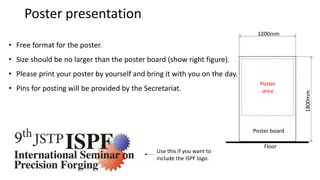
Poster Size? Specific to each conference/presentation venue. Pay careful attention to max size! If max poster size is 46 w x36 h: Poster Title Author(s) Byline 46 inches in height max In this case poster layout In this case poster layout will be portrait mode!! will be portrait mode!! Poster Components 36 inches (3 ft) in width max Paper at Big Prints (Evansdale Computer Lab/Media Services) limited to 36 (35 image) or 42 (41 image) width but any length so poster will most likely be printed with 36 paper as: Components Poster Title Author(s) Poster Byline 36 in 46 in Be aware of in margin on each edge. Take this into account! Be aware of in margin on each edge. Take this into account!
How do I prepare my poster? Use Microsoft PowerPoint or Publisher (or other presentation software). However, Microsoft products compatible with WVU computers. PowerPoint OK for Evansdale Computer Lab or Media Services Go to Design and then Slide Size - Custom and change width, height, and orientation of page (e.g. width=36 , height=46 , & orientation = portrait) Click View followed by Zoom to zoom in (10% gives picture of overall poster on screen) and out (100% gives actual size of text) as you prepare the poster. Publisher OK for Evansdale Computer Lab. For Media Services, convert to pdf. When first open click on More Blank Page Sizes, then Custom, Create New Page Size (or just go to Page Design and change page size) and change page size to width=36 and height=46 . Zoom in (10% gives picture of overall poster on screen) and out (100% gives actual size of text) as you prepare the poster. Plotter has tough time with gradient and/or busy backgrounds. Avoid!! Plotter has tough time with gradient and/or busy backgrounds. Avoid!!
Where do I print my poster? WVU Evansdale Computer Lab (basement of Evansdale Library) Varied Hours: Generally open during normal library hours (check hours at: https://lib.wvu.edu/hours/index.php?library=2) More information? Call (304)293-3742 and see http://it.wvu.edu/services/bigprints WVU Departments: Many Departments (Biology?) and Colleges (Statler, Health Sciences) have their own large format printers. Ask your faculty mentor. WVU Downtown Campus Library (Multimedia Services on Ground Level) Varied Hours (Check website): Generally open during normal library hours. More information? Call (304)293-4040 or see http://www.libraries.wvu.edu/services/multimedia/poster/ Need to use one of six Macintosh computers to right of Media Services desk. Ask for assistance. PowerPoint compatible. For Publisher, need to pre-convert to pdf. Bring original and pdf converted file. Sometimes colors chosen using PC software do not come out the same when printed from Macintosh. Do NOT begin poster printing less than 30 minutes before close!! Do NOT begin poster printing less than 30 minutes before close!!
Where do I print my poster (cont.)? Other, more expensive, places to get your poster printed, if desperate .. Morgantown Printing & Binding, Inc. morgantownprinting.com (304)292-3368 Office Depot (304)598-7899 limited to 24 width Morgantown Blueprint (304)292-6030 $36-$60 Have your poster ready to print out when you get there!! Have your poster ready to print out when you get there!! Do NOT wait until the last minute! There will be may be other Do NOT wait until the last minute! There will be may be other students trying to get their posters printed at the same students trying to get their posters printed at the same time. The sooner your poster is printed the better! time. The sooner your poster is printed the better!
How much does it cost at a WVU Site and how do I pay? Cost of poster printing is < $2/sq ft (reasonable size poster). Put enough money on your student ID to cover poster printing and take ID along when print out poster. Save poster (PowerPoint/Publisher version & pdf version) to USB drive. Take USB drive to Media Services and staff will assist you in printing out your poster. Once poster is sent to large-format plotter, you will swipe your student ID, select your poster, and money will be deducted from your student ID.
Recommended poster components? Note: Pay attention to instructions/rubric for specific event. Include .. Title: from abstract Author(s): from abstract (no Dr./Prof. titles) Byline/Author Affiliation: from abstract Poster Body Hypothesis/goals/problem statement(What s the question?) Motivation/purpose of research/broader impacts(Why care?) Background information (limited and as needed) Theoretical or Experimental Plan/Methods(Approach?) Data/results(What did you find?) Conclusions(What do your results mean? Did they answer the question?) Future work/directions(Next steps?) References (if needed, 5 or fewer, shorten, on bottom) Acknowledgements (Who funded/helped with work?) Typically, do NOT include the abstract on your poster!! Typically, do NOT include the abstract on your poster!!
Guidelines of Poster DOs Colors Use light background with dark lettering. Uses less ink and more readable. Limit to 3-4 compatible colors Use text colors consistently (e.g., main headers in dark blue, subheadings in tan, rest of text in black) Text Left justify most text except title/author/affiliation Use bold, italics, underlining consistently, but sparingly Use easy to read fonts Times New Roman (text) or Arial (headings/title) Use large font size Title 72 point (visible 15 ft away) Author/Byline 48 point Headings/Subheadings 44 point (visible 6-7 ft away) Text 32 point (visible 3 ft away) Minimize complete sentences Make title/headings compelling/attention grabbing similar to a newspaper headline. State results explicitly in headings (e.g. Results: Rats ingesting pot live longer!). Attracts attention from far away. (Not red on black) (Not green w/red) HINT Print out a handout version on an 8 1/2 x 11 piece of paper. If text HINT Print out a handout version on an 8 1/2 x 11 piece of paper. If text is unreadable on handout, then text is too small. Increase the font size. is unreadable on handout, then text is too small. Increase the font size.
Guidelines of Poster DOs (cont) Layout Arrange top to bottom then left to right Use bulleted/numbered lists for methods/conclusions Include some white space Use arrows or numbered headings to direct reader Use symmetric arrangement Use good balance of graphics and text Graphics Viewable 3 feet away at a minimum Use heavier lines to improve viewing Text should support graphics (not vice versa) Limit rows/columns in tables (> 20 table cells overwhelms) Limit bars on graph (6 or fewer) or lines (3 or fewer) On separate graphs: use same scale (especially for comparisons)
Make visually appealing!! Make visually appealing!! Good Layout: Horizontal & Vertical Symmetry Good Layout: Vertical Symmetry Good Layout: Diagonal Symmetry Poor Layout: No Symmetry & Text Heavy *Obtained from : Hess, G., Tosney, K., and Liegel, L. Creating Effective Poster Presentations, http://www.ncsu.edu/project/posters/NewSite/CreatePosterLayout.html.
Guidelines of Poster DOs (continued) Graphics Use graphics over text whenever possible Images/graphs > flow charts (e.g., for methods) > tables > bullet lists > text Pictures use jpeg format instead of tif (smaller size) Use white background within graphics Label legend directly on graphic. Legend outside of graphic takes up space. Simple, polished, and publication quality Poster Content Minimize methods section (unless poster is about new method) Throughout, stay focused and keep to message Focus message more on results Interpret results in conclusion section (don t restate results again!) Try for 40% graphics, 40% empty space, and 20% text.
Do include financial support/funding: Ask your research mentor for this information! Do include one type of WVU Emblem (perhaps at bottom and not too large): see http://brand.wvu.edu/brand-guide/identity/logo for more logos
Do include acknowledgements and emblems: Ask research mentor BUT place at bottom and don t make them too large
Guidelines of Poster DONTs.. Use fluorescent colors attention grabbing but visually annoying Use pastel colors for text like this..hard to read! Use text anywhere that is smaller than 24 point like this 10 point font can you read that 10 point font? Clutter with text Use complete sentences and wordy paragraphs minimize each word section to < 50 words Use cheesy clip art Use annoying/busy/distracting background Use dark or gradient background Postscript plotting feature has major issues with gradient backgrounds. Avoid gradient backgrounds in order to minimize printing time!
Poster Critiques * Pigs in Space Poster Example (Click below. Humorous example of a poster that could be improved.) (see http://colinpurrington.com/wp-content/uploads/2012/02/bad- scientific-poster-example.jpg) * Can Suburban Greenways Provide High Quality Bird Habit? Poster Example (Following slide. Example of a poster that is visually appealing and won an award.) *Accessed from Purrington, C. Designing Conference Posters, http://colinpurrington.com/wp-content/uploads/2012/02/bad-scientific-poster-example.jpg.
*Obtained from : Hess, G., Tosney, K., and Liegel, L. Creating Effective Poster Presentations, http://www.ncsu.edu/project/posters/NewSite/CreatePosterLayout.html.
WVU Poster Template WVU Cancer Institute (see http://wvucancer.org/about-us/templates- and-tools/)
Good Poster Websites Humorous Advice on Designing Scientific Posters by Colin Purrington (Swarthmore College):http://colinpurrington.com/tips/academic/posterdesign Designing Effective Research Posters by Justin Matthews (California State University, Monterey Bay): http://graduatestudent.ucmerced.edu/jmatthews/Site/Designing_Effective _Research_Posters.html Creating Effective Poster Presentations by George Hess, Kathryn Tosney and Leon Liegel (NC State University):http://www.ncsu.edu/project/posters/ Great Collection of Flickr posters, some good and some bad: http://www.flickr.com/groups/368476@N21/pool/ Creating an Effective Scientific Poster Presentation by Dr. Joe McFadden (WVU): https://www.youtube.com/watch?v=CVpj7LIamkU Other resources can be found at the SpeakWrite website: http://speakwrite.wvu.edu/
Overall Poster Should Be Focused Coherent Ordered Visual Graphic Poster is expanded and visual form of abstract! Poster should stand alone and tell your research story without you present AND with minimum words!
Friday July 28th is the last day of summer research for many of you. Before you leave, be sure to thank: your faculty research mentor, secondary mentors (graduate students, postdocs, etc.) with whom you have worked, and any other folks who have helped you in your summer research.
