Academic Debate Event and Academic Poster
Posters play a significant role in academic and event promotion. From designing academic posters for research presentations to creating event flyers for advertising, understanding the key elements such as layout, color scheme, typography, and visual appeal is crucial for effective communication. This content provides insights on creating engaging posters, considering audience, purpose, and design composition for successful poster campaigns.
Download Presentation

Please find below an Image/Link to download the presentation.
The content on the website is provided AS IS for your information and personal use only. It may not be sold, licensed, or shared on other websites without obtaining consent from the author.If you encounter any issues during the download, it is possible that the publisher has removed the file from their server.
You are allowed to download the files provided on this website for personal or commercial use, subject to the condition that they are used lawfully. All files are the property of their respective owners.
The content on the website is provided AS IS for your information and personal use only. It may not be sold, licensed, or shared on other websites without obtaining consent from the author.
E N D
Presentation Transcript
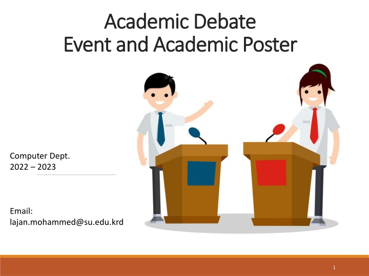
Academic Debate Academic Debate Event and Academic Poster Event and Academic Poster Computer Dept. 2022 2023 Email: lajan.mohammed@su.edu.krd 1
PosterDesign A poster is any piece of printed paper designed to be attached to a wall or vertical surface Posters include both textual and graphic elements, Posters may be used for many purposes They are a frequent tool of advertisers trying to communicate a message There are many types of posters however we only study Event and Academic Posters 2
Choose a softwareprogram - M.S PowerPoint - M.S Word 3
Event Poster(Flyer) Posters advertising events have become common Any sort of public event , may be advertised with posters Typical requirements of an Event Poster are: Logo (Organizer and/or Sponsors) Title Photo(s) Date and Time 4
Event Poster(Flyer) When design an Event Poster consider: Paper size, A3 (29.7 X 42cm) Font type and size (experiment with typography) Effective use of colors (create energy, elicit a mood and attract the eye) Remove unnecessary elements (say more with less) Visual interest and attraction (use shapes, fonts, colors, etc.) Design composition (how graphics interact with words) The audience (design for your audience) 5
AcademicPoster Posters are widely used in the academic community Most conferences include poster presentations in their program Research posters summarize information or research concisely and attractively to help publicize it and generate discussion The poster is usually a mixture of a brief text mixed with tables, graphs, pictures, and other presentation formats At a conference, the researcher stands by the poster display while other participants can come and view the presentation and interact with the author 6
Typical requirements of an Academic Poster Cut the text down to 300-400 words Format the type Prepare your images Design the layout Choose a color scheme Check it (very carefully) 7
When design an Academic Poster consider Poster size, A1 (59.4 X 84.1cm) Font type and size (experiment with typography) Use color to attract attention, organize, and emphasize (but don't overdo it) Keeps the sequence well-ordered and obvious (coherent flow of information) Use of bullets, numbering, and headlines make it easy to read Organize your poster in columns (easy to follow) 8
Remove unnecessary images and texts (say more with less) Keep posters visual (images and graphics say much more than words) Design composition (how graphics interact with words) Keep balance and white spaces (keep the background simple) The audience (design for your audience) Prepare a 3-5 minute verbal explanation Prepare mini size poster handouts 9
Posters fontsize In the competitions of Salahaddin University-Erbil, it is preferred to use poster size A1 (59.4 X 84.1cm) Main title (70-90) Subtitle headings (48-54) Authors and supervisors name (40-44) Department, College and University names (36-40) Text body (32-36) Captions (20-24) 10
Structure of academic poster Like other types of academic writing, an academic poster should be well organized, with clear headings and subheadings. The structure you choose depends on the task you have been given. 11
Structure of academicposter Reporting on research If you are reporting on a piece of research, your structure will be similar to a research report: Title Introduction Methods Results Discussion Conclusion References 12
Posterfonts Use sans serif fonts: these fonts are more readable than serif fonts from a distance. Avoid excessive text. (Poster should have roughly 20% text, 40% figures, 40% space) Text and figures should be readable from around roughly 1.5m to 2m Leave breathing space around your text 13
Posterfonts Do not use a different font type to highlight important points - otherwise the fluency and flow of your sentence can appear disrupted Do not use all UPPER CASE type in your posters. It can make the material difficult to read Use the bold face or italics or combinations to emphasize words and phrases. Left-align text. Using fully justified text will create large gaps between some words and make it difficult to read. 14
