Understanding Android Navigation: Menus, ActionBar/ToolBar, and Navigation Drawer
Explore the functionalities of ActionBar/ToolBar, menus, and navigation drawer in Android development. Learn about the transition from ActionBar to ToolBar, implementing multiple toolbars, and utilizing the Navigation Drawer layout for effective navigation in your app.

Download Presentation

Please find below an Image/Link to download the presentation.
The content on the website is provided AS IS for your information and personal use only. It may not be sold, licensed, or shared on other websites without obtaining consent from the author. Download presentation by click this link. If you encounter any issues during the download, it is possible that the publisher has removed the file from their server.
E N D
Presentation Transcript
Cosc 5/4730 Android Navigation: Menus, ActionBar/ToolBar, and Navigation Drawer
Navigation visual Back Button Action Buttons ActionBar/ ToolBar Menu Navigation Drawer Note: If there is physical menu button, then the menu does not show on the screen
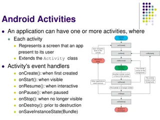
ActionBar/toolbar and Menus The default activity in Andriod Studio is an AppCompatActivity (via androidx.appcompat:appcompat) This provides an ActionBar and menu For the purpose of this lecture, that is what I m going to use. We have full support for fragments, ActionBar, and menus There is an older menu system from api 1, that still works, but I m not covering it. Note, Android prefers you to use the new ToolBar (androidx.appcompat) which replaces the ActionBar. The toolbar is functionally the same as an ActionBar. The toolbar supports Material Design elements that the actionBar can not.
toolbar The ActionBar has been basically replaced in lollipop with the ToolBar. Allows you to move the ActionBar and change it size too. One thing is you can now have more then one toolbar as well. Requires a style change. <style name="AppTheme.Base" parent= "Theme.AppCompat.DayNight.NoActionBar"> OR <style name="AppTheme.Base" parent= "Theme.MaterialComponents.DayNight.NoActionBar">
toolbar In a xml layout: <androidx.appcompat.widget.Toolbar android:layout_width="match_parent" android:layout_height="wrap_content" likely more theme/style attributes. </androidx.appcompat.widget.Toolbar>
Toolbar (java) use the androidx.toolbar instead of the default one. toolbar = (Toolbar) findViewById(R.id.app_bar); setSupportActionBar(toolbar); Now this is the ActionBar and you use all the same methods as before Which all my examples already use the SupportActionBar, so everything works.
Toolbar If you want second (or more) toolbar, say at the bottom Then you have to control that via the toolbar and not as actionbar. Because there can be only one actionbar . Note, you can leave the style with an ActionBar and everything will work as well.
Navigation Drawer Layout This is all but the default method that google wants you to use for navigation (sort of,has new gestures and google now suggests a bottom navigation view if possible) As well as menus. So you can use listview/recyclerview or the new NavView. Play store as example:
Navigation Drawer Layout (2) Using the toolbar instead of the actionbar, The navigation bar provides the function as google wants: the drawer layout covers the toolbar when it is open. ActionBar ToolBar
Well come back to the navigation drawer and toolbar, but first
Android MENUS
Menus Menus are created via an xml document First create a menu xml (normally in res/menu) with menu as the type. You can add items (and sub menus). You can also group the items as well. Menus are currently out of favor and most documents say to use a navigation drawer or bottom navigation. Menu example code is repo ui in directory Navigation
Menu.xml example: <group android:id="@+id/group1"> <item android:id="@+id/item1" android:orderInCategory="5" android:title="item1"/> <item android:id="@+id/item2" android:orderInCategory="10" android:title="item2"/> <item android:id="@+id/item3" android:orderInCategory="1" android:title="item3"/> <item android:id="@+id/item4" android:orderInCategory="3" android:title="item4"/> <item android:id="@+id/item5" android:orderInCategory="2" android:title="item5"/> </group> Note the orderInCategory determines the order of display, so this will show: Item3 Item5 Item4 Item1 item2
Sub menus in xml Create and item that will be the submenu heading Then create a menu instead of the item tags. <menu> <item> ... <menu> ... </menu> ... </item> </menu>
Menu Java code Use onCreateOpensMenu and onOptionsItemSelected Which android studio creates for you by default @Override public boolean onCreateOptionsMenu(Menu menu) { // Inflate the menu; this adds items to the action bar if it is present. getMenuInflater().inflate(R.menu.menu, menu); return true; } @Override public boolean onOptionsItemSelected(MenuItem item) { // Handle action bar item clicks here. int id = item.getItemId(); if (id == R.id. item1) { //assuming previous xml document return true; //do something here to handle the menu. } //handle the rest. return super.onOptionsItemSelected(item); }
Popup menus. Add a click listener (or longtouch, whatever) to anything. We are using a TextView, so make sure it clickable It will then call our code, called showPopupMenu(View v) Note this is not an override, just a method we are using public void onClick(View v) { showPopupMenu(v); }
showPopupMenu private void showPopupMenu(View v){ PopupMenu popupM = new PopupMenu(this, v); popupM.inflate(R.menu.popup); popupM.setOnMenuItemClickListener(new PopupMenu.OnMenuItemClickListener() { @Override public boolean onMenuItemClick(MenuItem item) { //do something return true; } }); popupM.show(); }
Fragments and Menus Fragments can contribute to the menu as well Including if there is no menu. In the OnCreate() method of the fragment, you must add setHasOptionsMenu(true); Otherwise the menu methods will not be called. A note, when the fragment is showing, the menu will be there and when the fragment is removed , then those menu items are removed as well. Remember, fragments are nice, because of the encapsulation.
Fragments and Menus (2) @Override public void onCreateOptionsMenu(Menu menu, MenuInflater inflater) { super.onCreateOptionsMenu(menu, inflater); inflater.inflate(R.menu.frag2menu, menu); } @Override public boolean onOptionsItemSelected(MenuItem item) { switch (item.getItemId()) { case R.id.frag2item: //do something. return true; } return super.onOptionsItemSelected(item); } Override the following, note the onCreateOptionsMenu is a little different
Fragment Example The show Fragment X is menu from the activity.
Menu creation Menu items can be changed later by invalidateOptionsMenu(); Which calls the onCreateOptionsMenu method again. So if you need to change, enable/disable menu items, you can do it pretty easily.
Android ACTIONBAR (BUT REALLY A TOOLBAR)
ActionBar The Actionbar can provide a Back button to the parent Activity. We can also add buttons , except they are menu items, via the xml Note I m using text, but it could just easily be an icon (or both!) We can also add sub menu to the ActionBar that drop down when clicked.
Xml code From Googles page: http://developer.android.com/guide/topics/resources/menu-resource.html Using the xmlns:app="http://schemas.android.com/apk/res-auto" app:showAsAction= ifRoom Only place this item in the Action Bar if there is room for it. withText Also include the title text (defined by android:title) with the action item. You can include this value along with one of the others as a flag set, by separating them with a pipe |. never Never place this item in the Action Bar. always Always place this item in the Action Bar. Avoid using this unless it's critical that the item always appear in the action bar. Setting multiple items to always appear as action items can result in them overlapping with other UI in the action bar. collapseActionView The action view associated with this action item (as declared by android:actionLayout or android:actionViewClass) is collapsible. Introduced in API Level 14.
Xml code example <menu xmlns:app="http://schemas.android.com/apk/res-auto" > <item android:id="@+id/actionmenu_settings" app:showAsAction="ifRoom" android:title="@string/action_settings"/> Show if room, if not show in normal menu <item android:id="@+id/submenu" android:title="sub menu" app:showAsAction="always" > <menu> <item android:id="@+id/asubitem1" android:orderInCategory="1" android:title="subitem1"/> <item android:id="@+id/asubitem2" android:orderInCategory="2" android:title="subitem2"/> </menu> </item> <item android:id="@+id/amenuitem1" android:title="item1"/> <item android:id="@+id/amenuitem2" android:title="item2"/> </menu> Always shows and creates a Drop menu (separate from standard Menu) Normal menu items
End result This shows how it can look The sub menu item has been clicked to show the sub menu.
Action Bar We can also have buttons as well and change them as needed, programmatically. This example uses the ViewPager2 and fragment examples and adds buttons for Previous and Next also finish, but that doesn t do anything The buttons may show at the bottom of the screen if there is not enough space on the actionbar.
Java code We need to use the invalidateOptionsMenu(); every time the page is changed, so Using the ViewPager2. registerOnPageChangeCallback( ) Otherwise, the main work is in the onCreateOptionsMenu(Menu menu)
OnCreateOptionsMenu public boolean onCreateOptionsMenu(Menu menu) { super.onCreateOptionsMenu(menu); getMenuInflater().inflate(R.menu.activity_screen_slide, menu); Enable the previous menu item, if we are not on the first page (xml). menu.findItem(R.id.action_previous).setEnabled(viewPager.getCurrentItem() > 0); Add either a "next" or "finish" button to the action bar, depending on which page is currently selected. Done programmatically. MenuItem item = menu.add(Menu.NONE, R.id.action_next, Menu.NONE, (viewPager.getCurrentItem() == mPagerAdapter.getCount() - 1) ? R.string.action_finish : R.string.action_next); item.setShowAsAction(MenuItem.SHOW_AS_ACTION_IF_ROOM | MenuItem.SHOW_AS_ACTION_WITH_TEXT); return true; }
Other things xml . android:titleCondensed="string android:icon="@[package:]drawable/drawable_resource_name android:onClick="method name android:actionLayout="@[package:]layout/layout_resource_name" android:actionViewClass="class name" android:actionProviderClass="class name" android:alphabeticShortcut="string" android:numericShortcut="string" android:checkable=["true" | "false"] The layout allows you to add say a search bar to the top.
Navigation Drawer Provides a slider window that allows you have navigation, like a listview, but not always on screen. Closed (actionbar) Opened
Navigation Drawer It uses a Drawer layout that takes two views Both views are likely layouts or fragments View/layout 1 is the main content. The one that shows when the drawer is closed. View/layout 2 is the drawer content. What shows when the drawer is open. Mostly like has a listview as well.
Navigation Drawer xml code <androidx.drawerlayout.widget.DrawerLayout android:id="@+id/drawer_layout" android:layout_width="match_parent" android:layout_height="match_parent"> <!-- As the main content view --> < Layout android:layout_width="match_parent" android:layout_height="match_parent"> <!-- whatever views/widgets needed --> </ Layout> <! drawer content view --> <ListView android:id="@+id/left_drawer" android:layout_gravity="start" //default left to right and switch for right to left languages. android:choiceMode="singleChoice"/> </androidx.drawerlayout.widget.DrawerLayout>
DrawerLayout Java The listview is setup like normal Except on a selection, we also close the drawer. mDrawerLayout = (DrawerLayout) findViewById(R.id.drawer_layout); In the setOnItemClickListener use mDrawerLayout.closeDrawers(); We need to tie the drawer to the actionbar, so the icons show, uses the ActionBarDrawerToggle.
DrawerLayout Java (2) getSupportActionBar().setDisplayHomeAsUpEnabled(true); getSupportActionBar().setHomeButtonEnabled(true); ActionBarDrawerToggle ties together the proper interactions between the sliding drawer and the action bar app icon mDrawerToggle = new ActionBarDrawerToggle(this, /* host Activity */ mDrawerLayout, /* DrawerLayout object */ R.string.drawer_open, /* "open drawer" description for accessibility */ R.string.drawer_close /* "close drawer" description for accessibility */ ) { public void onDrawerClosed(View view) { getSupportActionBar().setTitle(R.string.app_name); //change the title back , when closed. invalidateOptionsMenu(); // creates call to onPrepareOptionsMenu() } public void onDrawerOpened(View drawerView) { getSupportActionBar().setTitle("Categories"); //change the name, when opened. invalidateOptionsMenu(); // creates call to onPrepareOptionsMenu() } }; mDrawerLayout.setDrawerListener(mDrawerToggle); enable ActionBar app icon to behave as action to toggle nav drawer
DrawerLayout Java (3) /** * When using the ActionBarDrawerToggle, you must call it during * onPostCreate() and onConfigurationChanged()... */ Lastly, these two or it doesn t drawer correctly in the actionbar/toolbar. @Override protected void onPostCreate(Bundle savedInstanceState) { super.onPostCreate(savedInstanceState); // Sync the toggle state after onRestoreInstanceState has occurred. mDrawerToggle.syncState(); } @Override public void onConfigurationChanged(Configuration newConfig) { super.onConfigurationChanged(newConfig); // Pass any configuration change to the drawer toggls mDrawerToggle.onConfigurationChanged(newConfig); }
DrawerLayout Java (4) Lastly, a fix to the menu as well. public boolean onOptionsItemSelected(MenuItem item) { // The action bar home/up action should open or close the drawer. // ActionBarDrawerToggle will take care of this. if (mDrawerToggle.onOptionsItemSelected(item)) { return true; }
NavigationView The support NavigationView is newer and is to make coding easier. It takes a drawer header layout And a xml menu file for the list When a user clicks on a item, it can be handled similar to menus
NavigationView xml Example of the code Note implementation 'com.google.android.material:material:1.2.1'+ <com.google.android.material.navigation.NavigationView android:id="@+id/navview" android:layout_width="wrap_content" android:layout_height="match_parent" android:layout_gravity="start" app:headerLayout="@layout/drawer_header" //header xml. app:menu="@menu/drawer" /> //items to display.
NavigationView xml (2) <LinearLayout xmlns:android="http://schemas.android.com/apk/res/android" android:orientation="vertical" android:layout_width="match_parent" android:layout_height="match_parent"> <menu xmlns:android="http://schemas.android.com/apk/res/android"> <group android:checkableBehavior="single"> <item android:id="@+id/navigation_item_1" android:checked="true" android:icon="@mipmap/ic_launcher" android:title="@string/navigation_item_1"/> <item android:id="@+id/navigation_item_2" android:icon="@mipmap/ic_launcher" android:title="@string/navigation_item_2"/> <item android:id="@+id/navigation_item_3" android:icon="@mipmap/ic_launcher" android:title="@string/navigation_item_3"/> <item android:id="@+id/navigation_item_4" android:icon="@mipmap/ic_launcher" android:title="@string/navigation_item_4"/> </group> </menu> @layout/drawer_header @menu/drawer <TextView android:layout_width="wrap_content" android:layout_height="wrap_content" android:text="New Text" android:id="@+id/textView2" android:layout_gravity="center_horizontal" /> </LinearLayout>
NavigationView (java) mNavigationView = findViewById(R.id.nav_view); mNavigationView.setNavigationItemSelectedListener(new NavigationView.OnNavigationItemSelectedListener() { @Override public boolean onNavigationItemSelected(@NonNull MenuItem menuItem) { we could just as easily call onOptionsItemSelected(menuItem) and how it deal with it. this is just menu items. int id = menuItem.getItemId(); if (id == R.id.navigation_item_1) { ; return true; //handled} else if (id == R.id.navigation_item_2) { ; return true; //handled} return false; //we didn't handle the click. } });
Demos The NavDrawerFragDemo Uses the Shakespeare fragments from listview demos in the Drawerlayout Note the ListFragment, since you need to change the text color correctly, for a dark background and light text color. Also changing the listview rowlayout. NavDrawer is google example, show a listview and fragment. Some corrections for the newer version of the drawerlayout. In the rep ui is the navigation directory.
BottomNavigationView Bottom navigation bars make it easy for users to explore and switch between top- level views in a single tap. They should be used when an application has three to five top-level destinations. The bar can disappear on scroll, based on HideBottomViewOnScrollBehavior, when it is placed within a CoordinatorLayout and one of the children within the CoordinatorLayout is scrolled. This behavior is only set if the layout_behavior property is set to HideBottomViewOnScrollBehavior. The third item is checked in this example.
BottomNavigationView xml implementation 'com.google.android.material:material:1.1.0' <com.google.android.material.bottomnavigation.BottomNavigationView android:id="@+id/nav_view" app:menu="@menu/bottom_nav_menu" /> Uses a menu xml document example: <menu > <item android:id="@+id/action_first" android:title="First" android:icon="@drawable/ic_action_one" /> <item android:id="@+id/action_second" android:title="Second" android:icon="@drawable/ic_action_second" /> <item android:id="@+id/action_third" android:title="Third" android:icon="@drawable/ic_action_third" /> </menu> Examples in ui repo, in the advanced directory
BottomNavigationView java BottomNavigationView navView = findViewById(R.id.nav_view); navView.setOnItemSelectedListener( new NavigationBarView.OnItemSelectedListener() { public boolean onNavigationItemSelected(MenuItem item) { //item.setChecked(true); //to have the bottom view change. return false; } } );
BottomNavigationView Arch Nav. As you would expect it is also designed to work with the new architecture Navigation as well. The example in the UI advanced BottomNavigationViewDemo has all the code for the Navigation as well as non version.


")


")


")


")
")
")


")
")