Understanding Boxplots and Identifying Outliers in Quantitative Data Analysis

Learn how to interpret boxplots, identify outliers using the 1.5 x IQR rule, and compare distributions of quantitative data. Explore examples like Barry Bonds' home run records and tablet thickness measurements to enhance your statistical analysis skills.

Download Presentation

Please find below an Image/Link to download the presentation.
The content on the website is provided AS IS for your information and personal use only. It may not be sold, licensed, or shared on other websites without obtaining consent from the author. Download presentation by click this link. If you encounter any issues during the download, it is possible that the publisher has removed the file from their server.
E N D
Presentation Transcript
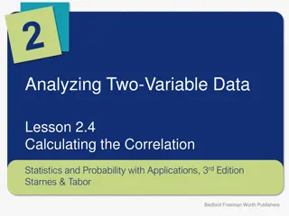
Analyzing One-Variable Data Lesson 1.8 Summarizing Quantitative Data: Boxplots and Outliers Statistics and Probability with Applications, 3rdEdition Starnes & Tabor Bedford Freeman Worth Publishers
Boxplots and Outliers Learning Targets After this lesson, you should be able to: Use the 1.5 x IQR rule to identify outliers. Make and interpret boxplots of quantitative data. Compare distributions of quantitative data with boxplots. Statistics and Probability with Applications, 3rd Edition 2
Boxplots and Outliers Barry Bonds set the major league record by hitting 73 home runs in a single season in 2001. The dotplot below shows the number of home runs that Bonds hit in each of his 21 complete seasons: Bonds s 73 home run season stands out (in red) from the rest of the distribution. Should this value be classified as an outlier? Statistics and Probability with Applications, 3rd Edition 3
Boxplots and Outliers Besides serving as a measure of variability, the interquartile range (IQR) is used as a ruler for identifying outliers. The 1.5 x IQR Rule Call an observation an outlier if it falls more than 1.5 IQR above the third quartile or below the first quartile. That is, Low Outliers < Q1 1.5 IQR High Outliers > Q3 + 1.5 IQR Statistics and Probability with Applications, 3rd Edition 4
How thin is that tablet? How thin is that tablet? Identifying outliers Identifying outliers PROBLEM: In a recent year, Consumer Reports rated many tablet computers for overall performance and quality. One variable measured was the depth (thickness) of each tablet in inches. The depths of the 23 tablets (in inches) produced by Samsung are given below. 0.32 0.30 0.30 0.33 0.33 0.27 0.33 0.39 0.33 0.48 0.33 0.32 0.27 0.38 0.31 0.38 0.33 0.37 0.33 0.39 0.34 0.39 0.32 Identify any outliers in the distribution. Show your work. To use the 1.5 IQR rule, you have to find the first and third quartiles. Start by sorting the data in increasing order. Then follow the method of Lesson 1.7. Q1 = 0.32 0.27 0.33 0.27 0.33 0.30 0.33 0.30 0.34 0.31 0.37 0.32 0.38 0.32 0.38 0.32 0.39 0.33 0.39 0.33 0.39 0.33 0.48 0.33 Median = 0.33 Q3 = 0.38 Statistics and Probability with Applications, 3rd Edition 5
How thin is that tablet? How thin is that tablet? Identifying outliers Identifying outliers Q1 = 0.32 0.27 0.33 0.27 0.33 0.30 0.33 0.30 0.34 0.31 0.37 0.32 0.38 0.32 0.38 0.32 0.39 0.33 0.39 0.33 0.39 0.33 0.48 0.33 Median = 0.33 Q3 = 0.38 Now find the IQR. IQR = Q3 Q1 = 0.38 0.32 = 0.06 Finally, calculate the lower and upper cutoff values for outliers. Outliers < Q1 1.5 IQR = 0.32 1.5 Outliers > Q3 + 1.5 IQR = 0.38 + 1.5 Because there are no data values less than 0.23 and one data value greater than 0.47, this distribution has one outlier. The tablet that is 0.48 inches thick is considered to be an outlier by the 1.5 x IQR rule. 0.06 = 0.23 0.06 = 0.47 Statistics and Probability with Applications, 3rd Edition 6
Boxplots and Outliers It is important to identify outliers in a distribution for several reasons: They might be inaccurate data values. 1. 2. They can indicate a remarkable occurrence. 3. They can heavily influence the values of some summary statistics, like the mean, range, and standard deviation. Statistics and Probability with Applications, 3rd Edition 7
Boxplots and Outliers You can use a dotplot, stemplot, or histogram to display the distribution of a quantitative variable. Another graphical option for quantitative data is a boxplot (sometimes called a box-and-whisker plot). A boxplot summarizes a distribution by displaying the location of 5 important values within the distribution, known as its five-number summary. Five-Number Summary, Boxplot The five-number summary of a distribution of quantitative data consists of the minimum, the first quartile Q1, the median, the third quartile Q3, and the maximum. A boxplot is a visual representation of the five-number summary. Statistics and Probability with Applications, 3rd Edition 8
Boxplots and Outliers A boxplot is a visual representation of the five-number summary. How to Make a Boxplot 1. Find the five-number summary for the distribution. 2. Draw and label the axis. Draw a horizontal axis and put the name of the quantitative variable underneath. 3. Scale the axis. Look at the smallest and largest values in the data set. Start the horizontal axis at a number equal to or below the smallest value and place tick marks at equal intervals until you equal or exceed the largest value. 4. Draw a box that spans from the first quartile (Q1) to the third quartile (Q3). 5. Mark the median with a vertical line segment that s the same height as the box. 6. Identify outliers using the 1.5 IQR rule. 7. Draw whiskers lines that extend from the ends of the box to the smallest and largest data values that are not outliers. Mark any outliers with a special symbol such as an asterisk (*). Statistics and Probability with Applications, 3rd Edition 9
Boxplots and Outliers The top dotplot in the figure below shows Barry Bonds s home run data. The first quartile, the median, and the third quartile are marked with lines. The process of testing for outliers with the 1.5 IQR rule is shown in red. Because there are no outliers, we draw the whiskers to the maximum and minimum data values, as shown in the finished boxplot at the bottom of the figure. Statistics and Probability with Applications, 3rd Edition 10
Whats a What s a plumpkin Making and interpreting a boxplot Making and interpreting a boxplot PROBLEM: Some students purchased pumpkins for a carving contest. Before the contest began, they weighed the pumpkins. The weights in pounds are shown below: 3.6 4.0 9.6 14.0 11.0 12.4 12.7 6.0 2.8 9.6 4.0 6.1 plumpkin? ? 13.0 5.4 2.0 11.9 6.0 5.4 6.6 31.0 15.0 33.0 3.4 (a) Make a boxplot to display the data. Start by sorting the data values from smallest to largest. Then find the five-number summary. Q1 = 4.0 2.0 9.6 2.8 9.6 3.4 11.0 3.6 11.9 4.0 12.4 4.0 12.7 5.4 13.0 5.4 14.0 6.0 15.0 6.0 31.0 6.1 33.0 6.6 Median = 6.6 Q3 = 12.7 Statistics and Probability with Applications, 3rd Edition 11
Whats a What s a plumpkin Making and interpreting a boxplot Making and interpreting a boxplot plumpkin? ? Q1 = 4.0 2.0 9.6 2.8 9.6 3.4 11.0 3.6 11.9 4.0 12.4 4.0 12.7 5.4 13.0 5.4 14.0 6.0 15.0 6.0 31.0 6.1 33.0 6.6 Median = 6.6 Q3 = 12.7 Check for outliers. IQR = Q3 Q1 = 12.7 4.0 = 8.7 Low Outliers < Q1 1.5 High Outliers > Q3 + 1.5 The pumpkins that weighed 31.0 and 33.0 pounds are outliers. Draw the graph. IQR = 4.0 1.5 IQR = 12.7 + 1.5 8.7 = 9.05 8.7 = 25.75 Statistics and Probability with Applications, 3rd Edition 12
Whats a What s a plumpkin Making and interpreting a boxplot Making and interpreting a boxplot plumpkin? ? (b) The farmer who grew these pumpkins told the students that the pumpkins from his farm weighed 14 pounds on average. Does the graph in (a) give convincing evidence that the students were cheated? Explain. No. From the boxplot, Q3 = 12.7, so about 75% (or more) of this sample of pumpkins weigh less than 14 pounds. This is pretty convincing evidence that the farmer s pumpkins that are less than 14 pounds, on average. Statistics and Probability with Applications, 3rd Edition 13
Boxplots and Outliers Boxplots provide a quick summary of the center and variability of a distribution. Boxplots do not display each individual value in a distribution. And boxplots don t show gaps, clusters, or peaks. Statistics and Probability with Applications, 3rd Edition 14
Boxplots and Outliers Boxplots are especially effective for comparing the distribution of a quantitative variable in two or more groups. Statistics and Probability with Applications, 3rd Edition 15
Which company makes a better tablet? Which company makes a better tablet? Comparing distributions with boxplots Comparing distributions with boxplots PROBLEM: In a recent year, Consumer Reports rated many tablet computers for overall performance and quality. Based on several variables, they gave each tablet an overall rating, where higher scores indicate better ratings. The overall ratings of the tablets produced by Apple and Samsung are given below: 87 84 88 77 87 84 87 76 87 83 87 76 87 83 86 75 86 83 86 75 86 83 86 75 86 81 86 75 86 79 86 75 84 76 84 74 84 73 84 71 Apple 83 62 83 Samsung Parallel boxplots of the data and numerical summaries are shown below. ? ?? Min 73 62 Q1 83 75 Median 84 83 Q3 86 86 Max 87 88 IQR 3 11 Apple Samsung 83.45 79.87 3.762 6.74 Compare the overall rating distributions for Apple and Samsung. Statistics and Probability with Applications, 3rd Edition 16
Which company makes a better tablet? Which company makes a better tablet? Comparing distributions with boxplots Comparing distributions with boxplots Due to the strong skewness and outliers, use the median and IQR instead of the mean and standard deviation when comparing center and variability. Shape: Both distributions of overall ratings are strongly left-skewed. Outliers: There are two low outliers in the Apple tablet distribution: overall ratings of 73 and 76. On the other hand, the Samsung tablet distribution has no outliers. Center: The Apple tablets had a slightly higher overall rating (median = 84) than the Samsung tablets (median = 83). Spread: There is much more variation in overall rating among the Samsung tablets than the Apple tablets. The IQR for Samsung tablets (11) is almost four times larger than the IQR for Apple tablets (3). Statistics and Probability with Applications, 3rd Edition 17
LESSON APP 1.8 Which is best at reducing stress? If you are a dog lover, having your dog with you may reduce your stress level. Does having a friend with you reduce stress? To examine the effect of pets and friends in stressful situations, researchers recruited 45 women who said they were dog lovers. Fifteen women were assigned at random to each of three groups: to do a stressful task (1) alone, (2) with a good friend present, or (3) with their dogs present. The stressful task was to count backward by 13s or 17s. The woman s average heart rate during the task was one measure of the effect of stress. The following table shows the data. 1. Identify any outliers in the three groups. Show your work. 2. Make parallel boxplots to compare the heart rates of the women in the three groups. 3. Based on the data, does it appear that the presence of a pet or friend reduces heart rate during a stressful task? Justify your answer. Statistics and Probability with Applications, 3rd Edition 18
LESSON APP 1.8 Which is best at reducing stress? Statistics and Probability with Applications, 3rd Edition 19
LESSON APP 1.8 Which is best at reducing stress? Statistics and Probability with Applications, 3rd Edition 20
Boxplots and Outliers Learning Targets After this lesson, you should be able to: Use the 1.5 x IQR rule to identify outliners. Make and interpret boxplots of quantitative data. Compare distributions of quantitative data with boxplots. Statistics and Probability with Applications, 3rd Edition 21