Analyzing Two-Variable Data in Statistics and Probability
This content delves into analyzing relationships between two quantitative variables in statistics and probability, focusing on distinguishing between explanatory and response variables, creating scatterplots, and interpreting the strength and form of relationships displayed. It emphasizes the importance of scatterplots in showcasing relationships between variables, with examples such as the correlation between diamond weight and price. Additionally, it addresses identifying explanatory variables in different scenarios, like study time versus extracurricular activities and house price versus living space. The material aims to enhance understanding of quantitative data analysis and visualization techniques.

Download Presentation

Please find below an Image/Link to download the presentation.
The content on the website is provided AS IS for your information and personal use only. It may not be sold, licensed, or shared on other websites without obtaining consent from the author. Download presentation by click this link. If you encounter any issues during the download, it is possible that the publisher has removed the file from their server.
E N D
Presentation Transcript
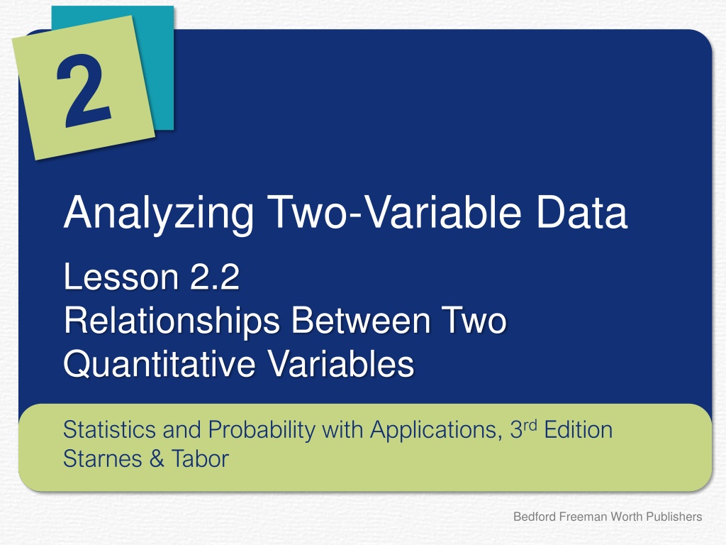
Analyzing Two-Variable Data Lesson 2.2 Relationships Between Two Quantitative Variables Statistics and Probability with Applications, 3rdEdition Starnes & Tabor Bedford Freeman Worth Publishers
Relationships Between Two Quantitative Variables Learning Targets After this lesson, you should be able to: Distinguish between explanatory and response variables for quantitative data. Make a scatterplot to display the relationship between two quantitative variables. Describe the direction, form, and strength of a relationship displayed in a scatterplot, and identify outliers. Statistics and Probability with Applications, 3rdEdition 2 2
Relationships Between Two Quantitative Variables Although there are many ways to display the distribution of a single quantitative variable, a scatterplot is the best way to display the relationship between two quantitative variables. Scatterplot A scatterplot shows the relationship between two quantitative variables measured on the same individuals. The values of one variable appear on the horizontal axis, and the values of the other variable appear on the vertical axis. Each individual in the data set appears as a point in the graph. Statistics and Probability with Applications, 3rdEdition 3 3
Relationships Between Two Quantitative Variables Here is a scatterplot showing the relationship between the weight (in carats) and price (in $1000s) for 95 different round, clear, internally flawless, and excellently cut diamonds. It is fairly easy to make a scatterplot by hand. The first step is to determine which variable is the response variable and which variable is the explanatory variable. However, in some cases there isn t a clear explanatory or response variable. Statistics and Probability with Applications, 3rd Edition 4 4
What grade would you give this house? What grade would you give this house? Identifying explanatory variables Identifying explanatory variables PROBLEM: Identify the explanatory variable for the following relationships if possible. Explain your reasoning. (a) The average hours of study time per week and the average hours of extracurricular activities per week for a sample of students. The explanatory variable could be either the average hours of study time per week or the average hours of extra-curricular activities per week, because either variable could be used to explain or predict the other. (b) The square footage of living space and the price in a sample of houses for sale. The explanatory variable is the square footage of living space, because the square footage of living space in a house helps explain its price. Statistics and Probability with Applications, 3rd Edition 5 5
Relationships Between Two Quantitative Variables How to Make a Scatterplot 1. Label the axes. The explanatory variable is plotted on the horizontal axis and the response variable is plotted on the vertical axis. If there is no explanatory variable, either variable can go on the horizontal axis. 2. Scale the axes. Put the name of the explanatory variable under the horizontal axis and place equally spaced tick marks along the axis beginning at a friendly number just below the smallest value of the explanatory variable and continuing until you exceed the largest value. Do the same for the response variable along the vertical axis. 3. Plot individual data values. For each individual, plot a point directly above that individual s value for the explanatory variable and directly to the right of that individual s value for the response variable. Statistics and Probability with Applications, 3rd Edition 6 6
Weight training Weight training Making a scatterplot Making a scatterplot PROBLEM: The table shows the number of pounds that 10 students in Gary Lang s weight training class could bench press and squat. Make a scatterplot to display the relationship between the bench press and squat weights for this sample. Bench press (pounds) 95 111 113 125 135 145 165 180 180 196 95 111 Squat (pounds) 141 208 100 218 284 275 338 338 420 420 141 208 SOLUTION: It s unclear if the bench press weight or the squat weight is the explanatory variable. Thus, a scatterplot showing bench press versus squat or showing squat versus bench press could be created. 200 450 400 180 Bench press weight (pounds) 350 Squat weight (pounds) 160 300 140 250 200 120 150 100 100 100 150 200 250 300 350 400 450 100 120 140 160 180 200 Squat weight (pounds) Bench press weight (pounds) Statistics and Probability with Applications, 3rd Edition 7 7
Relationships Between Two Quantitative Variables How to Describe a Scatterplot To describe a scatterplot, make sure to address the following four characteristics in the context of the data: Direction: A scatterplot can show a positive association, negative association, or no association. In a positive association, above-average values of the explanatory variable tend to be paired with above-average values of the response variable and below-average values tend to be paired with below-average values. In a negative association, above-average values of the explanatory variable tend to be paired with below-average values of the response variable and vice-versa. Form: A scatterplot can show a linear form or a nonlinear form. The form is linear if the overall pattern follows a straight line. Otherwise, the form is nonlinear. Strength: A scatterplot can show a weak, moderate, or strong association. An association is strong if the points don t deviate much from the form identified. An association is weak if the points deviate quite a bit from the form identified. Outliers: Individual points that fall outside the overall pattern of the relationship. Statistics and Probability with Applications, 3rd Edition 8 8
How fast are barefoot runners and how long can you expect to live? How fast are barefoot runners and how long can you expect to live? Describing a scatterplot Describing a scatterplot PROBLEM: Scatterplot (a) displays the time in seconds to run the 40-meter dash without shoes versus the time to run the same distance with shoes for a sample of 82 high school students. The data were collected from the website http://www.gapminder.org. Describe the relationships shown in the scatterplot. Outliers: There are two noticeable outliers in the data. One student had a time of around 8.4 seconds with shoes and around 5.9 seconds without shoes. The second outlier is a student who had a time of around 10.4 seconds with shoes and around 8.3 seconds without shoes. Direction: There is a positive association between time with shoes and time without shoes for this sample of students. Students who took longer to run 40 meters with shoes also took longer to run 40 meters without shoes. Form: There is a linear pattern in the scatterplot. That is, the overall pattern follows a straight line. Strength: Because the points do not vary much from the linear pattern, the association is strong. 11 10 Time without shoes (sec) 9 8 7 6 5 6 7 8 9 10 11 Time with shoes (sec) Statistics and Probability with Applications, 3rd Edition 9 9
How fast are barefoot runners and how long can you expect to live? How fast are barefoot runners and how long can you expect to live? Describing a scatterplot Describing a scatterplot PROBLEM: Scatterplot (b) displays the life expectancy (in years) and income per person (in dollars) for 179 countries in a recent year. The data were collected from the website http://www.gapminder.org. Describe the relationships shown in the scatterplot. Direction: There is a positive association between life expectancy and income per person. Countries with longer life expectancies tended to greater incomes per person, and vice versa. Form: There is a curved (nonlinear) pattern in the scatterplot. Strength: Because the points do not vary much from the curved pattern, the association is strong. 85 80 75 Life expectancy (yrs) 70 65 60 55 50 0 10000 20000 30000 40000 50000 60000 70000 80000 90000 Income per person ($) Statistics and Probability with Applications, 3rd Edition 10 10
LESSON APP 2.2 More sugar, more calories? Is there a relationship between the amount of sugar (in grams) and the number of calories in movie-theater candy? Here are the data from a sample of 12 types of candy. 1. Make a scatterplot to display the relationship between amount of sugar and the number of calories in movie-theater candy. Describe the relationship show in the scatterplot. 2. Statistics and Probability with Applications, 3rd Edition 11 11
LESSON APP 2.2 More sugar, more calories? 1. Make a scatterplot to display the relationship between amount of sugar and the number of calories in movie-theater candy. Statistics and Probability with Applications, 3rd Edition 12 12
LESSON APP 2.2 More sugar, more calories? 2. Describe the relationship show in the scatterplot. Statistics and Probability with Applications, 3rd Edition 13 13
Relationships Between Two Quantitative Variables Learning Targets After this lesson, you should be able to: Distinguish between explanatory and response variables for quantitative data. Make a scatterplot to display the relationship between two quantitative variables. Describe the direction, form, and strength of a relationship displayed in a scatterplot, and identify outliers. Statistics and Probability with Applications, 3rd Edition 14 14