Mastering Presentation Charts for Strategy Consultants

Effective communication of complex business ideas and recommendations through clear and concise presentations is crucial for strategy consultants. This toolkit focuses on utilizing powerful charts and visuals to convey strategic insights, starting from categorizing markets to drilling down into specific details.
- Strategy Consultants
- Presentation Charts
- Data Visualization
- Strategic Insights
- Business Communication

Download Presentation

Please find below an Image/Link to download the presentation.
The content on the website is provided AS IS for your information and personal use only. It may not be sold, licensed, or shared on other websites without obtaining consent from the author. Download presentation by click this link. If you encounter any issues during the download, it is possible that the publisher has removed the file from their server.
E N D
Presentation Transcript
STRATEGY CONSULTANTS TOOLKIT SELLING YOUR IDEAS WITH POWERFUL CHARTS
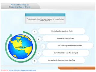
Introduction In order to communicate complex business ideas and recommendations, a presentation needs to be clear, concise, and easily understood Strategy consultants do that by telling a story, most commonly through presentations These presentations are normally data-driven and chart-centric But making data easy to understand is HARD This presentation will highlight the charts and visuals that top consulting firms and corporate strategists use to make their strategic insights clear and understood 2
Dividing up the Market 80% of revenue comes from the 5 largest verticals. Many business presentations start with a review of the current status quo So it is common to ask: How do I divide the client s market or how to I categorize my client's revenues or costs? A simple single 100% stacked bar is a good way to categorize markets, revenues or costs. Make sure the categories are MECE Mutually Exclusive and Collectively Exhaustive. If there are more than 10 categories, group some together or group the smaller ones in Other. In all slides with charts, include a tag line to present the key message, like the one to the left. 3
Drilling Down Once you have an overall sense of the market, you will often want to drill down into the details for a specific market, competitor or expense category. Charts are easiest to understand when you have 5-7 categories. Drilling down allows you to explode a specific category one more level. 4
Drilling Down Exploding a Category If there are more than 10 categories that are important or there s one key category that you want to subdivide, use a second bar to explode a category from the first bar. Use color to further highlight a key category. 5
Drilling Down with Multiple Charts FY 2012 National Expenditures FY 2012 Eastern Regional Expenditures General liability and participant accident insurance premiums 354 USAA Alpine staff and race support 264 Other USSA-provided services 148 1,186 Coaches' education administration 126 Ski Racing Magazine 77 US Ski Team pipeline dev. costs 81 General USSA admin 136 Regional staff operations and development 187 Coaches education 42 Other services 35 434 Payments to FIS on behalf of regions 44 Championships, NDS, and race supplies 126 Use multiple charts on one slide to divide a measure along a key dimension. In this case, we have expenses by region on the left. The horizontal stacked bars on the right provide the detail for the measure. In this case, we have expenses broken out in the largest region. 6 Source: http://media.ussa.org/Public/Communications/2013/McKinseyStudy.pdf
Adding More Measures So far, we ve looked at one key measure along a single dimension For example, revenue by vertical market or expenses by region. Add a second measure to examine both number of customers and total customer revenue by region or vertical market Add a second dimension to examine revenue by region and vertical market in the same chart. You can even add a third dimension to examine sales compared to both price and performance. 7
Dividing the Market With Two Measures One measure is often not enough. You can use two bars for related measures. In this example, the financial services vertical has high revenue relative to the number of customers and the chart highlights a potentially profitable sector. 8
Dividing the Market Along Two Dimensions If you need to look at two dimensions in depth, the Marimekko chart allows you turn multiple charts into a single graphic. Keep the number of categories for each dimension under 10 and make sure they are MECE. Again, use color to highlight opportunities. 9
Adding a 3rd DimensionPrice, Performance and Sales Use a bubble chart to compare your products to each other or to competitor products with respect to price and a key performance dimension. Price is on the Y axis. A key product characteristic (e.g., horsepower, size, efficiency) is on the X axis. The bubble size captures sales in units or dollars. The chart can help identify opportunities for new products or pricing changes. 10
Moving On To Trends We ve looked at one dimension and multiple dimensions, but our first few charts still only provided a snapshot of a single point in time, which as noted is where you will often start your story. However your story might next move on to illustrate trends over time and this gets harder to illustrate in most chart types, particularly when you have multiple dimensions. 11
Tracking Trends Over Time One solution is the multiple stacked bar chart, which shows growth in each category. Note we have also included a CAGR column to the right to show annual growth in each category plus total growth in year 1 to 4 across the top. 12
Showing Mix Change Over Time The 100% stacked bar we used before for two related measures, can also be used as it is shown above to show product or revenue mix changes over time. The comparison lines highlight individual changes. Include start and end year or all years in the chart. Use highlight colors to focus on large percentage gains or losses. 13
And Projections? Projections are a variation of trends. However, it can be useful to use slightly different charts to keep your presentation livelier and hence more compelling. 14
Projected Growth Versus Market Size Like the Marimekko, the Bar-Mekko shows two dimensions, for example market growth and market size. The bar widths are proportional to the value in the data row. 15
Estimate the Impact of Proposed Changes Or you can show the impact of proposed changes in a Cascade chart. Start with current state, add a bar for each change and use multiple total bars to show changes over multiple years. 16
And Non-Numeric Data? Some data you will want to use to communicate your story may not lend itself to being expressed in numbers as easily. But with some creativity, data can often be re-imagined as a chart that is far clearer than mere numbers. 17
Displaying Customer Feedback Q: What is your overall satisfaction with the company? (1-10; 10 = very satisfied) Commentary If I don't see a lot of returns here in purchasing, if there are no headaches, and if teachers keep going back to the supplier, it's a 10 as far as I'm concerned. I give them a 10 because we have an excellent contact, Shirley. She is there anytime we need something. She helps us stay in our price range and accomplish what we set out to do. You don't get that kind of service anymore. It makes people want to go back and spend more money. She makes us feel like we're #1. They have excellent customer service. When we were just starting up, they helped us select equipment, cleared up some delivery issues, and even came over and helped us open boxes. That was invaluable to us. Well, they are definitely cheaper than other suppliers, but that's both in price and product quality. It doesn't do us any good to have to return half of what we purchased. For example, use a page horizontal stacked bar to show customer feedback. You can show the distribution of answers for a specific question or the answers on several questions and then use the right half of the slide to display key quotes. 18
Summarizing Findings in a Table Figure Skating Skiing Swimming Gymnastics Cycling Fencing 21 of 120 (18%) 31 of 102 (30%) US Medals 6 of 42 (14%) 2 of 12 (17%) 4 of 55 (7%) 1 of 30 (3%) Multi-sport Club sport NCAA sport $30M Total Revenue, $M $24M $18M $13M $12M $5M 353K Membership, 000s 173K 125K 71K 40K 20K Revenue per member, $pp $604 $262 $163 $144 $85 $76 Tables are great for comparing business units along a set of dimensions. Use check boxes or Harvey Balls (stoplights) to show whether the dimension (e.g., NCAA sport) applies to the business (e.g., skiing). Add simple bar charts to mix qualitative and quantitative data in the same table. 19 Source: http://media.ussa.org/Public/Communications/2013/McKinseyStudy.pdf
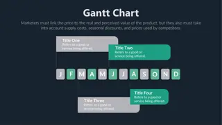
Plan Your Engagement With a Gantt Chart Month1 Month2 Month3 Month4 Task W1 W2 W3 W4 W5 W6 W7 W8 W9 W10W11W12W13W14W15W16 Design Meet with users Write document Build Code Integrate QA Internal Test User Test Reviews Use a simple one slide Gantt chart to communicate your project plan to your clients. Multiple level tasks allow you to show project details. Add milestones for key meetings or review points. 20
More Presentation Examples Bain & Company M&A Report 2020 Global Diamond Industry Report 2017 Achieving Operational Excellence at University of California Berkeley Boston Consulting Group Luxury Global Consumer Insights Economic Impact of the Media Industry in New York City Corporate Ventures in Sweden McKinsey & Company The Future of Healthcare US Postal Service Future Business Model Electricity Efficiency in the UK 21
Get Mekko Graphics Mekko Graphics is available as an annual subscription and you can try the software FREE for 30 days. It is the perfect opportunity to try before you buy You can license for a single person or your entire organization Download your free trial 22