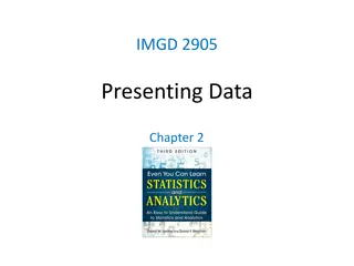
Best Practices for Effective Data Presentation in Charts
Present data effectively using visual charts and graphs by following principles such as using gentle colors, using fewer figures, avoiding cramped slides, and utilizing bar and plot charts for easy data comparison. Make sure to consider color choices, digit simplification, slide spacing, and data clarity for better communication.
Uploaded on Sep 17, 2024 | 0 Views
Download Presentation

Please find below an Image/Link to download the presentation.
The content on the website is provided AS IS for your information and personal use only. It may not be sold, licensed, or shared on other websites without obtaining consent from the author. Download presentation by click this link. If you encounter any issues during the download, it is possible that the publisher has removed the file from their server.
E N D
Presentation Transcript
Practical Principles on Presenting Data in Charts Present data in visual charts and graphs for more effective communication. Help the Eye Compare Data Easily 1 Use Gentle Color in Charts 2 Use Fewer Figures Whenever possible Principles on Presenting Data in Charts 3 Don't Make Slides Look Too Cramped 4 Comparison in Column is Easier than Row 5 Author Created by Edraw All-in-one Diagramming Software
Help the Eye Compare Data Easily Judging relative height is easier than width. As regard to data comparison, bar charts and plot charts are optimal choices. 100 90 80 80 72 60 53 40 33 20 Created by Edraw All-in-one Diagramming Software
Use Gentle Color in Charts colors applied should be eye- friendly. Avoid excessive color contrast, which can make eyes feel uncomfortable. To distinguish different series, use differentiated colors because eyes are highly attentive to colors. Generally, corporate audiences favor conservative and inoffensive color. Category 1 Category 2 Category 3 Category 4 Category 5 Category 1 Category 2 Category 3 Category 4 Category 5 120 120 240 240 120 120 120 120 120 120 Created by Edraw All-in-one Diagramming Software
Use Fewer Figures Whenever Possible Too many digits will make the brain and eye feel tired soon. Analyze and prune data before presenting. Use unit to simplify numbers on axis. For those large value numbers, present them in breviary format which is easier to recognize. Normal format Breviary format 19,000,000 19 million See an example in the next page. Created by Edraw All-in-one Diagramming Software
Don't Make Slides Look Too Cramped Remember that you are allowed to use more slides. Apply minimalism method. Put less words in slides. The audience will also feel overloaded if there are too much information in 1 slide. Less is more. < = > Created by Edraw All-in-one Diagramming Software
United States Average Wedding Cost in 2015 $12K Statistics show that the average wedding costs a whopping $25,200 in 2015. In these difficult economic times, it is NOT only the bride and groom are paying the price. $10K Till Debt Do Us Part! Breviary format data looks concise and are easy to recognize. $8K Weddings are expensive for all people involved. $6K 11.23K $4K $2K 3.92K 2.67K 1.61K 1.54K 1.51K 1.23K 817 641 124 Slanting texts leave more space.
Comparison in Column is Easier than Row When comparing numbers in a row, eyes have to move back and forth. right alignment is the "right" alignment for digits. If presented in a row and right justified, eyes can identify value difference easily by glancing at the length of digits. Category 1 159865 Category 1 159865 Category 2 89666 Category 2 89666 Category 3 72563 Category 3 72563 Category 4 352 Category 4 352 Created by Edraw All-in-one Diagramming Software


