Pie Chart Construction and Interpretation Tips

Learn how to draw pie charts, understand important data vocabulary, and analyze pie chart results with practical examples. Explore ways to present and measure data effectively using pie charts. Discover online resources for drawing pie charts even without a compass or protractor. Gain insights into displaying survey results in pie charts and interpreting the data accurately.

Download Presentation

Please find below an Image/Link to download the presentation.
The content on the website is provided AS IS for your information and personal use only. It may not be sold, licensed, or shared on other websites without obtaining consent from the author. Download presentation by click this link. If you encounter any issues during the download, it is possible that the publisher has removed the file from their server.
E N D
Presentation Transcript
Drawing Pie Charts If any of the links don t work: 1) Right click on the image and go to open hyperlink 2) Copy the address and paste it into the address bar on the internet 3) Google it! We ve included the image so you will be able to find it more easily.
Presenting and Measuring Data Important vocabulary to learn for the week! Click to check you know the definition. Data Information that has been collected by counting or measuring. Scale Points on the axis with equal intervals. Axis A graph has two perpendicular lines (lines at right angles). The horizontal axis is called the x-axis. The vertical axis is called the y-axis. Graph A diagram showing data. Frequency The number of times an event occurs. Line graph A graph where straight lines join points together to show the data. Average Loosely means an ordinary or typical value. There are 3 types of average that we learn about: mean, median and mode. When just the word average is used, it refers to the mean. Mean The sum of a set of numbers, or quantities, divided by the number of terms in the set. Example: The arithmetic mean of 5, 6, 14, 15 and 45 is (5 + 6 + 14 + 15 + 45) 5 i.e. 17. Pie Chart Also known as pie graph. A form of presentation of data. Within a circle, sectors like slices of a pie represent the quantities involved.
How to draw pie charts click on the picture! Don t worry if you haven t got a compass or protractor - there s an online method too! Drawing pie charts, Maths Explained - https://www.youtube.com/watch?v=p_nPxTRuLxo
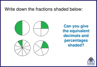
Use your knowledge to explain what is happening here. Pie Charts What is your favourite Quality Street? Sweet Results Degrees Degrees X 20 My Results 100 Strawberry Cream 5 Strawberry cream Orange cream 60 Orange Cream 3 Purple hazelnut Green triangle 120 Purple Hazelnut 6 Toffee ??? ?? = 20 40 Green Triangle 2 360 40 Other 2 X 20 TOTAL 18
Watch the following 3 slides to see how pie charts can be constructed. Try and work out what the numbers will be as you go along. When you have finished looking at the slides, you can make a pie chart of your own. Hints about how are on the last slide! In a survey, people were asked to indicate which one of the pies they liked the best. The information is given in the table. Display the information in a pie chart. 90 + + + + 72 PORK 66 APPLE . 108 BANOFFEE 24 360 60 TOTAL = CHOCOLATE 360 in a full turn
1) In a survey, people were asked to indicate which one of the subjects they liked the best. The information is given in the table. Display the information in a pie chart. 120 + + + + 70 MATHS 80 ENGLISH . 40 50 OTHER 360 36 TOTAL = SCIENCE 360 in a full turn
2) In a survey, people were asked to indicate their favourite pet. The information is given in the table. Display the information in a pie chart. 110 + + + + 120 CAT 80 . 30 DOG 20 360 36 TOTAL = FISH 360 in a full turn
Use one of the slides of data to create your own pie chart.* You could: use a compass to draw a circle and then a protractor to work out the degrees Use one of the circles in the folder and use a protractor to work out the degrees Follow the link on the next page to draw a pie chart on line * (Or you could collect some of your own data if you want an extra challenge. If you do this, it will be easier if the number of people that you ask is a factor of 360 .)
Kids Zone Create a Graph - https://nces.ed.gov/nceskids/graphing/Classic/pie.asp Click here! List the choices. For example: cats, dogs, rabbits etc For example: pies, subjects or pets How many people chose it


 In a survey, people were asked to indicate which one of")
 In a survey, people were asked to indicate their")