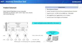
Anomaly Detection Using Process Behavior Charts
Explore the philosophy behind understanding variation and key principles in anomaly detection using process behavior charts. Learn about preparing data, creating SAS charts, running tests for special causes, and executing a plan for anomaly detection and reporting processes. The material draws heavily from Walter Shewhart's work and emphasizes the importance of analyzing and interpreting data for effective decision-making.

Download Presentation

Please find below an Image/Link to download the presentation.
The content on the website is provided AS IS for your information and personal use only. It may not be sold, licensed, or shared on other websites without obtaining consent from the author. Download presentation by click this link. If you encounter any issues during the download, it is possible that the publisher has removed the file from their server.
E N D
Presentation Transcript
Anomaly Detection Using Process Behavior Charts Jeff LaMar 2023 Iowa & Nebraska SAS Users Group May 22, 23
Topics Covered Philosophy of Understanding Variation & Key Principals Process Behavior Chart Overview Why three-sigma limits How to prepare data for charting in SAS How to Utilize SAS for Process Behavior Charts - Example charts Proc Shewhart SAS options 2
Topics Covered Creating output and input SAS data sets from charts Run Tests for special causes Proc Shewhart Code Snippet Cheat Sheets How to execute a plan for Anomaly Detection and Reporting Processes with multiple phases 3
Philosophy of Understanding Variation & Key Principals Notes: Much of this material can be attributed to Walter Shewhart. He was often known as the father of statistical quality control and introduced the concept that data can contain both signal and noise. Walter A. Shewhart Wikipedia In addition, many discussion points were obtained from the book: Understanding Variation the Key to Managing Chaos 2nd Ed. By Donald J. Wheeler Concepts Before information can be useful, it must be analyzed, interpreted, and assimilated. In short, raw data has to be digested before it can be useful No comparison between two values can be global. A simple comparison between the current figure and some previous value cannot fully capture and convey the behavior of any time series. Yet, comparisons to the current value to a previous value are the most common type of comparison encountered See a snapshot from a typical Production Report on next page: 4
Philosophy of Understanding Variation & Key Principals Production History - LaMar Drum Sticks Time Base: Shift, All Shifts 5A Nylon Tip Date Shift Part Number 7/1/2022 Shift 1 5A Nylon Tip 7/1/2022 Shift 1 5A Nylon Tip 7/1/2022 Shift 1 5A Nylon Tip 7/1/2022 Shift 2 5A Nylon Tip 7/1/2022 Shift 2 5A Nylon Tip 7/1/2022 Shift 2 5A Nylon Tip 7/1/2022 Shift 3 5A Nylon Tip 7/1/2022 Shift 3 5A Nylon Tip 7/1/2022 Shift 3 5A Nylon Tip 7/2/2022 Shift 1 5A Nylon Tip 7/2/2022 Shift 1 5A Nylon Tip 7/2/2022 Shift 1 5A Nylon Tip 7/2/2022 Shift 2 5A Nylon Tip 7/2/2022 Shift 2 5A Nylon Tip 7/2/2022 Shift 2 5A Nylon Tip 7/2/2022 Shift 3 5A Nylon Tip 7/2/2022 Shift 3 5A Nylon Tip 7/2/2022 Shift 3 5A Nylon Tip 7/3/2022 Shift 1 5A Nylon Tip 7/3/2022 Shift 1 5A Nylon Tip 7/3/2022 Shift 1 5A Nylon Tip Start Date: 07/01/2022 End Date: 07/03/2022 Total Sticks Good Stick % Defect % 1,267 91.2 1,291 88.9 2,558 90.0 843 91.2 1,460 95.3 2,303 93.8 811 93.6 1,101 87.0 1,912 89.9 1,273 94.3 1,580 94.9 2,853 94.7 251 82.9 570 90.0 821 87.8 1,114 88.7 1,430 93.1 2,544 91.2 1,351 92.7 1,348 92.2 2,699 92.6 Machine Grinder 1 Grinder 2 Total Grinder 1 Grinder 2 Total Grinder 1 Grinder 2 Total Grinder 1 Grinder 2 Total Grinder 1 Grinder 2 Total Grinder 1 Grinder 2 Total Grinder 1 Grinder 2 Total Good Sticks Up time % Down time % 77.2 85.8 81.5 65.0 94.2 79.6 63.4 77.0 70.2 78.3 87.6 83.0 43.3 55.1 49.2 69.9 87.7 78.8 79.1 87.9 83.5 1,155 1,148 2,303 769 1,391 2,160 759 960 1,719 1,201 1,500 2,701 208 513 721 988 1,332 2,320 1,252 1,246 2,498 8.8 11.1 10.0 8.8 4.7 6.2 6.4 13.0 10.1 5.7 5.1 5.3 17.1 10.0 12.2 11.3 6.9 8.8 7.3 7.8 7.4 22.8 14.2 18.5 35.0 5.8 20.4 36.6 23.0 29.8 21.7 12.4 17.1 56.7 44.9 50.8 30.1 12.3 21.2 20.9 12.1 16.5 Good? Bad? Can you tell what s going on here with just a glance? On 7/2, shift 1 produced 2,701 good sticks and then produced 2,498 on 7/3. Can you really make an accurate assessment based on just those two data points? Should shift 1 get scolded for their performance on 7/2? 5
Philosophy of Understanding Variation & Key Principals Concepts Good Drumsticks Production Totals Day: 7/1/2022 7/2/2022 7/3/2022 7/4/2022 7/5/2022 7/6/2022 7/7/2022 7/8/2022 7/9/2022 7/10/2022 7/11/2022 7/12/2022 Totals: 6,182 5,742 6,419 6,200 6,393 6,608 6,684 6,015 6,167 6,002 6,079 6,354 It is very difficult to digest information in a table of numbers (see table above). Numbers that are not easily assimilated are generally hard to communicate to others Time Series plots communicate the content of a data set more quickly and completely than do tables of values. See Below: Potential Issues: Scale could show skewed results. Could misinterpret ups and downs as exceptional variation. 6
Philosophy of Understanding Variation & Key Principals Concepts Walter Shewhart came up with two principles for understanding data: Principle # 1 No data have meaning apart from their context What does this mean? Stop reporting comparisons between pairs of values except as part of a broader comparison Start using graphs to present current values in context No matter what the data looks like, you must always use some method of analysis to come up with an interpretation of the data i.e. you can t look at the data and say something like well, this week appears to be worse than last week, don t just stand there, do something! or hey, the numbers look good this week, let s take everyone out for a pizza! This off and on-again approach is detrimental to continual improvement 7
Philosophy of Understanding Variation & Key Principals Concepts Principle # 1 No data have meaning apart from their context What does this mean? One of the most dangerous things to do is a comparison to averages Whenever values are compared to averages, it causes difficulties for managers to come up with explanations of why a value say is like 5% below the average When comparing to averages, you will find the current value to be either above average or below average . Basically you will be above average half the time and below average half the time. Did you know that HALF the doctors each year fall in bottom 50% of their class! So what should we do? Basically, we analyze numbers to know when a change has occurred in our processes/systems. However, the KEY POINT here is that numbers can change while the process does not (i.e. there is always some kind of variation in the data) Some variation is routine, run-of-the-mill and is expected, even when the process is stable The key is to detect exceptional variation, which is outside of the bounds of routine and can be interpreted as a process change Walter Shewhart solved the problem of separating out noise from exceptional process variation (true anomalies) by using process behavior charts 8
Philosophy of Understanding Variation & Key Principals Concepts Process Behavior Chart Signal How do separate out noise from exceptional variation The Process Behavior Chart begins with the data plotted in a time Series A Central line is added as a visual reference for detecting shifts/trends Upper and Lower Control limits are computed from the data These lines are placed symmetrically on either side of the central line The distance from center line is 3 standard deviations This allows the ability to filter out the routine variation See example chart of call center data for reference 9
Philosophy of Understanding Variation & Key Principals Concepts Principle # 2 While every data set contains noise, some data sets contain signals. Therefore, before you can detect a signal within any given data set, You must first filter out the noise Signals of exceptional variation are indicated by points which fall outside the limits (or by obvious non-random patterns of variation around the central line) This distinction between signals and noise is the foundation for every meaningful analysis of time series data There are two common mistakes people make when analyzing data Mistake 1: Interpreting routine variation as an issue/problem i.e., Interpreting noise as if it were a signal This mistake can lead to actions which at best inappropriate or worse, contrary to the correct course of action. This mistake leads to waste and loss and creates non-value activities and inefficiencies. Mistake 2: Not recognizing when an issue/change has occurred in the process i.e., Failing to detect a signal when it is present This mistake happens a lot when you apply arbitrary specifications to the process. The process changes but the values are still within some specification limits so no one notices 10
Philosophy of Understanding Variation & Key Principals Concepts Principle # 2 While every data set contains noise, some data sets contain signals. Therefore, before you can detect a signal within any given data set, You must first filter out the noise Unless you make a distinction between signals and noise, you will remain unable to properly analyze and interpret data The 2nd Principal of Understanding Data shows why every effective data analysis begins by separating the potential signals from the random noise Process Behavior charts are the simplest method ever invented to separate potential signals from probable noise Nobody tunes in and listens to static on the radio, so why should you try to gain insights by listening to, and trying to interpret static? 11
Philosophy of Understanding Variation & Key Principals Why Three-Sigma limits? Empirical Rule given a homogeneous set of data: 1. Roughly 60% to 75% of the data will be located within a distance of one standard deviation on either side of the mean Usually 90% to 98% of the data will be located within a distance of two standard deviations on either side of the mean Approximately 99% to 100% of the data will be located within a distance of three standard deviations on either side of the mean 2. 3. Three sigma limits provide an economic balance between: Interpreting routine variation as an issue Not recognizing an exceptional variation within the process Three sigma limits have been empirically proven to work well in practice it provides the sensitivity needed without causing an unacceptable number of false alarms The empirical rule also displays robustness the underlying data does NOT have to be normally distributed 12
Philosophy of Understanding Variation & Key Principals Standardized Distributions: % Outside Limits Uniform 42.3% +/- one sigma limits across six different distributions Triangle 37.1% Normal 31.7% Weibull 27.4% Gamma 26.2.3 % Exponential 13.5% 13
Philosophy of Understanding Variation & Key Principals % Outside Limits Standardized Distributions: +/- two sigma limits across six different distributions 0.0% Uniform Triangle 3.8% Normal 4.5% 4.8% Weibull 4.7% Gamma Exponential 5.0% 14
Philosophy of Understanding Variation & Key Principals Standardized Distributions: % Outside Limits +/- three sigma limits across six different distributions 0.0% Uniform Again, this demonstrates that three sigma limits covers non-normal distributions and can provide effective action limits when applied to real world data Triangle 0.0% Normal 0.3% 0.9% Weibull 1.4% Gamma Exponential 1.8% 15
Practical Visualizations of Process Behavior Charts - Examples Notes: Process Behavior charts for Individual Values and a Moving Range (Called an XmR chart) Can also do a straight X chart which does not include the moving range Charts created in SAS from Proc Shewhart procedure (Detail code provided for each chart) SAS product needed for chart creation (SAS/QC): /* To find what SAS products are installed on your system */ procproduct_status; run; You need to have this installed: For Base SAS Software ... For SAS/QC ... Custom version information: 15.2 (Note: version not important) 16
Practical Visualizations of Process Behavior Charts - Examples How to Prepare Data for charting: Preparing data is fairly straightforward Create a data set that, at minimum, has two columns 1. One column needs to be the x-axis time series number (i.e. date, day, week, month, year, number, timestamp, etc.). It just needs to be in a time series order and you can name it whatever you like. 2. The other column represents the values for the metric you want to plot on the y-axis (i.e. Volume of applications, Total widgets produced, table load time, defect rate) The key is to summarize your metric at the x-axis level (You might have to summarize volumes or calculate the defect rate, etc.) 17
Practical Visualizations of Process Behavior Charts - Examples How to Prepare Data for charting: Example dataset for Good Drumstick Production Totals Note: The ONLY columns I really need are Date and Good_Sticks However, this dataset will allow me to plot other metrics like Defect_pct, Down_time_pct, etc. 18
Practical Visualizations of Process Behavior Charts - Examples ods graphics on; title 'Process Behavior Chart for'; title2 'Good Drum Stick Production ; procshewhart data = prodhist_day_total; irchart Good_Sticks * Date / totpanels=1 markers ; run; Process running within Natural Variation All data points within control limits This looks better than the earlier plot! Moving Range (lower chart) shows differences between data points 19
Practical Visualizations of Process Behavior Charts Examples Individual Measures Chart for Good Drum Stick Production Moving Range Chart removed ods graphics on; title 'Process Behavior Chart for'; title2 'Good Drum Stick Production ; procshewhart data = prodhist_day_total; irchart Good_Sticks * Date / nochart2 totpanels=1 markers odstitle='Individuals Measures Chart' ; run; Removes the Moving Range Chart Moving Range (mR) Chart Removed Suppressing the mR chart is optional Added odstitle (note: odstitle = none removes any title within the chart - without the quotes) 20
Practical Visualizations of Process Behavior Charts Examples Defect Rate with data point outside control limits ods graphics on; title 'Process Behavior Chart for'; Title2 'Drum Stick Defect Rate ; procshewhart data = prodhist_day_total2; irchart defect_pct * Date / totpanels=1 markers odstitle=none; run; Process showing exceptional variation Moving range also shows exceptional variation 21
Practical Visualizations of Process Behavior Charts Examples Chart options Part 1 ods graphics on; title 'Process Behavior Chart for'; Title2 'Drum Stick Defect Rate ; procshewhart data = prodhist_day_total2; irchart defect_pct * Date / totpanels=1 markers odstitle=none zonelabels cout outfill tableall ; run; Zonelabels Adds labels A, B, C to zone lines Cout - Colors Markers and lines if data points are outside the process limits Outfill - Shades areas between control limits and connected points if outside process limits Tableall - Creates a basic table of data being charted (see next page) 22
Practical Visualizations of Process Behavior Charts Examples Chart options Part 2 Table produced with Tableall option 23
Practical Visualizations of Process Behavior Charts Examples Chart options Part 3a Creating Output Data Sets - Outlimits Outlimits = <dataset> - Saves control limits and control limit parameters (1 row produced) Note the outlimits statement follows the / and is part of the option choices SAS dataset Results for code below: _VAR_ Defect_pct Date _SUBGRP_ _TYPE_ _LIMITN_ ESTIMATE _ALPHA_ 2 0.002699796 _SIGMAS_ _LCLI_ _MEAN_ 9.075 13.81228575 _UCLI_ _LCLR_ _R_ _UCLR_ _STDDEV_ 3 4.337714253 0 1.781818182 5.820365965 1.579095249 ods graphics on; title 'Process Behavior Chart for'; Title2 'Drum Stick Defect Rate ; procshewhart data = prodhist_day_total; irchart defect_pct * Date / totpanels=1 outlimits = outlimits_data markers odstitle='Defect Rate' zonelabels ; run; Creates outlimits data set 24
Practical Visualizations of Process Behavior Charts Examples Chart options Part 3b Reading in the data set created from Outlimits option In this example, the outlimits data set is read in from defect rates calculated from 12 historical days of in control data These limits are now going to be applied to future results (LCL=5.82, mean=9.08, UCL=13.8) Note the limits statement follows the data = portion of the procedure statement and precedes the semi-colon Original outlimits output: _VAR_ Defect_pct Date _SUBGRP_ _TYPE_ _LIMITN_ ESTIMATE _ALPHA_ 2 0.002699796 _SIGMAS_ _LCLI_ _MEAN_ 9.075 13.81228575 _UCLI_ _LCLR_ _R_ _UCLR_ _STDDEV_ 3 4.337714253 0 1.781818182 5.820365965 1.579095249 ods graphics on; title 'Process Behavior Chart for'; title2 'Good Drum Stick Production ; procshewhart data = prodhist_day_total2 limits = outlimits_data; irchart defect_pct * Date / totpanels=1 markers odstitle='Defect Rate' zonelabels cout outfill ; run; Reads in outlimits data set 25
Practical Visualizations of Process Behavior Charts Examples Chart options Part 4 Creating Output Data Sets - Outtable The second output Data Set Choice that is useful Outtable = <dataset> - Saves individual measurements, moving ranges, control limits and exceeds limits flags The output dataset will contains multiple rows (One row for each time series datapoint) ods graphics on; title 'Process Behavior Chart for'; title2 'Drum Stick Defect Rate'; procshewhart data = prodhist_day_total2; irchart defect_pct * Date / outtable = outtable_data totpanels=1 markers odstitle='Defect Rate ;run; Creates outtable data set SAS Results below: 26
Practical Visualizations of Process Behavior Charts Examples Perform tests for special causes based on non-random run patterns These tests detect particular nonrandom patterns in the points plotted on the chart The tests can provide greater sensitivity and useful diagnostic information while incurring a reasonable probability of a false signal. You can request any combination of the eight tests by specifying the test indexes with the TESTS= option Test Index Pattern Description 1 One point beyond Zone A (outside the control limits) 2 Nine points in a row in Zone C or beyond on one side of the central Line (See Note 1 below) 3 Six points in a row steadily increasing or steadily decreasing (See Note 2 below) 4 Fourteen points in a row alternating up and down 5 Two out of three points in a row in Zone A or beyond 6 Four out of five points in a row in Zone B or beyond 7 Fifteen points in a row in Zone C on either or both sides of the central line 8 Eight points in a row on either or both sides of the central line with no points in Zone C 1. TEST2RUN=run-length specifies the length of the pattern for Test 2. The run-length values allowed are 7, 8, 9, 11, 14, or 20. The default run-length is 9. 2. TEST3RUN=run-length specifies the length of the pattern for Test 3. The run-length values allowed are 6,7, and 8. The default run-length is 6. 27
Practical Visualizations of Process Behavior Charts Examples Run tests for special causes ods graphics on; title 'Process Behavior Chart for'; title2 'Drum Stick Defect Rate'; procshewhart data = prodhist_day_total3; irchart defect_pct * Date / Tests=1 to 4 totpanels=1 markers odstitle='Defect Rate with Run Tests' zonelabels cout outfill ; run; Tests = 1 to 4 Specifies run tests to apply on data Test 3 signaled with 6 data points in a row steadily increasing Test 1 signaled with a data point outside of the control limits 28
Proc Shewhart Code Snippet Cheat Sheet All options discussed *** Use as SPC template; %let spc_dataset = prodhist_day_total; %let metric = Defect_Pct; %let x_axis = Date; ods graphics on; title 'Process Behavior Chart for'; title2 'Good Drum Stick Production ; procshewhart data = &spc_dataset. /* limits = outlimits_data */; irchart &metric. * &x_axis. / nochart /* Does not show either Individuals Measures or Moving Average Charts */ nochart2 /* Does not show secondary Moving Average chart */ tableall /* outputs data table to screen */ totpanels=1 /* outputs chart on one graph */ outlimits = outlimits_data /* outputs limits (1 row) that can be read in later */ outtable = outtable_data /* outputs data table dataset */ markers /* Turn on markers - default = circle */ odstitle= Defect Rate /* Add title inside the chart */ odstitle=none /* Turn off the automatic title */ zonelabels /* Add abc zone lines */ cout /* Colors Markers and lines if data points are outside the process limits */ outfill /* Shades areas between control limits and connected points if outside process limits */ tests=1 to 4 /* Specifies run tests (8 of them), Could say tests=1,3,8 to specify certain combinations */ test2run=7 /* Specifies run length pattern for Test 2 - Values allowed are 7,8,9,11,14,or 20. (default is 9) */ test3run=10 /* Specifies run length pattern for Test 3 - Values allowed are 6,7,or 8. (default is 6) */ ; run; 29
Proc Shewhart Code Snippet Cheat Sheet Minimal options but a great start *** Use as SPC template; %let spc_dataset = prodhist_day_total; %let metric = Defect_Pct; %let x_axis = Date; ods graphics on; title 'Process Behavior Chart for'; title2 'Good Drum Stick Production ; procshewhart data = &spc_dataset.; irchart &metric. * &x_axis. / totpanels=1 markers cout outfill; run; Note: You really don t need the macro variables. You can insert what you want straight in the procedure 30
How to Execute a plan for Anomaly Detection and reporting Example plan pg. 1 ************************************************************************************************; *** Create a dataset with a specific "by variable" with a date (or any other time series variable) *** Shift is the variable in this case; ************************************************************************************************; Example Screen shot: 31
How to Execute a plan for Anomaly Detection and reporting Example plan pg. 2 ************************************************************************************************; *** Run the Proc Shewhart with the "by variable" and produce output table for later processing; *** Note: No charts produced at this step, just the output table; ************************************************************************************************; procshewhart data = prodhist_total3; by shift; irchart defect_pct * Date / outtable = prodhist_out nochart; run; 32
How to Execute a plan for Anomaly Detection and reporting Example plan pg. 3 ************************************************************************************************; *** Identify records with Upper limit violations (in latest day) and then create a new dataset; ************************************************************************************************; data upper_violations; set prodhist_out; by shift; if last.shift and _EXLIM_ = 'UPPER'; run; ************************************************************************************************; *** Create dataset that has only those variables with upper limit violations; ************************************************************************************************; procsql; create table prodhist_upper as select a.* from prodhist_total3 a join upper violations u on a.shift = u.shift order by a.shift, a.date ; quit; 33
How to Execute a plan for Anomaly Detection and reporting Example plan pg. 4 ************************************************************************************************; *** Create SPC charts on variables that hit the upper limit in the latest month; ************************************************************************************************; ods graphics on; procshewhart data = prodhist_upper; by shift; irchart defect_pct * Date / totpanels=1 markers zonelabels cout outfill ; run; 34
Processes with multiple phases ************************************************************************************************; *** After plotting a chart, you identified a change based on a shift with defect percent; *** In this example, the Engineer for the Grinder Machine made process improvements on 7/13; ************************************************************************************************; Machine Improvement 35
Processes with multiple phases ************************************************************************************************; *** Modify input data set to include a phase variable due to the machine improvement; *** NOTE: Column Needs to be named _PHASE_; ************************************************************************************************; 36
Processes with multiple phases ************************************************************************************************; *** Run proc shewhart to get limits by phase (note: need to rename _phase to _index_); *** Need to rename _PHASE_ in output dataset (SAS reads in Phase limits as _INDEX_); *** Note: Objective here is to create an outlimits table for each of the phases; ************************************************************************************************; procshewhart data = prodhist_total4; by _PHASE_; irchart defect_pct * Date / nochart outlimits = phase_limits (rename=(_PHASE_=_INDEX_)) ; run; 37
Processes with multiple phases ************************************************************************************************; *** Use the phase limits dataset for input and run the proc shewhart chart *** to create chart showing phases with distinct changes in control limits; ************************************************************************************************; ods graphics on; title 'Process Behavior Chart for'; title2 'Drum Stick Defect Rate ; procshewhart data = prodhist_total4 limits = phase_limits; irchart defect_pct * Date / totpanels=1 markers odstitle='Phases Shown in Chart' readphase = all /* Reads all the phases from the input data set */ readindex = all /* Reads all the control limits from the LIMITS = data set */ phaselegend /* Displays a legend with the phase values */ ; run; 38
Resources Wheeler, Donald J. Understanding Variation The Key to Managing Chaos 2nd Ed. Knoxville, TN, SPC Press, 2000 Wheeler, Donald J. Advanced Topics in Statistical Process Control The Power of Shewhart s Charts . Knoxville, TN, SPC Press, 1995 Wheeler, Donald J. Understanding Statistical Process Control 2nd Ed. Knoxville, TN, SPC Press, 1992 SAS/QC Documentation (see Chap 19. The SHEWHART Procedure) - SAS/QC 15.1 User's Guide 40
Questions? Contact Info: Jeff LaMar Jeffrey.c.lamar@wellsfargo.com 41