Mastering Dynamic Presentations: Tips and Techniques for Effective Communication
Develop and deliver impactful presentations with these valuable insights. Learn from successful speakers and understand the key steps to captivate your audience. Enhance your communication skills through practical tips on preparation, visual aids, timing, and practice. Elevate your presentations to engage, inform, and leave a lasting impression.

Download Presentation

Please find below an Image/Link to download the presentation.
The content on the website is provided AS IS for your information and personal use only. It may not be sold, licensed, or shared on other websites without obtaining consent from the author. Download presentation by click this link. If you encounter any issues during the download, it is possible that the publisher has removed the file from their server.
E N D
Presentation Transcript
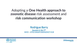
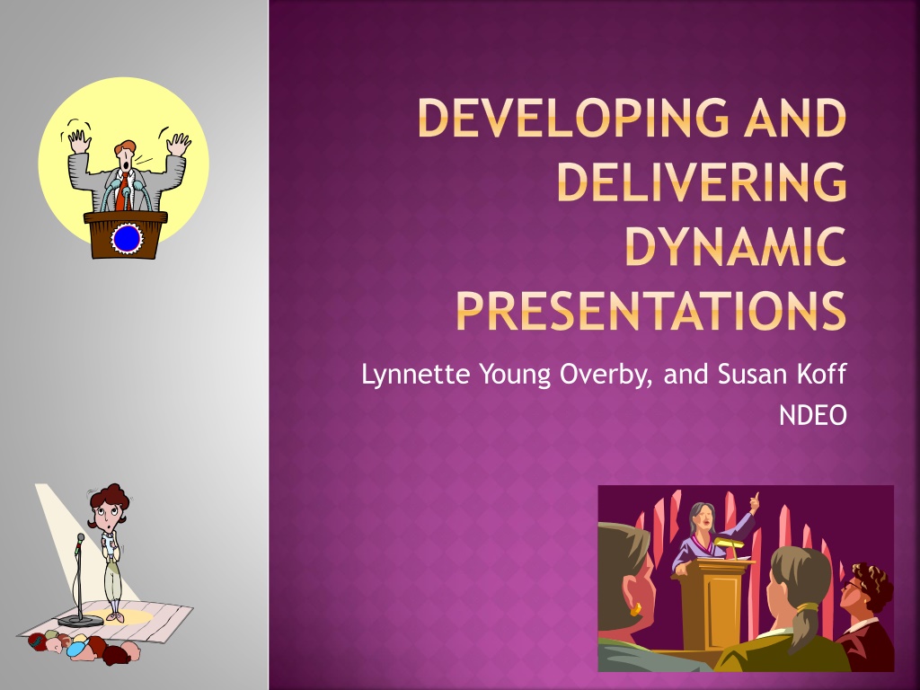
DEVELOPING AND DELIVERING DYNAMIC PRESENTATIONS Lynnette Young Overby, and Susan Koff NDEO
INVESTMENT WRITING Remember a time when you experienced an exceptional speaker. What captured your interest? Why was the speaker so successful?
Remember a time when a speaker did not capture your attention. What did you observe? Why was the speaker unsuccessful?
OVERVIEW Preparing and delivering an oral presentation Ten steps to a successful oral presentation One to two minute talk Visual Display Preparing a Poster Presentation Five steps to a successful poster presentation Content Dimensions
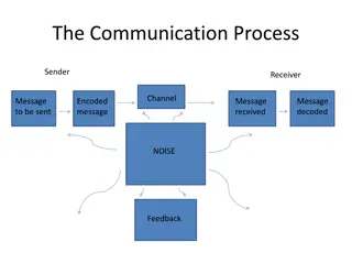
TEN STEPS TO A SUCCESSFUL ORAL PRESENTATION Basic Principle - Preparation What do I want the audience to know when I am finished? How do I present my talk such that the audience will understand, remember and apply what I have to say?
10 STEPS Step 1 = Start on Time Step 2 =State the message in a single sentence Step 3 = Select results and order them Step 4 = Clear Draw in Audience -Opening and Introduction Step 5 = Conclusions and ending
Step 6 = Excellent figures have the highest impact Step 7 = Visual Aids: Slides, Digital Stories, Video Step 8 = Communication instead of performing Step 9 = Timing Step 10 = Practice, practice, practice ..
OTHER TIPS Enhance your expressiveness Listen to a radio commercial compare Record you commercial Transfer vocal variety to your oral presentation Maximizing vocal fluency Practice at least 10 times aloud Make sure you can read your notes well marked and can be read from 3 feet
PRACTICE Basic Principle - Preparation What do I want the audience to know when I am finished? How do I present my talk such that the audience will understand, remember and apply what I have to say?
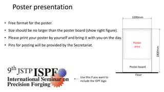
POSTER PRESENTATIONS FIVE STEPS TO AN EFFICIENT POSTER Step 1 = Formulate the message of your poster in a single sentence Step 2 = Introduction Use short sentences to identify the problem, list objectives, describe your investigation approach
Step 3 = Results Select the most pertinent results that support your message Remove everything else that is not absolutely necessary Use Figures with captions, avoid tables
Step 4 = Conclusion Write in short, clear statements. Finish with an assessment of your achievements in relation to your objectives, and future work Step 5 = Attention Getter - A title, a picture, a model, the main conclusion
AVOIDING COMMON MISTAKES Do not make the poster too long Avoid blocks of text longer than 10 sentences Use lists of sentences rather than blocks of text Use italics instead of underlining Use figures, graphs and pictures Include white space
ADVICE ON DESIGNING A POSTER Include Sections Title Introduction Materials and methods Results Conclusions Literature Cited Acknowledgements
PRESENTING YOUR POSTER Choose clothes to match your poster Wear a name tag Introduce yourself and shake hands with audience member Do not refer to notes when explaining your poster Speak to your viewers as you explain your poster give a 1 sentence overview of why your research/project is interesting and relevant. Thank your viewers for visiting
PRACTICE One to two minute presentation Speaker, Audience member, evaluator
Title that hints at the underlying issue or question Format in sentence case. This means only the t in title gets capitalized. Maintain a good amount of space between your columns. Although you could squeeze them right up against each other, the poster s aesthetics would suffer. So when your mentor says to do it, just nod your head as if you re listening, but roll your eyes as soon as she s not looking. Your name(s) here Department of Biology, Swarthmore College, Swarthmore, Pennsylvania 19081 Make sure the edges of your columns are aligned with adjacent columns. Don t trust your eyes: select the columns, then Align with the proper tool This is a header. If you make the font size large, and then add bolding there is no need to also apply underlining or italicization. Adding multiple kinds of styles, needlessly, just marks you as a poster novice. If you can orient your label horizontally, do it viewers with fused neck musculature are more likely to read it. Results The overall layout for this section should be modified from this template to best show off your graphs and other result- related illustrations. You might want a single, large column to accommodate a big map, or perhaps you could arrange 6 figures in a circle in the center of the poster: do whatever it takes to make your results graphically clear. And, for the love of God (or whoever), make your graphs big enough to read from 6 away. Paragraph format is fine, but sometimes a simple list of bullet points can communicate results more effectively: Conclusions You can, of course, start your conclusions in column #3 if your results section is data light. Conclusions should not be mere reminders of your results. Instead, you want to guide the reader through what you have concluded from the results. What is the broader significance? Would anyone be mildly surprised? Why should anyone care? This section should refer back, explicitly, to the burning issue mentioned in the introduction. If you didn t mention a burning issue in the introduction, go back and fix that -- your poster should have made a good case for why this experiment was worthwhile. A good conclusion will always refer to the literature on the topic -- how does your research add to what is already published on the topic? Blah, blah, blah. Blah, blah, blah. Blah, blah, blah. Blah, blah, blah. Blah, blah, blah. Blah, blah, blah. Blah, blah, blah. Blah, blah, blah. Blah, blah, blah. Blah, blah, blah. Blah, blah, blah. Blah, blah, blah. Blah, blah, blah. Blah, blah, blah. Blah, blah, blah. Blah, blah, blah. Blah, blah, blah. Blah, blah, blah. Blah, blah, blah. Blah, blah, blah. Blah, blah, blah. Blah, blah, blah. Blah, blah, blah. Blah, blah, blah. Blah, blah, blah. Blah, blah, blah. Blah, blah, blah. Blah, blah, blah. Introduction This is a Microsoft Powerpoint template that has column widths and font sizes optimized for printing a 36 x 56 poster just replace the tips and blah, blah, blah repeat motifs with actual content, if you have it. Try to keep your total word count under 500 (yea, this suggestion applies to everyone, even you). More tips (18 pages!) can be found at Advice on designing scientific posters at my web site (www.swarthmore.edu/natsci/cpurrin1). To see examples of how others have abused this template to fit their presentation needs, perform a Google search for powerpoint template for scientific posters. This paragraph has justified margins, but be aware that simple left-justification (other paragraphs) is infinitely better if your font doesn t space nicely when fully justified. Sometimes spacing difficulties can be fixed by manually inserting hyphens into longer words. Powerpoint doesn t automatically hyphenate, by the way. Your main text is easier to read if you use a serif font such as Palatino or Times (i.e., people have done experiments and found this to be the case). Use a non-serif font for your title and section headings. Figure 1. Photograph or drawing of organism, chemical structure, or whatever. Don t use graphics from the web (they usually look terrible when printed). Rats with brains navigated mazes faster Brainectomized Time (s) The first sentence of the first paragraph does not need to be indented. Control (brain intact) Maze difficulty index Figure 4. Avoid keys that force readers to labor through complicated graphs: just label all the lines (as above) and then delete the silly key provided by your charting software altogether. The above figure would also be greatly improved if I had the ability to draw mini rats with and without brains. I would then put these really cute little illustrations next to the lines they represent. data were so non-normal, they were bizarre 9 out of 12 brainectomized rats survived 1 brainectomized rat escaped, killing 12 undergraduates Control rats completed maze faster, on average, than rats without brains (Fig. 3b) (t = 9.84, df = 21, p = 0.032) (b) Be sure to separate figures from other figures by generous use of white space. When figures are too cramped, viewers get confused about which figures to read first and which legend goes with which figure. but tables are sometimes unavoidable. A table looks best when it is first composed within Microsoft Word, then Inserted as an Object. If you can add small drawings or icons to your tables, do so! (c) (a) Figures are preferred Remember: no period after journal name. Ever (unless you use abbreviation). Literature cited Bender, D.J., E.M Bayne, and R.M. Brigham. 1996. Lunar condition influences coyote (Canislatrans) howling. American Midland Naturalist 136:413-417. Brooks, L.D. 1988. The evolution of recombination rates. Pages 87-105 in The Evolution of Sex, edited by R.E. Michod and B.R. Levin. Sinauer, Sunderland, MA. Scott, E.C. 2005. Evolution vs. Creationism: an Introduction. University of California Press, Berkeley. Society for the Study of Evolution. 2005. Statement on teaching evolution. < http://www.evolutionsociety.org/statements.html >. Accessed 2005 Aug 9. Figure 3. Make sure legends have enough detail to explain to the viewer what the results are, but don t go on and on. Note that for posters it is good to put some Materials and methods information within the figure legends or onto the figures themselves it allows the M&m section to be shorter, and gives viewer a sense of the experiment(s) even if they have skipped directly to figures. Don t be tempted to reduce font size in figure legends, axes labels, etc. your viewers are probably most interested in reading your figures and legends! Materials and methods Be brief, and opt for photographs or drawings whenever possible to illustrate organism, protocol, or experimental design. Viewers don t actually want to read about the gruesome details, however fascinating you might find them. Blah, blah, blah. Blah, blah, blah. Blah, blah, blah. Blah, blah, blah. Blah, blah, blah. Blah, blah, blah. Blah, blah, blah. Blah, blah, blah. Blah, blah, blah. Blah, blah, blah. Blah, blah, blah. Blah, blah, blah. Blah, blah, blah. Blah, blah, blah. Blah, blah, blah. Blah, blah, blah. prese nted my theor y with a poste r befor e I wrot e my book . Hi. If you ve found this poster helpful, please consider sending me a postcard from wherever you are presenting your poster. It makes me feel like a have friends. Colin Purrington, Dept of Biology, Swarthmore College, Swarthmore, PA 19081, USA. Often you will have some more text-based results between your figures. This text should explicitly guide the reader through the figures. Blah, blah, blah (Figs. 3a,b). Blah, blah, blah. Blah, blah, blah. Blah, blah, blah. Blah, blah, blah. Blah, blah, blah. Blah, blah, blah. Blah, blah, blah. Blah, blah, blah. Blah, blah, blah. Blah, blah, blah. Blah, blah, blah. Blah, blah, blah. Blah, blah, blah. Blah, blah, blah. Blah, blah, blah (Fig. 3c). Blah, blah, blah. Blah, blah, blah. Blah, blah, blah. Blah, blah, blah. Blah, blah, blah. Blah, blah, blah (data not shown). Blah, blah, blah. Blah, blah, blah. Blah, blah, blah. Blah, blah, blah. Blah, blah, blah. Blah, blah, blah. Blah, blah, blah. Blah, blah, blah. Blah, blah, blah. Blah, blah, blah (God, personal communication). Abutting these last sections can save you a little space, and subtly indicates to viewers that the contents are not as important to read. Acknowledgments We thank I. G or for laboratory assistance, Mary Juana for seeds, Herb Isside for greenhouse care, and M.I. Menter for questionable statistical advice. Funding for this project was provided by the Swarthmore College Department of Biology, a Merck summer stipend, and my mom. [Note that people s titles are omitted.] I sure wish I d Put a figure here that explores a statistical result chuckdhasaposse This is the gene of interest! For further information Please contact email@blahcollege.edu. More information on this and related projects can be obtained at www.swarthmore (give the URL for general laboratory web site). A link to an online, PDF-version of the poster is nice, too. Figure 5. You can use connector lines and arrows to visually guide viewers through your results. Adding emphasis this way is much, much better than making the point with words in the text section. These lines can help viewers read your poster even when you re not present. If you just must include a pretentious logo, hide it down here rather than up near where it would compete with your title. Figure 2. Illustration of important piece of equipment, or perhaps a flow chart summarizing experimental design. Scanned, hand-drawn illustrations are usually preferable to computer-generated ones. Just bribe (cookies, whatever) an artist to help you out. Blah, blah, blah. Blah, blah, blah. However, blah, blah, blah.
TAKE HOME MESSAGE Oral presentations Poster presentations