Understanding Population Pyramids for Analyzing Population Trends
Population pyramids are graphical illustrations that showcase the distribution of age groups within a population, segmented by gender. By observing and documenting the patterns of population pyramids, one can discern trends such as rapid growth, slow growth, or negative growth, which are influenced by factors like economic conditions, healthcare, living standards, and birth control. The process of creating a population pyramid involves interpreting age-sex data tables to visually represent demographic characteristics, offering valuable insights for demographic analysis.

Download Presentation

Please find below an Image/Link to download the presentation.
The content on the website is provided AS IS for your information and personal use only. It may not be sold, licensed, or shared on other websites without obtaining consent from the author. Download presentation by click this link. If you encounter any issues during the download, it is possible that the publisher has removed the file from their server.
E N D
Presentation Transcript
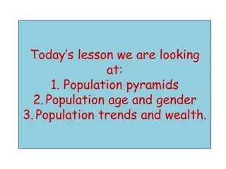
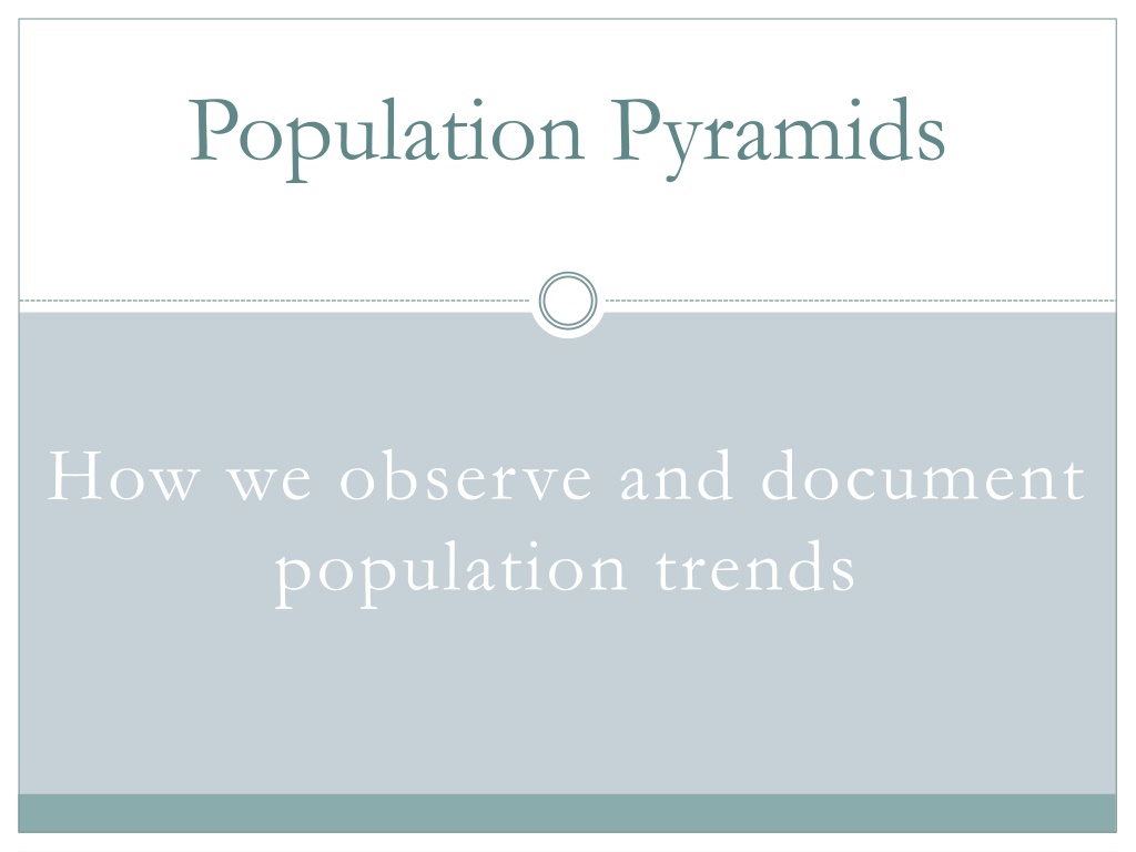
Population Pyramids How we observe and document population trends
Population Pyramids are illustrations divided into [male] and [female] columns that show the distribution of ascending age groups in a selected population
Rapid Growth Pyramids Pyramids that are shaped like an inverted V can be explained by many different factors, including: Poverty A Lack of Birth Control A 3rd World Economy A Lack of Healthcare Low Standards of Living Low Cost of Living
Slow Growth Pyramids Pyramids that are shaped like a beehive can also be explained by many different factors, including: Relative Wealth Birth Control & Education A 1st World Economy Some/Good Healthcare Good Living Conditions Moderate Living Costs
Negative Growth Pyramids Pyramids that are taper towards the bottom can be attributed to many different factors, including: Abundant Wealth Extensive Birth Control & Education A 1st World Economy Extensive Healthcare Excellent Living Conditions Expensive Cost of Living
Creating a Population Pyramid Take your Age-Sex Data Table and observe the population of Country A: 6,420,792 Now look at the number of Males from the age of 0-4: 479,894 479,894 / 6,420,792 = .0747, or 7.5% You multiply the product by 100 to achieve a percentage, then round up to the nearest half. Now take your Age-Sex Graph and draw a vertical line between 7 and 8 (7.5%) in the bottom left bracket (Males 0-4). Color the area from this line to the centerline blue to represent the percentage of the population which are males from the ages of 0 to 4. When you duplicate this process for the other side, use a pink or red color to represent females from the ages of 0 to 4. Continue repeating steps 1 through 5 all the way to the 100+ bracket using the data from your Age-Sex Data Table. 1. 2. 3. 4. 5. 6.