Understanding Community Vital Signs Dashboard - A Guide to Health Equity Analysis

Explore the significance of the Community Vital Signs (CVS) dashboard in analyzing health equity and addressing social disparities in health outcomes. Learn how to interpret the data, access recommendations, and utilize evidence-based models to drive actionable insights for improving community well-being.

Download Presentation

Please find below an Image/Link to download the presentation.
The content on the website is provided AS IS for your information and personal use only. It may not be sold, licensed, or shared on other websites without obtaining consent from the author. Download presentation by click this link. If you encounter any issues during the download, it is possible that the publisher has removed the file from their server.
E N D
Presentation Transcript
3.2 Interpreting the CVS dashboard ERASE-MM Community Vital Signs Project www.erase-mm-cvsproject.org
Pathway 1. MMRC Readiness Document # Document title 1.1 1.2 Is your MMRC ready to discuss health equity? Readiness checklist 2. Overview of the Community Vital Signs Project 2.1 2.2 What is the Community Vital Signs project? What causes inequities in pregnancy related mortality? 3. Using the CVS Dashboards 3.1 3.2 3.3 3.4 Understanding the data in the CVS dashboard Interpreting the CVS dashboard CVS Dashboard Cheat Sheet Retrieving CVS dashboards 4. Using the CVS Recommendations Reference 4.1 4.2 4.3 4.4 4.5 Using the CVS Recommendations Reference Overview of CVS Recommendation Reference Recommendation reference document, Part 1 (word) Recommendation reference detail table, Part 2 (excel) RWJF County Health Rankings Roadmap and Recommendations 5. For abstractors 5.1 5.2 Using the CVS dashboard for preparing case narratives Narrative template
Changing the conversation: ERASE-MM Community Vital Signs Project What are some causes of inequity? Socio-spatial data indicators CVS CVS Dashboard Recommendation Evidence-based conceptual model Provide Data Link to action
Changing the conversation: ERASE-MM Community Vital Signs Project What are some causes of inequity? Socio-spatial data indicators CVS CVS Dashboard Recommendation Evidence-based conceptual model Provide Data Link to action
Retrieving dashboards Required inputs to produce a CVS dashboard: Unique id (e.g. MMRIA id; state-generated id) Longitude/Latitude or census tract ID of decedent residence Year of death
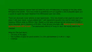
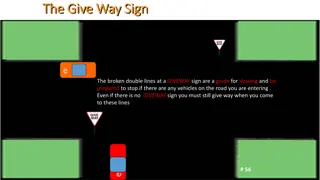
Community Vital Signs Dashboard
1 case = 1 dashboard
Summary Risk Score for each domain
Values for separate Indicators of Community Risk
Qualitative interpretation 1. If the dot is in the purplish zone, the decedent lived in a place with higher-than-average risk 2. If the dot is in the yellow zone, the decedent lived in a place that is similar to others in the state or nation 3. If the dot is in the green zone, the decedent lived in a place with lower-than-average risk
What do the points represent? 1. We ranked every place (county and census tract) in your state and in the whole U.S. on each Community Indicator from lowest to highest risk on every indicator 2. We measured whether this person scommunity environmental risk is average , or lower or higher than compared to other communities in your state or the whole U.S. 3. Report this person s community environment risk as a percentile compared to the state or US
How to interpret the values? Poverty Concentration: This person lived in a neighborhood that was riskier than average with respect to poverty concentration. Specifically their neighborhood is at the 80th percentile compared to all people in your state The 80thpercentile means that their neighborhood is riskier (has higher poverty concentration) than 80% of all other people s neighborhoods in your state
Why state and national dots? 1. Red dots compare this decedent s community to all other communities in your state 2. Blue dots compare this decedent s community to all other communities in the nation overall
Conclusion 1. The CVS dashboards summarize the neighborhood and county context in which the decedent lived, worked, or played 2. Indicators describe whether the decedent s community risk context is less risky/more health protective, similar to, or riskier/less health protective than the communities of other people in your state, or in the US at large
Acknowledgements The Community Vital Signs Project was developed by a team at Emory University with support from Centers for Disease Control and Prevention, Division of Reproductive Health Maternal Mortality Prevention Team Emory Team Michael Kramer (PI) Sarah Blake Autumn Watson Marissa Coloske CDC Team David Goodman Julie Zaharatos Toby Merkt Please use the Contact link at https://erase-mm-cvsproject.org to provide any feedback or ask questions This presentation was prepared by Michael Kramer