On the Shoulders of Giants: Harnessing Powerful Commands in Stata for Efficient Coding
Stata users can enhance their coding efficiency by utilizing powerful commands that are often overlooked. This presentation showcases examples of commands that can streamline coding work, ranging from interactive use to supporting long programs. By leveraging these commands, users can avoid reinventing the wheel and build on the work of others, standing on the shoulders of giants in the field of data analysis. The discussion covers tabulation techniques, newer preparation commands like tsegen and rangestat, and the utility of tools such as tabdisp for efficient data processing.

Download Presentation

Please find below an Image/Link to download the presentation.
The content on the website is provided AS IS for your information and personal use only. It may not be sold, licensed, or shared on other websites without obtaining consent from the author.If you encounter any issues during the download, it is possible that the publisher has removed the file from their server.
You are allowed to download the files provided on this website for personal or commercial use, subject to the condition that they are used lawfully. All files are the property of their respective owners.
The content on the website is provided AS IS for your information and personal use only. It may not be sold, licensed, or shared on other websites without obtaining consent from the author.
E N D
Presentation Transcript
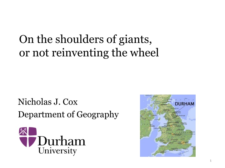
On the shoulders of giants, or not reinventing the wheel Nicholas J. Cox Department of Geography 1
Stata users can stand on the shoulders of giants. Giants are powerful commands to reduce your coding work. This presentation is a collection of examples based on some commands that seem little known or otherwise neglected. Every user is a programmer. The range is from commands useable interactively to those underpinning long programs. 2
On the shoulders of giants Robert K. Merton (1910 2003) 1965/1985/1993. University of Chicago Press. 3
With gravitas If I have seen further it is by standing on the sholders of Giants. Isaac Newton (left) (1642 1727) writing to Robert Hooke (right) (1635 1703) in 1676 4
With topological wit to Christopher Zeeman at whose feet we sit on whose shoulders we stand Tim Poston and Ian Stewart. 1978. Catastrophe Theory and its Applications. London: Pitman, p.v Sir Christopher Zeeman (1925 2016) (right) Tim Poston (1945 ) Ian Nicholas Stewart (1945 ) 5
Tabulations and listings For tabulations and listings, the better-known commands sometimes seem to fall short of what you want. One strategy is to follow a preparation command such as generate, egen, collapse or contract with tabdisp or _tab or list. 7
Newer preparation commands tsegen and rangestat (SSC; Robert Picard and friends) are newer workhorses creating variables to tabulate. tsegen in effect extends egen to time series and produces (e.g.) summary statistics for moving windows. rangestat covers a range of problems, including irregular time intervals, look-up challenges, other members of a group. Search Statalist for many examples. 8
tabdisp From the help: tabdisp calculates no statistics and is intended for use by programmers. In the manuals: documented at [P] tabdisp. But it s easy: you just need to know or at least calculate in advance what you want to display. Feature: tabdisp can mix numeric and string variables in its cells. This is useful in itself and as a way of forcing particular display formats (# of decimal places, date formats). 9
tabdisp Example: tabstat is mighty useful, but just one non- default display format is allowed. If you choose e.g. %2.1f sample sizes are displayed as 42.0 and 666.0. moments (SSC) shows sample size, mean, SD, skewness and kurtosis. It uses summarize for calculations and tabdisp for tabulation. The default format for everything but sample size is %9.3f, but that can be overridden. 10
. sysuse auto, clear (1978 Automobile Data) . moments mpg price weight -------------------------------------------------------------- n = 74 | mean SD skewness kurtosis --------------+----------------------------------------------- Mileage (mpg) | 21.297 5.786 0.949 3.975 Price | 6165.257 2949.496 1.653 4.819 Weight (lbs.) | 3019.459 777.194 0.148 2.118 -------------------------------------------------------------- . moments mpg price weight, format(%2.1f %2.1f) -------------------------------------------------------------- n = 74 | mean SD skewness kurtosis --------------+----------------------------------------------- Mileage (mpg) | 21.3 5.8 0.949 3.975 Price | 6165.3 2949.5 1.653 4.819 Weight (lbs.) | 3019.5 777.2 0.148 2.118 -------------------------------------------------------------- 11
tabdisp lmoments (SSC) is another example. The code shows examples of a useful technique, storing results in variables that need not be aligned with the main dataset. Not being able to have two or more datasets in memory is a frequent complaint . 12
tabdisp tabdisp uses the value in the first pertinent observation it encounters. For rows with unique identifiers, that is exactly right. For groupwise summaries, that is a good default. You just need to know about it. It is documented explicitly. Limit: Up to five variables may be displayed as cells in the table. (Many tables are far too complicated, any way.) 13
tabdisp Tabulate cumulative frequencies as well as frequencies? sysuse auto, clear by rep78, sort: gen freq = _N by rep78: gen cumfreq = _N if _n == 1 replace cumfreq = sum(cumfreq) tabdisp rep78, cell(freq cumfreq) http://www.stata.com/support/faqs/data- management/tabulating-cumulative-frequencies/ 14
_tab This really is a programmer s command, but can be used minimally: Top: Declare structure, specify top material Body: Loop over table rows, populating the table cells Bottom: Draw bottom line Example in missings (SSC; Stata Journal 15(4) 2015 and 17(3) 2017 in press). Another example in distinct (Stata Journal 15(3) 2015). 15
// top of table tempname mytab .`mytab' = ._tab.new, col(`nc') lmargin(0) if `nc' == 3 .`mytab'.width `w1' | `w2' `w3' else .`mytab'.width `w1' | `w2' .`mytab'.sep, top if `nc' == 3 .`mytab'.titles " " "#" "%" else .`mytab'.titles " " "#" .`mytab'.sep // body of table forval i = 1/`nr' { forval j = 1/`nc' { mata: st_local("t`j'", mout[`i', `j']) } if `nc' == 3 .`mytab'.row "`t1'" "`t2'" "`t3'" else .`mytab'.row "`t1'" "`t2'" } // bottom of table .`mytab'.sep, bottom 16
list Most users know list, but do you know it well? Any table that can be presented as a listing can be presented with list. It has several useful options. We can get arbitrarily complicated: Row identifiers Row and column identifiers Many identifiers Cell(s) Cell(s) Cell(s) 17
list exploited in groups groups is a tabulation command that is a wrapper for list. It was originally documented in Stata Journal 3(4) 2003 but has been much updated since on SSC. A revised account is forthcoming in Stata Journal 17(3) 2017. At its simplest it looks like tabulate in disguise, but it can do other stuff too. 18
. sysuse auto, clear . groups foreign +-------------------------------------+ | foreign Freq. Percent % <= | |-------------------------------------| | Domestic 52 70.27 70.27 | | Foreign 22 29.73 100.00 | +-------------------------------------+ 19
. groups foreign rep78 +------------------------------------+ | foreign rep78 Freq. Percent | |------------------------------------| | Domestic 1 2 2.90 | | Domestic 2 8 11.59 | | Domestic 3 27 39.13 | | Domestic 4 9 13.04 | | Domestic 5 2 2.90 | |------------------------------------| | Foreign 3 3 4.35 | | Foreign 4 9 13.04 | | Foreign 5 9 13.04 | +------------------------------------+ 20
. groups foreign rep78, percent(foreign) +------------------------------------+ | foreign rep78 Freq. Percent | |------------------------------------| | Domestic 1 2 4.17 | | Domestic 2 8 16.67 | | Domestic 3 27 56.25 | | Domestic 4 9 18.75 | | Domestic 5 2 4.17 | |------------------------------------| | Foreign 3 3 14.29 | | Foreign 4 9 42.86 | | Foreign 5 9 42.86 | +------------------------------------+ 21
. groups mpg, select(f == 1) show(none) +-----+ | mpg | |-----| | 29 | | 31 | | 34 | | 41 | +-----+ 22
. groups mpg, select(-5) +--------------------------------+ | mpg Freq. Percent Cum. | |--------------------------------| | 30 2 2.70 93.24 | | 31 1 1.35 94.59 | | 34 1 1.35 95.95 | | 35 2 2.70 98.65 | | 41 1 1.35 100.00 | +--------------------------------+ 23
. groups mpg, select(5) order(h) +-------------------------------+ | mpg Freq. Percent Cum. | |-------------------------------| | 18 9 12.16 12.16 | | 19 8 10.81 22.97 | | 14 6 8.11 31.08 | | 21 5 6.76 37.84 | | 22 5 6.76 44.59 | +-------------------------------+ 24
list Once again, list is the engine here. My favourite options of list include abbreviate variable names to # columns abbreviate(#) do not list observation numbers noobs sepby(varlist) separator line if varlist values change characteristic for variable name in header subvarname 25
statsby Few needs are commoner than collating groupwise results. Few ways of doing it are more neglected than statsby. The statsby strategy (Stata Journal 10(1) 2010) hinges on using statsby to produce a dataset (resultsset?) and then firing up graph. Detailed code is available in the paper, so we ll switch style to show first some results for box plots in idiosyncratic form. Key options of statsby here are subsets and total. 27
Domestic 1 Domestic 2 Domestic 3 Domestic 4 Domestic 5 Foreign 3 Foreign 4 Foreign 5 Domestic Foreign 1 2 3 4 5 Total 10 20 30 40 Mileage (mpg) 28
statsby statsby is also a natural for confidence interval plots. statsby underlies designplot, a generalisation of the not very well used grmeanby. For designplot see Stata Journal 14(4) 2014 and in press 17(3) 2017. The idea is to show summary statistics on one or more levels, e.g. whole dataset; by categorical predictors; by their cross- combinations and so on. In turn it is a wrapper for graph dot or graph hbar. 29
statsby used in designplot As before subsets and total options are key. Next we will see two aligned design plots for a version of a famous dataset on admissions to various majors A F at UC Berkeley. Lower admission rate for females looks like discrimination, but major by major females often do better. The aggregate pattern is an artefact of different frequencies of application to the majors, a case of Simpson s paradox. 30
proportion admitted number of applicants 0 0.25 0.5 0.75 1 0 500 1000 1500 2000 2500 3000 A A 933 B 585 B C 918 C D 792 D E 584 E F 714 F male male 2691 female female 1835 A male A male 825 A female A female 108 B male B male 560 B female B female 25 C male C male 325 C female C female 593 D male D male 417 D female D female 375 E male E male 191 E female E female 393 F male F male 373 F female F female 341 31
statsby It would be hard work programming that without the machinery provided by statsby. 32
by() option for combining graphs Many users know graph combine for combining graphs, and indeed it is very useful. I have used it often, e.g. in combineplot, crossplot and corrtable on SSC. But there are downsides, notably that the same design repeated is the same design repeated, with often similar text shown again and again. A favourite trick is using a by() option to produce separate panels, often after a restructuring of the data. The art that conceals art is then to obscure that trick. 33
Counting sunspots Astronomers (and even some economists) have been contemplating sunspots for some centuries. Even the annual data are a handful. See here for source. A standard line plot is just a roller coaster. (Using sunspots as an example is a miniature tradition here, started by William S. Cleveland in his books.) 34
300 200 mean 100 0 1700 1800 1900 2000 year 35
Aspect ratio and slicing R.A. Fisher, W.S. Cleveland and many others recommend getting segment slopes close to 45 . A standard device is to slice the series and portray slices in short and wide panels, stacked vertically. An even older device was to have very wide graphs as fold- out illustrations. sliceplot is a program to do this (Stata Journal 6(3) 2006) which hinges on graph combine, but there is a much simpler solution. 36
* just two lines of code! * choose your own # of slices, here 4 * ensure slices are nearly equal gen slice = ceil(4 * _n/_N) * see how much we zap line mean year, by(slice, note("") col(1) xrescale) subtitle("", fcolor(none)) xtitle("") yla(, ang(h)) ytitle(Mean sunspot number) 37
300 200 100 0 1700 1720 1740 1760 1780 300 200 Mean sunspot number 100 0 1780 1800 1820 1840 1860 300 200 100 0 1860 1880 1900 1920 1940 300 200 100 0 1940 1960 1980 2000 2020 38
Fine structure is now visible Asymmetric saw-tooth cycles are more evident. Back to the astronomers, climatologists, economists . 39
by() to get multiple panels cleanly The same trick, with more work, underlies multiline and multidot (SSC). In each case several variables are temporarily stacked into one and then by() is the machinery yielding multiple panels in similar, minimal style. multiline is an alternative to spaghetti plots, especially for responses in time on quite different scales or with quite different units. It is a wrapper for twoway. Compare also sparkline (SSC). 40
1500 1000 Gross investment 500 0 6000 5000 Market value 4000 3000 2000 1500 Plant and equipment value 1000 500 0 1935 1940 1945 1950 1955 41
subtitle() is tricky With multiline the subtitle() option is tricky. Put it on the left and remove traces of surrounding stuff. subtitle(, pos(9) bcolor(none) nobexpand place(e)) This is wired into the code, but it is a little hard to remember it all for your own separate use. Keep a note somewhere accessible. (I stole this from the manuals.) 42
multidot multidot is also a solution when multiple responses have different scales and/or units. It too is a wrapper for twoway although in look and feel it is closer to graph dot or graph bar. The *dot element just refers to the default. You can recast to other twoway types. It is also arguable that such (Cleveland) dot charts remain underused. 43
Price (USD) Mileage (mpg) Peugeot 604 Volvo 260 BMW 320i Audi 5000 Datsun 810 VW Dasher VW Scirocco Audi Fox Make and Model Datsun 200 Toyota Celica Honda Accord Toyota Corona VW Diesel Datsun 510 VW Rabbit Datsun 210 Honda Civic Fiat Strada Mazda GLC Renault Le Car Subaru Toyota Corolla 5000 10000 1500010 20 30 40 44
Active forces ('000) Reservists ('000) Defence budget ($ billion) China India United States N. Korea S. Korea Vietnam Indonesia Japan Taiwan Philippines Malaysia Singapore Australia 0 500 1000 1500 2000 0 1000 2000 3000 4000 5000 0 200 400 600 45
Not using graph combine here Once more: the device here is not to use graph combine but to call graph with a by() option after a temporary change to the data. 46
Unconventional coordinates A tougher problem is drawing graphs in coordinates other than rectangular or Cartesian. Graphs for circular data such as wind direction or time of year may use polar coordinates. Three proportions adding to a total, say p + q + r = 1, fall on a plane and so may be projected to triangular (trilinear, ternary) coordinates. triplot was written up in Stata Journal 4(2) 2004 and is intermittently updated on SSC. 47
100 0 1800 80 20 1810 1820 1830 60 40 1840 agriculture industrial 1850 1870 1880 40 60 1860 1890 1900 1920 1910 20 80 1930 1940 1950 1960 1970 1980 0 100 100 80 60 40 20 0 service and information 48
So, which giant is underneath? triplot rests on twoway scatter! You have to work out where the data should go, which is high or secondary school mathematics. Axes, axis labels and axis titles that would otherwise appear need to be removed with options such as xsc(off) and ysc(off). New axes and grid lines are inserted with scatteri, recast(line). 49


")
 show(none)")
")
 order(h)")


 option for combining graphs")


 to get multiple panels cleanly")

 is tricky")

")
")