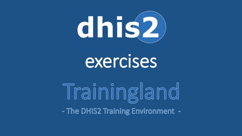
DHIS2 Trainingland - Data Analysis and Visualization Exercises


e
x
e
r
c
i
s
e
s


What is Trainingland?
Trainingland is an imaginary country for DHIS2 training
Trainingland contains modeled data
Trainingland is a place to learn about indicators, data
collection forms, data analysis and visualizations

1) Make sure you are online
2) Download / Run Chrome browser
3) Go to url:
https://inf5750.dhis2.org/demo
4) Log on
Username:
HMIS[district name]
Password:
INF5761!
Log on to Trainingland
1.1) Make a
pivot table
with the
Immunized fully coverage (%)
from the Immunization
indicator group for Trainingland for all the
months of 2017
1.2) Change table
layout
so that
periods
are shown as
columns
, not
rows
1.3) Update the table to include all Trainingland
districts
(as rows)
1.4) Hide the
totals
from the table
Options
1.5) Save the table as a
Favourite
(prefix with your username)
example:
username
immunizedfully Trainingland monthly 2016
2.1) Make a table for the data elements
ANC 1
st
visit
and
ANC 4
th
visit
in the
ANC data element group for Sweet district for the last 12
months
2.2) Update the table so that periods are
shown as columns
2.3) Include row totals in the table
Options
2.4) Save the table as a
Favourite
(prefixed with your username)
3.1) Make a line chart with ANC 1
st
visit coverage and ANC 4
th
visit coverage in
the
ANC indicator group
for the last 12 months, for Trainingland
3.2) Save the graph as a
Favourite
(prefixed with your username)
4.1) Make a bar chart with the same indicators, comparing all districts of Trainingland
for January 2018
5.1) Make a bar chart with the same indicators, comparing December 2016,
January 2017, December 2017 and January 2018 for Sweet district
6.1) Make a bar chart with the
Population Total
from the
Population
data element group
for 2015, 2016, 2017 and 2018 for Trainingland
6.2) Save the chart as a favourite (prefix with your name)
7.1) Open the chart favorite you made in assignment 6,
with Total population
7.2) Open this chart as a table
8.1)
Go to the Home/Dashboard Screen
8.2) Locate the Add button and Add a new Dashboard –
name it with your username / district name
8.3) Type your username in the search field and add the
favorites you have created to the new Dashboard!
Explore DHIS2 Trainingland, an imaginary country for training, to learn about indicators, data collection forms, and data analysis through a series of exercises including creating pivot tables, making charts, and saving favorites.

Download Presentation

Please find below an Image/Link to download the presentation.
The content on the website is provided AS IS for your information and personal use only. It may not be sold, licensed, or shared on other websites without obtaining consent from the author. Download presentation by click this link. If you encounter any issues during the download, it is possible that the publisher has removed the file from their server.
E N D
Presentation Transcript
exercises exercises Trainingland Trainingland - - The DHIS2 Training Environment The DHIS2 Training Environment - -
What is Trainingland? Trainingland is an imaginary country for DHIS2 training Trainingland contains modeled data Trainingland is a place to learn about indicators, data collection forms, data analysis and visualizations
Log on to Trainingland 1) Make sure you are online 2) Download / Run Chrome browser 3) Go to url: https://inf5750.dhis2.org/demo 4) Log on Username: Password: HMIS[district name] INF5761!
1.1) Make a pivot table with the Immunized fully coverage (%) from the Immunization indicator group for Trainingland for all the months of 2017 1.2) Change table layout so that periods are shown as columns, not rows 1.3) Update the table to include all Trainingland districts (as rows) 1.4) Hide the totals from the table Options 1.5) Save the table as a Favourite (prefix with your username) example: username immunizedfully Trainingland monthly 2016
2.1) Make a table for the data elements ANC 1stvisit and ANC 4thvisit in the ANC data element group for Sweet district for the last 12 months 2.2) Update the table so that periods are shown as columns 2.3) Include row totals in the table Options 2.4) Save the table as a Favourite (prefixed with your username)
3.1) Make a line chart with ANC 1stvisit coverage and ANC 4thvisit coverage in the ANC indicator group for the last 12 months, for Trainingland 3.2) Save the graph as a Favourite (prefixed with your username)
4.1) Make a bar chart with the same indicators, comparing all districts of Trainingland for January 2018
5.1) Make a bar chart with the same indicators, comparing December 2016, January 2017, December 2017 and January 2018 for Sweet district
6.1) Make a bar chart with the Population Total from the Population data element group for 2015, 2016, 2017 and 2018 for Trainingland 6.2) Save the chart as a favourite (prefix with your name)
7.1) Open the chart favorite you made in assignment 6, with Total population 7.2) Open this chart as a table
8.1) Go to the Home/Dashboard Screen 8.2) Locate the Add button and Add a new Dashboard name it with your username / district name 8.3) Type your username in the search field and add the favorites you have created to the new Dashboard!


 Make a pivot table with the Immunized fully coverage")
 Make a table for the data elements ANC 1stvisit and ANC")
 Make a line chart with ANC 1stvisit coverage and ANC")
 Make a bar chart with the same indicators, comparing")
 Make a bar chart with the same indicators, comparing")
 Make a bar chart with the Population Total from the")
 Open the chart favorite you made in assignment 6,")
 Go to the Home/Dashboard Screen")