Understanding Key Dashboard Metrics for Business Management

 
Managing the Enterprise
 
 
It’s all about the data, …
 
Today’s economy, communications, social interaction, politics …
you name it, is driven by the internet
The internet is driven by data
Search/ SEO, recommenders, curated content, ML and AI …
It’s no surprise that money follows the metrics
And technology enables the metrics that drag the money along
One of the most valuable assets in today’s world is data, and the
people who manage the data, access to the data and know how to
use the data are equally valuable
 
What companies are interested in
 
Companies are typically risk-averse
They want to know what is going on today so they can plan the
safest (and most lucrative) direction for tomorrow
I’m not saying that is the most effective or socially conscious way … but it
is a reality
And even socially conscious decisions are informed by data
So … we will look at some ways companies look at data to get a
grounding in how data can be presented and how technology
supports the work
 
Common metrics
 
Dashboard metrics are tools and measurements you can use to
create digital displays of data that you've gathered
These displays may include charts, graphs, tables and
percentages to help you better understand a specific area of a
company.
Dashboard tools typically operate software or web applications
that collect data, either through extracting it from other sources
or receiving it from manual inputs and transform that data into
visual forms.
Businesses often use these dashboard tools to track and
measure key performance indicators (KPIs) in each section of the
company.
 
17 Dashboard Metrics Examples (With KPIs for Each Type) | Indeed.com
 
HR Metrics
 
# Active employees
Tenure
Vacation usage
Absences
Geographic distribution of personnel
Employee performance
 
Manufacturing
 
Safety
Production (items built, stored)
Rate of production
Rate of shipment
Quality (# built, # rejected)
 
Business and Finance
 
Budget
Expenses
People
Buildings, operation expenses
Profit/ loss (Quarterly, Annual)
Productivity per dept.
Products growth/ success
# Products sold; YOY change
 
Dept. Operations
 
Projects
Slip rate
Employee productivity
People per project per project (How many people it takes for each project)
Department size, growth, budget
Product quality
Complaints/ bugs/ recalls (like missing doors :P )
 
Sales
 
# Products
# Sales
Sales/ product
Sales/ month (quarter, year)
YOY change
Sales/ customer
# customers
 
Dashboard basics
 
Core metrics (for a particular department)
Displays in basic formats
Pie chart
Line chart
Bar chart
Line/ Bar charts will typically allow for changes in timescale
 
Typical landmines
 
The data needed is often across different areas
E.g. you may need data from HR, Manufacturing, Sales …
Decisions
How to merge and ‘harmonise’ the data
Live pull/ transform?
Time-based pull/ transform/ store?
On demand?
Combo?
Constraints
You can’t change the source of the data (i.e. no-one wants you to fiddle
with THEIR process)
 
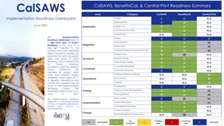
Common dashboards
 
18 Best Dashboard Examples for Any Business [Free Templates Included] | Databox Blog
 
Charting packages
 
Many JS packages are available for simplifying data visualization
There are completely generic ones (e.g. D3.js)
There are many built to match another UI framework’s design pattern
Some are specific to types of visualizations e.g. financial, trees, nodes …
For MUI and React some examples are:
X-charts
React-google-charts
Highcharts
React-chartjs
Recharts
 
recharts
 
We will use recharts (why not)
npm install recharts
And then


Obviously, include what you need
import
 { 
PieChart
, 
Pie
, 
Cell
, 
Legend
, 
Tooltip
,
    
BarChart
, 
CartesianGrid
, 
XAxis
, 
YAxis
, 
Bar
, 
Rectangle
 } 
from
 
'recharts'
;
 
Example – PieChart
<
strong
 
style
=
{
{ 
paddingLeft:
 
"10%"
, 
fontSize:
 
"20px"
 }
}
>
#
Workers by classification
</
strong
>
<
PieChart
  
width
=
{
400
}
 
height
=
{
400
}
>
    
<
Pie
 
dataKey
=
"value"
 
data
=
{
chartData
}
 
cx
=
{
200
}
 
cy
=
{
200
}
              
innerRadius
=
{
40
}
 
outerRadius
=
{
80
}
 
fill
=
"blue"
              
label
 
/>
    
<
Tooltip
 
/>
</
PieChart
>
 
Example – PieChart … custom labels
<
PieChart
 
width
=
{
400
}
 
height
=
{
400
}
 
>
    
<
Legend
></
Legend
>
    
<
Pie
        
data
=
{
chartData
}
        
cx
=
"50%"
 
cy
=
"50%"
        
labelLine
=
{false}
        
label
=
{
renderCustomizedLabel
}
        
outerRadius
=
{
80
}
 
fill
=
'black'
        
dataKey
=
"value"
 
>
        
{
chartData
.
map
((
entry
, 
index
) 
=>
          {
              
return
(
              
<
Cell
 
key
=
{
`cell-
${
index
}
`
}
 
fill
=
{
COLORS
[
index
 % 
COLORS
.
length
]
}
  
/>
                    )
         }
         )
}
    
</
Pie
>
</
PieChart
>
const
 
renderCustomizedLabel
 = ({ 
cx
, 
cy
, 
midAngle
, 
innerRadius
,
outerRadius
, 
percent
, 
index
 }) 
=>
 {
        
const
 
radius
 = 
innerRadius
 + (
outerRadius
 - 
innerRadius
) * 
0.5
;
        
const
 
x
 = 
cx
 + 
radius
 * 
Math
.
cos
(-
midAngle
 * 
RADIAN
);
        
const
 
y
 = 
cy
 + 
radius
 * 
Math
.
sin
(-
midAngle
 * 
RADIAN
);
      
console
.
log
(
x
,
y
, 
index
)
        
return
 (
          
<
text
 
x
=
{
x
}
 
y
=
{
y
}
 
fill
=
"white"
 
textAnchor
=
{
x
 > 
cx
 ? 
'start'
 :
'end'
}
 
dominantBaseline
=
"central"
>
            
{
`
${
(
percent
 * 
100
).
toFixed
(
0
)
}
%`
}
          
</
text
>
        );
      };
 
Bar Charts
<
BarChart
      
width
=
{
500
}
  
height
=
{
300
}
  
data
=
{
barData
}
      
margin
=
{
{
                
top:
 
50
,
                
right:
 
30
,
                
left:
 
20
,
                
bottom:
 
5
,
     }
}
  
>
      
<
CartesianGrid
 
strokeDasharray
=
"3 3"
 
/>
        
<
XAxis
 
dataKey
=
"name"
 
/>
        
<
YAxis
 
/>
        
<
Tooltip
 
/>
        
<
Legend
 
/>
        
<
Bar
 
dataKey
=
"averageWage"
 
fill
=
"#8884d8"
  
activeBar
=
{
<
Rectangle
 
fill
=
"pink"
 
stroke
=
"blue"
 
/>
}
 
/>
</
BarChart
>
 
Additional info
 
Recharts
https://recharts.org/en-US/examples
 
Recommendation
1.
Decide what data you want to display
2.
Select appropriate chart(s)
3.
Decide organization of data
4.
Design API to get data from DB in the closest form possible to easily
populate the charts
You will need to have some specialized APIs to do things like grouping,
aggregation etc.
Slide Note
Embed
Share

In today's data-driven world, companies rely on various metrics and tools to make informed decisions and track performance. From HR metrics to manufacturing and finance indicators, this article explores the importance of data in driving business success. Dive into common dashboard metrics, the role of data in decision-making, and how technology supports these processes.


Uploaded on Aug 23, 2024 | 0 Views


Download Presentation

Please find below an Image/Link to download the presentation.

The content on the website is provided AS IS for your information and personal use only. It may not be sold, licensed, or shared on other websites without obtaining consent from the author. Download presentation by click this link. If you encounter any issues during the download, it is possible that the publisher has removed the file from their server.

E N D

Presentation Transcript


  1. Managing the Enterprise

  2. Its all about the data, Today s economy, communications, social interaction, politics you name it, is driven by the internet The internet is driven by data Search/ SEO, recommenders, curated content, ML and AI It s no surprise that money follows the metrics And technology enables the metrics that drag the money along One of the most valuable assets in today s world is data, and the people who manage the data, access to the data and know how to use the data are equally valuable

  3. What companies are interested in Companies are typically risk-averse They want to know what is going on today so they can plan the safest (and most lucrative) direction for tomorrow I m not saying that is the most effective or socially conscious way but it is a reality And even socially conscious decisions are informed by data So we will look at some ways companies look at data to get a grounding in how data can be presented and how technology supports the work

  4. Common metrics Dashboard metrics are tools and measurements you can use to create digital displays of data that you've gathered These displays may include charts, graphs, tables and percentages to help you better understand a specific area of a company. Dashboard tools typically operate software or web applications that collect data, either through extracting it from other sources or receiving it from manual inputs and transform that data into visual forms. Businesses often use these dashboard tools to track and measure key performance indicators (KPIs) in each section of the company. 17 Dashboard Metrics Examples (With KPIs for Each Type) | Indeed.com

  5. HR Metrics # Active employees Tenure Vacation usage Absences Geographic distribution of personnel Employee performance

  6. Manufacturing Safety Production (items built, stored) Rate of production Rate of shipment Quality (# built, # rejected)

  7. Business and Finance Budget Expenses People Buildings, operation expenses Profit/ loss (Quarterly, Annual) Productivity per dept. Products growth/ success # Products sold; YOY change

  8. Dept. Operations Projects Slip rate Employee productivity People per project per project (How many people it takes for each project) Department size, growth, budget Product quality Complaints/ bugs/ recalls (like missing doors :P )

  9. Sales # Products # Sales Sales/ product Sales/ month (quarter, year) YOY change Sales/ customer # customers

  10. Dashboard basics Core metrics (for a particular department) Displays in basic formats Pie chart Line chart Bar chart Line/ Bar charts will typically allow for changes in timescale

  11. Typical landmines The data needed is often across different areas E.g. you may need data from HR, Manufacturing, Sales Decisions How to merge and harmonise the data Live pull/ transform? Time-based pull/ transform/ store? On demand? Combo? Constraints You can t change the source of the data (i.e. no-one wants you to fiddle with THEIR process)

  12. Common dashboards 18 Best Dashboard Examples for Any Business [Free Templates Included] | Databox Blog

  13. Charting packages Many JS packages are available for simplifying data visualization There are completely generic ones (e.g. D3.js) There are many built to match another UI framework s design pattern Some are specific to types of visualizations e.g. financial, trees, nodes For MUI and React some examples are: X-charts React-google-charts Highcharts React-chartjs Recharts

  14. recharts We will use recharts (why not) npm install recharts And then import { PieChart, Pie, Cell, Legend, Tooltip, BarChart, CartesianGrid, XAxis, YAxis, Bar, Rectangle } from 'recharts'; Obviously, include what you need

  15. Example PieChart <strong style={{ paddingLeft: "10%", fontSize: "20px" }}># Workers by classification</strong> <PieChart width={400} height={400}> <Pie dataKey="value" data={chartData} cx={200} cy={200} innerRadius={40} outerRadius={80} fill="blue" label /> <Tooltip /> </PieChart>

  16. Example PieChart custom labels <PieChart width={400} height={400} > <Legend></Legend> <Pie data={chartData} cx="50%" cy="50%" labelLine={false} label={renderCustomizedLabel} outerRadius={80} fill='black' dataKey="value" > {chartData.map((entry, index) => { return( <Cell key={`cell-${index}`} fill={COLORS[index % COLORS.length]} ) } )} </Pie> </PieChart> const renderCustomizedLabel = ({ cx, cy, midAngle, innerRadius, outerRadius, percent, index }) => { const radius = innerRadius + (outerRadius - innerRadius) * 0.5; const x = cx + radius * Math.cos(-midAngle * RADIAN); const y = cy + radius * Math.sin(-midAngle * RADIAN); console.log(x,y, index) return ( <text x={x} y={y} fill="white" textAnchor={x > cx ? 'start' : 'end'} dominantBaseline="central"> {`${(percent * 100).toFixed(0)}%`} </text> ); /> };

  17. Bar Charts <BarChart width={500} margin={{ height={300} data={barData} top: 50, right: 30, left: 20, bottom: 5, }} <CartesianGrid strokeDasharray="3 3" /> <XAxis dataKey="name" /> <YAxis /> <Tooltip /> <Legend /> <Bar dataKey="averageWage" fill="#8884d8" activeBar={<Rectangle fill="pink" stroke="blue" />} /> </BarChart> >

  18. Additional info Recharts https://recharts.org/en-US/examples Recommendation 1. Decide what data you want to display 2. Select appropriate chart(s) 3. Decide organization of data 4. Design API to get data from DB in the closest form possible to easily populate the charts You will need to have some specialized APIs to do things like grouping, aggregation etc.

Related


More Related Content

giItT1WQy@!-/#giItT1WQy@!-/#giItT1WQy@!-/#giItT1WQy@!-/#giItT1WQy@!-/#