Understand plotting functions in MATLAB
Explore how to plot functions like sin(x) and e^(-x/3)sin(x) in MATLAB, along with multiplying arrays and utilizing display facilities such as plot, stem, and setting titles and labels. Learn about the nomenclature for typical XY plots and see an example of plotting rocket height vs. downrange distance.
Download Presentation

Please find below an Image/Link to download the presentation.
The content on the website is provided AS IS for your information and personal use only. It may not be sold, licensed, or shared on other websites without obtaining consent from the author. Download presentation by click this link. If you encounter any issues during the download, it is possible that the publisher has removed the file from their server.
E N D
Presentation Transcript
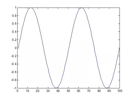
Basic Task: Plot the function sin(x) between 0 x 4 Create an x-array of 100 samples between 0 and 4 . >>x=linspace(0,4*pi,100); Calculate sin(.) of the x-array 1 >>y=sin(x); 0.8 0.6 0.4 Plot the y-array 0.2 0 -0.2 -0.4 -0.6 >>plot(y) -0.8 -1 0 10 20 30 40 50 60 70 80 90 100
Plot the function e-x/3sin(x) between 0 x 4 Create an x-array of 100 samples between 0 and 4 . >>x=linspace(0,4*pi,100); Calculate sin(.) of the x-array >>y=sin(x); Calculate e-x/3 of the x-array >>y1=exp(-x/3); Multiply the arrays y and y1 >>y2=y*y1;
Plot the function e-x/3sin(x) between 0 x 4 Multiply the arrays y and y1 correctly >>y2=y.*y1; Plot the y2-array 0.7 >>plot(y2) 0.6 0.5 0.4 0.3 0.2 0.1 0 -0.1 -0.2 -0.3 0 10 20 30 40 50 60 70 80 90 100
Display Facilities plot(.) 0.7 0.6 0.5 0.4 0.3 Example: >>x=linspace(0,4*pi,100); >>y=sin(x); >>plot(y) >>plot(x,y) 0.2 0.1 0 -0.1 -0.2 -0.3 0 10 20 30 40 50 60 70 80 90 100 0.7 0.6 stem(.) 0.5 0.4 0.3 Example: >>stem(y) >>stem(x,y) 0.2 0.1 0 -0.1 -0.2 -0.3 0 10 20 30 40 50 60 70 80 90 100
Display Facilities title(.) >>title( This is the sinus function ) This is the sinus function 1 xlabel(.) 0.8 0.6 0.4 >>xlabel( x (secs) ) 0.2 sin(x) ylabel(.) 0 -0.2 -0.4 -0.6 -0.8 >>ylabel( sin(x) ) -1 0 10 20 30 40 50 60 70 80 90 100 x (secs)
Example: The following MATLAB session plots y = 0 4 1 8x for 0 x 52, where y represents the height of a rocket after launch, in miles, and x is the horizontal (downrange) distance in miles. >>x = 0:0.1:52; >>y = 0.4*sqrt(1.8*x); >>plot(x,y) >>xlabel( Distance (miles) ) >>ylabel( Height (miles) ) >>title( Rocket Height as a Function of Downrange Distance ) The resulting plot is shown on the next slide.
The auto scaling feature in MATLAB selects tick-mark spacing.
The plot will appear in the Figure window. You can obtain a hard copy of the plot in several ways: 1. Use the menu system. Select Print on the File menu in the Figure window. Answer OK when you are prompted to continue the printing process. 2. Type print at the command line. This command sends the current plot directly to the printer. 3. Save the plot to a file to be printed later or imported into another application such as a word processor. You need to know something about graphics file formats to use this file properly. See the subsection Exporting Figures
When you have finished with the plot, close the figure window by selecting Close from the File menu in the figure window. Note that using the Alt-Tab key combination in Windows-based systems will return you to the Command window without closing the figure window. If you do not close the window, it will not reappear when a new plot command is executed. However, the figure will still be updated.
Requirements for a Correct Plot The following list describes the essential features of any plot: 1. Each axis must be labeled with the name of the quantity being plotted and its units! If two or more quantities having different units are plotted (such as when plotting both speed and distance versus time), indicate the units in the axis label if there is room, or in the legend or labels for each curve. 2. Each axis should have regularly spaced tick marks at convenient intervals not too sparse, but not too dense with a spacing that is easy to interpret and interpolate. For example, use 0.1, 0.2, and so on, rather than 0.13, 0.26, and so on. (continued )
Requirements for a Correct Plot (continued) 3. If you are plotting more than one curve or data set, label each on its plot or use a legend to distinguish them. 4. If you are preparing multiple plots of a similar type or if the axes labels cannot convey enough information, use a title. 5. If you are plotting measured data, plot each data point with a symbol such as a circle, square, or cross (use the same symbol for every point in the same data set). If there are many data points, plot them using the dot symbol. (continued )
6. Sometimes data symbols are connected by lines to help the viewer visualize the data, especially if there are few data points. However, connecting the data points, especially with a solid line, might be interpreted to imply knowledge of what occurs between the data points. Thus you should be careful to prevent such misinterpretation. 7. If you are plotting points generated by evaluating a function (as opposed to measured data), do not use a symbol to plot the points. Instead, be sure to generate many points, and connect the points with solid lines.
The grid and axis Commands The grid command displays gridlines at the tick marks corresponding to the tick labels. Type grid on to add gridlines; type grid off to stop plotting gridlines. When used by itself, grid toggles this feature on or off, but you might want to use grid on and grid off to be sure. You can use the axis command to override the MATLAB selections for the axis limits. The basic syntax is axis([xmin xmax ymin ymax]). This command sets the scaling for the x- and y-axes to the minimum and maximum values indicated. Note that, unlike an array, this command does not use commas to separate the values. More? See page 222.
The function in generated with the plot command, which gives more control than the fplot command.
Plotting Polynomials with the polyval Function. To plot the polynomial 3x5 + 2x4 100x3 + 2x2 7x + 90 over the range 6 x 6 with a spacing of 0.01, you type >>x = -6:0.01:6; >>p = [3,2,-100,2,-7,90]; >>plot(x,polyval(p,x)),xlabel( x ), ... ylabel( p )
Saving Figures To save a figure that can be opened in subsequent MATLAB sessions, save it in a figure file with the .fig file name extension. To do this, select Save from the Figure window File menu or click the Save button (the disk icon) on the toolbar. If this is the first time you are saving the file, the Save As dialog box appears. Make sure that the type is MATLAB Figure (*.fig). Specify the name you want assigned to the figure file. Click OK.
Exporting Figures To save the figure in a format that can be used by another application, such as the standard graphics file formats TIFF or EPS, perform these steps. 1. Select Export Setup from the File menu. This dialog lets you specify options for the output file, such as the figure size, fonts, line size and style, and output format. 2. Select Export from the Export Setup dialog. A standard Save As dialog appears. 3. Select the format from the list of formats in the Save As type menu. This selects the format of the exported file and adds the standard file name extension given to files of that type. 4. Enter the name you want to give the file, less the extension. Then click Save. More? See pages 225-226.
On Windows systems, you can also copy a figure to the clipboard and then paste it into another application: 1. Select Copy Options from the Edit menu. The Copying Options page of the Preferences dialog box appears. 2. Complete the fields on the Copying Options page and click OK. 3. Select Copy Figure from the Edit menu.
Subplots You can use the subplot command to obtain several smaller subplots in the same figure. The syntax is subplot(m,n,p). This command divides the Figure window into an array of rectangular panes with m rows and n columns. The variable p tells MATLAB to place the output of the plot command following the subplot command into the pth pane. For example, subplot(3,2,5) creates an array of six panes, three panes deep and two panes across, and directs the next plot to appear in the fifth pane (in the bottom-left corner).
The following script file created Figure 5.21, which shows the plots of the functions y = e 1 2xsin(10x + 5) for 0 x 5 and y = x3 100 for 6 x 6. x = 0:0.01:5; y = exp(-1.2*x).*sin(10*x+5); subplot(1,2,1) plot(x,y),axis([0 5 -1 1]) x = -6:0.01:6; y = abs(x.^3-100); subplot(1,2,2) plot(x,y),axis([-6 6 0 350]) The figure is shown on the next slide.
Data Markers and Line Types To plot y versus x with a solid line and u versus v with a dashed line, type plot(x,y,u,v, -- ), where the symbols -- represent a dashed line. To plot y versus x with asterisks (*) connected with a dotted line, you must plot the data twice by typing plot(x,y, * ,x,y, : ).
To plot y versus x with green asterisks () connected with a red dashed line, you must plot the data twice by typing plot(x,y, g* ,x,y, r-- ).
Specifiers for data markers, line types, and colors. Data markers Line types Colors . * Dot (.) Asterisk (*) Cross ( ) Circle () Plus sign (+ +) Square () Diamond ( ) Five-pointed star (w) Solid line Dashed line Dash-dotted line Dotted line Black Blue Cyan Green Magenta Red White Yellow k b c g m r w y . + s d p . Other data markers are available. Search for markers in MATLAB help.
Labeling Curves and Data The legend command automatically obtains from the plot the line type used for each data set and displays a sample of this line type in the legend box next to the string you selected. The following script file produced the plot in Figure 5.2 3 (see next slide). x = 0:0.01:2; y = sinh(x); z = tanh(x); plot(x,y,x,z, -- ),xlabel( x ), ... ylabel( Hyperbolic Sine and Tangent ), ... legend( sinh(x) , tanh(x) )
Why use log scales? Rectilinear scales cannot properly display variations over wide ranges.
Logarithmic Plots It is important to remember the following points when using log scales: 1. You cannot plot negative numbers on a log scale, because the logarithm of a negative number is not defined as a real number. 2. You cannot plot the number 0 on a log scale, because log10 0 = ln 0 = . You must choose an appropriately small number as the lower limit on the plot. (continued )
Logarithmic Plots (continued) 3. The tick-mark labels on a log scale are the actual values being plotted; they are not the logarithms of the numbers. For example, the range of x values in the plot in Figure 5.3 2 is from 10 1= 0 1 to 102= 100. 4. Gridlines and tick marks within a decade are unevenly spaced. If 8 gridlines or tick marks occur within the decade, they correspond to values equal to 2, 3, 4 8, 9 times the value represented by the first gridline or tick mark of the decade. (continued )
Logarithmic Plots (continued) 5. Equal distances on a log scale correspond to multiplication by the same constant (as opposed to addition of the same constant on a rectilinear scale). For example, all numbers that differ by a factor of 10 are separated by the same distance on a log scale. That is, the distance between 0.3 and 3 is the same as the distance between 30 and 300. This separation is referred to as a decade or cycle. The plot shown in Figure 5.3 2 covers three decades in x (from 0.1 to 100) and four decades in y and is thus called a four-by-three-cycle plot.
MATLAB has three commands for generating plots having log scales. The appropriate command depends on which axis must have a log scale. 1. Use the loglog(x,y) command to have both scales logarithmic. 2. Use the semilogx(x,y) command to have the x scale logarithmic and the y scale rectilinear. 3. Use the semilogy(x,y) command to have the y scale logarithmic and the x scale rectilinear.
Specialized plot commands. Command Description Creates a bar chart of y versus x. bar(x,y) Produces a plot with two y-axes, y1 on the left and y2 on the right. plotyy(x1,y1,x2,y2) Produces a polar plot from the polar coordinates theta and r, using the line type, data marker, and colors specified in the string type. polar(theta,r, type ) Produces a stairs plot of y versus x. stairs(x,y) Produces a stem plot of y versus x. stem(x,y)
Exponential and Power Functions Plotted on Log Scales
A polar plot showing an orbit having an eccentricity of 0.5.
Error Plots The code is on page 238.
Interactive Plotting in MATLAB This interface can be advantageous in situations where: You need to create a large number of different types of plots, You must construct plots involving many data sets, You want to add annotations such as rectangles and ellipses, or You want to change plot characteristics such as tick spacing, fonts, bolding, italics, and colors.
The interactive plotting environment in MATLAB is a set of tools for: Creating different types of graphs, Selecting variables to plot directly from the Workspace Browser, Creating and editing subplots, Adding annotations such as lines, arrows, text, rectangles, and ellipses, and Editing properties of graphics objects, such as their color, line weight, and font.
The Plot Tools interface includes the following three panels associated with a given figure. The Figure Palette: Use this to create and arrange subplots, to view and plot workspace variables, and to add annotations. The Plot Browser: Use this to select and control the visibility of the axes or graphics objects plotted in the figure, and to add data for plotting. The Property Editor: Use this to set basic properties of the selected object and to obtain access to all properties through the Property Inspector.
Three-Dimensional Line Plots: The following program uses the plot3 function to generate the spiral curve >>t = 0:pi/50:10*pi; >>plot3(exp(-0.05*t).*sin(t),... exp(-0.05*t).*cos(t),t),... xlabel( x ),ylabel( y ),zlabel( z ),grid
The curve x = = e 0.05tsin t, y = = e 0.05tcos t, z = = t plotted with the plot3 function.


