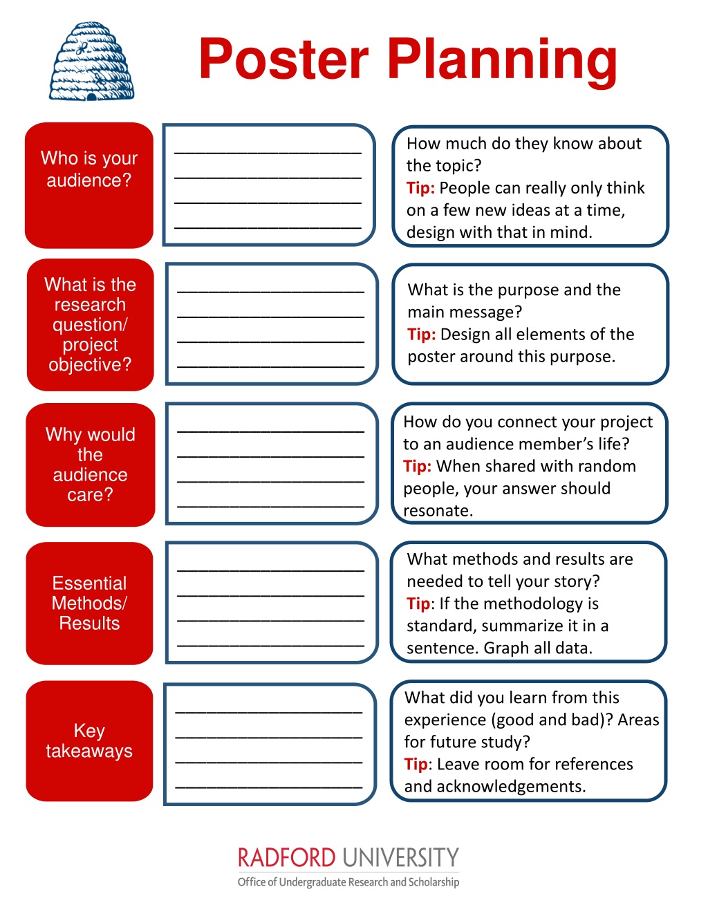
Poster Planning
P
o
s
t
e
r
P
l
a
n
n
i
n
g
Why would
the
audience
care?
What is the
research
question/
project
objective?
Essential
Methods/
Results
Key
takeaways
What is the purpose and the
main message?
Tip:
Design all elements of the
poster around this purpose.
How do you connect your project
to an audience member’s life?
Tip:
When shared with random
people, your answer should
resonate.
What methods and results are
needed to tell your story?
Tip
: If the methodology is
standard, summarize it in a
sentence. Graph all data.
What did you learn from this
experience (good and bad)? Areas
for future study?
Tip
: Leave room for references
and acknowledgements.
Who is your
audience?
How much do they know about
the topic?
Tip:
People can really only think
on a few new ideas at a time,
design with that in mind.
Design concepts that will make your poster
standout and be effective:
Before you start, decide on the size of the poster following
event guidelines and adjust your file (PowerPoint, etc.).
Titles matter. Design yours to be bold, fun, and professional.
Limit your poster to 500 words or less.
Make all fonts 36 or larger (including graphs and figures).
High resolution images only.
If possible, use PNG files for images and graphs.
50-75 % of the space is blank or visuals.
Less is more: colors, fonts, styles, etc.
Bullets points over sentences.
Light background colors and dark text.
The entire poster should relate directly to your main message
and research objectives.
Pro tip:
Remember your audience will only be able to absorb a few
concepts. Ask yourself each time you put something into your poster
if you really need it
.
P
o
s
t
e
r
P
l
a
n
n
i
n
g
Radford University colors:
Radford
Red
,
Dark gray,
Navy
Blue
,
Light gray,
Black,
Green,
Gold
,
Purple,
Tan,
Teal,
Yellow
P
o
s
t
e
r
P
l
a
n
n
i
n
g
Sketch the layout
Once you finish your poster check to make sure:
Did you leave a ¾ inch margin?
Is the poster 50 % white space and visuals?
Does the title and design draw you in?
Are your fonts consistent? 36 point or larger?
Have you mainly used only 2-3 colors?
Is your word count under 500?
At 100 % zoom do all of your figures look sharp and clear?
Do all your elements relate to your main objective?
Are your headers, columns, textboxes aligned vertically and
horizontally?
Did you acknowledge funding, mentoring, poster printing, etc.?
Did you include references and cite using an appropriate
system?
Have
all
other co-authors, presenters and mentors seen and
approved of the final copy?
Once last time with fresh eyes, proof read for spelling,
grammar, etc.
Submit your poster as a pdf for free printing through OURS
www.radford.edu/ours
P
o
s
t
e
r
P
l
a
n
n
i
n
g
Create a visually appealing poster using key design concepts that will make your research stand out to your audience. Remember to focus on your main message and research objectives, use bold titles, limit text to 500 words, and incorporate high-resolution images. Follow layout guidelines, utilize blank space, and maintain consistency in fonts and colors. Check alignment, readability, and overall aesthetic appeal before submitting for printing.

Download Presentation

Please find below an Image/Link to download the presentation.
The content on the website is provided AS IS for your information and personal use only. It may not be sold, licensed, or shared on other websites without obtaining consent from the author. Download presentation by click this link. If you encounter any issues during the download, it is possible that the publisher has removed the file from their server.
E N D
Presentation Transcript
Poster Planning __________________ __________________ __________________ __________________ How much do they know about the topic? Tip: People can really only think on a few new ideas at a time, design with that in mind. Who is your audience? What is the research question/ project objective? __________________ __________________ __________________ __________________ What is the purpose and the main message? Tip: Design all elements of the poster around this purpose. __________________ __________________ __________________ __________________ How do you connect your project to an audience member s life? Tip: When shared with random people, your answer should resonate. Why would the audience care? What methods and results are needed to tell your story? Tip: If the methodology is standard, summarize it in a sentence. Graph all data. __________________ __________________ __________________ __________________ Essential Methods/ Results What did you learn from this experience (good and bad)? Areas for future study? Tip: Leave room for references and acknowledgements. __________________ __________________ __________________ __________________ Key takeaways
Poster Planning Design concepts that will make your poster standout and be effective: Before you start, decide on the size of the poster following event guidelines and adjust your file (PowerPoint, etc.). Titles matter. Design yours to be bold, fun, and professional. Limit your poster to 500 words or less. Make all fonts 36 or larger (including graphs and figures). High resolution images only. If possible, use PNG files for images and graphs. 50-75 % of the space is blank or visuals. Less is more: colors, fonts, styles, etc. Bullets points over sentences. Light background colors and dark text. The entire poster should relate directly to your main message and research objectives. Pro tip: Remember your audience will only be able to absorb a few concepts. Ask yourself each time you put something into your poster if you really need it.
Poster Planning Radford University colors: Radford Red, Dark gray, Navy Blue, Light gray, Black, Green, Gold, Purple, Tan, Teal, Yellow Sketch the layout
Poster Planning Once you finish your poster check to make sure: Did you leave a inch margin? Is the poster 50 % white space and visuals? Does the title and design draw you in? Are your fonts consistent? 36 point or larger? Have you mainly used only 2-3 colors? Is your word count under 500? At 100 % zoom do all of your figures look sharp and clear? Do all your elements relate to your main objective? Are your headers, columns, textboxes aligned vertically and horizontally? Did you acknowledge funding, mentoring, poster printing, etc.? Did you include references and cite using an appropriate system? Have all other co-authors, presenters and mentors seen and approved of the final copy? Once last time with fresh eyes, proof read for spelling, grammar, etc. Submit your poster as a pdf for free printing through OURS www.radford.edu/ours