Old vs. New in Business Intelligence Data Visualization_ What Really Has Changed_
Discover how business intelligence data visualization has transformed from static reports to dynamic, interactive dashboards. Explore the technological advancements, such as AI, real-time data integration, and no-code tools, that have revolutionized how businesses harness and visualize their data.
Download Presentation

Please find below an Image/Link to download the presentation.
The content on the website is provided AS IS for your information and personal use only. It may not be sold, licensed, or shared on other websites without obtaining consent from the author. Download presentation by click this link. If you encounter any issues during the download, it is possible that the publisher has removed the file from their server.
E N D
Presentation Transcript
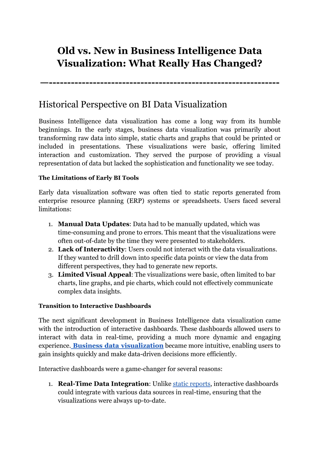
Old vs. New in Business Intelligence Data Visualization: What Really Has Changed? --------------------------------------------------------------- Historical Perspective on BI Data Visualization Business Intelligence data visualization has come a long way from its humble beginnings. In the early stages, business data visualization was primarily about transforming raw data into simple, static charts and graphs that could be printed or included in presentations. These visualizations were basic, offering limited interaction and customization. They served the purpose of providing a visual representation of data but lacked the sophistication and functionality we see today. The Limitations of Early BI Tools Early data visualization software was often tied to static reports generated from enterprise resource planning (ERP) systems or spreadsheets. Users faced several limitations: 1. Manual Data Updates: Data had to be manually updated, which was time-consuming and prone to errors. This meant that the visualizations were often out-of-date by the time they were presented to stakeholders. 2. Lack of Interactivity: Users could not interact with the data visualizations. If they wanted to drill down into specific data points or view the data from different perspectives, they had to generate new reports. 3. Limited Visual Appeal: The visualizations were basic, often limited to bar charts, line graphs, and pie charts, which could not effectively communicate complex data insights. Transition to Interactive Dashboards The next significant development in Business Intelligence data visualization came with the introduction of interactive dashboards. These dashboards allowed users to interact with data in real-time, providing a much more dynamic and engaging experience. Business data visualization became more intuitive, enabling users to gain insights quickly and make data-driven decisions more efficiently. Interactive dashboards were a game-changer for several reasons: 1. Real-Time Data Integration: Unlike static reports, interactive dashboards could integrate with various data sources in real-time, ensuring that the visualizations were always up-to-date.
2. User-Friendly Interfaces: The advent of no-code data visualization tools made it easier for non-technical users to create and customize their dashboards. This democratization of data access meant that more people within an organization could leverage Business Intelligence data visualization. 3. Enhanced Visuals: Modern data visualization software offered a wider range of chart types and visual elements, making it easier to represent complex data in a clear and concise manner. Technological Advancements Driving Change in BI Data Visualization The landscape of Business Intelligence data visualization has transformed dramatically over the past decade, driven by rapid technological advancements. These changes have revolutionized how businesses interact with their data, providing more dynamic, insightful, and accessible visualizations. Understanding these technological drivers is crucial for businesses, data analysts, and BI professionals who aim to leverage the full potential of modern data visualization tools. Cloud Computing and Real-Time Data Integration One of the most significant technological advancements in Business Intelligence data visualization is the advent of cloud computing. Cloud-based data visualization software has enabled businesses to store vast amounts of data securely and access it from anywhere, facilitating real-time collaboration and decision-making. Unlike traditional on-premises solutions, cloud BI platforms offer scalability, allowing businesses to handle increasing data volumes without the need for significant infrastructure investments. This shift has made business data visualization more agile, with real-time updates ensuring that decision-makers always have the most current information at their fingertips. With cloud computing, BI tools can seamlessly integrate with various data sources such as ERP systems, CRM platforms, and external data feeds. This integration capability means that businesses can consolidate disparate data into a single, unified view, making it easier to uncover correlations and trends. Additionally, the cloud's elasticity allows for the automatic adjustment of computing resources based on the workload, ensuring optimal performance during peak usage times without the risk of downtime or latency. The Rise of AI and Machine Learning Artificial intelligence (AI) and machine learning (ML) have introduced a new era of capabilities in Business Intelligence data visualization. These technologies enable advanced analytical functionalities, such as predictive analytics and automated insights, which were previously unimaginable. 2
For instance, data visualization software powered by AI can identify patterns and trends within data sets, providing actionable insights that drive strategic decisions. This level of analysis goes beyond traditional methods, allowing businesses to anticipate market changes, optimize operations, and enhance customer experiences. AI-driven BI tools can also automate routine data analysis tasks, freeing up analysts to focus on more strategic activities. For example, machine learning algorithms can continuously analyze data streams to detect anomalies or emerging trends, automatically generating alerts or recommendations. Natural language processing (NLP) capabilities enable users to interact with BI tools through conversational interfaces, asking questions in plain language and receiving instant, context-aware responses. This makes Business Intelligence data visualization more intuitive and accessible to a broader range of users. No-Code Data Visualization Tools No-code data visualization tools have democratized the ability to create complex visualizations, empowering non-technical users to build and customize their own dashboards. These tools provide intuitive drag-and-drop interfaces, eliminating the need for coding knowledge. This accessibility means that more people within an organization can engage with and utilize Business Intelligence data visualization, fostering a data-driven culture. Grow Data Visualization exemplifies this trend by offering a user-friendly platform that enables users to create sophisticated visualizations without any coding, making business data visualization more inclusive and efficient. The no-code approach also accelerates the development and deployment of BI solutions. Users can quickly prototype and iterate on their dashboards, incorporating feedback from stakeholders in real-time. This rapid development cycle reduces the time to value, enabling businesses to respond swiftly to changing market conditions or operational challenges. Furthermore, no-code platforms, such as Grow BI, often include pre-built templates and connectors for popular data sources, streamlining the integration process and ensuring that users can start visualizing their data almost immediately. Enhanced User Experience and Interactivity The latest iterations of data visualization tools have vastly enhanced the usability and interaction for users. Modern BI tools offer interactive dashboards that allow users to drill down into data, filter views, and explore various dimensions effortlessly. This level of interactivity transforms static reports into dynamic, engaging experiences, enabling users to gain deeper insights and make more informed 3
decisions. Business Intelligence data visualization is no longer a passive process; it is an active exploration of data, facilitated by advanced visualization capabilities. Interactive features such as dynamic filtering, drill-through, and cross-highlighting enable users to interact with their data in real-time, uncovering hidden insights and answering specific business questions on the fly. Advanced visualizations such as heat maps, geospatial maps, and network diagrams provide rich, multidimensional views of data, revealing complex relationships and patterns that might be missed with traditional charts and graphs. Additionally, modern BI tools support collaborative features, allowing users to share insights, annotate visualizations, and discuss findings within the platform, promoting a more collaborative and informed decision-making process. Integration with Multiple Data Sources The ability to integrate with multiple data sources seamlessly is another key advancement in Business Intelligence data visualization. Modern data visualization software can connect to a wide range of data sources, including databases, cloud services, and third-party applications. This integration capability ensures that all relevant data is consolidated into a single platform, providing a holistic view of business operations. 4
Grow Data Visualization excels in this area by offering robust integration features, allowing businesses to unify their data and gain comprehensive insights. Advanced data integration capabilities enable businesses to perform complex data blending and transformation tasks within the BI platform. This means that users can combine data from different sources, apply transformations, and create calculated fields without needing to export data to external tools. Real-time data streaming and ETL (extract, transform, load) processes ensure that the data used for visualization is always up-to-date and accurate. These capabilities are essential for maintaining data integrity and consistency across the organization, enabling reliable and trustworthy Business Intelligence data visualization. Real-Time Data Updates Another critical aspect of enhanced user experience in Business Intelligence data visualization is the ability to access real-time data updates. In the past, data visualizations were often based on static data, which could quickly become outdated. Now a days, data visualization software, however, integrates seamlessly with various data sources, providing up-to-the-minute information. This real-time 5
capability ensures that users are always working with the most current data, leading to more accurate and timely decision-making. Grow Data Visualization leverages real-time data integration to provide users with constantly updated dashboards, enhancing the relevance and reliability of the insights generated. Aspect Old BI Tools New BI Tools Data Integration Manual data updates; limited integration capabilities Real-time data integration from multiple sources User Interface Complex, non-intuitive; requires technical skills User-friendly, no-code data visualization interfaces Interactivity Static reports; limited interaction Highly interactive dashboards with drill-down features Customization Minimal customization options Extensive customization; drag-and-drop functionality Collaboration Siloed data; difficult to share insights Built-in collaboration features; easy sharing Data Accessibility On-premises, limited remote access Cloud-based; accessible from anywhere, anytime Mobile Support Limited or no mobile support Full mobile accessibility with responsive design Analytical Capabilities Basic descriptive analytics Advanced analytics including predictive and AI-driven insights Visualization Types Basic charts (bar, line, pie) Advanced and diverse visualizations (heat maps, scatter plots, etc.) Scalability Limited scalability; hardware constraints Highly scalable; leverages cloud infrastructure Cost High upfront costs; expensive maintenance Subscription-based pricing; lower total cost of ownership Implementation Time Long implementation cycles Rapid deployment; quicker time-to-value 6
Customization is a key feature that enhances the user experience in business data visualization. Users need the ability to tailor dashboards to their specific requirements, whether it s adjusting the layout, choosing different chart types, or setting up personalized filters. This flexibility ensures that the data visualization software can adapt to the unique needs of different users and business scenarios. Grow Data Visualization excels in offering a wide range of customization options, allowing users to create bespoke dashboards that provide the most relevant and impactful insights for their roles. Collaborative Features Modern Business Intelligence data visualization tools also emphasize collaboration. In today s interconnected business environment, it s crucial for teams to be able to share insights and work together seamlessly. Data visualization software with built-in collaboration features allows users to share dashboards, comment on data points, and collectively explore insights. This collaborative approach fosters a more data-driven culture within organizations, where insights are not siloed but are accessible and actionable by all relevant stakeholders. Grow Data Visualization supports collaboration by enabling easy sharing and real-time collaboration on dashboards, ensuring that teams can work together effectively. Mobile Accessibility With the rise of mobile technology, the ability to access data visualization tools on-the-go has become increasingly important. Mobile accessibility ensures that users can interact with their dashboards anytime, anywhere, using their smartphones or tablets. This flexibility is particularly valuable for business users who need to make decisions while traveling or attending meetings away from their desks. Grow Data Visualization offers mobile-friendly interfaces that maintain the same level of interactivity and user experience as their desktop counterparts, ensuring that users are always connected to their data. Mobile BI solutions are optimized for touch interfaces, allowing users to interact with dashboards and reports using gestures such as pinch-to-zoom and swipe. Offline capabilities enable users to access and analyze data even when they are not connected to the internet, ensuring uninterrupted productivity. Push notifications can alert users to important changes or insights, prompting timely actions based on the latest data. These features make Business Intelligence data visualization more 7
adaptable to the needs of modern, on-the-go professionals, supporting a more agile and responsive business environment. Conclusion The journey from old to new in Business intelligence data visualization highlights remarkable advancements that have transformed how businesses interact with their data. From static, manual reports to dynamic, interactive dashboards, the evolution of BI tools has significantly enhanced data accessibility, usability, and insight generation. Modern BI solutions offer real-time data integration, advanced analytics, and intuitive no-code interfaces, making business data visualization more powerful and user-friendly than ever before. One standout example of these advancements is Grow Data Visualization. Grow's platform provides a seamless experience, combining real-time data integration, AI-driven insights, and an easy-to-use interface. Whether you're a seasoned data analyst or a business user with no technical background, Grow empowers you to create sophisticated, actionable visualizations effortlessly. This democratization of data access leads to a data-driven culture, enabling everyone in the organization to make informed decisions based on the latest insights. What's unique about Grow is its commitment to continuous innovation and user-centric design. Grow's platform not only meets the current needs of businesses but also anticipates future trends in data visualization. With features like mobile accessibility, robust data integration, and advanced analytics, Grow ensures that your business intelligence capabilities remain cutting-edge. Ready to experience the future of Business Intelligence data visualization? Start your journey with Grow today. Sign up for a 14-day free trial and explore the powerful features that can transform your data into actionable insights. To learn more about Grow's offerings, check out the Grow Pricing 2024 on Capterra. By choosing Grow, you're not just upgrading your BI tools; you're investing in a platform designed to drive innovation, efficiency, and growth. Don't get left behind with outdated methods experience the transformative power of modern data visualization with Grow. 8


