Creating Engaging Presentations with Verdana Font
Explore the world of presentation design with Verdana font. Learn to craft visually appealing slides using bold headings, elegant content layouts, and a clean white background. Discover the power of color schemes and default settings to enhance the overall look of your presentations. Dive into table styles and best practices for creating impactful visual content in your slides.
Download Presentation

Please find below an Image/Link to download the presentation.
The content on the website is provided AS IS for your information and personal use only. It may not be sold, licensed, or shared on other websites without obtaining consent from the author.If you encounter any issues during the download, it is possible that the publisher has removed the file from their server.
You are allowed to download the files provided on this website for personal or commercial use, subject to the condition that they are used lawfully. All files are the property of their respective owners.
The content on the website is provided AS IS for your information and personal use only. It may not be sold, licensed, or shared on other websites without obtaining consent from the author.
E N D
Presentation Transcript
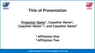
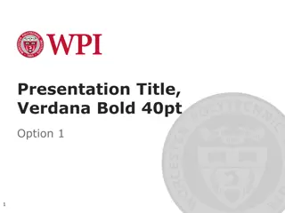
Presentation Title, Verdana Bold 40pt Option 1
Presentation Title, Verdana Bold 40pt Option 1
Layout: SectionDivider, Verdana Bold 40pt Divider Subtext Verdana 28 pt 4
Layout: Title and Content Verdana Bold 32pt First level bullet text, Verdana 24pt Line spacing 0.95, before paragraph 12pt Left justified Sentence case First level bullet color is accent1 Second level bullet Verdana 20pt Line spacing 0.95, before paragraph 6pt Third level Third level o Fourth level Worcester Polytechnic Institute 5
Layout: Two Content First level bullet, Verdana 22pt Line spacing 0.95, before paragraph 10pt Left justified Sentence case First level bullet color is accent 1 Second level bullet Third level First level bullet, Verdana 22pt Line spacing 0.95, before paragraph 10pt Left justified Sentence case First level bullet color is accent 1 Second level bullet Third level Worcester Polytechnic Institute 6
Color Scheme White Background R255 G255 B255 Accent 1 R171 G25 B45 Black R0 G0 B0 Accent 2 R178 G183 B187 Red R171 G25 B45 Accent 3 R44 G106 B140 Grey R109 G109 B109 Accent 4 R183 G160 B121 Accent 5 R70 G160 B220 Accent 6 R109 G109 B109 Worcester Polytechnic Institute 7
Default Settings Theme Fonts: Verdana (heading) Verdana (body) Drawing Style Default: Sample Sample Sample Text Box Default: Verdana 16pt Color: Black Align: Center Line Spacing: Multiple .95 Space Before: 6pt Line Style Default: For labels only use layout placeholders for bulleted lists Worcester Polytechnic Institute 8
Default Table Style Heading 1 Heading 2 Heading 3 Heading 4 Heading 5 Content Content Content Content Content Content Content Content Content Content Content Content Content Content Content Content Content Content Content Content Worcester Polytechnic Institute 9
Layout: PhotoCaption Photo description Worcester Polytechnic Institute 10
Layout: Content Column Chart Sample 6 5 Series 1 Series 2 Series 3 Series 4 Series 5 Series 6 4 3 2 1 0 Category 1 Category 2 Category 3 Category 4 Worcester Polytechnic Institute 11
Layout: Two Content Column Chart Sample First level bullet text Line spacing 0.95, before paragraph 12pt Left justified Sentence case First level bullet color is accent 2 Second bullet level Line spacing 0.95, before paragraph 6pt 6 5 4 3 2 1 0 Cat 1 Cat 2 Cat 3 Cat 4 Series 1 Series 3 Series 2 Series 4 Worcester Polytechnic Institute 12
Layout: Content Line Chart Sample 6 5 Series 1 Series 2 Series 3 Series 4 Series 5 Series 6 4 3 2 1 0 Category 1 Category 2 Category 3 Category 4 Worcester Polytechnic Institute 13
Layout: Two Content Line Chart Sample First level bullet text Line spacing 0.95, before paragraph 12pt Left justified Sentence case First level bullet color is accent 2 Second bullet level Line spacing 0.95, before paragraph 6pt 6 5 4 3 2 1 0 Cat. 1 Cat. 2 Cat. 3 Cat. 4 Series 1 Series 3 Series 2 Series 4 Worcester Polytechnic Institute 14
Layout: Content Pie Chart Sample Series 1 Series 2 Series 3 Series 4 Series 5 Series 6 Worcester Polytechnic Institute 15
Layout: Two Content Pie Chart Sample First level bullet text Line spacing 0.95, before paragraph 12pt Left justified Sentence case First level bullet color is accent 2 Second bullet level Line spacing 0.95, before paragraph 6pt Series 1 Series 3 Series 2 Series 4 Worcester Polytechnic Institute 16
Presentation Title, Verdana Bold 40pt Option 1
Presentation Title, Verdana Bold 40pt Option 1
Presentation Title, Verdana Bold 40pt Option 1 20
Layout: Title and Content Verdana Bold 32pt First level bullet text, Verdana 24pt Line spacing 0.95, before paragraph 12pt Left justified Sentence case First level bullet color is accent1 Second level bullet Verdana 20pt Line spacing 0.95, before paragraph 6pt Third level Third level o Fourth level 21 Worcester Polytechnic Institute
Layout: Two Content First level bullet, Verdana 22pt Line spacing 0.95, before paragraph 10pt Left justified Sentence case First level bullet color is accent 1 Second level bullet Third level First level bullet, Verdana 22pt Line spacing 0.95, before paragraph 10pt Left justified Sentence case First level bullet color is accent 1 Second level bullet Third level 22 Worcester Polytechnic Institute
Color Scheme Background R109 G109 B109 Accent 1 R171 G25 b45 White Text R255 G255 B255 Accent 2 R178 G183 B187 White -Rule R255 G255 B255 Accent 3 R44 G106 B140 Black R0 G0 B0 Accent 4 R183 G160 B121 Accent 5 R70 G160 B220 Accent 6 R217 G205 B149 23 Worcester Polytechnic Institute
Default Settings Theme Fonts: Verdana (heading) Verdana (body) Drawing Style Default: Sample Sample Sample Text Box Default: Verdana 16pt Color: White Align: Center Line Spacing: Multiple .95 Space Before: 6pt Line Style Default: For labels only use layout placeholders for bulleted lists 24 Worcester Polytechnic Institute
Default Table Style Heading 1 Heading 2 Heading 3 Heading 4 Heading 5 Content Content Content Content Content Content Content Content Content Content Content Content Content Content Content Content Content Content Content Content 25 Worcester Polytechnic Institute
Layout: PhotoCaption Photo description 26 Worcester Polytechnic Institute
Layout: Content Column Chart Sample 6 5 Series 1 Series 2 Series 3 Series 4 Series 5 Series 6 4 3 2 1 0 Category 1 Category 2 Category 3 Category 4 27 Worcester Polytechnic Institute
Layout: Two Content Column Chart Sample First level bullet text Line spacing 0.95, before paragraph 12pt Left justified Sentence case First level bullet color is accent 2 Second bullet level Line spacing 0.95, before paragraph 6pt 6 5 4 3 2 1 0 Cat 1 Cat 2 Cat 3 Cat 4 Series 1 Series 3 Series 2 Series 4 28 Worcester Polytechnic Institute
Layout: Content Line Chart Sample 6 5 Series 1 Series 2 Series 3 Series 4 Series 5 Series 6 4 3 2 1 0 Category 1 Category 2 Category 3 Category 4 29 Worcester Polytechnic Institute
Layout: Two Content Line Chart Sample First level bullet text Line spacing 0.95, before paragraph 12pt Left justified Sentence case First level bullet color is accent 2 Second bullet level Line spacing 0.95, before paragraph 6pt 6 5 4 3 2 1 0 Cat. 1 Cat. 2 Cat. 3 Cat. 4 Series 1 Series 3 Series 2 Series 4 30 Worcester Polytechnic Institute
Layout: Content Pie Chart Sample Series 1 Series 2 Series 3 Series 4 Series 5 Series 6 31 Worcester Polytechnic Institute
Layout: Two Content Pie Chart Sample First level bullet text Line spacing 0.95, before paragraph 12pt Left justified Sentence case First level bullet color is accent 2 Second bullet level Line spacing 0.95, before paragraph 6pt Series 1 Series 3 Series 2 Series 4 32 Worcester Polytechnic Institute
