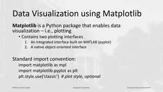
Data Visualization with Matplotlib in Python
Matplotlib is a powerful Python package for data visualization, offering both an integrated interface (pyplot) and a native object-oriented interface. This tool enables users to create various types of plots and gives control over the visualization process. Learn about basic operations, differences
7 views • 19 slides

SlideOrbit - Share Presentations & Documents Online
SlideOrbit is a free platform to share PowerPoint presentations and PDF documents. Simply upload your presentations or documents to SlideOrbit, and we'll convert it to a web-friendly HTML5 format making it shareable via our online presentation player which can be embedded on any sites. Presentations
2 views • 9 slides
HTML5 development services
HTML5 generation offers numerous capabilities with a wide variety of structural elements, semantics, media factors, and new attributes making it easier for developers and virtual marketers to power organic traffic on their websites.
4 views • 3 slides

Open Source Chat Based Data Visualization With Helical Insight
Open Source Chat Based Data Visualization plays a pivotal role in modern business operations, enabling organizations to derive insights, make informed decisions, and drive growth. However, traditional visualization tools often come with high costs and steep learning curves, limiting accessibility an
1 views • 2 slides
Benefits of Open Source Chat-based Data Visualization
In the realm of Business Intelligence (BI), data visualization plays a pivotal role in transforming raw data into actionable insights. Traditional BI tools often require users to possess technical expertise in querying databases and creating visualizations. However, the emergence of open source chat
1 views • 2 slides
Open Source Alternative to Tableau for Data Visualization in 2024
As businesses increasingly rely on data-driven decisions, the demand for powerful data visualization tools continues to grow. Tableau has long been a leader in this space, known for its robust capabilities and user-friendly interface. However, open-source alternatives are gaining traction due to the
0 views • 2 slides

Reusing Phylogenetic Data for Enhanced Visualization and Analysis
Reusing phylogenetic data can revolutionize scientific research by enabling synthesis of knowledge and comparative analyses across scientific disciplines. However, a significant portion of valuable phylogenetic data is lost due to the prevalent use of static images for tree publication. To address t
0 views • 8 slides

Advanced Adaptive Media Player (AAMP) Overview
AAMP is a versatile player library capable of HLS and DASH playback, developed as an open-source lightweight IP video player. It supports multiple DRMs, offers improved performance, and reduces costs. AAMP features Java-script-based playback, audio/video buffering management, codec support for 4K st
0 views • 14 slides

Wind Tunnels: Devices for Aerodynamic Testing
Wind tunnels are devices that simulate air flows to test models under controlled conditions. They are classified as low-speed and high-speed tunnels, used to replicate flying or moving objects. Testing involves studying air motion using techniques like smoke visualization, colored threads, and speci
2 views • 37 slides

Interactive Plotting with ggplot and Shiny: Enhancing Galaxy Visualization Tools
Explore the concept of transforming existing ggplot2 Galaxy tools into interactive platforms using Shiny or Plotly implementations. Discover a variety of plot types available with ggplot2, such as barplots, violin plots, PCA plots, and heatmaps. Utilize additional plot options through various geom_*
3 views • 9 slides

EEG Conformer: Convolutional Transformer for EEG Decoding and Visualization
This study introduces the EEG Conformer, a Convolutional Transformer model designed for EEG decoding and visualization. The research presents a cutting-edge approach in neural systems and rehabilitation engineering, offering advancements in EEG analysis techniques. By combining convolutional neural
1 views • 6 slides
Web Application Development and Programming CTE Program Overview
Viera High School offers a comprehensive CTE program in Web Application Development and Programming, taught by Mr. Dohmen. Students learn popular programming languages like Python, SQL, JavaScript, Java, C#, and C. The courses cover web programming, JavaScripting, and PHP programming, providing cert
3 views • 7 slides
Top Web Development Institute in Noida: Master the Skills for a Thriving Career
Looking to build a successful career in web development? Enroll at the leading web development institute in Noida and gain expertise in essential programming languages like HTML5, CSS3, JavaScript, and popular frameworks such as React and Bootstrap.
0 views • 1 slides

Design and Evaluation in Visualization Techniques
Understanding the importance of formal evaluations in visualization techniques, this material covers a range of evaluation methods including empirical and analytic approaches such as usability tests, controlled experiments, and expert reviews. It delves into the scientific method of hypothesis forma
1 views • 41 slides
Multidimensional Icons in Data Visualization Solutions
This collection showcases various types of visual icons used in data visualization to represent values of different variables, such as categorical, quantitative, and Boolean data. Each icon summarizes specific information for a given item in a collection, ranging from nominal and ordinal data to the
0 views • 9 slides
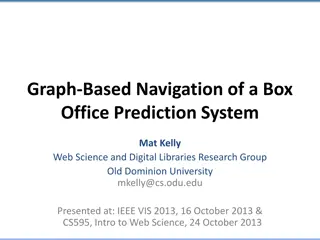
Box Office Prediction System Using Graph-Based Navigation
A study conducted by Mat Kelly from Old Dominion University presents a graph-based navigation system for predicting box office ratings. The research used Visual Analytics techniques to analyze data sourced exclusively from movie IDs and listing files. By leveraging tools like D3.js, JavaScript, and
0 views • 20 slides

Enhancing Safety in Navigation Through Improved Data Quality Visualization
The IHO Data Quality Working Group focuses on classifying and depicting the quality of digital hydrographic information to ensure safe navigation. The group addresses the need for clear warnings on ECDIS displays regarding poor-quality survey data. Despite progress in developing visualization method
1 views • 34 slides
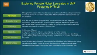
Exploring Female Nobel Laureates in JMP Featuring HTML5
Discover the trends of female Nobel Laureates across decades and categories using interactive charts and geographic information. Explore the impact and underrepresentation of women in Nobel Prizes through data analysis and visualization techniques.
0 views • 7 slides
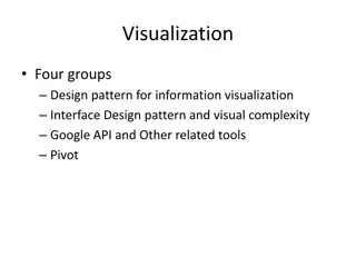
Software Design Patterns for Information Visualization
Explore design patterns for information visualization interfaces, understand the complexities, and leverage tools like Google API. Learn about different software design patterns, categories of patterns for information visualization, and the relationships between them. Discover the reference model fo
0 views • 27 slides
CSS Rule Sets and Cross-Browser Compatibility in ASP.NET Applications
Learn how to code CSS rule sets and ensure cross-browser compatibility in ASP.NET applications. Explore Visual Studio features for working with HTML and CSS, along with guidelines for testing web pages on different browsers and utilizing HTML5 features effectively.
0 views • 20 slides

Interactive Data Visualization Tools and Techniques Quiz
This quiz tests knowledge on data visualization tools, techniques, and concepts. Questions cover topics such as the use of EDA in data visualization, interactive graph outputs, historical figures in data visualization, GIS data types in SAS/JMP, outlier detection in 3D scatterplots, and limitations
1 views • 11 slides
Cognition Models in InfoVis: Understanding Knowledge Creation Process
Visualization plays a key role in aiding cognition by supporting knowledge creation and seeking tasks through process models and task taxonomies. Understanding the cognitive aspects of information visualization is crucial for aiding comprehension and knowledge understanding, as demonstrated by the u
0 views • 41 slides
Discover SnapLogic: The Elastic Integration Platform
SnapLogic is a powerful cloud-based integration platform designed for seamless connectivity between various applications and data sources. With its HTML5-based Designer, Manager, and Dashboard, SnapLogic offers a user-friendly and efficient solution for data integration across different platforms. I
0 views • 15 slides
Porting to BlackBerry using Apache Cordova - Development Insights
Explore the process of porting to BlackBerry using Apache Cordova as shared by Gord Tanner and Michael Brooks. Discover tips on overcoming challenges, ensuring compatibility, and leveraging HTML5 for a smoother transition to the BlackBerry platform.
0 views • 25 slides
JavaScript Slot Machine Code Simplified_ Develop in Just Minutes
Learn how to develop a slot machine game in just minutes with JavaScript Slot Machine Code. Explore the essentials of casino JavaScript, HTML5 Slot Machine Development, and the latest trends in online gaming and casino software.\n\nSource>>\/\/ \/jav
0 views • 5 slides
Enhancing Classmate's Data Visualization for Homework Assignment 2
Explore the process of applying a classmate's data visualization code to your own data for Homework Assignment 2. Critique the effectiveness of the visualization in conveying the intended point and offer suggestions for improvement if necessary. Follow the steps outlined to submit your completed ass
0 views • 4 slides

Evolution of the Internet: A Visual Journey Through Web Technologies
Explore the rich history of the internet through key technologies such as HyperText System, Gopher, Lynx, Mosaic, Netscape, Web Servers, Client-Server model, Web Hosting, Domain Name Registration, DNS Records, HTML, Firewall, HTML5 & JavaScript, and more. From early browsers to modern coding languag
0 views • 34 slides
Harnessing the Power of Casino JavaScript for HTML5 Casino Game Development
Discover how to leverage casino JavaScript for HTML5 casino game development. Learn how JavaScript slot machine code and casino game code can create engaging and scalable games.\n\nSource>>\/\/ \/javascript-slot-machine-code\n
0 views • 5 slides
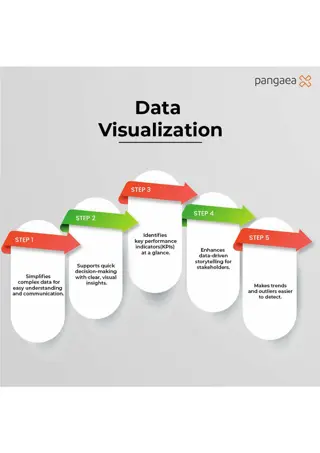
Maximize Business Impact with Data Visualization
This infographic shows how data visualization simplifies complex data, supports decision-making, highlights KPIs, and enhances data-driven storytelling. Its an essential tool for identifying trends and outliers. Discover expert data visualization talent at Pangaea X by visiting www.pangaeax.com.
7 views • 1 slides

Data Visualization Presentations Collection
Collection of various image slides containing charts, graphs, and data visualization elements. The slides showcase different types of visual representations such as bar graphs, line charts, percentages, and more. Each slide provides a unique visualization, making it a diverse collection for presenta
0 views • 13 slides
HTML5 Basics
Explore the new HTML5 elements, features, and guidelines, including the importance of the doctype declaration, language specification, metadata in the head section, and structural elements like sections, navigation, articles, headers, and footers. Gain insights into creating well-structured web page
0 views • 22 slides
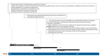
Effective Stakeholder Interviews for Visualization Tool Improvement
Conducting in-depth interviews with stakeholders is crucial for identifying their needs and use cases for visualization tools. By asking targeted questions and analyzing responses, insights can be gained to enhance the current visualization technique, like Eiffel Vici. The process involves mapping s
0 views • 5 slides
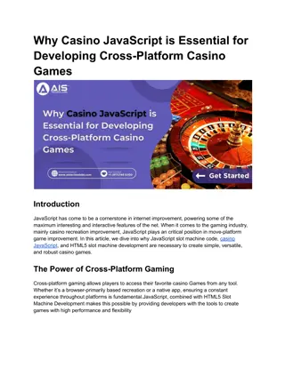
Why Casino JavaScript is Essential for Developing Cross-Platform Casino Games
Learn how JavaScript slot machine code, casino JavaScript, and HTML5 Slot Machine Development shape cross-platform slot game development. Contact AIS Technolabs!\n\nSource>>\/\/ \/javascript-slot-machine-code\n
0 views • 3 slides

Unleash the Power of JavaScript Slot Machine Code for Your Online Casino (1)
Learn how to create captivating online slot machines with JavaScript Slot Machine Code, Casino game code, Casino game HTML code, HTML5 casino games source code, Slot machine JavaScript for your platform.\n\nKnow more>>\/\/ \/javascript-slot-machine-c
0 views • 4 slides

Comprehensive Study Guide for Web Design 1 Final Exam
This study guide covers essential topics such as HTML, CSS, history of HTML, goals of HTML5, HTML5 syntax rules, HTML5 DOCTYPE, and basic HTML5 coding. It explains the evolution of HTML standards, the purposes of HTML5, and provides practical examples for better understanding.
0 views • 40 slides

Enhancing Data Visualization Community Engagement through Viz and Tell Sessions
This resource outlines a model for building a critical community focused on data visualization, offering Viz and Tell/Coffee Break sessions to encourage engagement and learning. Topics covered include visualization instruction, tools, ethics, data journalism, and more. The model emphasizes open disc
0 views • 6 slides
Importance of Data Visualization in Network Management
Data visualization plays a crucial role in understanding and extracting value from data, especially in the realm of network management. Visualization techniques enable better decision-making, pattern recognition, and storytelling with data. By exploring data through visualization tools, one can unco
0 views • 26 slides
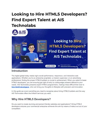
Looking to Hire HTML5 Developers
Looking to hire HTML5 developers? Find expert HTML5 programmers at AIS Technolabs for responsive apps. Contact us to hire dedicated HTML5 developers now.\n\nSource>>\/\/ \/hire-html-5-developer\n\n
0 views • 4 slides
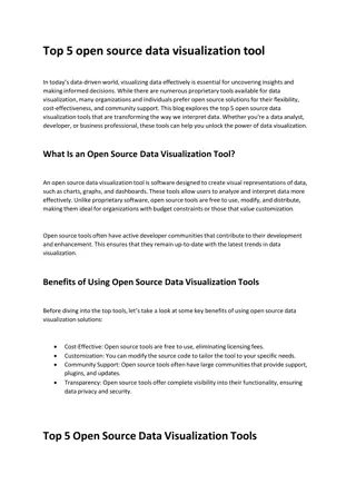
Top 5 Open Source Data Visualization Tools
This blog explores the top 5 open source data visualization tools that are transforming the way we interpret data. Whether you're a data analyst, developer, or business professional, these tools can help you unlock the power of data visualization.
0 views • 5 slides