
The Surface Weather Map
Surface weather maps, symbols, and their meanings. Discover how to interpret weather features and map lines for weather predictions. Learn the efficient plotting of data on maps.
1 views • 11 slides

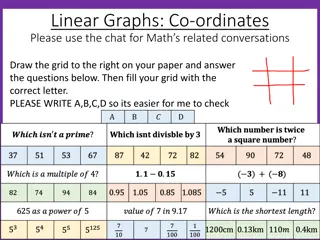
Graphical representations of linear relationships
This material includes a series of checkpoint activities and additional tasks related to graphical representations of linear relationships for Year 8 students. Students will engage in tasks such as plotting points on coordinate grids, analyzing ant movements, exploring different rules for plotting p
1 views • 51 slides
Weibull Analysis with MINITAB: Step-by-Step Guide
Learn how to perform Weibull Analysis using MINITAB versions 14 to 18. Understand the process of plotting failures, picking the right distribution, and interpreting Weibull plots for reliability analysis. Follow the detailed steps and visual aids provided to conduct a successful Weibull Analysis on
0 views • 22 slides
Ask On Data for Efficient Data Wrangling in Data Engineering
In today's data-driven world, organizations rely on robust data engineering pipelines to collect, process, and analyze vast amounts of data efficiently. At the heart of these pipelines lies data wrangling, a critical process that involves cleaning, transforming, and preparing raw data for analysis.
2 views • 2 slides
Data Wrangling like Ask On Data Provides Accurate and Reliable Business Intelligence
In current data world, businesses thrive on their ability to harness and interpret vast amounts of data. This data, however, often comes in raw, unstructured forms, riddled with inconsistencies and errors. To transform this chaotic data into meaningful insights, organizations need robust data wrangl
0 views • 2 slides
Exploring Three-Dimensional Geometry in Precalculus
Delve into the world of analytical geometry in three dimensions with a focus on plotting points, calculating distances and midpoints, graphing spheres, and understanding vectors in space. This chapter covers essential concepts such as 3D coordinate systems, equations of spheres, vector operations, a
0 views • 29 slides

Mastering Quadratic Functions: Graphing Through Transformations
Explore the vertex form of quadratic equations, understand transformation rules, and learn step-by-step methods for graphing quadratics with examples and practice problems. Enhance your skills in identifying vertices, plotting points, and visualizing the U-shaped graphs of quadratic functions.
0 views • 10 slides
Digital Differential Analyzer (DDA) Algorithm in Computer Graphics
In computer graphics, the Digital Differential Analyzer (DDA) Algorithm is utilized as the basic line drawing algorithm. This method involves interpolation of variables between two endpoints to rasterize lines, triangles, and polygons efficiently. The algorithm requires inputting coordinates of two
1 views • 9 slides
Interactive Plotting with ggplot and Shiny: Enhancing Galaxy Visualization Tools
Explore the concept of transforming existing ggplot2 Galaxy tools into interactive platforms using Shiny or Plotly implementations. Discover a variety of plot types available with ggplot2, such as barplots, violin plots, PCA plots, and heatmaps. Utilize additional plot options through various geom_*
3 views • 9 slides

Data Governance and Data Analytics in Information Management
Data Governance and Data Analytics play crucial roles in transforming data into knowledge and insights for generating positive impacts on various operational systems. They help bring together disparate datasets to glean valuable insights and wisdom to drive informed decision-making. Managing data ma
1 views • 8 slides
Experimental Aerodynamics II Lab 5: Converging-Diverging Nozzle Analysis
This lab focuses on understanding and analyzing the converging-diverging nozzle in a supersonic wind tunnel facility at NCSU. It involves studying different flow regimes, plotting pressure and temperature variations, and identifying flow conditions based on back pressure ratios. The lab aims to char
3 views • 7 slides

Power System Transient Stability Overview: ECEN 667 Lecture Summary
This summary covers the key points discussed in the lecture on transient stability in power systems by Professor Tom Overbye at Texas A&M University. Topics include contingency analysis, results interpretation, PowerWorld Simulator usage, plotting results, and more. Detailed information is provided
0 views • 43 slides
Scatter Diagram Method for Correlation Analysis
Scatter Diagram Method is a simple and effective way to study the correlation between two variables. By plotting data points on a graph, it helps determine the degree of correlation between the variables. Perfect positive and negative correlations, as well as high and low degrees of correlation, can
0 views • 11 slides
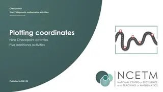
Interactive Mathematics Activities for Year 7: Plotting Coordinates and More
Engage in a series of nine checkpoint activities focusing on plotting coordinates, including scenarios like ant movements, pirate treasure hunts, high and low points, and understanding coordinate axes. Dive into fun challenges and develop key skills in mathematics while exploring various coordinate
0 views • 29 slides
Nuclear Data Recycling Using NuDat Programs
Explore the use of NuDat classes in plotting beta-minus decay half-lives, electron capture processes, reliable ECp values, and antineutrino spectra calculations. Delve into topics like cross-section spectra, thermal fission yields, and the decay of various nuclides. The research also discusses assum
0 views • 14 slides
Introduction to Plane Table Surveying in Civil Engineering
Plane table surveying is a graphical and cost-effective method used for surveying small-scale areas. This method involves simultaneous plotting of the survey while in the field, ensuring accuracy and efficiency. Key principles, instruments, setting up procedures, advantages, disadvantages, and commo
2 views • 37 slides
Overview of the COAWST Toolbox and its Components
The COAWST Toolbox is a suite of MATLAB tools, scripts, and functions that offers standard functionalities for creating grids, initial conditions, atmospheric forcing, boundary conditions, and climatology files for COAWST. It includes tools for creating tidal forcing files, and ROMS expects specific
0 views • 51 slides

Data Collection and Analysis for Businesses
Explore the impact and role of data utilization in organizations through the investigation of data collection methods, data quality, decision-making processes, reliability of collection methods, factors affecting data quality, and privacy considerations. Two scenarios are presented: data collection
1 views • 24 slides
Fun Math with Coordinate Geometry Challenges
Engage in a series of coordinate geometry challenges involving plotting points, identifying shapes like rectangles and kites, and exploring geometric properties such as equal line lengths and triangle types. Test your skills and observation with these interactive exercises.
1 views • 18 slides
Introduction to Python for Numerical Computing and Scientific Application
This document introduces the use of Python for numerical computing and development of scientific applications in the context of Civil and Environmental Engineering. It covers topics such as utilizing the SciPy ecosystem, creating graphs using pylab/matplotlib, plotting 3D graphs, and working with Pa
0 views • 36 slides
Meteorological Data Analysis and Visualization Tools for Regional Weather Services
Explore advanced tools and technologies for analyzing and visualizing meteorological data in regional weather services. From observational variables to forecast and ensemble models, learn about different plotting methods, interactive features, and map layers used in the field of meteorology. Enhance
0 views • 6 slides
Review of SOHO SWAN Derived Cometary Water Production Rates
This review discusses the data access tools, investigation methods, and scientific plotting involved in analyzing SOHO SWAN derived cometary water production rates for comets between 1998 and 2021. The dataset includes ASCII files with various parameters like UTC time of observation and water produc
3 views • 8 slides
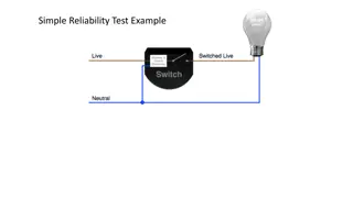
Simple Reliability Test Example for Bulbs
Understanding reliability testing for bulbs involves testing failure rates, predicting longevity based on on/off cycles, and analyzing data to determine failure patterns. This example demonstrates collecting data, plotting results, fitting Normal curves, and using life distribution output profilers
0 views • 8 slides
Back-End Ocean Data Analysis Program for LCS Calculation
A program designed to automatically retrieve ocean data over an eight-day period and compute Lagrangian Coherent Structures (LCS) on a daily basis. The generated data can then be plotted to visualize the LCS patterns in the ocean. Motivated by guiding fluid flows, the program can aid in predicting t
0 views • 11 slides
Effect of Sunshine on Museum Visitors
A museum owner suggests that fewer people visit the museum on sunny days. To investigate this claim, a table is provided showing the number of visitors to the museum over a 10-day period last summer along with daily sunshine totals. By plotting a scatter graph for this data, it can be analyzed wheth
0 views • 29 slides
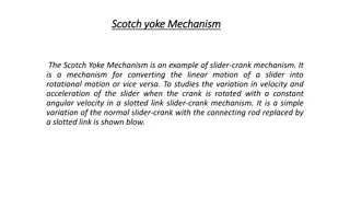
The Scotch Yoke Mechanism: Experiment and Analysis
The Scotch Yoke Mechanism is a slider-crank mechanism that converts linear motion into rotational motion or vice versa. This experiment involves studying the velocity, acceleration, and displacement of a slider as the crank is rotated with constant angular velocity in a slotted link slider-crank mec
1 views • 5 slides
The Importance of Partograph in Monitoring Labor Progress
Partograph is a crucial tool for healthcare providers to monitor labor progression and ensure the well-being of both mother and baby. This article covers the significance of using a partograph, the frequency of recording parameters during labor, and how to plot and interpret findings for effective d
0 views • 17 slides
Statistical Methods for Data Analysis Modeling PDFs with RooFit
Statistical methods guide on using RooFit within the ROOT framework for data analysis and modeling. Learn about RooRealVar definitions, Gaussian PDF building, and plotting techniques in various dimensions.
0 views • 18 slides
Visual Guide to Drawing Line Graphs with Data
Learn how to create line graphs step by step using provided data sets, including temperature over time and weight loss on a diet. Understand the process of plotting points, connecting them, adding axes labels, and scaling for accurate representation. Follow along with detailed instructions and visua
0 views • 4 slides
MATLAB Workshop: Graphs, Runtime Analysis, and Plotting Techniques
MATLAB Workshop Part 3 delves into the creation of 2D and 3D plots, along with advanced plotting commands, runtime analysis using tic and toc functions, and the utilization of the MATLAB profiler. The content demonstrates techniques for plotting multiple curves, creating subplots, and visualizing da
0 views • 22 slides
MATLAB Plotting: Introduction and Examples
This content provides a hands-on guide to plotting functions in MATLAB, including creating arrays, plotting basic trigonometric functions like sin(x), manipulating arrays, and displaying plot properties. It covers essential plotting techniques, functions, display facilities, customization options, a
0 views • 17 slides

MATLAB Data Plotting Techniques for Multiple Functions
Explore advanced MATLAB techniques for plotting multiple functions in a single plot and across multiple subplots. Learn how to create visually appealing plots using functions like plot, subplot, title, and legend. Enhance your data visualization skills through hands-on examples and practical applica
0 views • 11 slides
Visualizing Choropleth Maps in R with tmap using CSO ESRI Shapefiles and StatBank Data
Learn how to create thematic choropleth maps in R using the tmap package. This tutorial covers importing ESRI shapefiles from CSO, loading StatBank data, plotting map data, and customizing map appearance with color palettes. Follow step-by-step instructions with visuals for effective spatial data vi
0 views • 22 slides
Graphs of Functions in Mathematics
Learn how to draw the graph of a function using its equation. Explore examples such as plotting the graph of f(x) = 2x + 1 and f(x) = x^2 + 1 within specific ranges. Understand the process of creating tables of values, plotting points accurately, and connecting them with straight lines or smooth cur
0 views • 20 slides
Understand plotting functions in MATLAB
Explore how to plot functions like sin(x) and e^(-x/3)sin(x) in MATLAB, along with multiplying arrays and utilizing display facilities such as plot, stem, and setting titles and labels. Learn about the nomenclature for typical XY plots and see an example of plotting rocket height vs. downrange dista
0 views • 57 slides
Weather Station Data and Atmospheric Pressure Basics
Explore essential concepts in meteorology including weather station instrumentation, atmospheric pressure determination, weather map basics, and isotherm plotting. Learn about interpreting weather station models, identifying pressure systems, and understanding isotherms for temperature analysis on w
0 views • 5 slides
New Facilities for HYDKIN Toolbox by D. Borodin, F. Cianfrani, B. Köppers
Explore the latest upgrades to the HYDKIN toolbox, including particle solvers, data import/export features, and tools for spectral and sensitivity analysis. Enhance your A&M data manipulation and plotting with a user-friendly graphical interface. Access the EIRENE databases and improve simulation re
0 views • 17 slides
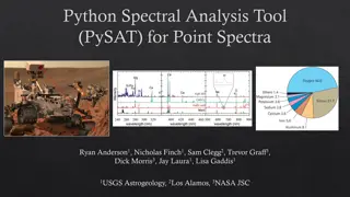
PySAT Point Spectra Tool: Spectral Analysis and Regression Software
PySAT is a Python-based spectral analysis tool designed for point spectra processing and regression tasks. It offers various features such as preprocessing, data manipulation, multivariate regression, K-fold cross-validation, plotting capabilities, and more. The tool's modular interface allows users
0 views • 6 slides
Introduction to MATLAB: Overview, Programming, and Applications
MATLAB, short for MATrix LABoratory, is a powerful tool that simplifies matrix computations with integrated visualization and programming features. Developed by Cleve Moler in the 1970s, MATLAB is widely used for mathematical operations, programming structures like conditions and loops, graphical us
0 views • 6 slides
Introduction to Data Analysis in Geophysics using MATLAB Graphics Handles
Practice interactive input, file reading, and plotting in MATLAB Graphics Handles lab. Explore ways to improve graphics in Geophysics data analysis. Learn basic histogram plot representation with properties and understand the functionalities provided in MATLAB for handling geophysical data through g
0 views • 21 slides