Effective Presentation Design Tips

Ensure your presentation design stands out by following these tips: use background slides for consistency, select a consistent typeface, vary text sizes for emphasis, prioritize alignment, and delete unnecessary slides. Remember to customize the design to suit your content and audience for maximum impact.

Download Presentation

Please find below an Image/Link to download the presentation.
The content on the website is provided AS IS for your information and personal use only. It may not be sold, licensed, or shared on other websites without obtaining consent from the author. Download presentation by click this link. If you encounter any issues during the download, it is possible that the publisher has removed the file from their server.
E N D
Presentation Transcript
Optional Title Goes Here. This is an instructional slide. Please remember to delete this slide from the presentation. This is an instructional slide. Please remember to delete this slide from the presentation. About these slides The following slides in this standard (4:3) presentation are background slides, meaning that you will place your own text on them. Many of the slides in this deck contain tips to help with your design. You should delete any slide you do not use, and duplicate any slide you want to use more than once.
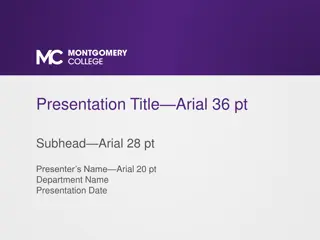
Optional date goes here. Title of presentation goes here. Subheading (if needed) goes here.
Optional Title Goes Here. This background design works well if you need to replicate a title throughout the presentation.
Optional Title Goes Here. Optional date goes here. This also works well if you need to replicate a title and include a date.
If you do not need to replicate a title, this background design allows for more space.
Choose a typeface and use it consistently throughout the presentation. Sans Serif typefaces are recommended for all digital presentations. Sans Serif typeface examples Helvetica Franklin Gothic Book Futura Avenir Arial Verdana This presentation contains slides with different typefaces. This is deliberate in order to provide multiple examples.
Use different text sizes for greater contrast. Different text sizes help the audience recognize the focal point of your presentation. The contrast in text size should be clearly different. A 20-point difference is a good starting point. A succession of slides that use the same contrast can help your presentation appear more cohesive.
Alignment is important. If possible, do not center large portions of text. This is an example of a left-aligned text box. A center-aligned text box can look awkward. Left- or right-aligned text gives the impression that text is anchored instead of floating.
Remember, empty space is your friend. Empty space creates contrast. It s not necessary to fill every section of your slide.
One more thing Try to keep slides short and simple. Don t fill slides with long sentences or phrases that you can verbally state. Instead, choose words or short phrases that convey the context of your subject, or act as a springboard for more conversation. Like this
Short and simple Don t fill slides with long sentences. Choose words or short phrases that convey your subject. Elaborate aloud on those points.
Thank You This is an optional background. You also could duplicate the title page, or any other background, if you want to signify that the presentation is complete.