Visualizing School Data Across Districts
In this presentation, a variety of array and scatterplot visualizations are used to compare elementary, middle, and high schools within a district. The scatterplots provide insights into graduation rates, academic outcomes, and spending levels at different school levels. By examining these data points, educators and policymakers can make informed decisions to improve educational outcomes within the district.

Download Presentation

Please find below an Image/Link to download the presentation.
The content on the website is provided AS IS for your information and personal use only. It may not be sold, licensed, or shared on other websites without obtaining consent from the author.If you encounter any issues during the download, it is possible that the publisher has removed the file from their server.
You are allowed to download the files provided on this website for personal or commercial use, subject to the condition that they are used lawfully. All files are the property of their respective owners.
The content on the website is provided AS IS for your information and personal use only. It may not be sold, licensed, or shared on other websites without obtaining consent from the author.
E N D
Presentation Transcript
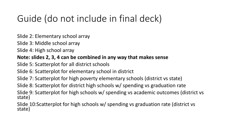
Guide (do not include in final deck) Slide 2: Elementary school array Slide 3: Middle school array Slide 4: High school array Note: slides 2, 3, 4 can be combined in any way that makes sense Slide 5: Scatterplot for all district schools Slide 6: Scatterplot for elementary school in district Slide 7: Scatterplot for high poverty elementary schools (district vs state) Slide 8: Scatterplot for district high schools w/ spending vs graduation rate Slide 9: Scatterplot for high schools w/ spending vs academic outcomes (district vs state) Slide 10:Scatterplot for high schools w/ spending vs graduation rate (district vs state)
CSI school name X% FRL District Name/Abbreviation spending per student by school on each elementary school(2018-19) For discussion: What is the LEA s current resource allocation methodology? What reactions do you have to how dollars are allocated across schools? COLOR Green = lower % economically disadvantaged students Red = higher % economically disadvantaged students
CSI SCHOOL NAME X% GRAD RATE OR FRL District Name/Abbreviation spending per student by school on each middle school (2018-19) For discussion: What is the LEA s current resource allocation methodology? What reactions do you have to how dollars are allocated across schools? COLOR Green = lower % economically disadvantaged students Red = higher % economically disadvantaged students
CSI SCHOOL NAME X% GRAD RATE OR FRL District Name/Abbreviation spending per student by school on each high school (2018-19) For discussion: What is the LEA s current resource allocation methodology? What reactions do you have to how dollars are allocated across schools? COLOR Green = lower % economically disadvantaged students Red = higher % economically disadvantaged students
District spending by school vs. school outcomes for all schools in District name (2018-19) For discussion: How can the LEA better leverage resources to do more for students ? What opportunities and barriers exist? COLOR Green = lower % economically disadvantaged students Red = higher % economically disadvantaged students SHAPE Circle = traditional public school Plus = charter school SIZE Larger the circle or plus sign = the larger the school enrollment CSI school name
District spending by school vs. school outcomes in District name: Elementary schools (2018-19) For discussion: How can the LEA better leverage resources to do more for students ? What opportunities and barriers exist? COLOR Green = lower % economically disadvantaged students Red = higher % economically disadvantaged students SHAPE Circle = traditional public school Plus = charter school SIZE Larger the circle or plus sign = the larger the school enrollment CSI school name
District spending by school vs. school outcomes: all high-poverty (>75%) elementary schools in State name (2018-19) District Name elementary schools are darkened For discussion: How can the LEA better leverage resources to do more for students ? What opportunities and barriers exist? COLOR Green = lower % economically disadvantaged students Red = higher % economically disadvantaged students SHAPE Circle = traditional public school Plus = charter school SIZE Larger the circle or plus sign = the larger the school enrollment CSI school name
District spending by school vs. graduation rates in District Name high schools (2018-19) For discussion: How can the LEA better leverage resources to do more for students ? What opportunities and barriers exist? CSI school name
District spending by school vs. school outcomes: all high schools in State Name (2018-19) District name high schools are darkened For discussion: How can the LEA better leverage resources to do more for students ? What opportunities and barriers exist? CSI school name
District pending by school vs. graduation rates: all high schools in State Name (2018-19) District Name high schools are highlighted CSI school name For discussion: How can the LEA better leverage resources to do more for students ? What opportunities and barriers exist?
")