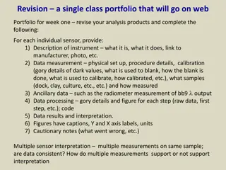
Scatter Diagrams for Data Interpretation
Scatter diagrams display data involving two variables, helping to identify correlations and draw lines of best fit for analysis. Learn about different types of correlations and how to estimate one variable's value given the other using scatter plots.

Download Presentation

Please find below an Image/Link to download the presentation.
The content on the website is provided AS IS for your information and personal use only. It may not be sold, licensed, or shared on other websites without obtaining consent from the author.If you encounter any issues during the download, it is possible that the publisher has removed the file from their server.
You are allowed to download the files provided on this website for personal or commercial use, subject to the condition that they are used lawfully. All files are the property of their respective owners.
The content on the website is provided AS IS for your information and personal use only. It may not be sold, licensed, or shared on other websites without obtaining consent from the author.
E N D
Presentation Transcript
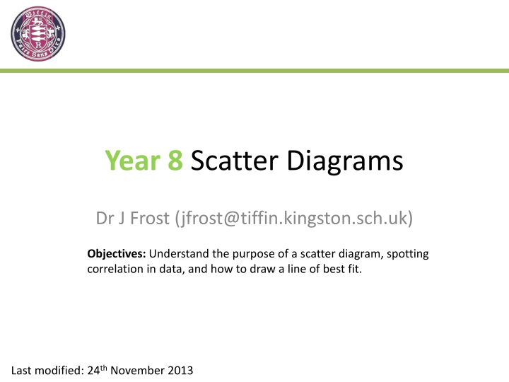
Year 8 Scatter Diagrams Dr J Frost (jfrost@tiffin.kingston.sch.uk) Objectives: Understand the purpose of a scatter diagram, spotting correlation in data, and how to draw a line of best fit. Last modified: 24th November 2013
What are Scatter Diagrams? They display data involving two variables. For example, we might collect compare students test performance in English and Maths. Maths vs English Test Scores 100 English Maths 90 40 65 41 68 99 75 58 86 66 90 32 55 57 92 80 97 78 67 75 72 100 45 80 70 60 Maths Score 50 40 30 20 10 0 0 10 20 30 40 50 60 70 80 90 100 English Score
How can they help us interpret data? They can help us identify if there is any relationship between the two variables. The relationship between two variables is known as correlation. Maths vs English Test Scores ? 100 90 80 How are English and Maths test scores related? If someone s English test score is higher, their Maths score tends to be higher. 70 60 Maths Score 50 ? 40 30 20 10 We call this relationship: Positive correlation ? 0 0 10 20 30 40 50 60 70 80 90 100 English Score
Different Types of Correlation There s 3 types you should be able to identify. Weak negative correlation ? ? 25 100 Weekly time on internet (hours) 90 20 80 70 15 Maths Score 60 Type of correlation: Weak positive correlation ? ? 50 10 40 30 5 20 10 0 0 strength type 0 20 40 60 80 100 0 10 20 30 40 50 60 70 80 90 100 Age English Score 70.00 No correlation ? 60.00 40 50.00 35 Cost of train fare 30 40.00 Crime Rate 25 20 30.00 15 20.00 10 Strong positive correlation ? ? 5 10.00 0 0.00 0 10000 20000 30000 40000 50000 60000 0 50 100 150 Number of people in city called 'Dave' Distance travelled (km)
Line of best fit We can add a line of best fit to the scatter diagram. This allows us to estimate one variable s value given the other. Maths vs English Test Scores If a boy gets 50% in his English test, what score might we expect him to get in his Maths test? 100 y = 0.5475x + 38.527 R = 0.4479 90 80 70 60 Maths Score 50 65% ? 40 30 20 (I used Excel to generate this trendline.) 10 0 0 10 20 30 40 50 60 70 80 90 100 English Score
Line of Best Fit We can add a line of best fit to the scatter diagram. This allows us to estimate one variable s value given the other. Here s a more interesting question... Maths vs English Test Scores 100 y = 0.5475x + 38.527 R = 0.4479 90 Can you come up with an equation that could estimate a Maths Score (y) from an English score (x)? 80 70 60 Maths Score 50 y = 0.55x + 38.5 ? 40 30 We can find the gradient by picking two random points on the line suitably far apart. The y-intercept seems to be about 39. 20 10 0 Change in y is 43 0 10 20 30 40 50 60 70 80 90 100 English Score (0, 39) and (80, 82) m = = = 0.54 y x 43 80 Change in x is 80
Line of Best Fit 25 20 Weekly time on internet (hours) 15 10 5 0 0 10 20 30 40 50 60 70 80 90 Age ? ? y-intercept: 17 Gradient: -0.18 ? Equation of line: -0.18x + 17
Line of Best Fit 25 20 Weekly time on internet (hours) y = -0.18x + 17 15 10 5 0 0 10 20 30 40 50 60 70 80 90 Age If someone s age is 50, how many hours would we therefore expect them to be on the internet? (-0.18 x 50) + 17 = 8 ?
Calculator Fun! We can actually use our calculator to input data and find a line of best fit. Distance from Kingston (x) 0.2km 2.5km 3.6km 0.8km House Price (y) 560,000 470,000 365,000 580,000 Reference: Use the Casio Calculator interactive slides for instructions!
In general, we should be wary of making estimates using values outside the range of our data. Earnings 80000 70000 Estimating for this age is bad because: The person may have retired. ? 60000 50000 40000 Estimating for this age is bad because: Children don t have full- time jobs. ? 30000 20000 10000 Age 0 10 20 30 40 50 60 70 80 90 When we use our line of best fit to estimate a value inside the range of our data, this is known as: interpolation ? When we use our line of best fit to estimate a value outside the range of our data, this is known as: extrapolation ?