Introduction to Swing Components in Java
Swing in Java offers powerful and flexible components that surpass AWT, with features like tabbed panes, scroll panes, trees, and tables. Unlike AWT, Swing components are lightweight and platform-independent. Learn about Swing components, their classes, containers, and event handling in this comprehensive guide.

Download Presentation

Please find below an Image/Link to download the presentation.
The content on the website is provided AS IS for your information and personal use only. It may not be sold, licensed, or shared on other websites without obtaining consent from the author.If you encounter any issues during the download, it is possible that the publisher has removed the file from their server.
You are allowed to download the files provided on this website for personal or commercial use, subject to the condition that they are used lawfully. All files are the property of their respective owners.
The content on the website is provided AS IS for your information and personal use only. It may not be sold, licensed, or shared on other websites without obtaining consent from the author.
E N D
Presentation Transcript
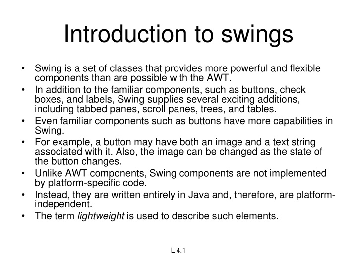
Introduction to swings Swing is a set of classes that provides more powerful and flexible components than are possible with the AWT. In addition to the familiar components, such as buttons, check boxes, and labels, Swing supplies several exciting additions, including tabbed panes, scroll panes, trees, and tables. Even familiar components such as buttons have more capabilities in Swing. For example, a button may have both an image and a text string associated with it. Also, the image can be changed as the state of the button changes. Unlike AWT components, Swing components are not implemented by platform-specific code. Instead, they are written entirely in Java and, therefore, are platform- independent. The term lightweight is used to describe such elements. L 4.1
Limitations of AWT AWT supports limited number of GUI components. AWT components are heavy weight components. AWT components are developed by using platform specific code. AWT components behaves differently in different operating systems. AWT component is converted by the native code of the operating system. L 4.3
Components Swing components are derived from the JComponent class. JComponent inherits the AWT classes Container and Component.
Swings components are represented by classes defined within the package javax.swing.
Containers Top-Level Containers The components at the top of any Swing containment hierarchy L 5.8
General Purpose Containers Intermediate containers that can be used under many different circumstances. L 5.9
Special Purpose Container Intermediate containers that play specific roles in the UI. L 5.10
Exploring swing- JApplet, If using Swing components in an applet, subclass JApplet, not Applet JApplet is a subclass of Applet Sets up special internal component event handling, among other things Can have a JMenuBar Default LayoutManager is BorderLayout L 6.1
JFrame public class FrameTest { public static void main (String args[]) { JFrame f = new JFrame ("JFrame Example"); Container c = f.getContentPane(); c.setLayout (new FlowLayout()); for (int i = 0; i < 5; i++) { c.add (new JButton ("No")); c.add (new Button ("Batter")); } c.add (new JLabel ("Swing")); f.setSize (300, 200); f.show(); } } L 6.2
JComponent JComponent supports the following components. JComponent JComboBox JLabel JList JMenuBar JPanel JPopupMenu JScrollBar JScrollPane JTextComponent JTextArea JTextField JPasswordField JTextPane JHTMLPane L 6.3
Icons and Labels In Swing, icons are encapsulated by the ImageIcon class, which paints an icon from an image. constructors are: ImageIcon(String filename) ImageIcon(URL url) The ImageIcon class implements the Icon interface that declares the methods 1. int getIconHeight( ) 2. int getIconWidth( ) 3. void paintIcon(Component comp,Graphics g,int x, int y) L 7.1
Swing labels are instances of the JLabel class, which extends JComponent. It can display text and/or an icon. Constructors are: JLabel(Icon i) Label(String s) JLabel(String s, Icon i, int align) Here, s and i are the text and icon used for the label. The align argument is either LEFT, RIGHT, or CENTER. These constants are defined in the SwingConstants interface, Methods are: 1. Icon getIcon( ) 2. String getText( ) 3. void setIcon(Icon i) 4. void setText(String s) Here, i and s are the icon and text, respectively. L 7.2
Text fields The Swing text field is encapsulated by the JTextComponent class, which extendsJComponent. It provides functionality that is common to Swing text components. One of its subclasses is JTextField, which allows you to edit one line of text. Constructors are: JTextField( ) JTextField(int cols) JTextField(String s, int cols) JTextField(String s) Here, s is the string to be presented, and cols is the number of columns in the text field. L 7.3
Buttons Swing buttons provide features that are not found in the Button class defined by the AWT. Swing buttons are subclasses of the AbstractButton class, which extends JComponent. AbstractButton contains many methods that allow you to control the behavior of buttons, check boxes, and radio buttons. Methods are: 1. void setDisabledIcon(Icon di) 2. void setPressedIcon(Icon pi) 3. void setSelectedIcon(Icon si) 4. void setRolloverIcon(Icon ri) Here, di, pi, si, and ri are the icons to be used for these different conditions. The text associated with a button can be read and written via the following methods: 1. String getText( ) 2. void setText(String s) Here, s is the text to be associated with the button. L 7.4
JButton The JButton class provides the functionality of a push button. JButton allows an icon, a string, or both to be associated with the push button. Some of its constructors are : JButton(Icon i) JButton(String s) JButton(String s, Icon i) Here, s and i are the string and icon used for the button. L 8.1
Check boxes The JCheckBox class, which provides the functionality of a check box, is a concrete implementation of AbstractButton. Some of its constructors are shown here: JCheckBox(Icon i) JCheckBox(Icon i, boolean state) JCheckBox(String s) JCheckBox(String s, boolean state) JCheckBox(String s, Icon i) JCheckBox(String s, Icon i, boolean state) Here, i is the icon for the button. The text is specified by s. If state is true, the check box is initially selected. Otherwise, it is not. The state of the check box can be changed via the following method: void setSelected(boolean state) Here, state is true if the check box should be checked. L 8.2
Combo boxes Swing provides a combo box (a combination of a text field and a drop-down list) through the JComboBox class, which extends JComponent. A combo box normally displays one entry. However, it can also display a drop-down list that allows a user to select a different entry. You can also type your selection into the text field. Two of JComboBox's constructors are : JComboBox( ) JComboBox(Vector v) Here, v is a vector that initializes the combo box. Items are added to the list of choices via the addItem( ) method, whose signature is: void addItem(Object obj) Here, obj is the object to be added to the combo box. L 8.3
Radio Buttons Radio buttons are supported by the JRadioButton class, which is a concrete implementation of AbstractButton. Some of its constructors are : JRadioButton(Icon i) JRadioButton(Icon i, boolean state) JRadioButton(String s) JRadioButton(String s, boolean state) JRadioButton(String s, Icon i) JRadioButton(String s, Icon i, boolean state) Here, i is the icon for the button. The text is specified by s. If state is true, the button is initially selected. Otherwise, it is not. Elements are then added to the button group via the following method: void add(AbstractButton ab) Here, ab is a reference to the button to be added to the group. L 8.4
Tabbed Panes A tabbed pane is a component that appears as a group of folders in a file cabinet. Each folder has a title. When a user selects a folder, its contents become visible. Only one of the folders may be selected at a time. Tabbed panes are commonly used for setting configuration options. Tabbed panes are encapsulated by the JTabbedPane class, which extends JComponent. We will use its default constructor. Tabs are defined via the following method: void addTab(String str, Component comp) Here, str is the title for the tab, and comp is the component that should be added to the tab. Typically, a JPanel or a subclass of it is added. The general procedure to use a tabbed pane in an applet is outlined here: 1. Create a JTabbedPane object. 2. Call addTab( ) to add a tab to the pane. (The arguments to this method define the title of the tab and the component it contains.) 3. Repeat step 2 for each tab. 4. Add the tabbed pane to the content pane of the applet. L 9.1
Scroll Panes A scroll pane is a component that presents a rectangular area in which a component may be viewed. Horizontal and/or vertical scroll bars may be provided if necessary. Scroll panes are implemented in Swing by the JScrollPane class, which extends JComponent. Some of its constructors are : JScrollPane(Component comp) JScrollPane(int vsb, int hsb) JScrollPane(Component comp, int vsb, int hsb) Here, comp is the component to be added to the scroll pane. vsb and hsb are int constants that define when vertical and horizontal scroll bars for this scroll pane areshown. These constants are defined by the ScrollPaneConstants interface. 1. HORIZONTAL_SCROLLBAR_ALWAYS 2.HORIZONTAL_SCROLLBAR_AS_NEEDED 3.VERTICAL_SCROLLBAR_ALWAYS 4.VERTICAL_SCROLLBAR_AS_NEEDED Here are the steps to follow to use a scroll pane in an applet: 1. Create a JComponent object. 2. Create a JScrollPane object. (The arguments to the constructor specify thecomponent and the policies for vertical and horizontal scroll bars.) 3. Add the scroll pane to the content pane of the applet. L 9.2
Trees Data Model - TreeModel default: DefaultTreeModel getChild, getChildCount, getIndexOfChild, getRoot, isLeaf Selection Model - TreeSelectionModel View - TreeCellRenderer getTreeCellRendererComponent Node - DefaultMutableTreeNode L 9.3
Tables A table is a component that displays rows and columns of data. You can drag the cursor on column boundaries to resize columns. You can also drag a column to a new position. Tables are implemented by the JTable class, which extends JComponent. One of its constructors is : JTable(Object data[ ][ ], Object colHeads[ ]) Here, data is a two-dimensional array of the information to be presented, and colHeads is a one-dimensional array with the column headings. Here are the steps for using a table in an applet: 1. Create a JTable object. 2. Create a JScrollPane object. (The arguments to the constructor specify the table and the policies for vertical and horizontal scroll bars.) 3. Add the table to the scroll pane. 4. Add the scroll pane to the content pane of the applet. L 9.4


