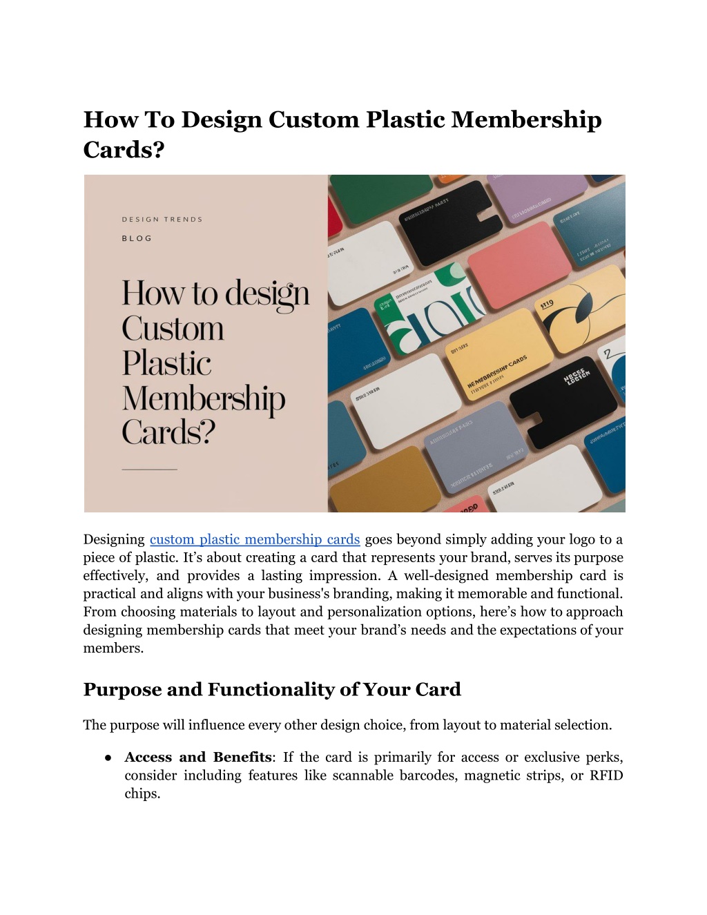
How To Design Custom Plastic Membership Cards?
Discover how to create unique, durable plastic membership cards that make a lasting impression. Get design tips for standout results.
Download Presentation

Please find below an Image/Link to download the presentation.
The content on the website is provided AS IS for your information and personal use only. It may not be sold, licensed, or shared on other websites without obtaining consent from the author. Download presentation by click this link. If you encounter any issues during the download, it is possible that the publisher has removed the file from their server.
E N D
Presentation Transcript
How To Design Custom Plastic Membership Cards? Designing custom plastic membership cards goes beyond simply adding your logo to a piece of plastic. It s about creating a card that represents your brand, serves its purpose effectively, and provides a lasting impression. A well-designed membership card is practical and aligns with your business's branding, making it memorable and functional. From choosing materials to layout and personalization options, here s how to approach designing membership cards that meet your brand s needs and the expectations of your members. Purpose and Functionality of Your Card The purpose will influence every other design choice, from layout to material selection. Access and Benefits: If the card is primarily for access or exclusive perks, consider including features like scannable barcodes, magnetic strips, or RFID chips.
Member Identification: Cards meant for member identification should have ample space for personal details, photos, or unique member numbers. Aesthetic Appeal: Cards that emphasize brand visibility, like loyalty cards, should highlight logo placement, brand colors, and any taglines that reflect your business. Selecting the Right Material Custom membership cards typically come in a few material options, each suited to different purposes and budgets. The material you choose can affect the durability, weight, and overall feel of the card. Material Description Ideal For PVC Plastic Durable water and wear and smooth; resistant to Most membership cards standard Eco-Friendly PVC Similar recycled materials to PVC but made from Brands sustainability focused on Polycarbonate Highly durable, scratch-resistant, and more heat-tolerant High-end long-term use cards for Biodegradable Plastic Made from compostable materials and designed to break down over time Environmentally-conscio us businesses PVC is by far the most popular choice for membership cards due to its durability and affordability, but other materials can serve specific needs. For instance, polycarbonate is ideal for cards that require prolonged use, while biodegradable plastic offers a sustainable option without compromising on quality. Design Elements That Matter With the card s purpose and material in mind, the next step is to focus on key design elements that enhance the card s usability and aesthetics. 1. Card Dimensions and Layout Most membership cards follow a standard credit card size of 3.375 x 2.125 inches. This size is convenient for wallets and compatible with card readers and ID holders. However, layout matters just as much as size.
Vertical or Horizontal Layout: Decide whether a vertical or horizontal orientation better suits the information and branding. A vertical layout can work well for ID purposes, while a horizontal layout may be better for loyalty or rewards cards. Spacing and Alignment: Ensure there s enough white space to make the card visually appealing and easy to read. Crowding too much information can make it look cluttered and unprofessional. 2. Brand Colors and Logo The colors and logo placement on your custom membership cards should reflect your brand without overpowering the design. Colors: Stick to your brand s primary colors, but avoid overly vibrant backgrounds if they interfere with readability. Neutral backgrounds (like white or matte black) often work well with brand colors as accents. Logo Placement: Position the logo in a place where it s visible but doesn t dominate the card s layout. The top-left or center placement typically balances visibility with space efficiency. If you re designing printed membership cards for multiple membership levels (such as gold, silver, and bronze), use subtle color variations for each tier to make differentiation easy. 3. Font Selection and Readability Choose fonts that align with your brand s style but prioritize readability. Avoid using more than two font styles on a membership card, as it can make the design look disjointed. Font Size: Important details, such as member names and ID numbers, should be easily readable at a glance. Font Style: Sans-serif fonts are generally preferred for membership cards because of their clean and modern look. 4. Adding Functional Features To increase the card s functionality, consider adding these optional elements: Barcode or QR Code: Both options are convenient for scanning at entry points or for redeeming rewards. Magnetic Strip or RFID: Great for clubs or facilities where members need quick access.
Signature Panel: Adding a writable panel on the card allows members to sign, adding a layer of security. The goal is to add value without overcrowding the design. Balance aesthetics with functionality to create a card that s both attractive and practical. Finishing Options for a Professional Look The final touches can elevate your card s appearance and feel, enhancing the member s experience. 1. Matte vs. Gloss Finish A card s finish significantly impacts its durability and look. Glossy finishes make colors pop but may show fingerprints easily, whereas matte finishes provide a subtle, professional look. Finish Type Benefits Drawbacks Matte Subtle, fingerprint-resistant professional, Colors muted may appear slightly Gloss Brightens colors has a smooth feel Prone scratches to fingerprints and Frosted Adds texture, unique semi-transparent look Limited color options For a unique appearance, consider a frosted finish for semi-transparent plastic cards, which works well for upscale brands looking to stand out. 2. Embossing and Spot UV Coating To add texture and make your card feel high-end, embossing (raised text or logos) or spot UV coating (a glossy overlay on select areas) can be effective. Embossed Text: Works well for logos or member names, adding a tactile element. Spot UV: Highlight specific design elements, such as a logo, to make them shine without overwhelming the rest of the card.
Tips for Printing Membership Cards Successfully Printing is just as important as the design, and choosing the right printing process ensures the final product matches your vision. 1. Select a Trusted Printer: Look for printing services that specialize in print membership cards and have experience working with plastic materials. 2. Digital vs. Offset Printing: Digital printing is typically faster and more affordable for small quantities, while offset printing offers higher quality for large orders. 3. Proofs and Testing: Always request a sample proof before ordering a full batch. Check the sample for color accuracy, texture, and feature placement. 4. Consider Eco-Friendly Printing: Choose printers that use sustainable materials or recycled plastic if environmentally friendly options are important to your brand. Data Security and Member Privacy If your membership cards contain sensitive information, such as a member ID or a magnetic strip with personal data, you ll need to consider data security. Encryption for Digital Cards: RFID-enabled cards should use encryption to protect stored data. Minimal Personal Information: Include only essential information on the physical card, such as a member number rather than personal data, to minimize risk. Secure Production: Use a trusted printer that ensures the security of your designs and any data embedded in the cards. Creative Customization Ideas for Unique Membership Cards To customization options: make your membership cards truly memorable, consider these creative Holographic Foil: Add a holographic effect to parts of the card for a unique, eye-catching look. Edge Foiling: Apply metallic edging to give the card a luxurious feel, suitable for premium memberships. Color Variations for Tiers: Use different colors for various membership levels (e.g., silver, gold, platinum) for easy identification.
Unique Shapes: If youre looking to stand out, consider non-standard shapes, such as rounded or oval designs while keeping dimensions practical. Putting It All Together Every element, from the material to the finish and customization options, should come together to create a cohesive, effective design that aligns with your brand s identity. Here s a checklist to keep your design on track: Purpose-Driven Design: Is the card functional for its intended use? Material and Finish: Have you selected a material and finish that fits both durability and aesthetic needs? Brand Consistency: Does the design (color, logo, font) reflect your brand s identity? Functionality and Security: Are essential features (barcodes, magnetic strips) included where necessary? Professional Printing: Have you chosen a trusted printer and selected the right printing method? Wrap Up Designing custom plastic membership cards requires attention to detail, from selecting the right materials to making smart layout choices. The result should be a card that s functional, visually appealing, and memorable for your members. Ready to design a membership card that speaks volumes? Start with these principles, and your printed membership cards will offer value and brand loyalty that goes beyond the plastic. Looking for high-quality, custom plastic cards that make an impact? Duracard has you covered with fast, reliable service and cards made right here in the USA. Whether it s membership, gift, or rewards cards, our designs are compatible with most POS systems and can be customized to fit your brand perfectly. Site Article: How To Design Custom Plastic Membership Cards?


