Effective Electronic Presentation Guidelines for VLSI Test Symposium
Comprehensive guide for creating impactful electronic presentations at the 2019 VLSI Test Symposium. Covers presentation specifications, best practices, and tips to engage a technical expert audience effectively. Emphasizes concise content, visual clarity, high contrast, limited text, and smooth transitions for a successful presentation.
Download Presentation

Please find below an Image/Link to download the presentation.
The content on the website is provided AS IS for your information and personal use only. It may not be sold, licensed, or shared on other websites without obtaining consent from the author.If you encounter any issues during the download, it is possible that the publisher has removed the file from their server.
You are allowed to download the files provided on this website for personal or commercial use, subject to the condition that they are used lawfully. All files are the property of their respective owners.
The content on the website is provided AS IS for your information and personal use only. It may not be sold, licensed, or shared on other websites without obtaining consent from the author.
E N D
Presentation Transcript
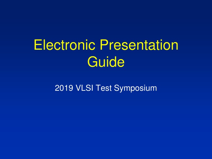
Electronic Presentation Guide 2019 VLSI Test Symposium
Outline Presentation guidelines Specs for electronic slides Deadlines and instructions A bad example 2
VTS Presentations Presentations: 15 min + 5 min Q & A DO NOT attempt to fit entire paper onto slides Clearly focus on the main message, list only the key innovations and novel approaches Get straight to the point, audience is comprised of technical experts Details of proofs, previous works, and theories are redundant 3
Standards and Guidelines Standards: Mandatory requirements for VTS Presentations will be dropped for failure to follow Guidelines: Suggested good practices Result in good visuals Supported by template It s your choice: Deviate at your own risk ! 4
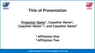
Standards Mandatory title slide Company (university) logo on title slide only High contrast: Light lettering/lines on a dark background 5
Guidelines 15 slides, including title slide 9 lines max on a text slide 7 words max per line Use short phrases, avoid long sentences Use Arial, or similar sans serif font 36 Point Titles 28 point text 6
Guidelines (2) Show only what you will talk about Use figures and flow charts to explain your ideas Use graphs instead of tables 350 300 Circuit Old New 250 bxy1 200 178 200 Old New bxy2 300 287 bxy3 198 150 150 100 50 0 bxy1 bxy2 bxy3 7
Contrast High contrast very important Has to be visible from back of large room Use light lines/text on a dark background Foreground: White, yellow, light cyan Background: Black, dark blue, brown, dark green Caution: Red, orange or blue lettering and lines become unreadable when projected 8
Display Speed and Animations Slides should display instantly Do not distract the audience with slow transition effects Avoid overuse of slow graphics, fonts and special effects 9
Annoying: Many Different Animations Text test 10
Better: Simple Animations Text test 11
AV Setup VTS supplies projection computer (4:3 preferred) VTS preloads all presentations No changes at the conference Make sure your presentation is saved in PowerPoint Show (.ppsx) format! This is better than .ppt or .pptx because your show will start automatically. 12
Schedule Deadline to submit file: April 5, 2019 Provides time to get presentation into database and check slides Improvement possible if necessary 13
Instructions for Presentation Upload Go to http://www.tttc-vts.org Click on Authors/Reviewers and then on Login Same username and password as for submission Click on Manage My Papers For each paper you submitted you will see: Click here to submit your presentation Click here to set the presenter s name Speaker Bio will need to filled on site with a pre- defined format. Form provided at registration desk. 14
Updating Presentations Step 1 Click here to update your presentation till the deadline Step 2 Click here to update the presentation, the program chair will check and approve 15
And Finally, A Bad Example This slide has no title. Titles help guide the audience through the talk. All slides except photographs should have a title. The font on this slide is too small. It s readable here, but when projected, only the presenter and maybe those in the front rows will be able to read it. Those in the back will be completely lost. USE OF ALL CAPITAL LETTERS OR ITALICS also makes slides difficult to read. Use dark backgrounds; not light! This slide would be easier to follow if indentations were used. Don t design your VTS slides to be stand alone. They are a guide to your presentation. If they were understandable by themselves, we could just publish them and forget about presentations! Your slides support what you say: They don t replace it. This slide has too many words and too many points. Keep your slides under nine lines. 16
