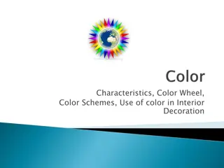
Design Principles: Contrast, Repetition, Alignment, Proximity, Color Theory
Explore the significance of design principles such as contrast, repetition, alignment, proximity, and color theory in creating visually appealing and effective designs. Learn how contrast plays a vital role in guiding the viewer's attention and enhancing visual interest through various techniques like size, value, type, and color. Delve into the world of color theory and discover the color wheel's impact on creating harmonious color combinations.

Download Presentation

Please find below an Image/Link to download the presentation.
The content on the website is provided AS IS for your information and personal use only. It may not be sold, licensed, or shared on other websites without obtaining consent from the author.If you encounter any issues during the download, it is possible that the publisher has removed the file from their server.
You are allowed to download the files provided on this website for personal or commercial use, subject to the condition that they are used lawfully. All files are the property of their respective owners.
The content on the website is provided AS IS for your information and personal use only. It may not be sold, licensed, or shared on other websites without obtaining consent from the author.
E N D
Presentation Transcript
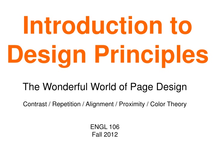
Introduction to Design Principles The Wonderful World of Page Design Contrast / Repetition / Alignment / Proximity / Color Theory ENGL 106 Fall 2012
CONTRAST Is the measurable amount of difference between all the elements in a design s page, screen, frame, etc. Contrast adds interest to the page and provides a means of emphasizing what is important or directing the reader's eye. On a page without contrast, the reader doesn't know where to look first or what is important. Contrast makes a page more interesting so the reader is more apt to pay attention to what is on the page.
CONTRAST WITH SIZE Big and small elements of the same type, such as big and small images and big and small type are the most obvious uses of size to create contrast. Contrasting white space or the physical size of the piece with another element of the design is another method.
CONTRAST WITH VALUE The relative lightness or darkness of two elements to each other can create a contrast in value. Whether with shades of gray or tints and shades of a single color, the further apart the values the greater the contrast.
CONTRAST WITH TYPE Type contrast can utilize size, value, and color to create contrasting typographic treatments. Add bold or italics to create contrast. Mix large type with small type. Combine serif with sans serif type to create type contrast. Set portions of text in contrasting colors or varying values.
COLOR CONTRAST Color theory is a body of practical guidance to color mixing and the visual impact of specific color combinations. It may be nice to think we have perfect eyes and that our taste in color combinations will be suitable to everyone else s. However, this is hardly ever the case. Luckily, we have tools to help us . . .
THE COLOR WHEEL It s Not Just For Art Class Anymore
HOW IT WORKS Colors next to each other on the wheel are called analogous. They will blend very well together.
HOW IT WORKS Colors across from each other on the wheel are called complementary. They will provide the most visual contrast.
COLOR - HUE Basic source of color (what light is reflected). This is what most people think of as a color . Hues are the colors you see on a standard color wheel. http://sgvarts.blogspot.com/2009/02/tip-vocabulary-of-color.html
COLOR - VALUE How rich or muted, bright or dull a color. Saturation is a measure of where the color lies in a continuum from pure hue to no hue (or the difference between the pure hue and a gray of the same value). http://sgvarts.blogspot.com/2009/02/tip-vocabulary-of-color.html
COLOR - SATURATION Lightness or darkness of a color (what you see in a black and white photography). Value is a measure of where a color lies in a range from white to black. http://sgvarts.blogspot.com/2009/02/tip-vocabulary-of-color.html
VARIED CONTRAST The same colors will look different considering the colors they are matched with. Sometimes they will be dulled, and sometimes they will pop out even more. This effect will become very important to keep in mind when choosing text and background colors for your design.
BACKGROUNDS AND TEXT Kind of Christmas-like, but technically the contrast is there. Poor Contrast. This would be very hard to look at for a long period of time. Good Contrast. This would technically work. Poor contrast. Consult your color wheel if your own eye can t see how poor this looks!
REPETITION Repetition, or consistency, means that you should repeat some aspect of the design throughout the entire document. Repetition acts as a visual key that ties your piece together in other words, it unifies it. Repetition controls the reader's eye and helps you keep their attention on the piece as long as possible.
COMMONLY REPEATED ELEMENTS Graphic Style (Motifs) Font Type and Size Decorative Elements Movement (in videos or movies) Alignments Shapes Colors Placement of Details (page numbers) Navigational Tool Placement (on websites) And potentially more!
ALIGNMENT Alignment is the placement of text and graphics so they line up on the page. Use alignment to: create order organize page elements group items create visual connections Good alignment is invisible. Most readers won't consciously notice that everything is lined up neatly, but they will feel it when things are out of alignment.
REALLY BAD LACK OF ALIGNMENT
LEFT ALIGNMENT Edge alignment lines up text or objects along their top, bottom, left, or right edges. Left-aligned text (with ragged right edges) is one of the most familiar alignments.
RIGHT ALIGNMENT Right alignment, another edge alignment method, generally works best for small bits of text, such as posters, some ads, and in this business card layout.
CENTER ALIGNMENT Center alignment may be horizontally or vertically aligned, or both. Elements may be centered on the page, within sections of the page, or with other elements on the page.
ALIGNMENT & BALANCE Another concept to keep in mind when setting a page alignment is BALANCE. Visual balance comes from arranging elements on the page so that no one section is heavier than the other.
SYMMETRICAL BALANCE This poster design divides the page into four equal sections. Although not mirror images, the overall look is very symmetrical and balanced. Each of the line drawings are more or less centered within their section. The graphic (text and image) in the upper center of the page is the focal point tying all the parts together.
MORE SYMMETRY Each vertical half (excluding text) of the brochure is a near mirror image of the other, emphasized with the reverse in colors. Even the perfectly centered text picks up the color reversal here. This symmetrically balanced layout is very formal in appearance.
ASYMMETRICAL BALANCE The plants spring up primarily along the left side but with a few stems escaping and arching across the page. The text, although randomly placed, follows the lines of the plants keeping them anchored to the overall design. The off-balance design creates a sense of freedom and movement.
RADIAL BALANCE Here we have an example of radial balance in a rectangular space. The year represents the center of the design with the subtle color sections radiating from that center. The calendar month grids and their corresponding astrological symbols are arrayed around the year in a circular fashion.
UNUSED SPACE Sometimes unused space can be fine, but often the key is to not have any! Shoot for a balanced page, where everything is aligned with purpose, and will look pleasing to the viewer s eye. Along with contrast, you will create visual hierarchy and help the reader s eye move through the more important parts of the page.
PROXIMITY The Principle of Proximity tells you to put related items close together physically. Things that aren't related should be farther apart. The amount of separation between items or groups tells your reader how the material is organized.
PROXIMITY The last slide was bad (in case you missed it). The writing there was too far away from the heading of Proximity, especially since they should be related. Not only did the last slide violate proximity, but it also had poor alignment because of this.