Insights into Potato Gene Expression and Co-Expression Networks
Explore the construction of the potato expression atlas and co-expression network through a detailed workflow. Visualize data on gene expression, up-regulated genes, power law distribution, and co-expression clusters. Interactive exploration available on the StCoExpNet web server.

Download Presentation

Please find below an Image/Link to download the presentation.
The content on the website is provided AS IS for your information and personal use only. It may not be sold, licensed, or shared on other websites without obtaining consent from the author. Download presentation by click this link. If you encounter any issues during the download, it is possible that the publisher has removed the file from their server.
E N D
Presentation Transcript
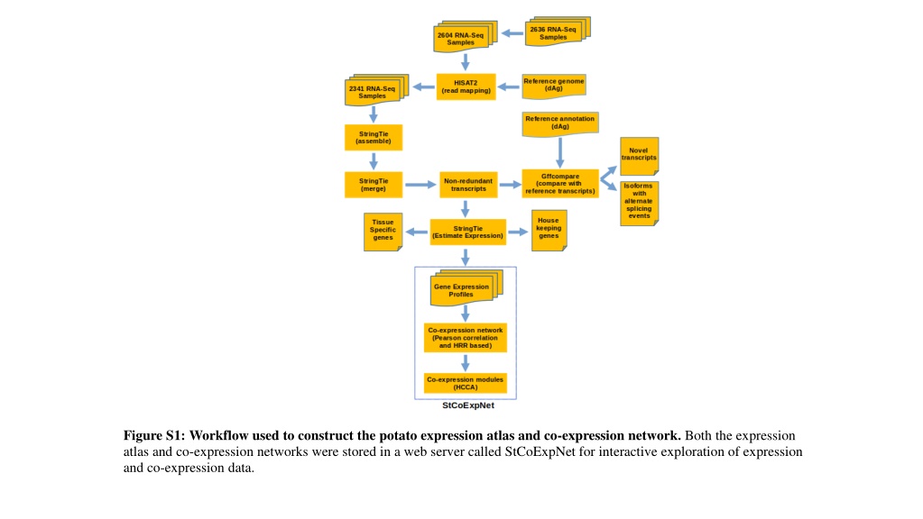
Figure S1: Workflow used to construct the potato expression atlas and co-expression network. Both the expression atlas and co-expression networks were stored in a web server called StCoExpNet for interactive exploration of expression and co-expression data.
Figure S2: Bar plot for number of genes with transcripts per million (TPM) < 1 versus number of codons per gene.
Figure S3: Heatmap shows number of genes that were up-regulated in tissues arranged in rows as compared to those in columns. The criteria used to identify up-regulated genes were a log2 (fold-change) value of at least 2 and an adjusted P-value 0.05, determined through the moderated t-statistic in the LIMMA package.
Figure S4: The graph displays a power law distribution based on potato gene expression data. The logarithmically transformed x-axis represents the degree of nodes, or the number of connections associated with a particular gene, while the y-axis reflects the frequency of a particular degree. Both axes have been transformed using a base-10 logarithmic scale.
Figure S5. The gene expression profile of co-expression clusters, Cluster_90 and Cluster_78. Numbers in parentheses in the graph's title indicate the number of genes in the respective clusters. The line plots show that the tissues are on the x-axis, and the genes are on the y-axis. The thick red line indicates the average Z score of the cluster, and the thin grey lines indicate the Z score of individual genes.
Figure S6. The gene expression profile of co-expression clusters, Cluster_23 and Cluster_97. Numbers in parentheses in the graph's title indicate the number of genes in the respective clusters. The line plots show that the tissues are on the x- axis, and the genes are on the y-axis. The thick red line indicates the average Z score of the cluster, and the thin grey lines indicate the Z score of individual genes.
Figure S7: Heatmap shows Zlog-transformed TPM values of homologs of PhAN2 across tissues. Dark gray: 0 TPM; Blue: Below average expression; Red: Above average expression; White: Average expression.