University of Cincinnati Cancer Center Presentation Deck Overview
This specially designed presentation deck for the University of Cincinnati Cancer Center includes guidelines, best practices, and FAQs for creating impactful and cohesive presentations. The deck features brand colors, style, and fonts, along with pre-built design templates for easy customization. Utilize the provided slides and follow the instructions to create professional and visually appealing presentations.
Download Presentation

Please find below an Image/Link to download the presentation.
The content on the website is provided AS IS for your information and personal use only. It may not be sold, licensed, or shared on other websites without obtaining consent from the author.If you encounter any issues during the download, it is possible that the publisher has removed the file from their server.
You are allowed to download the files provided on this website for personal or commercial use, subject to the condition that they are used lawfully. All files are the property of their respective owners.
The content on the website is provided AS IS for your information and personal use only. It may not be sold, licensed, or shared on other websites without obtaining consent from the author.
E N D
Presentation Transcript
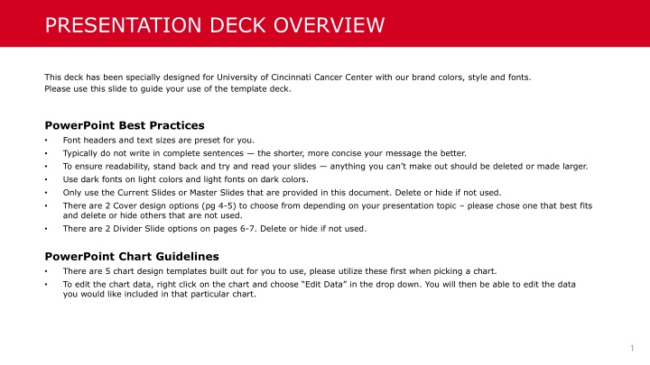
PRESENTATION DECK OVERVIEW This deck has been specially designed for University of Cincinnati Cancer Center with our brand colors, style and fonts. Please use this slide to guide your use of the template deck. PowerPoint Best Practices Font headers and text sizes are preset for you. Typically do not write in complete sentences the shorter, more concise your message the better. To ensure readability, stand back and try and read your slides anything you can t make out should be deleted or made larger. Use dark fonts on light colors and light fonts on dark colors. Only use the Current Slides or Master Slides that are provided in this document. Delete or hide if not used. There are 2 Cover design options (pg 4-5) to choose from depending on your presentation topic please chose one that best fits and delete or hide others that are not used. There are 2 Divider Slide options on pages 6-7. Delete or hide if not used. PowerPoint Chart Guidelines There are 5 chart design templates built out for you to use, please utilize these first when picking a chart. To edit the chart data, right click on the chart and choose Edit Data in the drop down. You will then be able to edit the data you would like included in that particular chart.
FAQS Need to change the layout of a slide? Right click the slide you would like to change in the list of slides on the left and choose Layout. You will be able to choose from the prepopulated slide master options. Want to go to the slide master? Click View on the top navigation bar. From there, click on the Slide Master icon and it will bring you to the slide master slides. How can you place a new image into a slide? Click Insert on the top navigation bar. From there, click on the Pictures icon. You will be able to then search your file system for the photo you would like to place. What if I would like to change the colors of my chart? We have designed this deck to follow UC Health s color and brand guidelines and make it simple to use for you. Please keep the chart colors, and any colors within the custom color theme.
TITLE GOES HERE Subtitle goes here 01.01.2022
TITLE GOES HERE Subtitle goes here 01.01.2022
SECTION CHART 1 2019 Enrollment Other 10% 4th Qtr 8% 3rd Qtr 10% 1st Qtr 60% 2nd Qtr 12%
SECTION CHART 2 2019 Enrollment 70% 60% 60% 50% 40% 30% 20% 10% 12% 10% 10% 8% 0% 1st Qtr 2nd Qtr 3rd Qtr 4th Qtr Other
SECTION CHART 3 2019 Enrollment Other 10% 4th Qtr 8% 3rd Qtr 10% 2nd Qtr 12% 1st Qtr 60% 0% 10% 20% 30% 40% 50% 60% 70%
SECTION CHART 4 2019 Enrollment 70% 60% 50% 40% 30% 60% 20% 10% 12% 10% 10% 8% 0% 1st Qtr 2nd Qtr 3rd Qtr 4th Qtr Other
SECTION CHART 5 2019 Enrollment 70% 60% 60% 50% 40% 30% 20% 12% 10% 8% 10% 10% 0% 1st Qtr 2nd Qtr 3rd Qtr 4th Qtr Other
THANK YOU! 19


