Prediction and Confidence Intervals in Meta-Analysis
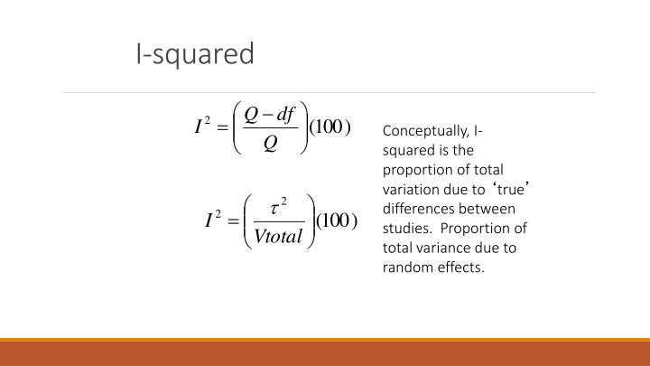
Conceptually, I-squared represents the proportion of total variation due to true differences between studies, while Proportion of total variance is due to random effects. Prediction intervals provide a range where study outcomes are expected, unlike confidence intervals which contain the parameter's single but unknown value. The difference between CI and PI is often misunderstood but crucial in interpreting meta-analysis results. Explore how these intervals play a key role in evaluating the variability and reliability of study effects in meta-analysis.

Download Presentation

Please find below an Image/Link to download the presentation.
The content on the website is provided AS IS for your information and personal use only. It may not be sold, licensed, or shared on other websites without obtaining consent from the author.If you encounter any issues during the download, it is possible that the publisher has removed the file from their server.
You are allowed to download the files provided on this website for personal or commercial use, subject to the condition that they are used lawfully. All files are the property of their respective owners.
The content on the website is provided AS IS for your information and personal use only. It may not be sold, licensed, or shared on other websites without obtaining consent from the author.
E N D
Presentation Transcript
I-squared Q Q df = 2 100 ( ) I Conceptually, I- squared is the proportion of total variation due to true differences between studies. Proportion of total variance due to random effects. 2 = 2 100 ( ) I Vtotal
Comparison Depnds on k X X Depends on Scale Q P T-squared T I-squared X X I-squared does effects variance has some size, which is indexed in units of the observed effect size (e.g., r). The larger the sample size, the smaller the sampling variance, and thus the larger I- squared. To me, the prediction interval (coming up) is the most interpretable. does depend on the sample sizes (Ns) of the included studies. The random-
Prediction or Credibility Intervals = + * 2 Bounds M t T V df * M Makes sense if random effects (REVC > 0). Otherwise, just CI for mean. M is the random effects mean (summary effect). The value of t is from the t table with your alpha and df equal to (k-2) where k is the number of independent effect sizes (studies). The variance VM is the squared standard error of the RE summary effect, and T2 is the REVC estimate. Conceptually, prediction interval is not an estimate of error of the mean. (See next slide.)
Confidence Intervals vs Prediction Intervals The confidence interval is supposed to contain a parameter that has a single but unknown value. 95CI should contain the population mean 95 percent of the time it is computed The prediction interval is supposed to contain a percentage of a normal distribution that has an unknown mean and variance. 95PI will contain 95 percent of the underlying true values of the effect sizes that actually vary from situation to situation. Difference between CI and PI widely misunderstood
From earlier slide. CI vs PI CI contains the Mean. PI contains the Distribution of random effects. PI tells you where to expect study outcomes; it is NOT an error variance. Prediction Interval Confidence Interval
CMA Exercise 3 Review Kvam results. Find and interpret Q REVC (tau-squared) I-squared Download Excel PI calculation program Find and interpret PI
Find and interpret Q REVC (tau-squared) I-squared Prediction Interval The prediction interval is very wide. It indicates that the effect of exercise on depression is quite variable. The average effect size is only a crude approximation of what to expect, even without sampling error. It is reasonable to expect studies where exercise truly has no effect.
Analysis 3 overall (summary) results Number of studies, k = 23, total people, N = 977 Research question or Study aims Search & eligibility Overall mean: g = -.68, CI = [-.92 to -.44]; moderate to large effect size Coding, computation of effects, conversions Analysis Overall Graphs Moderators Sensitivity Heterogeneity: Q(22) = 68.74, p <.001. I-squared = 67.99; moderate to large heterogeneity Did not report REVC or prediction interval, but they should (tsk, tsk). The impact of heterogeneity is larger than what they seem to acknowledge. (Not sure if overall data includes drugs as control condiditions.) Discussion
Break (lunch) Coming up next -> Research question or Study aims Search & eligibility Coding, computation of effects, conversions Analysis Overall Graphs Moderators Sensitivity Discussion
Graphs Communicate results Reveal data problems Suggest appropriate models
Convention is to alphabetize, but many other ways Graphs 1 Forest Plot Overall results Estimate Conf Int 1. Study information 2. Forest plot symbols 3. Overall mean Signifcant vs. Not
CMA graphics Exercise Load the Kvam data
Get the forest plot and modify it Run analyses -> select by -> Prepost -> uncheck 2 -> bottom left click Random Right click Statistics for each study -> customize stats uncheck Standard err, Variance, Zvalue Effect measure -> Hedge s g Box with double down arrows to list sample size Barchart box to get Weights High resolution plot -> Edit -> Header -> type Analysis 1 ->Apply Edit -> labels -> type Exercise Control -> Apply Edit -> footer -> delete Meta Analysis -> Apply Format -> set scale -> -4 to +4 Format -> study and summary symbols -> click the empty square
This is a close match to the article. Not sure the problem with the relative weight. Can fix in PowerPoint.
Plot of follow-up results. Note that the effect sizes are small, but we do not know what happened to the means. Need an extra graph or table.
Graphs 3 Some indication that exercise is about as effective as medication and that it may add to effects beyond medication. Too few studies to be conclusive.
Forest Plot Sort by effect size, then plot. Steady progression? Missing middle? Heavy weight studies in the middle? Expect some curl at the ends for small samples. Source: http://stats.stackexchange.com/questions/107557/forest- plot-for-meta-analysis-displaying-the-mean-es-with-and- without-outliers
Go to Data Entry Right click the effect size (Hedges g). Sort A to Z Redo the graph What is the problem with this one?
Forest Plot 4 - Cumulative Overall OR and CI plotted by adding each study over time. Pineles (2014). Miscarriage and exposure to tobacco smoke. Note on sociology of science; often largest ES first; decline over time. Shows that contrary to some authors, there has always been good evidence of risk.
Funnel Plots Shows ES by precision. Expect a funnel shape if fixed- effects sampling distribution. Asymmetry suggests pub bias; excess variance suggests heterogeneity (moderators). This one shows pretty good symmetry but lots of variability (mortality rates by hospital).
Funnel Plot Graphs 4 Trim-and-fill is one kind of sensitivity (what if?) analysis. This is opposite the usual pattern because of the negative mean. Is there a correlation between sample size and effect size?
CMA Exercise 4 Kvam data Select posttest data (exclude follow-up) Run a funnel plot and interpret Run trim-and-fill and interpret
Funnel Plot -> Run analyses -> Select data (prepost = 1 for these data) -> Analyses -> Publication bias (1) -> Black and white (2) 2 You can customize for PowerPoint or for publication 1
Trim & fill -> Publication bias -> Next table (several) Notice that it plots fixed Effects and to the left by Default. It says no Imputed studies here. Note mean = -.48
Trim & fill Random & right of mean Selected. Now it imputes 8 studies. Mean moves From -.48 to -.30. Then show the funnel plot.
Funnel with imputed studies -> Plot observed and imputed studies


 results")
")