Guidelines for Building Effective PowerPoint Presentations
Learn how to create professional PowerPoint presentations with these step-by-step instructions for layout, formatting, and utilizing icons. Follow the provided guidelines to enhance the visual appeal and effectiveness of your slides.
Download Presentation

Please find below an Image/Link to download the presentation.
The content on the website is provided AS IS for your information and personal use only. It may not be sold, licensed, or shared on other websites without obtaining consent from the author.If you encounter any issues during the download, it is possible that the publisher has removed the file from their server.
You are allowed to download the files provided on this website for personal or commercial use, subject to the condition that they are used lawfully. All files are the property of their respective owners.
The content on the website is provided AS IS for your information and personal use only. It may not be sold, licensed, or shared on other websites without obtaining consent from the author.
E N D
Presentation Transcript
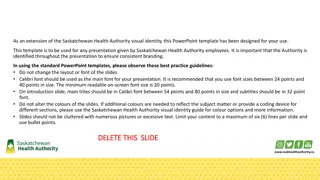
Instructions when building your PowerPoint 1. Do not use this instruction slide in your presentation. Delete this slide and all slides below before finalising your presentation. 2. To make a slide, click on New slide in the Ribbon. Then right click on the slide as it appears in the panel to the left of screen and select Layout. Choose the layout you want to apply. This will apply a Master Layout to your slide - whichever layout you have selected. Alternatively, right-click Insert slide and select a layout simultaneously. 3. Formatting rules: Keep text size a minimum of 18pts Calibri font and where possible, colour #0031A7 (RGB 0,49,167) Dark Blue, Text 2 or Black. Headings should be 32pts and colour #0031A7 Dark Blue, Text 2 or Black. Only use the colours in the Theme Colours. Do a Review > Spelling check. 4. A selection of icons is available for cutting and pasting into your own slides. If you want to change the colour of an icon select icon and change icon using Shape Fill and/or Shape Outline (it will depend on how the icon was built so try each). 5. There are four example layout slides below, just for ideas. Each of these example slides has the words Example layout # in the top left corner. Duplicate the slide you wish to use and delete the words Example layout #. Move the new slide up into your presentation and edit as needed. Delete all the example slides below these instructions before you finalise your presentation. 2
Selection of icons 3 Footer
4 Footer
Example layout 1 Click to add title Put a title here Place some explanatory text here, remembering to use a minimum 18pt Calibri font. Lorem ipsum dolor sit amet, consectetur adipiscing elit, sed do eiusmod tempor incididunt ut labore et dolore magna aliqua. Put a title here Place some explanatory text here, remembering to use a minimum 18pt Calibri font. Lorem ipsum dolor sit amet, consectetur adipiscing elit, sed do eiusmod tempor incididunt ut labore et dolore magna aliqua. Put a title here Place some explanatory text here, remembering to use a minimum 18pt Calibri font. Lorem ipsum dolor sit amet, consectetur adipiscing elit, sed do eiusmod tempor incididunt ut labore. 5 Footer
Example layout 2 Put a title here Put a title here Place some explanatory text here, remembering to use a minimum 18pt Calibri font. Lorem ipsum dolor sitet. Place some explanatory text here, remembering to use a minimum 18pt Calibri font. Lorem ipsum dolor sitet. Put a title here Put a title here Place some explanatory text here, remembering to use a minimum 18pt Calibri font. Lorem ipsum dolor sitet. Place some explanatory text here, remembering to use a minimum 18pt Calibri font. Lorem ipsum dolor sitet. Put a title here Put a title here Place some explanatory text here, remembering to use a minimum 18pt Calibri font. Lorem ipsum dolor sitet. Place some explanatory text here, remembering to use a minimum 18pt Calibri font. Lorem ipsum dolor sitet. 6 Footer
Example layout 3 60% 98% 75% PUT A TITLE HERE Place some explanatory text here, remembering to use a minimum 18pt Calibri font. Lorem ipsum dolor sitet elit, sed do eiusmod tempor incididunt ut labore et dolore magna aliqua. PUT A TITLE HERE Place some explanatory text here, remembering to use a minimum 18pt Calibri font. Lorem ipsum dolor sitet elit, sed do eiusmod tempor incididunt ut labore et dolore magna aliqua. PUT A TITLE HERE Place some explanatory text here, remembering to use a minimum 18pt Calibri font. Lorem ipsum dolor sitet elit, sed do eiusmod tempor incididunt ut labore et dolore magna aliqua. 7 Footer
Example layout 4 Place some explanatory text here, remembering to use a minimum 18pt Calibri font. Lorem ipsum dolor sit amet, consectetur adipiscing elit, sed do eiusmod tempor incididunt ut labore et dolore magna aliqua. Lorem ipsum dolor sit amet, consectetur adipiscing elit, sed do eiusmod tempor incididunt ut labore et dolore magna aliqua. Lorem ipsum dolor sit amet, consectetur adipiscing elit, sed do eiusmod tempor incididunt ut labore et dolore magna aliqua. So there. 8 Footer


