Evolution of Los Angeles Transit Graphics: Past and Present
Explore the rich history of Los Angeles transit through its graphic and design elements, from the iconic liveries and logos of the Yellow Cars to the modern branding efforts of Metro. Witness the transition across the decades, capturing the essence of local transportation evolution.
Download Presentation

Please find below an Image/Link to download the presentation.
The content on the website is provided AS IS for your information and personal use only. It may not be sold, licensed, or shared on other websites without obtaining consent from the author.If you encounter any issues during the download, it is possible that the publisher has removed the file from their server.
You are allowed to download the files provided on this website for personal or commercial use, subject to the condition that they are used lawfully. All files are the property of their respective owners.
The content on the website is provided AS IS for your information and personal use only. It may not be sold, licensed, or shared on other websites without obtaining consent from the author.
E N D
Presentation Transcript
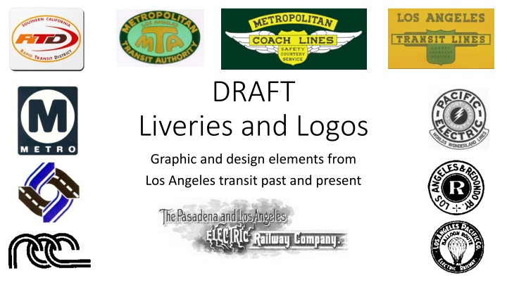
DRAFT Liveries and Logos Graphic and design elements from Los Angeles transit past and present
1900-2023 our first 100+ years in graphics Candidates and background - ideas Los Angeles Railway or LARy or Yellow Cars (1910-1945) Logos included stylized scripts, electricity bolts, San Gabriel Mission bell tower, streetcar liveries in yellows and yellow and green. Passenger take ones with news/public affairs, logos/graphics. Los Angeles Motor Coach or LAMC (1923-1947) oval green and white logo that includes the logos of Los Angeles Railway and Pacific Electric in it. Yellow and red accent liveries, includes post WWII automobile-like painted wheel well fenders that echo the design of postwar cars with a swooping/sweeping aerodynamic look. Successor Los Angeles Transit Lines or LATL (1945-1958) Yellow and green liveries continue with a very standard yellow and green logo that their parent company National City Lines used across the country. Los Angeles Transit Lines absorbs Los Angeles Motor Coach into its system. Pacific Electric or PE or Red Cars (1899-1953) World famous red black and white circle logo that initially said Safety, Courtesy, Speed, and was later updated to Safety, Courtesy, Service. Also world famous livery colors of Red, Orange accent stripe and silver tops on rail cars and buses. Successor Metropolitan Coach Lines or MCL or Metro (1953-1958) believe this is where the real transition to green buses and railcars begins. Extensive use of the word Metro in promotions.First print and radio ad campaigns with Metro Man, and first TV commercials the animated cartoon Unstrung Man/Wax Man, and first ad wrapped buses. First branded express buses, Wilshire Zephyr service Los Angeles Metropolitan Transit Authority or LAMTA or MTA (1958-1964) successor to Metropolitan Coach Lines and Los Angeles Transit Lines. Green vehicle liveries with famous Mushroom logo in green and gold on vehicles, tokens and other items Uses MTA moniker. Other logos used on various items at the first MTA, one of them with a shark fin triangular design. First branded commuter express bus service, Freeway Flyers. Southern California Rapid Transit District or SCRTD or RTD or The District (1964-1993) successor to LAMTA. Early years had a boomerang logo and buses with a bronze, gold and white livery. Later changed to the famous red snowflake or kiss logo and a basic white livery with black, red and orange accents. Where those red and orange accents meant to convey a connection back to Pacific Electric s colors? 1984 Olympics logos. 25thanniversary logo. First brand local shuttle service, MiniBus, today s DASH buses. Los Angeles County Transportation Commission or LACTC or The Commission (1977-1993) blue and black logo of interlocking highways and rails intended to convey stewardship over a multimodal transportation system. Begins use of a standard Metro M and the term Metro to refer to the transit system, and its multimodal elements. They asked muni operators and related transportation services to adopt the Metro M log in advance of the planned merger with SCRTD to brand all of the elements of a coordinated multimodal transportation system and emphasize to the public that everyone in LA County is our customer no matter what their preferred method is for navigating the county. Original Red White Blue stripe on a white livery for the blue line. Red Italian racing stripe livery on stainless steel subway trains. Reaches an agreement in late 1988 with SCRTD to name its Metro Rail project the Metro Red Line and name the Los Angeles Long Beach light rail project the Metro Blue Line. Los Angeles County Metropolitan Transportation Authority or Metro (1993 to present). Successor to SCRTD and LACTC. Various bus and rail liveries tested in the early years and the carried over M logo until the great re-branding effort of 2004 where the inspired Pacific Electric Red, Orange and Silver re-emerges in its most striking implementation. Rapid Bus horizonal red and white tear drop (essentially a modern re-brand and vast expansion of the 1950 s express bus Zephyr express bus service idea). Brief time of Rapidway until the adoption of Orange Line for the San Fernando grade separated BRT project but most important, a trademarked unique Metro M logo. Metro created its own unique set of icons to convey messages visually. Consent decree era protest graphics. Many other logo driven campaigns for passenger safety and courtesy. Imagine campaign in 2007-2008 LRTP to Measure R.
Pacific Electric Pacific Electric (1899-1953) connected four Southern California counties and laid out our sprawling region pre-freeway. The big red cars are the subject of urban legends and urban history. Los Angeles had the world s largest electrified rail system for passengers and freight when it peaked in 1922 Its high contrast logo with the motto Comfort, Speed, Safety was used on its electric trains, buses, maps and timetables. The logo s inner ring later changed to Rail and Motor Coach with the addition of a wing to indicate speed. As more buses took over rail routes, the center electric bolt was eventually dropped. PERyScope was a passenger take-one monthly newsletter with its own contemporary mid-century modern logo.
Pacific Electric an iconic livery silver colors of its trains and motor coaches is instantly recognizable today, 65 years after its last train ran. The high contrast red, black, white, gold and the years, with orange trim, black and white accents, silver and orange pin stripes, and silver or French gray rooftops. Five shades of its iconic red were used over 1899-1915 Crimson Red 1915-1929 Electric Lines Red #1 1930-1934 Shoshone Red or Red #2 1934-1941 Banderillo Red or Red #3 1939-1953 Pacific Electric Red Brown was used on specialized rail maintenance cars, and locomotives were mostly painted black. Green and Black were used on trucks, Mineral PE buses used the same livery at rail cars.
Los Angeles Railway Los Angeles Railway (1895 1945) (LARy) was an electric streetcar system, the Yellow Cars, that radiated out in all directions from Downtown Los Angeles, serving neighborhoods up to 8-10 miles north, south, east and west of the central business district. This is the system that was slowly transformed by buses and longer routes between 1923 and 1963 to accommodate the growing city, becoming today s Metro s bus system. Its logo ..Mission bell tower within a bell shape and radiating wing-like electric bolts. Fare Tokens carry the streetcar bell theme, perhaps inspired by the distinct LARy streetcar bell sound.
Los Angeles Railway The liveries of LARy Yellow on yellow - Fruit Salad White top, green to the beltline and yellow down
Los Angeles Motor Bus/Coach The first bus transit provider for Los Angeles. Started in 1923 to serve streets without rail, like Western Ave, Wilshire Blvd and Sunset Boulevard, and be a feeder system to multiple rails lines that crossed those streets. It was a joint subsidiary of Los Angeles Railway and Pacific Electric. A simple oval logo contains both LARy and PE logos within it. Buses were provided to LAMC by both PE and LARy, most operated out of a newly constructed bus yard at Virgil and Santa Monica Blvd, now the location of the City of LA Bureau of Street Lighting. After Los Angeles Railway was purchased by Los Angeles Transit Lines, and as conversions of streetcars to bus service increased, LA Motor Coach was eventually into Los Angeles Transit Lines.
Los Angeles Transit Lines (1945-1958) Los Angeles Railway s successor LATL was owned by a parent company, National City Lines. They used a standard shield logo in every city where they operated transit, and a standard motto, Safety Courtesy Service. By this time (end of WWII), LA s booming wartime economy and notorious traffic rendered Pacific Electric s older motto, Comfort, Speed, Safety was rendered obsolete. The notion of speed carried on visually, in the form of double wings in the logo of PE s successor, Metropolitan Coach Lines. Shields (safety) versus Wings (speed). Safety, Courtesy, Service still in use?? Comfort and Speed are gone as motto words but live on in other ways. (Insert Annual Report cover here WPA style Winged Buses graphic) The Wing as a graphic theme for transit services in the City of Angels - LARy s radiating electricity wings in its logo becomes an actual single wing in later PE logo, then becomes two wings on its successor, the metropolitan coach lines logo.
Comfort transit seating Wood, Leather, Moquette, Fabric and Vinyl Metro Bus. Moquette. Rainbow? 2004 LA Motor Coach. Basket weave. Color? Moquette. 1941 LA Motor Coach. Dark Green? Leather textured vinyl. 1942 Pacific Electric Bus. Zebra Stripe. Color? Moquette. 1946 SCRTD Bus. Vinyl and Fabric. Brown and gold. 1982
Speed Freeway Fliers, Zephyr Service, Minibuses, Commuter Express, DASH and Rapid Bus BRT While the word speed in no longer a stated word in the most common mottos of transit service providers, but speedier special transit services are branded to convey it nonetheless Insert examples of the graphics for special/speed branded services
Metropolitan Coach Lines (1953-1958) Successor to Pacific Electric First use of the term Metro to refer to transit service in Los Angeles, including in neon light at their 6th and Main headquarters.
Metropolitan Coach Lines (1953-1958) Successor to Pacific Electric Heavy into marketing, Metropolitan Coach Lines experimented with the first ad wrap custom promotional liveries. Disney Imagineering, Knott s Berry Farm and 20th Century Fox commissioned the custom promotional liveries.
Metropolitan Coach Lines (1953-1958) Successor to Pacific Electric Metro Man campaign plan Heavy into marketing, Metropolitan Coach Lines created the first known TV commercials for transit. Two different 20 second animated cartoon ads ran on local channels during popular television series of the time. MCL allocated a budget of $60,000 in 1956 for TV advertising. Unstrung Man/Wax Man - https://metroprimaryresources.info/advertising-los-angeles- bus-service-on-television-1956-cartoon-commercials-how- they-were-made/926/
Metropolitan Coach Lines (1953-1958) Successor to Pacific Electric The Metro Man print and radio campaign: See pages 3-5 of this edition of Metro Coach News: http://libraryarchives.metr o.net/DPGTL/employeene ws/MCL_Metro_Coach_N ews_1957_Aug.pdf
Los Angeles Metropolitan Transit Authority (1958-1964) This is the beginning of public ownership, governance and control over the former privately run transit providers. LAMTA acquires Los Angeles Transit Lines and Metropolitan Coach lines, effective March 3, 1958. Angelenos are finally in control of their transit future. Instead of sticking with the term Metro, they adopt MTA as a moniker and create an iconic mushroom logo for the vehicles, uniform patches, Operator cap badges, and fare tokens. From 1951-1958, LAMTA existed as a transit planning agency who recommended a suspended monorail based transit system. The T over the M and A is echoes the mono track structure supporting hanging monorail cars. LAMTA tests out several other logos over their short 6.5 year history as a transit agency, but were none as iconic and enduring.
Southern California Rapid Transit District Original boomerang logo, snowflake or kiss logo and story of its designer, Olympics logos (2) and 25 year anniversary logo. Drew Sturzan designed Street Fleet graphics and custom bus livery. King Tut bus. Moved from solid color bronze, gold and white buses to plain white buses with a tri color stripe to cut costs.
Los Angeles County Transportation Commission Interlocking rail and highway logo RCC subsidiary logo Metrolink s original logo Access Services logo Push to adopt M logo and Metro moniker for all of Los Angeles
Los Angeles County Metropolitan Transportation Authority M and Metro from the transportation commission generic, could not be trademarked. Use of MTA reemerges as the domain name on first website and email addresses. Amorphas public image of the default graphics on transit system. Multiple rail liveries. Merger chaos for a decade. 2003-2004 re-branding campaign to unify the public image under the Metro name and a new unique trademarked M logo. Massive, far reaching effort on changing websites, email domain, vehicle logos and livery colors, signage and all promo materials, forms, stationary, business cards everything was now uniform. Unique set of icons to communicate free of language. Various branded public campaigns.
Extras/Others Community Generated Graphics - Protest Contact the Center for Political Graphics Archive for more..?
Extras/others - Los Angeles Pacific Railway The Los Angeles Pacific Railroad (1896 1911) (LAP) was passenger and freight steam railway system in Los Angeles County, California. At its peak it had 230 miles (370 km) of track extending from Downtown Los Angeles to Hollywood to Santa Monica, and South Bay towns along Santa Monica Bay. The balloon route was a Los Angeles sightseeing excursion by rail. Leased by Pacific Electric, later purchased, absorbed and electrified by Pacific Electric to expand their passenger and freight system and to stop the Long Warf in Santa Monica from becoming a competitor to the Port of Los Angeles.
